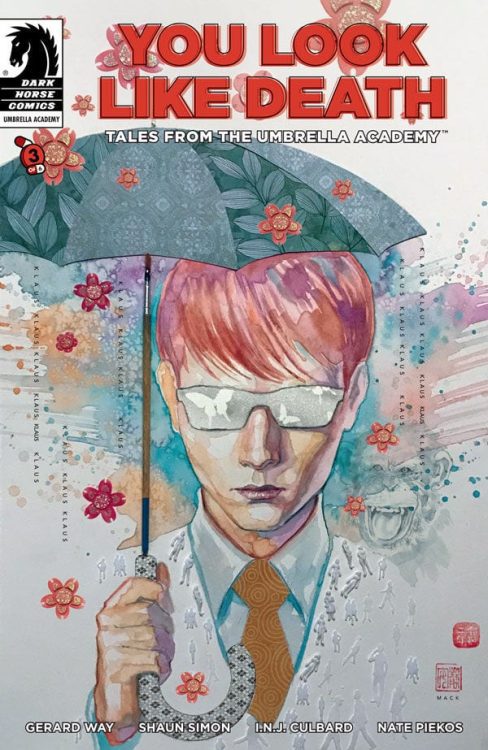
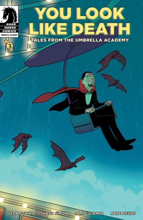
Dark Horse’s You Look Like Death #3 amps up some of the weirdness, but loses something in the exchange. Writers Gerard Way and Shaun Simon, artist I.N.J. Culbard, and letterer Nate Piekos of Blambot may be letting the story get away from them. The charm of this wild world they’ve created can take them quite far, but not far enough to make up for characters who don’t know what they want.
Writing
Way and Simon have written some of our lovely characters into a corner. The Shivers and Klaus, previously the driving forces of the plot, have hit a standstill. Watching Klaus get paraded around by Vivian, it becomes unclear what he really wants. At one point, it seemed like he wanted to go to The Void. But now that he’s getting free passes willy nilly, he’s not doing much there. Any deeper reason for him wanting to go to The Void is unclear. The Shivers, on the other hand, who was after Klaus from the beginning, has been distracted by running an underground theme park. It’s funny, it’s weird, but it’s not moving. Vivian is the only major character at this point whose drive is clear. Despite her massive ego and flair for the dramatic, she can’t pull the plot forward on her own. Way and Simon need to delve back into what makes these characters tick, and know what each character wants, even when the characters themselves are unsure.

Art
Culbard’s page layouts are generally quite simple in this issue. You might even say they’re repetitive. But Culbard uses this to allow certain moments to stand out. When we first see the underground theme park, when Jack is confronted at the diner, or when Vivian gets into a fight in her mansion, the page changes. Culbard allows the panels to overlap each other. The orderly look of other pages, with the thin white gutters between each panel, is gone. It makes each moment feel bigger, and like it bleeds into the next. Sometimes literally. Culbard creates a rhythm and a norm that he then breaks to highlight moments of importance.
Coloring
Culbard does something similar with his colors. A lot of this issue is very minimalistically colored. But when Vivian gets into her fight, the page is very colorful. The scene is beautiful, with its dark reds and deep blues. But the next page is the exact opposite. We’re brought back to our writer in The Void. Everything is a pale blue except for the orange and yellow of a small infographic in the back. It’s such a boring page. But that’s what Culbard wants us to think. By sandwiching it between pages with deep colors, Culbard truly underlines what makes The Void a kind of hell. It’s not that it’s awful or that it’s amazing, it’s that it’s nothing.

Lettering
Piekos uses the length of his balloon tails to indicate the power of the person speaking. When we meet back with The Shivers, he seems a little less threatening than he once was. The word balloons that shoot up over his head, past a bunch of dead space, underline how short he is. It makes him seem harmless. Whereas, when the large man in white shows up at a diner, the tiny tail of his word balloon highlights how huge he is. Later, however, Piekos uses this same concept to create the opposite effect. When Sage is confronted by a band of vampires, their first line is powerful. A small tail leading to a word balloon right next to their head. But the follow-up line is different. We just see the vampire’s feet, and the tail curls down almost playfully. Piekos has the character establish dominance so that their playfulness only further proves how powerful they are in the scene.
There’s a lot about this issue that works. Culbard and Piekos have a visual chemistry that’s brilliant. But Klaus and The Shivers have lost their way, and Way and Simon’s script doesn’t help to make sense of how or why. Way and Simon need to reconnect with the underlying desire of their characters in order to push the plot forward. Tales from the Umbrella Academy: You Look Like Death #3 is out from Dark Horse November 18th at a comic shop near you!

