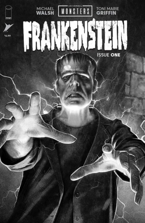
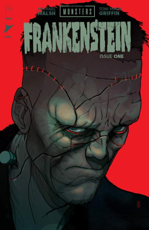
When it comes to recognizable monsters, Frankenstein’s creature could arguably be the most famous. Whether you have seen the 1931 Universal Pictures movie directed by James Whale or not, you will be familiar with Boris Karloff’s visual presence, grunting vocabulary, and predilection to violence. The film has inspired wave after wave of filmmakers and storytellers in the near 100 years since it was made, and the visual motifs have bled into popular culture to such a degree that that this version of Frankenstein is the default setting for so much that has followed in horror, drama, and even comedy.
It is no surprise, therefore, that the new Universal Pictures/Skybound presentation of Frankenstein, releasing on August 28th, returns to the setting of the original film and integrates a new story into the existing one. This sets Universal Monsters: Frankenstein apart from Skybound’s previous serials, Dracula and Creature from the Black Lagoon Lives, which were both sequels involving the monstrous characters. Just like the absurdist play Rosencrantz and Guildenstern Are Dead, this new Frankenstein contains a story that happens in the wings, behind the scenes of the lead narrative. And just like the boy at the center of the story, the narrative sneaks cheeky glimpses at the main filmatic story while hiding in the shadows, desperate not to be found out. It’s like the writer wants to recreate the famous film but is nervous about treading on such an iconic piece of art. Instead he uses the story of the boy to allow himself some agency into the legend and show us, the reader, the best bits of the movie.

Credit: Universal Pictures/Skybound
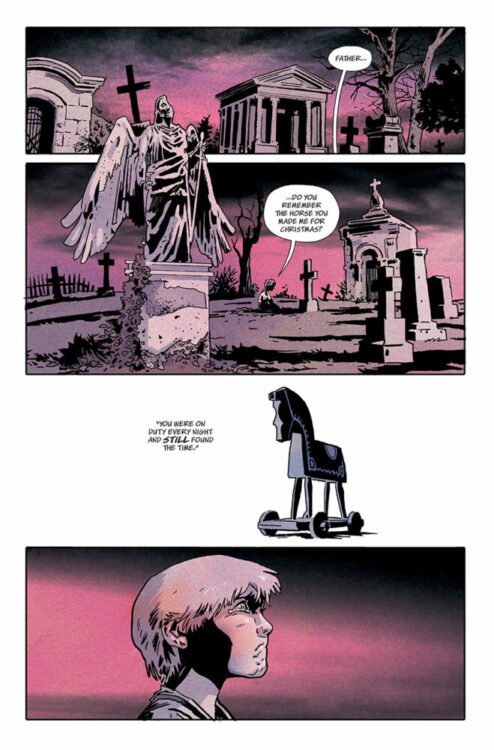
The comic opens with a tragic scene: a boy alone at the grave of his father. Before him is spread the remnants of a toy his father made for him, broken by bullies, and which he is unable to fix. The toy lies on the ground in separate parts with the whole seemingly lost to the world now that his dad is not there to reconstruct it. This simple set up is an echo of the future narrative and has great significance to the way that the boy’s involvement with Frankenstein and his monster will play out.
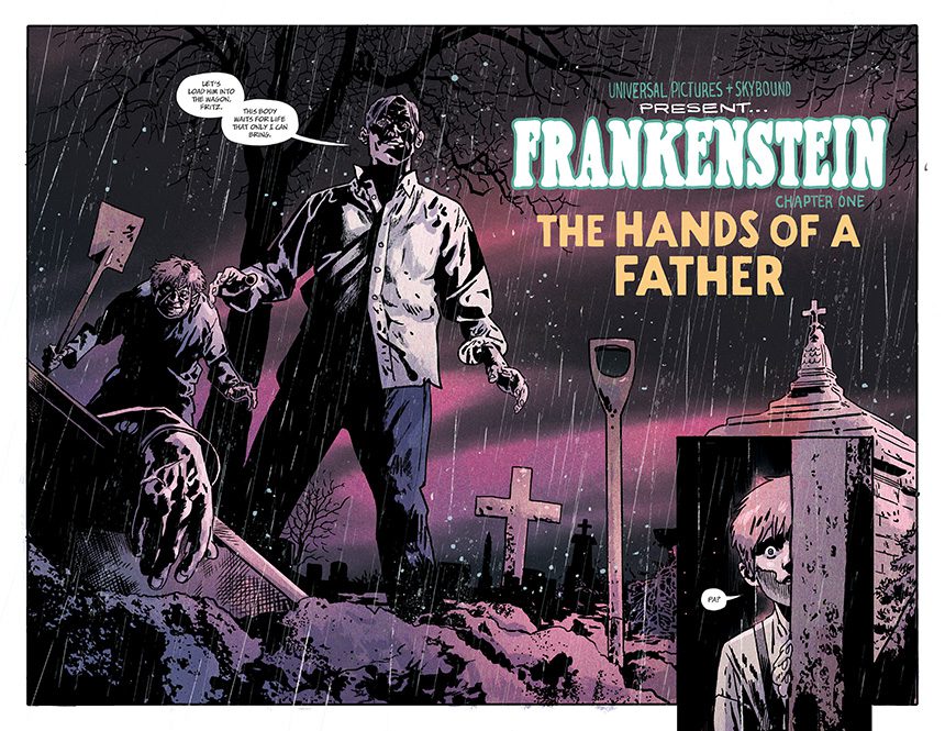
After witnessing Henry Frankenstein and the comical hunchback, Fritz, dig up the coffin containing his father, the boy hitches a ride on the wagon back to the gothic mansion where the infamous doctor is performing his experiments.

Credit: Universal Pictures/Skybound
Throughout this comic, writer/artist Michael Walsh revels in mixing his story with that of the original 1931 movie. He swipes lines of dialogue and exposition directly from the film while retelling classic scenes in his own way. Both the movie and the comic open with a grave robbing scene, but it is not the same scene. This is important because it allows Walsh to set up the characters in a particular light that is slightly different from James Whale’s visual shocker. The character of Fritz is diminished in the beginning, with Walsh sidestepping the awkward comical representation of the disabled character. However, as the comic story progresses a completely different side to Fritz is shown, elevating him into the realms of complex character and not just comic relief. This is the first example of how Walsh manipulates the original sentimentality of the film, which was aimed at a specific social audience, and alters it to fit the modern world.
Fritz exists in the movie as a hangover from the stage productions based on the novel. At that time, certain elements of theatre had to be included in order to get the plays produced, therefore comic relief and musical numbers were added to the visually striking stage design. James Whale’s movie took inspiration from these stage plays, arguably more than the original Mary Shelley novel, and through the power of cinema made them integral to the plot of Frankenstein. In retelling the movie version, Walsh has to navigate these elements and, just as Whale did in the 1930s, make each of the parts fit his modern story. In this aspect, Walsh creates a nostalgic yet modern take on the movie. Readers will instantly recognize certain elements and scenes, but the subtle changes won’t be as noticeable, thereby allowing Walsh to slightly change the characterization and poke at different emotions in the reader.

Credit: Universal Pictures/Skybound
Speaking of the familiar, the design work in this comic is phenomenal. It captures the essence of the 1930s spectacle and gives it a comic book twist that has the same effect on today’s reader that the film had on audiences 90 years ago. When the boy first enters Frankenstein’s lab, the transition and impact is exactly the same as in the movie. As a reader, your jaw drops in awe at the unimaginable wonder that you are confronted with. Even today, where the elaborate laboratory is the expected norm from a “mad” doctor like Frankenstein, the presentation by Walsh is immaculate. Some of this is down to the shifting color palate provided by Toni Marie Griffin. Throughout the comic, the colors are muted and sparse, reflecting the black and white of the movie, but giving it an emotional element that is directly linked to the central character, the boy. In the page before the big laboratory reveal, the color transitions from the unnerving, scary, ruby colored skies and grey/blue grounds into the manufactured green of the lab. One panel in particular includes both the natural, outside color saturation and the looming unnatural color of the inside. As the boy moves through the panels, his environment changes and, as a reader turning the page to see the boy’s destination, we are hit with a sense of awe inspiring wonder underlined with dread. We know what happens in that lab and this makes us fear for the boy. He is new, his presence in the story is an unknown factor, and this makes us readers—knowledgeable of the Frankenstein story—uncomfortable.
If someone were to say to me that they were going to retell Frankenstein and make me afraid for one of the characters, I would have dismissed them instantly. But Michael Walsh has done just that. He has injected this legendary story with a new horror, a fear for a child, but he has also brought back the sublime beauty that is inherent in Mary Shelley’s novel. The 1931 movie made the creature into a monster. It removed his ability to communicate effectively and made each of his actions a destructive one. The creature in Shelley’s novel is a desperate one, a sympathetic one, and intellectually more in touch with its surroundings. There is a deep sadness to the creature who reaches out emotionally at every opportunity. Much of this is lost in James Whale’s adaptation, but Micheal Walsh is able to reintroduce this to the character and the narrative. Along with the horror and the uncertainty in the comic, there is a really heartbreaking moment. It is an emotional punch, at first comforting and heartwarming, but that feeling dissipates as foreknowledge of the creature’s future shrouds the scene in darkness.

Credit: Universal Pictures/Skybound
The Universal Monsters line of comics from Skybound have landed at exactly the right time, as horror and the uncanny are sweeping through whole ranges of comics. The re-emergence of EC into the market, with announcements of future titles to come out towards the end of the year, and the success of the Creepshow anthology from Image Comics appear to have influenced the entire market, with other publishers getting in on the act. The beauty of this comic, and its main selling point, is that Frankenstein is an established property, recognized the world over. It appeals to comic book fans, but also literature fans, movie fans, pop culture fans, and a host of academics. Most people who pick this up will already be familiar with the concepts behind the story and the visual motifs of the setting and characters. The Universal Pictures Frankenstein monster is the template that has dominated visual representations of the character, especially in the North American market. To play successfully in that sandbox is a risky business, but Walsh makes it look easy. He has grasped the monster by the electrodes and screamed louder than any of the other creators in the Universal Monsters series, daring to improve on the original material of the 1931 movie.
Out of all of the possibilities for tie-in comics with the Universal Pictures back catalog, Frankenstein is the probably one of the most anticipated, but also the most challenging. More so even than Dracula, the Universal Pictures Frankenstein has a distinct aesthetic and tone that will resonate with people. To recapture that and create something new, something that people would want to read, is a massive undertaking. Luckily, Michael Walsh knocks it out of the park. This is an exceptional comic that breathes new life into Frankenstein’s monster while lovingly embracing a 90-year-old movie.

