The Decepticons are making their move in Transformers #19 by Brian Ruckley, Anna Malkova, Joana La Fuente, and Jake M. Wood. Is this revolution a nailbiting experience or does it get lost in the disorder?
Summary
“All Fall Down.” Cybertron is in crisis. Calamity has befallen the planet. This is Megatron’s moment to show just how much power he has and to deal with any problems accordingly…

Writing
If the previous issue was showcasing the best of Brian Ruckley, this issue points to all of the flaws in their style. The issue suffers from too much dialogue and not enough action. The revolution has come, the setup for this has been broadcasted for several issues. There shouldn’t be so many panels talking about suspicions and characters about to make moves. Less talk and more scenes of destruction are what is needed in this issue.
The biggest problem this issue is the revelation about the Titan introduced at the start of the catastrophe. The massive has disappeared, confirmed to be gone with a single panel dialogue and will not be participating in moving the story forward. Though the giant robot did make the Tether fall and cause a lot of collateral damage on the surface, there was a chance for more mayhem to unfold. Sadly, it appears this possibility has disappeared for the moment which serves as a reminder of the wasted grandeur this arc could posses.

Artwork
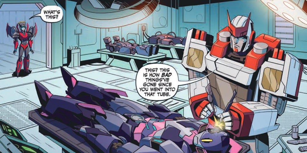
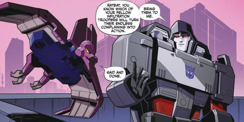
The art by is Anna Malkova is decent but seems to be inconsistent. Some panels are filled with great detail and striking expressions. Other panels the characters seem blocky and have facial expressions which throw off the severity of tense situations.
The coloring by Joana LaFuente is suffering from the same erratic nature. Some panels the colors help to add a striking look to the characters and other times it seems to add to the blandness. This doesn’t seem up to LaFuente’s usual level of consistency.

The lettering by Jake M. Woods seems to be the only area standing out in this issue. The letterboxes for Soundwave are very distinct and perfectly encapsulate the unique speech pattern the character is known for. Seeing the same style used later to symbolize a comlink message helps to nail down a non-auditory sound when seeing the boxes.
Conclusion
Transformers #19 doesn’t feel like the start of a grand uprising. Instead, it feels boring which is the last thing you want from a comic which seemed to have been building to this point for several issues. As its only the start hopefully this arc will pick up some speed because right now it’s hard to imagine it getting any slower with its pace.

