The Visitor #3 from Valient Entertainment out this week, has MJ Kim provide some great artwork for Paul Levitz’s mystery as it gets a romantic subplot.
Recap
The Visitor revolves around an AI project that Japan is staking its future on. Most details surrounding the project are under wraps; however, the projects seem to have caused some disastrous turns in the future. The titular Visitor arrives from this time to sabotage the project by targeting lead programmer Kubo. However, Kubo is under the protection of his nephew Ogawa and UN Security Agent Talia Daubney. While they manage to keep The Visitor off of Kubo, Japanese officials find from his DNA the Visitor’s origins as an enhanced Japanese man.
The Visitor #3 Is A Distraction
 With nobody including Paul Levitz at liberty to reveal crucial story details, The Visitor #3 feels like it’s backpedaling to square two. After the revelations in issue 2, the only thing that changes is seeing The Visitor’s face in flashbacks. Otherwise we get a low tech analysis of Visitor’s origins and a little action that goes nowhere.
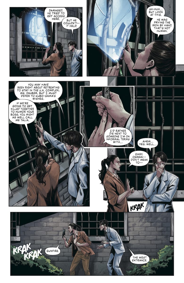
Well, that and a romantic subplot between Ogawa and Daubney that exists in the spur of a couple of moments. Which doesn’t make a whole lot of sense. These characters who barely know each other happen to fall in love from their hands touching? But more than that, the series isn’t about them.
The Artwork Advances More Than The Story
MJ Kim steals the spotlight with how she illustrates more than decent body language. The best examples come from the two officials. Abe likes to present himself as high and mighty per his Imperial heritage by suddenly standing up to look down on people. Hayashi’s slender figure and serpent-like movements meanwhile display his likely ulterior motivations.
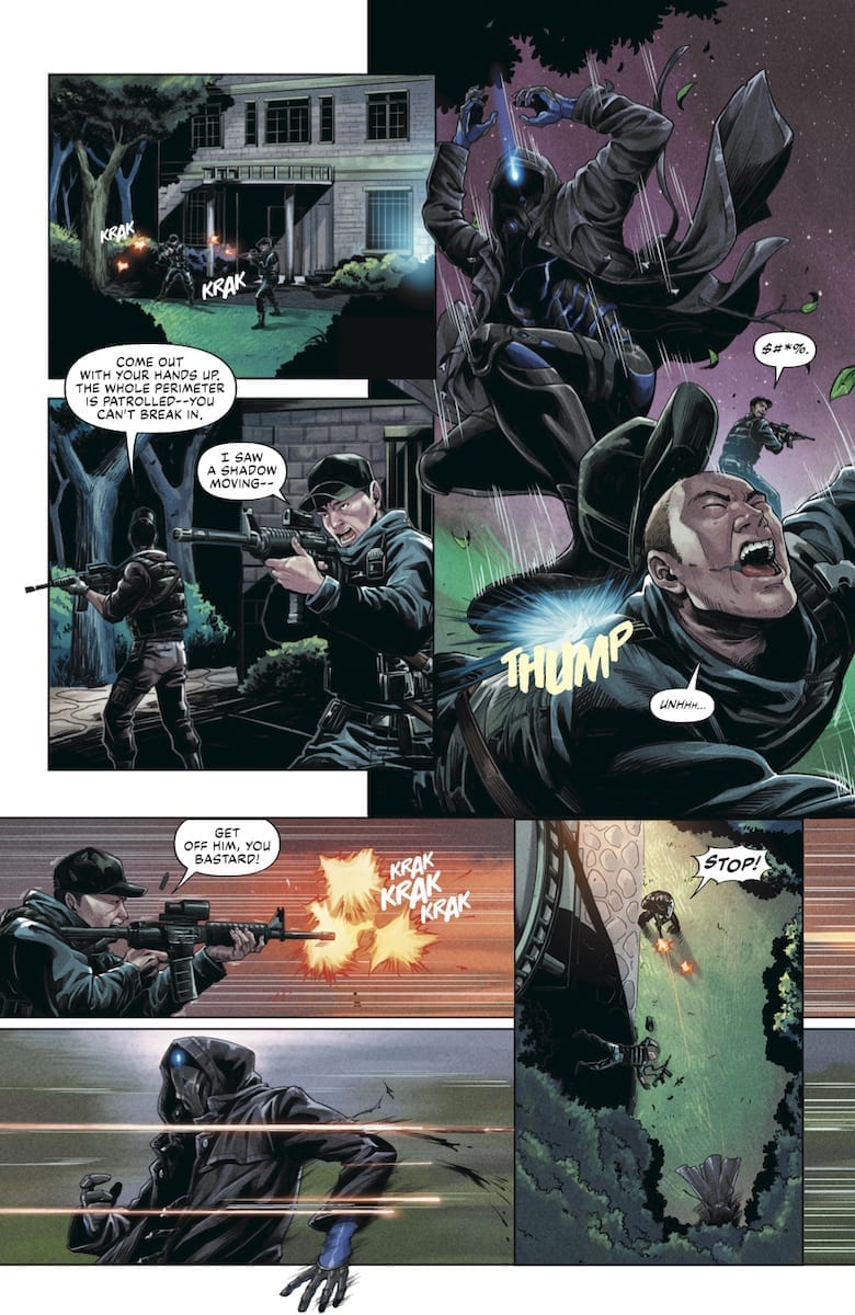
Kim also demonstrates other skills in how she creates the panels. For the flashback sequences, they possess a very microchip component appearance. Then there are the actions acting parallel. The primary plot gets two-thirds of the page while isolated vertical strips show whats happening elsewhere. Which brings up how Kim uses the binary monochromatic canvases. While it’s a little strange how being outside at night uses white canvases, being inside with the lights off is just perfect for the black canvas. This allows the moments with the Visitor to shine brightest.
Even If The Visitor #3 Shows Itself To Be Dimming
 The coloring by Ulises Arreola in The Visitor #3 uses a lot of dark shading. Fitting for the mystery elements and surprise by the Visitor’s bright lights. He even keeps the bright color coding: blue for revelations and orange for danger. Unfortunately, their purposes are very limited in this issue. Most of the revelations, for example, come from how the Visitor makes an entrance.
Simon Bowland’s lettering functions well. All of the word balloons have a decent arrangement to get readers through the story. But, when it comes to the onomatopoeias, they don’t feel like extensions of the action, just decorations. They don’t share a matching color as the effects or objects they come off save for the ones in The Visitor’s flashback. It’s as if the artists are trying to get the details out, but The Visitor #3 won’t let them.
Do Whatever You Want With The Visitor #3
While the artwork remains consistently good, this issue takes a couple of controversial turns. Rather than try to solve the mystery, all we get is what everyone is already aware of from the last issue. But more than that, a romantic subplot has come up to distract the readers for the finale.

