

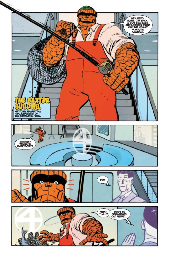
“Brooklyn, New York. Years Ago.” So starts writer Walter Mosley’s script for The Thing #1. Letterer Joe Sabino shows the dateline in a large, yellow, almost goofy font. With these small things, Mosley and Sabino create a time capsule to campy 60’s comics. Yet, the image that artist Tom Reilly and colorist Jordie Bellaire present, on the first page, is anything but campy. A hooded figure stalks a dilapidated neighborhood. The background characters are quiet, silenced by a hushed terror. The hooded figure does a mysterious yet horrifying act, and then we’re met with a smiling Ben Grimm in a fisherman’s outfit.
The Thing #1, from Marvel Comics, is a wild blend of 60’s stories with a modern temperament. Writer Walter Mosley, artist Tom Reilly, colorist Jordie Bellaire, and letterer Joe Sabino manage to have the best of both worlds.
Writing
Mosley’s range is shocking and brilliant. One might thing that Mosley, a celebrated novelist, would tend towards having a more text-heavy script. But The Thing #1 is wonderfully paced. Mosley, on multiple occasions, will blast us through an action sequence that has little dialogue at all. And his wordier scenes have a joyful silliness to them. By setting this issue “Years Ago,” Mosley gives himself the perfect opportunity to celebrate old comics, by matching their tone and style. Yet he’s always bouncing back to scenes of a deeper and darker nature. Mosley really has found a fantastic balance of fun and depth.
Art
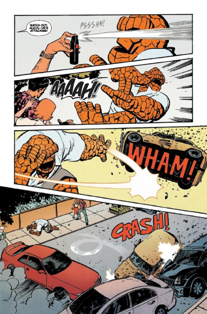
Reilly brings in so much of the wonderful silliness of The Thing #1 with his art style. Every emotion the characters feel is amped up to 11. When Ben Grimm and Alicia Masters get into a fight, it escalates immediately. In one panel, Ben looks angry with his arms crossed, in the next they’re both yelling at each other with their whole bodies contorted in fury, in the full throws of an all-out shouting match. And when Ben is talking to someone about his strengths and weaknesses, he’s a whole tableau of emotions. He’s depressed then deep in thought, satisfied then totally discouraged. All of it is plain as day on his face.
Reilly gives these pages a really melodramatic tone, matching the time period these scenes are celebrating. But the truly emotional moments, Reilly slips under the radar. When Ben is trying to be strong, or when he’s facing away – almost like he’s too hurt to face the reader at all – that’s when your heart breaks. Reilly hides it among the flashy fun that he provides so well, but it’s the beating heart of the story.
Coloring
Bellaire shows what each scene is about in the color palettes that she chooses for them. When we open on the hooded figure, the scene is grey and lifeless. Soon, it evolves into something red and violent. Later, when Ben has a nightmare, his dream is colored in that same tint of red. But when we first see Ben, he looks like himself. He’s wearing orange coveralls and looking happy. The color palette is warm and welcoming. As Ben begins to feel more and more isolated, the color palette turns to a cold blue. Ben is always a character who wears his heart on his sleeve. Thanks to Bellaire, The Thing #1 follows Ben’s example!
Lettering
Just like everything else in The Thing #1, the lettering has a great way of bouncing between styles. Even at the beginning, the dateline is in big, yellow bubble letters. Sabino makes it feel and look like an old comic. The big sound effects that follow, like the “KRASH” of a door bursting into pieces, adds to what could almost be called the “60’s Batman” effect. But just a few pages later, it’s the thin white lettering of “KNOCK KNOCK” that stands out. It’s eerily quiet compared to everything else we’ve seen. And soon we see why. The lettering for the “BTHMP BTHMP” noise of a beating heart is just as subtle. Sabino makes the most horrifying moments the most understated and it has a brilliant and terrifying effect.
Marvel’s The Thing #1 is a ton of fun. But hidden between the laughs and the action is a really emotional story too. This creative team is somehow having their cake and eating it too. They’re celebrating old comics, in all their campy glory, and creating a timely narrative of heartbreak and disillusion. Pick up The Thing #1, out from Marvel Comics November 10th, at a comic shop near you!