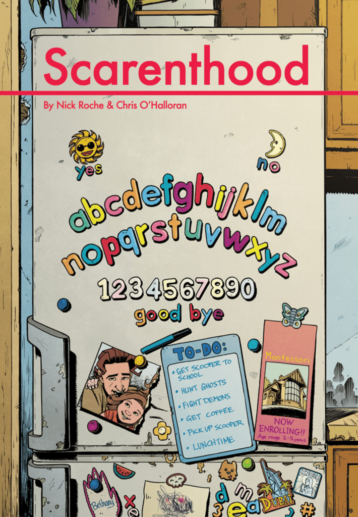
SCARENTHOOD #1 is out October 28th from IDW Publishing, and it is a chilling tale about hunting ghosts and demons (and being done in time to pick your kids up from school).
By writer/artist Nick Roche, colorist Chris O’Halloran, and letterer Shawn Lee, SCARENTHOOD is an Irish folk horror about four parents whose children attend the same pre-school. After disturbing an ancient evil in their small town, the group starts spending their days battling demons and uncovering a decades-old mystery, all while juggling their normal parental responsibilities.
(CHECK OUT OUR INTERVIEW WITH NICK ROCHE ALL ABOUT SCARENTHOOD RIGHT HERE!)
Let’s not bury the lede here: this is the must-read new comic for this Halloween season.
What works so well about SCARENTHOOD is that the story is driven by real-life fears and insecurities. There is an inherent truth to the writing. Roche is a parent of a young girl himself, and he channeled all of his anxieties about being responsible for a tiny human into this book. So if you’re a parent yourself, you’ll probably find this comic extra striking and scary, but even those of us without kids will get a good fright. That’s because the character development is so strong right off the bat that you develop an immediate bond with this cast. So when the spooky stuff goes down, you feel genuine concern for these fictional parents and their fictional kids.
It’s not all allegory though, so don’t you fret horror fans: here be monsters, and they are terrifying.
Outside of story and character, good horror largely comes down to two more subtle things: atmosphere and pacing — and the SCARENTHOOD team nails both.
Roche has stated that O’Halloran is “utterly in control of the tone of each scene,” and that’s a good call because the man is a master colorist. Ice Cream Man fans already know about how O’Halloran’s muted colors can set a scene and send chills down your spine. In SCARENTHOOD, he’ll take you from “everything’s fine” to “sh*t just got real” on a dime. The way the color palette changes from scene to scene (or moment to moment) is a brilliant subliminal way to give readers the willies and put them on edge on a subconscious level.
And then there’s Roche’s designs of the world and characters. The settings are all taken from real life, so again there is that inherent truth to the story that enhances the horror. Because the world looks and feels real (and O’Halloran’s colors are again a huge part of that), it makes you feel like this story is real. Roche’s character designs are then more cartoony, and that’s genius in itself because it tricks your brain into thinking this is just a fun slice-of-life comic, making the horrifying elements all the more horrifying when they hit.
In terms of pacing, Roche utilizes multiple panels and close-ups to build tension and drama, which is crucial in horror storytelling. Lee’s lettering guides you through each scene at just the right speed so that tension grows naturally, and he delivers you at the pay-off point when your stress is at its zenith. There is a lot of dialogue in this issue, but it never bogs down a scene or slows you down thanks to Lee.
I have to say though, there is one splash page in this debut that is one of the most effective splash pages I’ve read this year. The way everything comes together — the build up to the splash, the “camera” angle Roche uses, O’Halloran’s colors, and Lee’s subtle lettering (there’s no actual dialogue in this moment, but Lee still plays a vital part) — it took my breath away and I felt that genuine concern I mentioned earlier.
Horror is a genre bogged down with tropes, but SCARENTHOOD feels fresh and original. Our heroes aren’t high schoolers, or babysitters, or homicide detectives — they’re parents who just want to do right by their kids. Roche, O’Halloran, and Lee are firing on all cylinders here, and they breathed new life into one of comics’ toughest genres.


