Written by Ed Brubaker, with art and letters by Sean Phillips, and coloring by Jacob Phillips, Image Comics’ Reckless is nearly a perfect graphic novel. It’s a wild ride through a version of the 1980’s which feels more like a stale 1970’s. We meet a cast of characters, including titular Ethan Reckless, who are clinging to a past that’s gone, because there doesn’t seem to be much of a plan to see the future.
Writing
“If I had more time, I would have written a shorter letter.” That’s a quote that’s been attributed to Mark Twain, Winston Churchill, Blaise Pascal and more. It’s one of those things that rings so true, everyone wants to claim their hero said it. (Pretty sure it was actually Pascal, by the way.) Brubaker’s script is a good example of this idea. It’s just one draft away from being perfect. About a third of Brubaker’s captions feel unnecessary. As he introduces us to Ethan Reckless, we are also introduced to Ethan’s inner monologue. Some of it is just Brubaker giving us a sense of where we’re heading, and what Ethan has planned next. Other times, Brubaker harps on the right detail.
Details like our antagonist Wilder’s impression of Ted Bundy, or a flashback where Ethan and his old flame Rainy think they can just run away together. These are the kinds of details that tell us so much, while pretending to be innocuous. It’s still an incredibly strong script, with wonderful twists and turns. But there’s room for a little more mystery in these pages. And the strongest moments happen when there is no narration and Brubaker lets events speak for themselves. Like when Ethan and Special Agent Hancock take a tense ride home. Brubaker often does use extensive narration in his works — it provides the neo-noir feel that he’s mastered — but this feels a little bit heavier than usual. As we get deeper into the story, Brubaker becomes more and more focused on the right details, until we hit the magnificent finale.

Art
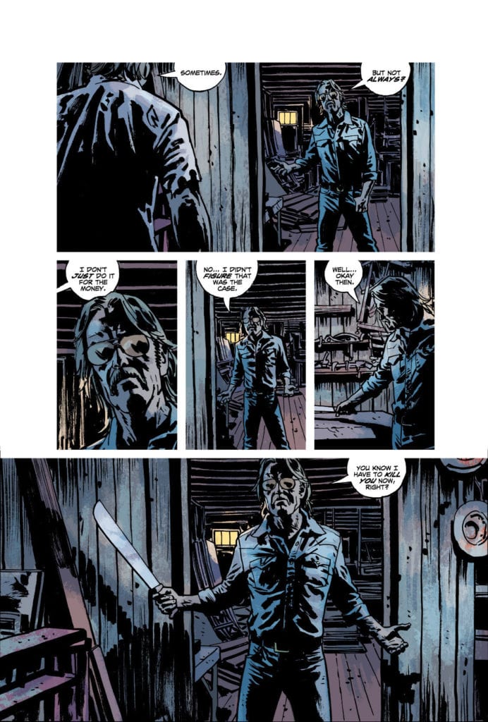
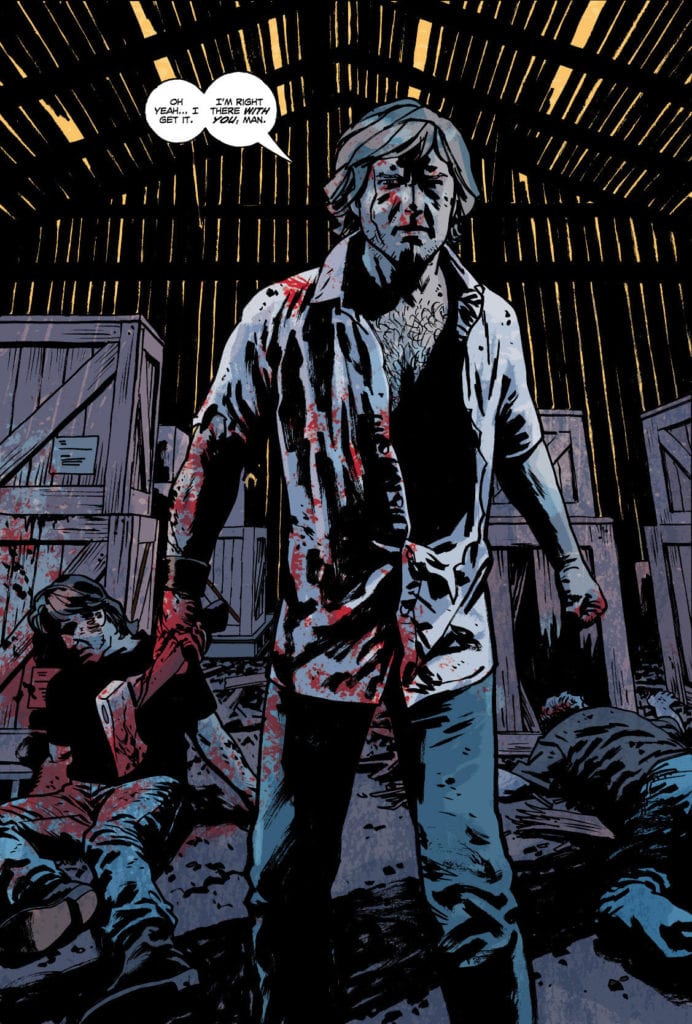
Sean Phillips creates a visual rhythm in Reckless. There are essentially three forms his pages take: 1) with three rows of panels, two rows separated from the page’s edge by a white margin, while the third row is one wide shot that goes all the way to the edge of the page; 2) instead of the wide shot, Phillips has one panel connecting to a corner of the page; or 3) we get a splash with art covering the entire page. Phillips varies small things in these formats, but the layouts become familiar quickly. This means that the 10 pages, out of a good 150, that don’t fit the format slap the reader right in the face.
The few pages Phillips has that have a white margin around all of the art make the reader feel trapped. One page is even depicting gridlocked traffic. Another of these pages, Reckless is watching as his life explodes, unable to do anything. But one page layout, which Phillips only uses twice, sticks in the mind. On the upper left corner of the page and on the lower right, Phillips has two panels that go right to the page’s edge. On one page, we see Wilder. He’s a monster in the first panel, but in the last he suddenly feels dangerously human. On the other page, we see Reckless. In one corner he looks determined, maybe angry. In the other corner, he’s trying to look like he hasn’t just been crushed. These pages begin and end with a close up of a character, but what happens in between these images deeply affects how we see the character by the time we come back to them.

Coloring
Jacob Phillips colors Reckless in a way that’s deliberately reminiscent of old pulp comics and paperbacks. At times, the coloring looks like it’s just a little off. The coloring for Reckless’ hair is smidge too far to the left, so it falls outside of the lines. It gives it the feel of something that went through the printer with the coloring and inking out of sync. But it isn’t distracting. It’s an accent to each page. Occasionally they’re to be noticed and appreciated as a callback, but only if you’re looking for it. Phillips used a similar style in Pulp, giving that graphic novel the same old-comics feel.
Phillips also balances a monotone feel with simple beauty brilliantly. We get the impression that Reckless’ life is pretty bland. Much of the color palettes showing his day-to-day don’t have much variation to them. But Phillips adds dashes of colors that jump out at you. Whether it’s the pink haze of what it’s like to see Rainy again, the neon orange and yellow of their erotic acid trip, or the bright red of a fist to the face, these are moments where our unfeeling protagonist actually feels. And while the rest of the comic does feel quite monotonal, each page being predominantly different shades of one color, it’s still gorgeous. Phillips manages to capture an unfeeling existence and keep it interesting at the same time.
Image Comics’ Reckless is nearly perfect. If the script were whittled down slightly, it would be perfect. As it is, it’s still a mind-blowing beginning to another fantastic series from Brubaker and the Phillipses! Don’t miss another awesome, pulpy, neo-noir crime comic from the guys who do it best. Reckless is out December 16th, from Image Comics, at a comic shop near you!

