

Comics and crime stories are a match made in heaven, like Laurel and Hardy, burgers and chips, or Zack Snyder and extended cuts. The noir aesthetic and inherent violence of hard-boiled detective novels suited the cheap pulp comic productions of the 1940s and 1950s and, once the Comic Code Authority lost its influence and power, it was natural for violent crime to return to the pages of comics. In truth, the whole superhero genre is just crime stories dressed up in tights and extravagance, and played out in the bright lights so it’s not as upsetting for people who are easily offended.
In BOOM! Studies’ new crime comic Profane — written by Peter Milligan and illustrated by Raὒl Fernandez, with colors by Giada Marchisio, and letters by Jeff Eckleberry — the title character finds himself drawn into a meta murder mystery that is as much a puzzle for him as it is for the reader. Memory loss, femme fatales, and murder make up the dangerous game, but Will Profane is going to discover more about himself than he was ever wanting to know.
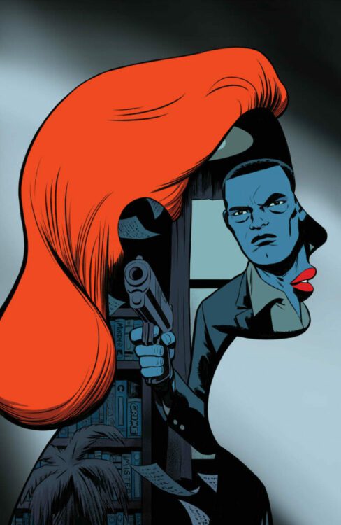
Credit: Boom! Studios
The opening of Profane reads like the opening of a classic murder mystery novel—one written by Raymond Chandler or Mickey Spillane, who gets a mention later in the comic. The classic voiceover cliche is presented here in caption boxes by letterer Eckleberry, who gives them the feeling of being ripped from a novel. The typeface and caption box design encapsulates the sense of reading a classic pulp magazine, if only the comic could be printed on the cheap, ink-running paper that those magazines used to be printed on. Reading a traditional comic is a tactile experience, and the need to produce the highest quality product often undermines the artistic decisions made within the comic itself. To really get the feel for Milligan’s story, this comic should be printed on newsprint, where the ink rubs off onto your fingers, sharing the grime from the narrative with the reader. As good pulp fiction is immersive, the experience of reading it should also be so.
Product design aside, Milligan demonstrates his passion for crime stories throughout this opening issue. References to famous novels are plentiful, whether they are straightforward name drops like the use of a Mickey Spillaine book, or more obscure background references, such as the bar from The Big Sleep. However, the most impressive aspect is Milligan’s ability to weave his way around a mystery while embracing all of the cliches of classic detective fiction. At points, it’s almost cheeky how the writer incorporates the tropes of crime fiction into the comic while maintaining a serious story. It’s like removing the jokes from a Robert Rankin novel and pushing it as serious literature. You can never quite tell if Milligan is messing with you or not. Some of his previous work has been outstanding, and he has a proven track record for writing compelling, well-constructed short stories. From his early work on 2000AD and Rogan Gosh in Revolver comic, through his Vertigo work for DC, and an exceptional four issue run on Hit Girl, Milligan has always produced intriguing, thought provoking, and challenging work. Profane is no different. There is a passable surface story but, even within this first issue, layers become apparent and are slowly stripped away to reveal more and more beneath. The narrative unfolds to embrace a greater meta-narrative that isn’t bogged down in cheap fourth wall breaks. There is an element of Paul Auster’s City of Glass in these pages but focusing on character instead of writer.
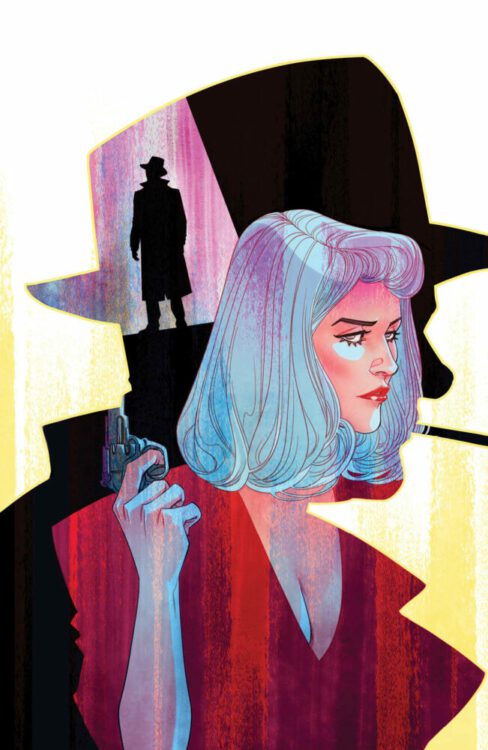
Credit: Boom! Studios
Just like the narrative, the artwork is deceptively straightforward. Raὒl Fernandez has a classic comic book style with bold shapes, heavy outlines and chunky areas of shadow. Each page has a clear line of focus, often running down the center of the page, which leads the eye naturally from one panel to the next. However, the nature of the story and the mystery that is constantly referred to, forces you as a reader to stray from the focal line. This creates a forced tension between what you as a reader should be doing and what you want to do. For example, on the opening page, the visuals follow Profane as he enters a house and moves from one room to the next. Your eye is drawn down the center of the page with each door that is opened, however Fernandez fills each panel with objects and images that could be relevant to the plot. As the voiceover mentions private detectives and solving cases, your brain naturally starts to look for clues and items of significance. Fernandez litters the pages with such clues, or possible red herrings, turning each page into a cornucopia of possibilities. Is that slightly out of focus poster relevant? Do I need to identify the women in each of the photographs that Profane passes?
If you pick up a comic, flick through it to get a general gist, then chuck it to the side, classing it as read, then you are missing out, especially in comics like Profane. This has been designed to be pawed over and scrutinized. The creators are expecting you to look into each nook and cranny, peer into the shadows to look for shapes, and study each face in the background to see if they reoccur elsewhere. From the opening page, the narrative puts you on guard to watch every little step which in turn means that you appreciate the art of this comic so much more. The clever scripting, with its deliberate cliched styling, and detailed panel work means that there is a lot packed into this first issue. There is a lot to digest and examine, and then re-examine when you reach the cliffhanger ending with the first, of what I expect to be many, major twists.

Credit: Boom! Studios
Profane is a visual treat, with Marchisio’s colors helping to control the number of time jumps, flashbacks, and shocking memory revelations. A change in color wash separates the various aspects of the narrative so that the narrative never becomes muddled or confusing. Marchisio uses subtle changes in tone between objects in panels but also picks one color as a standout to follow from panel to panel, across a page. This creates another focal point on a page, sometimes helping Fernendez’s reading pattern, sometimes complicating it. It is yet another layer to this multi-layered comic.
If you’re not yet convinced, I’m not sure what else I can say. It’s a murky world out there, and sometimes it’s good to get lost in a good book or, in this case, comic. The creators tell their story and pack it with brilliance and wit. Profane has a strong opening narrative, great artwork from all involved, and a comic that wears its inspiration on its sleeve. This will appeal to crime enthusiasts, comic book historians, and fans of good stories told well.