Jonathon Hickman’s Powers of X #1 gives fans tangible evidence that his run will be one of X-Men’s best. The art team consisting of R.B Silva, Adriano Di Benedetto, Marte Gracia, VC’s Clayton Cowles on letters, and Tom Muller with designs are no slouches propping up Hickman’s story with stellar art. It may be too early to call, but all signs point to Powers of X being one of X-Men’s essential reads.
Take all of that with a grain of salt because this is very much a Hickman story. Creepy Anthropomorphic aliens? Check. A Strong Inclination towards Prophecy? Check. Unconventional Storytelling methods? Check. Graphs consisting of made-up statistics, terms, and languages? Super Check. If you are not a fan of Hickman’s previous runs on Fantastic Four, Secret Wars, or his stellar Image Comics‘series East of West then Powers of X may be a bit of a difficult read.

As mentioned prior, Powers of X #1’s script can be a bit difficult to follow as it takes place in four separate time periods.
Year 1: The Dream
Year 10: The World
Year 100: The War
Year 1,000: Ascension
With each having to do with the prominence of Mutants in that time. It’s difficult to speak much of the plot without giving too much away; it should be read rather than explained. It seems like the more critical time periods are Year 100: The Man-Machine-Mutant War and Year 10: when House of X takes place.
Hickman’s writing style thoughtful and meticulous and it is refined to precision in Powers of X #1. The use of the fortune cards from Year 1 in Year 100 was particularly noteworthy. If there is one critique of Hickman’s script, it’s that there are a lot of moving parts, especially in Year 100. It’s almost confusing to decipher who are the mutants and who are the machines and what exactly they are fighting about. A graph comes in later to help explain and put some things into context, but it requires a couple of rereads.

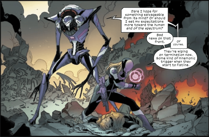
The artistic team of Silva, Di Benedetto, Garcia, Cowles, and Muller proves ideal for Powers of X. Silva’s lines are expressive and defined, Di Benedetto and Silva’s ink is exact, and Gracia’s colors are deep and add nuance to each scene. The highlight of the issue remains the overall design of Krakoa in Year 10 and the Human-Machine Monolith and surrounding town in Year 100. Krakoa looks naturalistic and spiritual like an Elvish Cathedral while The Tower of Nimrod is industrial and stoic, like a cleaned-up version of Blade Runner’s L.A.
The art team does struggle somewhat with scenes containing a lot of movement or action. While the action panels are neatly drawn and colored, the overall fight between mutants and humans/machines in Year 100 feels poorly choreographed. It looks like characters are just charging at each other and screaming. It can also be confusing to remember where characters are in the fights in relation to the enemy, and their weapons as most of the shots are intense close-ups on the faces before pulling out to wide explosions or action panels.

Also, in the scene where Nimrod is putting his prisoner in the torture machine, there is a surprising lack of detail on Nimrod himself compared to his machine. Nimrod’s lack of sharp define lines makes him look made of clay or silly putty when viewed from afar.
In tandem with its twin House of X, Powers of X #1 is shaping up to be the exact reboot X-Men needed. Hickman’s script is nuanced and political, and the art team proves they are more than capable of delivering on their potential. Simply put, every X-Men fan should be reading Powers of X #1.

