

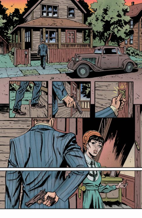
It starts with a wooden suburban house surrounded by trees. A classic 1930s Ford two-seater is parked out front, and a man in a pinstripe suit is walking up to the front door. The first brown-heavy panel sets the scene and the tone for the first issue of Kosher Mafia published by Mad Cave Studios. Written by David Hazan and drawn by Sami Kivelä, Kosher Mafia is a mobster story told in the classic gangster style, with ultra-violent sequences nestled between boardroom meetings and family drama. Flashbacks and plotting are the highlights to describe this first issue, and you are in for a treat when it is released on August 7th.
Credit: Mad Cave Studios
Set in Cleveland in 1936, the story opens with a meeting between Mr. Gold and Howard Berkowicz, enforcer and bookkeeper respectively for the Jewish Mafia. Their quiet confrontation, a cliche of the gangster genre, is the centerpiece from which the rest of the story spirals out. Through a collection of flashbacks—memories shared between Gold and Berkowicz—Hazan sets up the story and begins to build his specific narrative. This approach ties in with the tropes of the genre and allows Hazan to control the information being fed to the readers. Each speech by the two main characters is backed up with visual representations of actions taken previously, giving their words power and credibility. The plot oscillates between Gold and Berkowicz, giving their slightly biased interpretations of events, so that the reader not only gets a view of the characters as they see themselves, but also how their opposite sees them. Gold is brutal and fair, but also, as we can see from Berkowicz’ reactions to him, intimidating and loyal. In return, Gold shows us that Berkowicz is to be respected as he is a valuable member of the mafia.
Hazan’s script and way of unfolding the plot makes everything personal to the central characters. There is a massive story playing out around them: the rise and fall of American gangs, the oncoming storm that is the Second World War, and the rise of the Nazi beliefs within America. However, Hazan is able to keep the comic focused on the two main characters, their personalities and interactions. Kosher Mafia is a personal tale set in the violent and stormy sea of history.

Credit: Mad Cave Studios
The highlight here, for me at least, is Sami Kivelä’s artwork. Having worked on some wonderful titles such as Abbott and Deer Editor, he has also produced art for two of the best comics in recent years: Machine Gun Wizards and Undone by Blood. In both of these titles, Kivelä has demonstrated that he understands the intricacies of genre illustration while also retaining a personal style. This is no different in Kosher Mafia. The tropes of gangster storytelling are visible on the page but the characterisation of the main cast and the inspired panel layouts add depth to the reading.
The opening page is a prime example of Kivelä’s brilliance. There are two main images on the page, but six individual panels. Three inserts, close ups of Mr. Gold, highlights the characters actions as he walks steps onto the porch of the house from the first panel, but it is the final two panels that are truly brilliant. One image is split into two by a thick white gutter. There is no plot requirement for the gutter, it does not give the reader any additional information about the surface scene, however it emphasizes elements of the characters in the image. The reader is given specific information about Mr. Gold and his intentions in visiting the house and the hesitancy of Mrs. Berkowicz at inviting him in. The gutter provides a pause to the reading, forcing the reader to focus on Mr. Gold’s gun and Mrs. Berkowicz’ invitation; it singles both of these out from the image, giving them additional weight in the scene. It seems so simple, using the format specific elements of comics to help enhance the story, but it is so often overlooked in modern, mainstream comics. You will see people arguing about how comics are an art form, and work like this is a perfect example of what people should be doing in comics. Stop trying to mimic other mediums and embrace the format. The excessively violent scenes in films like The Godfather or Goodfellas, are represented here in a single panel made up of solid black figures in the foreground and a large, blood red, word filling the background. A silhouette of a man striking another man with a crowbar in front of the word “CRACK” written large behind them has the same narrative punch as Robert DeNiro beating a man to death with a baseball bat in Untouchables.

Credit: Mad Cave Studios
Not yet convinced? Maybe color is your thing. If so, award winning colorist Ellie Wright delivers exactly what you are looking for. There are some clear color transitions between the present and the flashbacks, with the latter taking on a sepia tone befitting a 1930s gangster tale. The present day element has some brighter, almost vivid, colors, however these still fit the era the story is set in. Nothing is too modern, too artificial. Most of the vibrancy comes from the natural world—the distinctive greens of the trees or the vivid orange sky.
Add to this the excellent lettering work by Simon Bowland and there isn’t a weak link anywhere in this comic. Bowland has a history of producing wonderful work (just see his long run of The Boys and any of his 2000AD work) and his experience shows here. He delicately splits out the speech, sharing the words across multiple balloons in order to add emphasis to the dialogue and create specific speech patterns. In addition, the speech balloons fit perfectly into the space in the panel, neither dominating or becoming lost in the art. There is a synergy between the art, the colors and the letters that create a single, lasting impression of the characters and the world in which they live.
Having said all of that, this comic will not appeal to everyone. The genre of the comic will instantly turn some readers off, and that is fine. Not everyone likes the same thing and genres are a great separator of readers. Superheroes don’t, as a general rule, float my boat, but I can still appreciate a well crafted superhero comic, while ignoring the continuity and all that comes with a franchise. You can learn a lot about a medium from genre-specific texts that are classed as classics in their field: The Godfather, Jaws, and Night of the Living Dead are all very different movies, but each is a shining example of what cinema can achieve, technically and culturally. We may have to wait until more issues of Kosher Mafia have been released to say for sure that it is a title worth examining, but based on the first issue, there is a lot to discover in these pages.