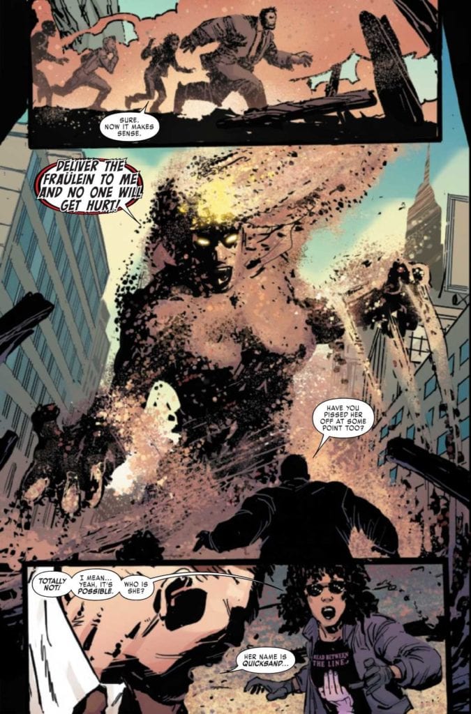
JUGGERNAUT #3, available from Marvel Comics on November 18th, puts Cain Marko in the middle of a lawsuit for past damages while an old enemy comes calling for D-Cel. Fabian Nicieza’s writing establishes a solid redemption story for Juggernaut and teases a deeper mystery in store for the giant and his “agent.”
Cover Art
Geoff Shaw’s cover is as menacing as it is prescient. Juggernaut holds the scales of justice amidst the rubble, and his cold, glowing stare suggests an enemy underneath is pulling the strings. Shaw paints a powerful pose that brings your eye right to Juggernaut’s eyes in a magnetic way.
Writing
Nicieza picks up a short period after the events of issue #2 (read our review of Juggernaut #2 here) with the lawsuit well underway when a powerful villain interrupts the proceedings. During the ensuing chaos, we’re treated to some flashback scenes reminiscent of Batman Begins’ training scenes that explain how Marko got his new armor.
The mystical, magical, hard-earned explanation for the new armor works. It defines Marko as somebody who’s as tough on the inside as he is when wearing the Juggernaut armor on the outside. That toughness, and his increasing willingness to help people, turns Juggernaut into a former-villain that’s easy to root for.
Nicieza’s allusion to a big bad behind the scenes increases my anticipation and excitement for the next issue.
Pencils/Inks
Ron Garney’s rough style continues to match Juggernaut’s rough, blue-collar nature in a very organic way. He’s a character that’s not afraid to get his hands dirty, and Garney’s art is perfectly in line with that rough-and-tumble sensibility.
The rough style works even better in this issue because the guest villain, Quicksand, takes on a grainy, flowing anatomy that suits Garney’s work well.

Coloring
Matt Milla adds authenticity to this issue with great use of filters, specifically on the flashback scenes. It helps to delineate between panels in the present day and actions set in the past, and the coloring makes the flow of multiple timelines clear and easy to follow.
Lettering
VC’s Joe sabino executes a credible job with clean, clear, and concise lettering. The lettering is a little too clean as it doesn’t quite integrate with the art style naturally, but it carries the story through at a good pace.
Conclusion
JUGGERNAUT #3, available from Marvel Comics on November 18th, is an entertaining entry in a, so far, surprisingly good series. The art matches the characters and situations perfectly, and the story is far from predictable in the best possible way. I highly recommend this book.

