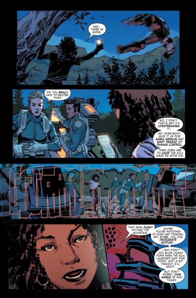
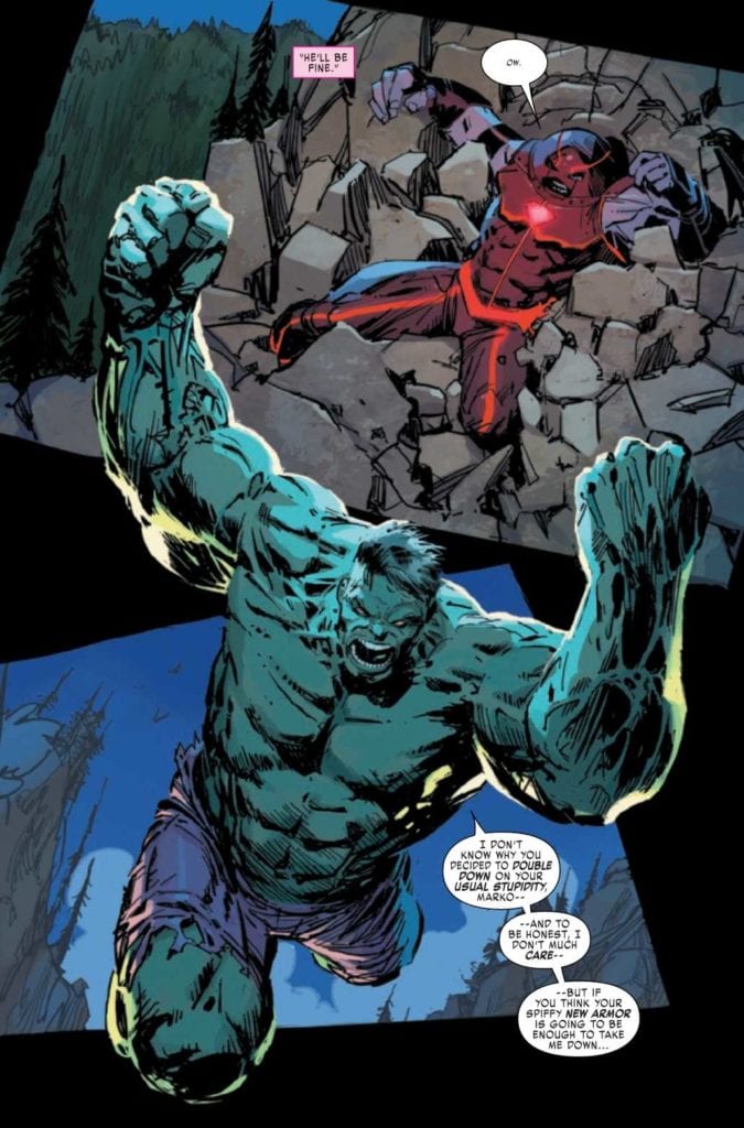
JUGGERNAUT #2, available from Marvel comics on October 21st, pits the Juggernaut against the Hulk as a PR move. Juggernaut’s “agent” may not be giving him the best advice. Written by Fabian Nicieza and drawn by Ron Garney, this latest chapter demonstrates that doing the right thing is not always the best thing.
Cover Art
Geoff Shaw’s cover is raw, powerful, and dynamic. Two giants facing off in a fast-paced brawl make for an eye-catching cover.
Writing
Cain Marko is trying to make good on the past’s damage through some mildly fabricated good deeds. His PR agent, D-Cel, convinces him to go after the Hulk and bring him in to answer to a ‘Victims of the Hulk” support group. Needless to say, the plan doesn’t work out as intended.
Nicieza’s story has a great battle to kick things off, and there are interesting flashbacks to clue the reader in on how Juggernaut got his new armor. However, the highlight is Hulk’s dialog as the new Immortal Hulk that’s a blend of the mindless monster and Banner’s intellect. This Hulk is self-aware and brutal in an almost malicious way. Nicieza makes you fear the Hulk more than I recall in recent memory.
That said, D-Cel continues to be a mystery in this story. All of her suggestions turn out poorly, and Marko was never one to be led around by the nose as he is here. Up to this point, D-Cel is more annoying than additive, but hopefully, that will turn around in future issues.

Nicieza continues to build a surprising amount of sympathy for Juggernaut, and I hope the potential pays off in future issues as well.
Pencils/Inks
Garney’s art is rough, raw, and perfect for the grounded nature of this story. The highlight of this issue, unsurprisingly, is the fight between Hulk and Juggernaut in the opening scenes. When Hulk slams the ground with his fists, the panels practically shake. When a body hits the side of a mountain, there’s no doubt these are the strongest characters on Marvel’s Earth.
I was particularly impressed with the detailed work on Hulk’s anatomy. His limbs and torso are almost tree-like. Also, Garney went for a smaller chest in favor of more size through the ribs, giving the Hulk an authentic brawler physique. The characterizations are humanoid in form, but you can feel the weight of these giants in every panel.

Coloring
Matt Milla’s coloring work is solid from start to finish. The issue’s overall look is muted, but colors pop when they need to, especially in panels with some kind of power beam or blast. Milla also made an interesting choice by tinting Hulk’s eyes an orange-yellow color, so they stand out more and, frankly, make him look a bit demonic. That was a nice touch.
Lettering
VC’s Joe Sabino’s lettering is clean, sharp, and keeps the pace smoothly. Sabino also does a great job with the assortment of smashing noises. They fill the panels to projects “big” sounds without crowding out the art.
Conclusion
JUGGERNAUT #2, available from Marvel comics on October 21st, pits two behemoths against each other in a titanic battle that ends badly, in more ways than one. The art team elevates this issue beyond the story for a decent read.

