How do you follow something like Alien: The Illustrated Story? It is seen by a number of people, including Frank Miller, as the best adaptation of a movie in comic book form. The transition from cinema to comic is perfect, adapting a dynamic visual movie into superb static storytelling. Some of the horror and suspense is lost in Archie Goodwin and Walter Simonson’s version but they more than make up for this with the striking visuals and character interaction.
With Alien: The Original Screenplay readers get a completely new take on an old classic. This is nothing new and has been happening in cinema since the 1970s, although it was the popularity of video in the 1980’s that allowed the ‘Director’s Cut’ to feed fan’s the world over. Movies like Blade Runner and Aliens have undergone the Director’s Cut treatment and in each case they add to and fix some of the original release’s narrative problems. However, just because you can do something doesn’t mean you should. Remember the Donnie Darko extended edition? The newer version includes elements that belittles the intelligence of the audience and removes the ambiguity of the story that made the film so interesting in the first place.
When it comes to comic adaptations, revisiting original scripts to create new takes on fan favourites is becoming a bit of a trend. BOOM! Studios recently released Planet of The Apes Visionaries, a graphic novel based on the original Rod Serling script. The book was a success and a big hit with the fans of the franchise.
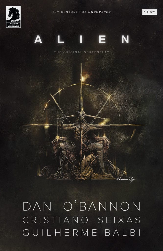
In Alien: The Original Screenplay, published by Dark Horse Comics, writer Cristiano Seixas and artist Guilherme Balbi return to the very beginning to adapt Dan O’Bannon’s first script. Long before Ridley Scott and H R Giger infected the movie with their singular vision, this version contains designs based on O’Bannon’s original descriptions. The question is, does this comic provide fascinating new insights into the movie, narrative, and Alien franchise? Or is it a case of flogging a dead face-hugger?

Original’s
Issue 1 of Alien: The Original Screenplay was released on 5 August and the second issue is due out on 2 September. Earlier this year it was announced that the publishing rights for both Alien and the closely linked Predator franchises were moving to Marvel, which means this will most likely be Dark Horses final foray into these worlds. If you take that into account along with fan expectation then there is a lot riding on this series.
The first issue’s opening is instantly familiar. In the depths of space, the crew of a cargo ship awake, drowsy and out of sorts. Although the scene is very similar it is also markedly different in a number of ways. The first, noted in the very first panel, is the title of the ship: The Snark. Instantly a different tone is set then when the movie introduces the Nostromo. Maybe the word snark used to conjure up images of mythical and elusive creatures but today, it is more likely to invoke hilarity. It becomes very difficult to take the sequence seriously because, in the back of your mind, you’re thinking about the word Snark. This less than serious tone is enhanced by the introduction of the first crew member: the cat. The series begins with what appear to be jokes.
Readers will know that the cat played a major part in the movie and the cryogenic pods popping open to reveal the sprawled feline is a cute, funny moment that contrasts against the dark, brooding technology that surrounds it. I mention this only because it illustrates how the tone throughout the opening issue is different from the movie, and what you might expect. The crew all appear similar in age, with their uniforms invoking more of a military vibe than the working class miners in Ridley Scott’s vision. The design and layout of the cryogenic pods feeds this assumption because they are more reminiscent of Aliens, the War Movie sequel, then they are the visually exciting starfish shaped design from Alien.

Character Flow
As the story progresses you will find yourself trying to reconcile the characters in the story to the ones from the movie. Motives and reactions will throw you off as you expect one character to act in a particular way but doesn’t. It is the curse of dealing with such a familiar story. Every little difference in behaviour or design is instantly noticeable and as a result very distracting. From the naming of the crew to the design of the spaceships, Seixas and Balbi have a difficult job keeping the reader’s attention.
Even moments that haven’t changed from this original script to the finished product can be distracting. This is most notable with the speech itself. When there is a line of dialogue that is familiar it stands out on the page almost as if letterer Michael Heisler has written it in a different font. Which is unfair to Heisler whose lettering work is wonderful throughout. He brings the speech to life by placing the balloons around the panels to illustrate pauses or fast conversations. The sound effect work is especially effective and there is a clear distinction between the mechanical world of the Snark and the organic world of the Alien.
The biggest problem with this version of events is the crew themselves. Ripley wasn’t Ripley until Sigourney Weaver stepped into the boiler suit with her attitude and determination. Ash is only Ash because Ian Holm was so believable as an emotionally disturbed synthetic. The crew of the Snark are too similar in nature. There is an element of playfulness between them and also a tension that is generated from people working in such close confides, however two issues in and there aren’t any clear personalities. Broussard is brash and impatient as he enters the alien pyramid but then so are his crew mates waiting at ground level.

Mid Review Turnaround
So far I’ve been pretty harsh about Alien: The Original Screenplay but it’s not all bad, in fact it’s fair to say there is a massive amount of ‘good’ to be garnered from this comic. In order to do that, however, there is one thing that you have to do: forget that this is the Alien story you know and love. Put that to the back of your mind and bury it deep because that’s the only way you are going to enjoy reading this comic.
This is a spaceship you don’t recognise with a crew you don’t know. These aren’t the Captain, the heroine, or the victim that you are accustomed to. Instead it’s a collection of new people to get to know, thrown into a situation that is familiar but then, isn’t most situations in the Aliens franchise?
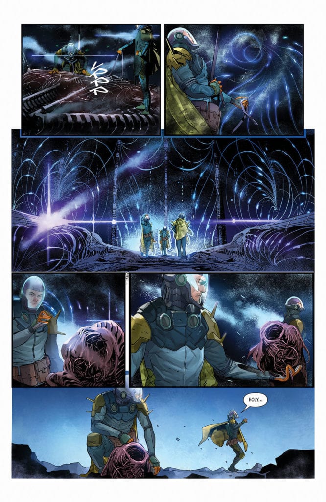
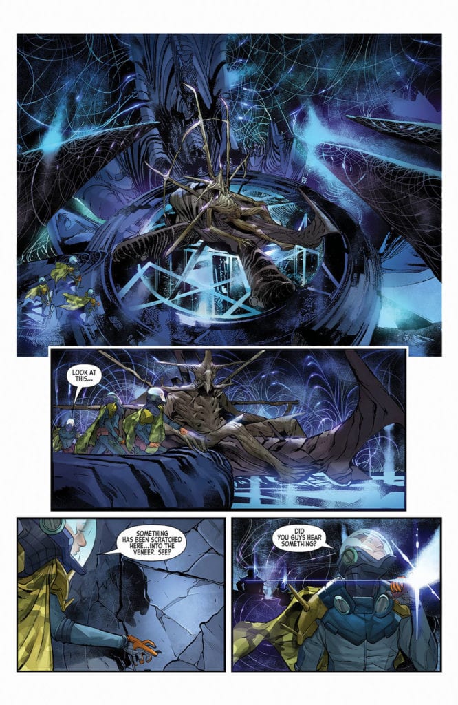
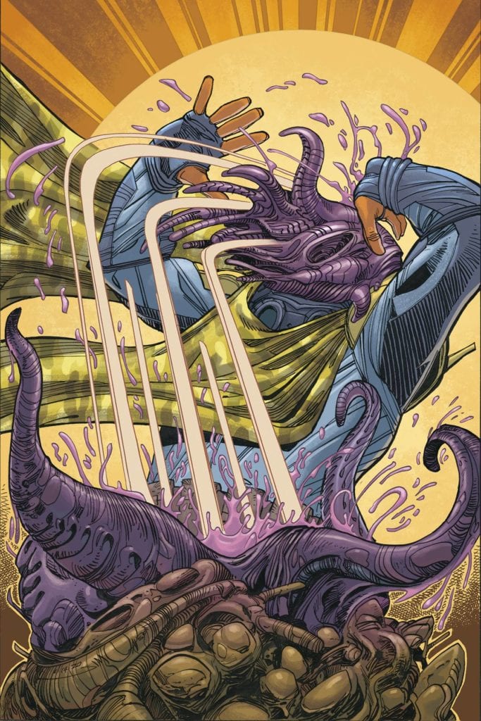
There is enough of a difference in these opening two issues to distance the story from the movie. The design work helps because it is quite radically different in a number of places. The derelict spacecraft lays in the dust storm like a stranded starfish, with large spikes protruding from it. The Pilot is all extended bone, looking more like the creatures from Pitch Black or a deformed Nemesis the Warlock.
There is no-way to hide what is coming in the narrative but Balbi is able to distract the reader just enough with his artwork to retain some mystery and tension. The switch with the Alien eggs from the derelict to a large pyramid adds a new dimension reminiscent of a short story called Aliens: Advent/Terminus which also features a pyramid and a young bunch of cocky explorers.
There is a wonderful contrast between the Snark interiors and the desolate hostile rock they land on. Candice Han’s colors play a large part in this. Cold blues cover the smooth, clean interiors where technology reigns. This is juxtaposed against the mucky yellows and oranges of the dust storm raging all around them. The contrast is best illustrated in the panels where the Snark sits in the centre of the storm so that you can see the two worlds battling it out for dominance on the page. It is visually very powerful and striking.

Conclusion
Alien: The Original Screenplay is a difficult comic to get a grip of. On the one hand it’s a visually stunning piece of work with great storytelling that favours atmosphere over character. What the cast lack in personality is made up for with impressive design work and expanded vistas.
On the other hand, it can’t escape from it’s legacy and the narrative flow is shattered by the constant comparisons to the original movie. Every difference becomes scrutinised, for better or worse, and even the recognisable moments stand out on the page like a beacon for the fans. The worst part about this constant comparison is that this version will never live up to the brilliance of Ridley Scott’s vision. The Alien designs will never be as visually impressive as H R Giger’s horrifying nightmares.
In the end, your enjoyment of this is going to come down to how well you disengage it from what you already know. If you’re not an Alien fan and haven’t, for some reason, seen the movie then you will get so much more out of this series. This is also true if, as a fan, you can distance this from what you know. However, if you go into this expecting some new insights into the franchise you love, you are going to be disappointed. The biggest takeaway from this is that the script didn’t make the movie the phenomenal experience that it is. A number of the themes and narrative elements so important to the Alien story are missing and the crew just aren’t as likeable as Dallas and Co.

