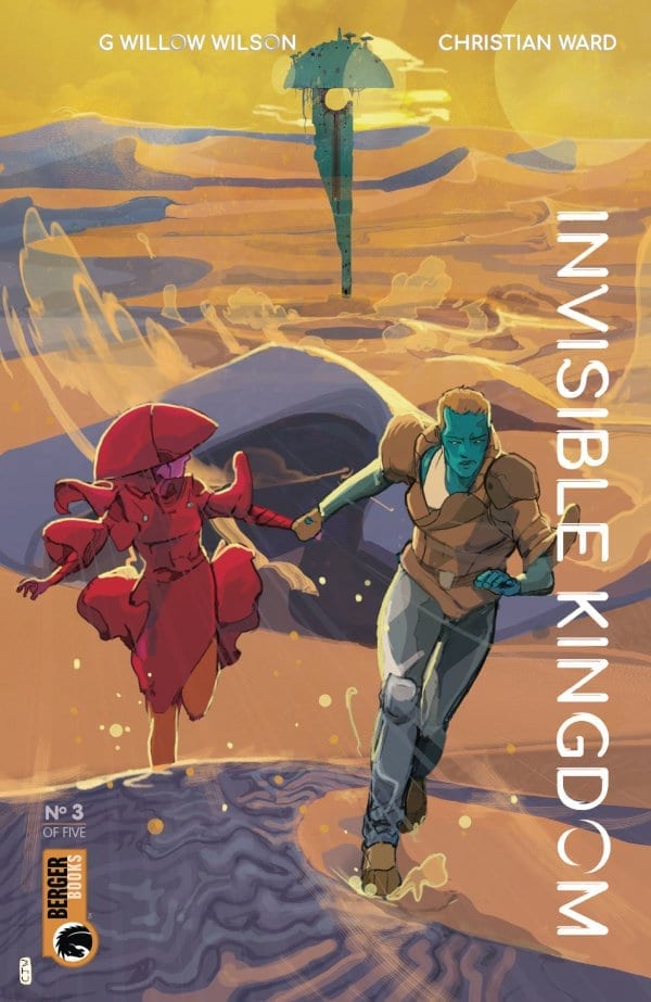
A crew on the run and a lesson in religion greet readers in the third issue of the new sci-fi epic Invisible Kingdom from Dark Horse Comics. Combining an intriguing story with fantastic art work, can the Invisible Kingdom team maintain the high standard they’ve set in previous issues?
Writing/Story
With fuel running low and scout ships from the Lux company searching for them, Grix has to risk everything piggybacking on a passing comet. The situation becomes even more complicated when they receive the message from Vess who appears to have discovered the same ‘truth’ about the Lux company.
With two central characters questioning their life choices, G. Willow Wilson is able to shine a light into the darkness. By having the corruption within the system discovered from each side, both aspects of this sci-fi world can be examined from within, for better or worse. The reader is able to see how Wilson’s world functions and, in turn, question the real world in the same way.
Wilson isn’t making any grand statements in the Invisible Kingdom, but she is clearly demonstrating how easy it is to see only what those in charge want you to see. The leader of the religious organisation is manipulative and bully’s Vess while the Corporation can quietly eliminate those who stand against it.
The story in this issue is about bringing the central characters together. The staging is very straight forward: two set up sequences, one for each character, followed by the inevitable meeting. In a number of respects this issue of Invisible Kingdom reads like a chapter from a Firefly story. Grix and her crew have a definite Serenity vibe about them. However, Wilson is able to give her characters their own voices and establishes their characters very successfully. Both Grix and Vess are on difficult journeys and this comes across during the action. The way they react to the situation that fate has put them in is very different but they ultimately want the same thing. Wilson clearly shows that the only way they can survive is by working together.

Art
The Invisible Kingdom offers Christian Ward the opportunity to draw outlandish space sequences and complex personal character moments; both of which he excels at. His style is bold and brash, especially with his chaotic colors splashing across the page, barely contained within the black panel boarders.
Ward chooses emotional representation rather than literal interpretation. In some panels the figures are merely shapes to represent their positions, with specific color patterns identifying which character is which. At other moments all other details fall away apart from the character in the foreground. This focuses the reader’s attention.
Ward isn’t afraid to create an alien landscape and this is achieved mostly through his colors. Standard bipeds are turned into alien creatures simply by the color choices Ward makes. This makes Invisible Kingdom stand out from the crowd. While others strive for a realism in their fantasy and science fiction, Ward and Wilson embrace the alien-ness of their world. It still contains echoes of the world around us but looks so different it becomes fascinating and intriguing.
Even Sal Cipriano adopts the out of this world approach when producing the lettering. The sound effects are rendered in a range of colors that pop from the page. In a number of cases they cross the panel boarders and the gutters, encroaching on the other panels around them.
It is interesting to note that for a comic with such a unique visual style, for the most part it is only the sound effects that break the conventions of the comic book structure. Most of the imagery is contained within the ridged format of the panels, boarders and gutter. In the world of the Invisible Kingdom it would appear that only sound has the power to break convention. The rigid structure is needed in this instance to contain Wards artwork. If the boarders were broken regularly the storytelling aspect of the comic would be lost. To compensate for this the sound effects have a life of their own, reminding the reader of two things: firstly that they are in fact reading a very structured comic and the implications of that; and secondly that the story is about breaking conventions in small, seemingly insignificant ways.
Conclusion
There are many layers in Wilson and Wade’s Invisible Kingdom. There is a space opera style story, which will be familiar to many fans of science fiction. The combination of religion and outlaws on the run forms the backbone of some of Sci-Fi’s greatest stories, just take a look at the Star Wars franchise and the exceptional manga series Akira.
To accompany this are the amazing visuals from Ward which dare to be something different to everything else on the self.
And underneath it all is a commentary on a range of topics such as the structure of society, the struggle against personal convictions, and even the formality of comic books themselves.
It is easy to compare Invisible Kingdom to other comics such as Saga or the Firefly series but this is very different to those series. Wilson and Wade are using their respective languages to create something different. It has a sublime beauty and a deeper meaning that stretches beyond simple entertainment. Each page is a work of Art: beautiful, engrossing and challenging.

