HELLFIGHTER QUIN #4, available from Mad Cave Studios on August 12th, follows Quin, Shard, and Deadeye as they enter the arena against Invictus and his allies…plus one big kaiju. Jay Sandlin’s story pulls no punches (literally) in an issue that’s almost wall-to-wall super-powered action.
Cover Art
Atagun Ilhan’s cover lays the foundation for the big reveal in this issue. Who is the Doomseer? You’ll find out at the end, but in the meantime, the cover projects an excellent sense of mystery and foreboding. Doomseer looms as a spectral menace that haunts Quin’s team fighting through the tournament, and that juxtaposition is perfect in more ways than one.
Writing
Sandlin’s story is the highlight of this issue. When putting a comic script together, it’s not enough to write, “And now they fight.” The action is typically a collaboration between writer and artist to choreograph action that looks cool and also continues the story through the action.
Here, Sandlin furthers the potential for romance between Quin and Shard in between the punches, and the conclusion of the fight plays right in the Overseer’s hands. You get the distinct impression that the fight’s outcome was part of a greater plan that makes the story significantly more layered.
Pencils/Inks
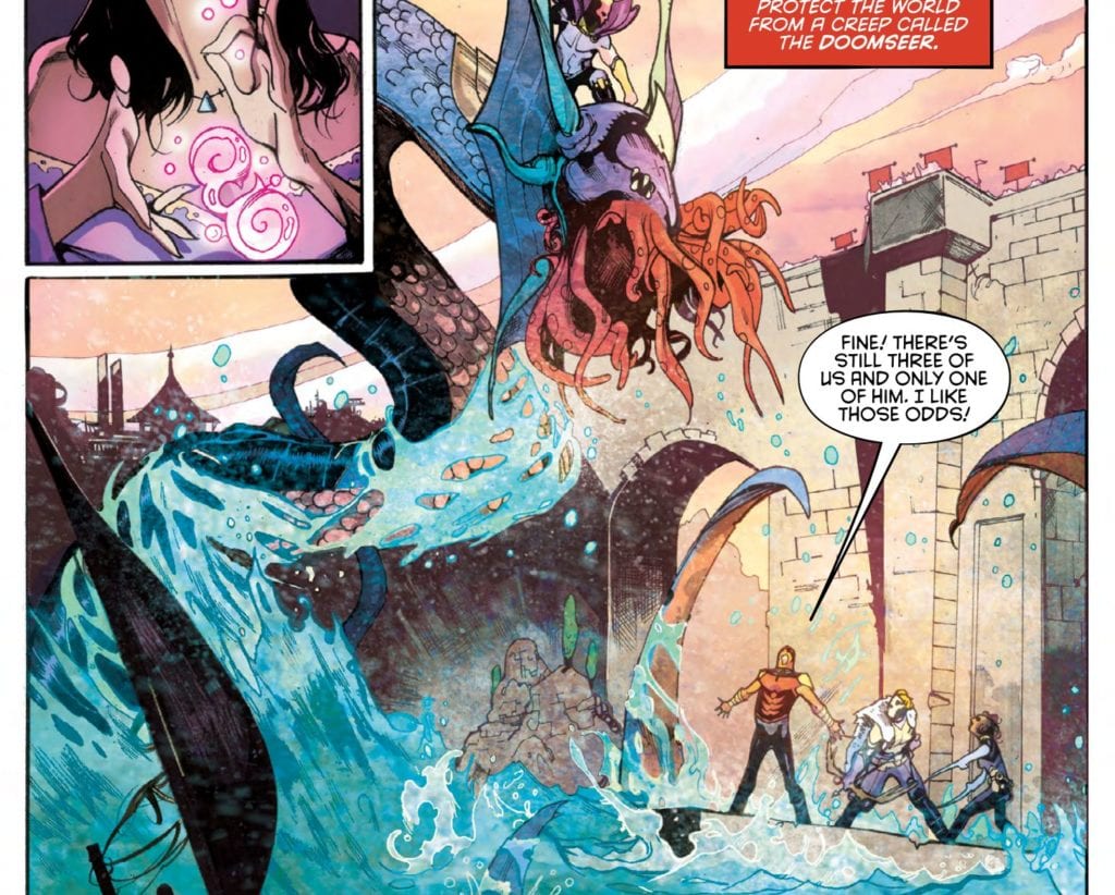
Ilhan shows some improvement in technique over prior issues (see our review of issue #2 here). In particular, the scenery and backgrounds are eye-catching in detail and really set the stage for an ancient Colosseum-style battle. Also, the action sequences, which take up a majority of this issue, are full of life and energy. Ilhan is demonstrating a strong command of kinetic action in the panel layouts and composition.

That said, the anatomy and renderings of the characters is a weak point in this issue. Faces are ill-defined to the point of looking distorted or misshapen. When an issue is so heavily dependent on the wow factor of the action sequences, the anatomy of the characters moving through the fight has to be tight. Ilhan’s art is improving over prior issues, but at its current level, it’s distracting enough to detract from the story.
Coloring
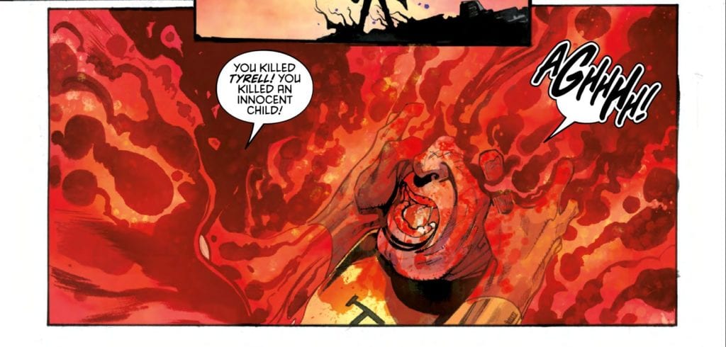
Maria Santaolalla’s coloring work has a lot more room to shine in this issue. The brightness of the airy Colosseum, the sparkling waterfalls, Quin’s blazing attacks – just to name a few – stand out to add pop to the story. Santaolalla’s colors are significantly improved over the muddled shadows so strongly present in issue #2, and they amp up the energy prevalent in Ilhan’s artwork.

Lettering
Justin Birch’s lettering is a prime example of organic integration. The word bubbles are placed well and keep the reader’s eye moving briskly through the pages, but what stands out is the use of coloring on the sound effects. Birch chose to add color and shading to the sound effects to match a visual focal point if the panel in which it’s placed. It’s a nice touch that makes the sound feel more integrated to the action taking place.
Conclusion
HELLFIGHTER QUIN #4, available from Mad Cave Studios on August 12th, is a bright, energetic, action-packed issue with a twist reveal at the end. The art team is showing significant improvements over the previous issues, and the writing is top-notch — lots of promise for what’s to come.

