

With the upcoming live action release of Secret Invasion on Disney+, it makes sense for Marvel to release a book that highlights the main character of the series, Nick Fury Jr. This one-shot features stories from Nick Fury Sr as well as his son. Al Ewing is writing this love letter to the Super spy and old school mystery genre. Joining him are Scot Eaton, Tom Reilly, Adam Kubert and Roman Rosanas on pencils, Jordie Bellaire on colors and Joe Caramagna on letters.
WRITING
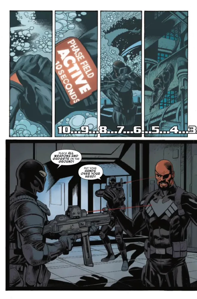
Al Ewing has the difficult task of writing both Nick Fury characters and making them seem different personality-wise. This issue takes place in the present as Nick Fury Jr. tries to figure out what S.C.O.R.P.I.O. is, and in the past that details the origin of the Zodiac key. Stories like this work when the writing is good and the timelines match up well. Ewing does that here. Everything in the past is connected and important to what is happening in present day. Ewing also gives readers continuity as he draws all the way back to the Sgt. Fury And His Howling Commandos days for part of the issue. Original Sin is also used and referenced in this book as well. Ewing’s internal monologue for Nick Fury Jr. is extremely important for this issue as well. Ewing allows us to see how Fury Jr. uses his intellect and skills to get what he needs. Things like asking Cyclops to help him get to the moon or using a multipurpose gun gives readers an insight into why he’s such an amazing character. At the heart of all of this is a story about a father and son though. While the panel time of them together isn’t a large sample, Ewing makes their time count. Fury #1 is a book that should appeal to anyone who loves a good mystery and family reunions.

ART
The pencils are split up between several different artists. Each section details a different period in time for Nick Fury Sr. or Nick Fury Jr. Scot Eaton starts off the issue with a current Nick Fury Jr. Eaton’s work, with inks by Cam Smith, feels close and personal. We get a lot of panels with close ups of half of Fury Jr.’s face. Tom Reilly takes over after page 11 and he has a similar style to Eaton. Where Reilly shines is in his flashback sequences. These pages have a dated yet modern feel to them. Reilly will leave some panels with less detail during the flashback, and it works out well because it feels like it fits the time. Adam Kubert takes over after that for another flashback portion. This is the section that feels like you’re reading an old school comic. It looks like newsprint and almost has a texture to the art work. Finally Roman Rosanas wraps things up with his style that is very modern, yet pulp comic. Panels in this section bring detail to the characters, but leave much of the background open. Rosanas accentuates the characters and draws the reader into their actions.
The colors by Jordie Bellaire are amazing here. Bellaire has to use multiple different color pallets for several different artists. Doing colors for this book was no easy task. The section that sticks out the most are the vibrant and pop of the Roman Rosanas section. Bellaire uses a perfect blend of light and dark to bring attention to the characters. The backgrounds are the perfect color to allow a red or green to demand your attention. In the pages she colors for Adam Kubert, the colors need to feel old fashioned. Bellaire uses lots of lighter greens and peach for army uniforms and skin tones. Tom Reilly’s portion of the book has a vintage feel to it as well, but Bellaire uses harder tones than in the Kubert section. She allows backgrounds to be dark until there is some action, then they blow up with a fiery red or an incendiary green. Bellaire did a phenomenal job using different styles of color to match each artist. This is a masterclass in how to color comics.
The letters by Joe Caramagna shine in this issue as well. His placement of narration boxes in the vintage Nick Fury Sr. story are perfect. They appear at the bottom and upper left corner of each panel and are simple to read. When something drastic is said, like “Nick Fury ain’t dead yet!” Caramagna uses red around the words for emphasis. There are a few sound effects that have an impact on the story. Nick Fury Jr. using a multipurpose weapon to blast a villain leaves a “VWEEEEE” on the page. Caramagna also layers the letters so they nearly overlap one another. Good lettering can really help a story out, and Joe Caramagna gave Fury #1 a nice boost.
CONCLUSION
Fury #1 is a good read, but it’s also a touching story about a father and son. Al Ewing always shows up and delivers whenever he’s on a book. The art works wonderfully and the colors blow the top off of this issue. Nick Fury Jr. is in good hands as long as Al Ewing is working his magic on him. Fury #1 is available at a comic shop near you!