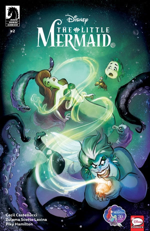
The second issue of Disney’s The Little Mermaid from Dark Horse Comics has some very impactful moments thanks to art by Zulema Scotto Lavina. Yet, does the story wafer too much and make it lose the momentum it achieved in the first issue?
Summary
Ariel’s trove of treasures is discovered by King Triton, and the memento of her forbidden love for a human, Prince Eric, is destroyed. Ariel is faced with the ultimate decision–will she sacrifice the essence of who she is to pursue the love she knows to be true?
Writing
This issue turns the adolescent angst up high. As ariel longs to be in the human world, classic internal conflicts associated with teenagers are present. Mentions of “the same old thing” and “no one understands me” pop up in this issue. The teen angst is so over the top, it almost makes Ariel seems incredibly naive and ignorant to just how evil Ursual is or how much danger she could be as Ariel enters the sea witch’s realm.
Speaking of which, the issue doesn’t take the time to properly address Ursula. She’s mentioned much like in the previous issue as being a “ghost story” being a myth. Instead, Ariel is simply dead set on getting legs. There is no mention from Ariel’s internal dialogue of “Ursula used to be the blank” or “She was known for so and so atrocities.” The movie established she used to live in Atlantica but King Triton banished her but this is just in a brief message. It seems like this would have been a perfect opportunity to use Ariel’s monologue to establish Urusla’s back story better. Still, writer Cecil Castellucci is making sure it’s more Arield’s story than anyone other characters.

Artwork
The artwork by Zulema Scotto Lavina it still at a high level of presentation. It is able to recreate scenes from the film in a striking manner. A special note needs to be given to how the scene where Ariel first immerges from the water after getting her legs was captured.
With Piky Hamilton on colors, the mystical elements of the story are the best part of the entire issue. Triton’s destruction of Ariel’s collection and Urusal’s spell to give Ariel her legs are very impactful thanks to colorwork. Thanks to the attention paid to the color, the issue truly feels magical.
The lettering by Richard Starkings and Comicraft’s Jimmy Betancourt maintains a great sense of storytelling thanks to Ariel’s monologue boxes. Also, little elements like adding musical notes around a dialogue bubble when someone is singing. It helps to show how many of the musical numbers from the film have been turned into speeches to Ariel instead of songs.
Conclusion
Disney’s The Little Mermaid #2 from Dark Horse Comics still continues to be a great series for young readers. It is a faithful adaptation of the original story and boasts fantastic art which faithfully captures moments of the original film. As long as this level of quality continues, this series will definitely be one for fans of comics and Disney priorities to pick up.

