

Hitting the shelves of every comic book shop this week, and (if there is any justice in the world) falling into the hands of every comic book reader, is the greatly anticipated Epitaphs from the Abyss. A product of the Oni-Lion Forge Publishing group, this is a revival of the Entertaining Comics (more commonly known as EC) line of horror and science fiction comics that ended with Incredible Science Fiction #33 in 1956. Although their satire comics lasted the 1950s backlash against obscene publications, and there have been many reprints over the years (not to mention knock offs), this is the first official return in 70 years for this part of the EC brand—in comic book form at least.
Credit: Oni Press/EC
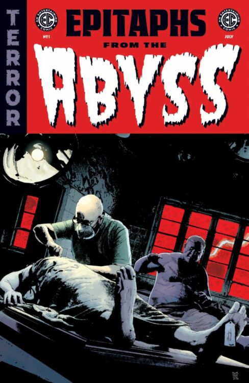
The old school design of the cover, with a title that is extremely reminiscent of the horror comics of the 1950s, copies titles such as Tales from the Crypt and Vault of Horror in both layout design and striking visuals. With a bold title and disturbing cover picture, the comic disrupts the modern comic book aesthetic, creating a scream back to a time when comics had the power to truly shock and outrage. A cover needs to grab a reader’s attention, and it has been a long time since a design has really stood out among the slew of superhero titles that overstock most comic shops. That’s not to say we haven’t had great covers, but it’s been a while since something challenged the norm, and embracing a 70 year old design just highlights how impactful those original covers were. Issue one of Epitaphs pays homage to the best of those covers, and you can’t help but think that the inclusion of the blood spattered axe is a reference to the most infamous cover: Crime SuspenStories #22.
The enduring feature of the original EC comics of the late 1940s and early 1950s was “to offer better stories than can be found in other comics. [..] They are true-to-life adult stories ending in a surprise. That’s our formula” (a quote from Bill Gaines reproduced in Qiana Whitted’s excellent book EC Comics: Race, Shock & Social Protest). This formula proved successful. So successful, in fact, that other publishers used the mass hysteria of the 1950s’ fight against juvenile delinquency and the creation of the Comics Code Authority to pretty much bankrupt Gaines’ publishing company.
Credit: Oni Press/EC
However interesting the history of EC is, I don’t want to delve into it too much here, because the history of the publisher is not as important as the formula of the comics when we look at the new Epitaphs from the Abyss. The portmanteau approach to the comic, with four separate stories linked by theme rather than character or creator, is a long standing tradition, especially within the horror genre. It can be seen in cinema with companies like Amicus Productions releasing a series of seven movies between 1965 and 1974. But the tradition dates back even before EC’s venture into horror and crime comics, and can be seen in the Grand Guignol theatre traditions from 1897. Like its predecessors, Epitaphs is a collection of stories, linked via a storyteller of supernatural appearance, with each twisted tale featuring a protagonist who is far from heroic, and just deserts are meted out on a golden platter. There’s no hope here, no-one to come to your rescue, and brutal justice is the closest you will get to a happy ending. Let’s face it, it is exactly what you have come looking for.
There are two major takeaways from this premiere issue, and the first is that each of the four stories is a magnificent example of the short story horror genre. There are despicable characters driven by greed and jealousy: acts of theft, murder, mind control, and unspeakable violence. Desperation flows through the panels as the characters face and attempt to escape their fate, and there is social commentary front and center. One of the aspects of the original EC comics was their fight to publish stories that challenged the status quo and the unjust elements in society. Epitaphs follows in this footstep, although not at quite the groundbreaking level that stories like Judgement Day from 1953 did. But that challenge is there. If you are concerned about politics in comics, you might want to stay away from this title.
Due to the short length of each story, I don’t want to dwell on them individually and give anything away, but there are elements of the supernatural, conspiracies within the government, and disturbing social experiments that border on Black Mirror territory with a hint of the Twilight Zone (I’ll come back to this later). Each of the writers has something to say and they use their short page count perfectly. J. Holtham’s story contains some very obvious twists, but it is the way that he leans into the obviousness that makes the story work. Chris Condon and Brian Azzarello both use modern politics to create their scares, but it is Stephanie Phillips’ tale of terror that is the most disturbing, if not the most original. Phillips’ also has the advantage of Phil Hester’s artwork to back it up. His work has a recognisable style and suits the twisted horror genre perfectly. The line work is heavy and almost unnatural. He is a bold inker and brings a high level of dynamism to his panels. There is an energy that fuels the story and heightens the horror. The artwork brings a sense of urgency and builds levels of emotion so that you almost forget the familiarity of the story.
The artwork on Us vs. Us by Vlad Legostaev does something similar with its simplified characters and exaggerated forms. This story, which is the most obscure of the four, is initially the most EC of these stories. This is helped by the bold colouring of Brittany Peer who picks up the palate of the comics title and runs with it throughout the comic strip. Large, flat areas of colour denote the backgrounds, enhancing the foreground storytelling while creating a nostalgic feeling for the old 1950s printed comics. While Senator, Senator looks and reads like an early X-Files comic, Us vs. Us is the most EC-esque when it comes to horror, with Killer Spec taking a close second.
Credit: Oni Press/EC
If all of this sounds like your idea of a great comic, then, stop reading and go pick up Epitaphs from the Abyss. It’s a fun, entertaining comic that will annoy all of the right people. The writers and artists all do a wonderful job of bringing this horror comic to life, with a perfect blend of horror and comedy.
However, this comic’s biggest selling point is the fact that it is the return to the stands of EC, a brand that had a massive impact on the publishing world and influenced hundreds of people in the last 70 years. Steven Spielberg, Tobe Hooper, and George A Romero were all fans of the comic series, and each would have been boarding on their teenage years when EC’s infamous comics hit the stores. The artists—such as Bernard Krigstein, Graham Ingels, Johnny Craig, and Wally Wood—all became synonymous with the comics they worked on, which helped some of their careers, but also ended others when the bubble burst. If you become known for drawing grotesque horror comics and then these become banned, getting follow up work becomes very difficult.
When you promote yourself as a specific thing, in this case a return of EC, it comes with certain expectations, and meeting those expectations is never easy. It is true to say that EC titles are known and loved today mostly by people who weren’t around when they were originally released. The fandom has grown overtime, feeding into the legend with every new generation that discovers the magnificent stories, and the hard hitting “prechies” that challenged the society of the early 1950s. But not all of the stories in titles like Haunt of Fear or Crime SuspenStories were ground breakers. In fact, many of them would be problematic if released as new in today’s market and a large number of the stories would be classed as mediocre at best. So what is it that makes the brand so exciting and differentiates it from the many horror and crime compilations that have come and gone since Tales from the Crypt was last on the stands? How can EC stand out in a world which has comics such as Creepy, Creepshow, Red Room, and television series like Inside No. 9 and Black Mirror? How can you make a comic compete while still remaining true to what it was?
Step one is attention to detail, and with letterer Richard Starkings, Oni Press have found the perfect person to recreate the lettering style of the original comics. The font and style of the text in those 1950s comics was as iconic as the stories themselves. And Starkings has painstakingly recreated this for both of the new EC titles, Epitaphs from the Abyss and Cruel Universe. From the cover title to the hosts opening preamble, there is something nostalgic and satisfying about the way the lettering looks. It instantly makes you feel like you are reading one of the classic comics, despite the fact that the rest of it looks completely different. Getting those few initial pages right was probably the most important part of this brand relaunch because it satisfies the readers expectations from the beginning, allowing for the format to change going forward with little resistance. If the covers weren’t right, the contents would be a harder sell.
Credit: Oni Press/EC
Personally, I wanted the comics inside to adopt the style of the original EC comics, with text heavy caption boxes, standard grids for the panel layouts, and highly detailed images within each panel, reflecting the complexity of the stories being told. Remove the paratext from Epitaphs and it would be hard to differentiate this comic from any other horror anthology. Unless we examine the themes, that is. Back in the 1950s, a number of common themes emerged from the titles that EC published: Poetic Justice, political and social messages, cheeky adaptations. Each of these are present in Epitaphs with the stories featuring at least one, but in some cases more. And the familiarity of some of the stories won’t be a coincidence, as the writers and artists are drawing on modern influences, such as Black Mirror or the Purge movies, to recreate a tale that might have appeared in The Vault of Horror, for example. The idea behind Oni Press’ new venture is to imagine what the EC line of comics would look like in today’s market, and this opening issue is probably a good example. Obviously the style of storytelling would have changed over time, despite my personal love for the old format, but the obedience to theme and attention to the details makes this a worthy successor.
I guess that the only way we will know for sure if these comics have the same impact is if, in 50 years time, the movers and shakers of the movie, television, and gaming industries cite these as inspiration. Without Tales from the Crypt, we might not have Jaws or Night of the Living Dead. We definitely wouldn’t have Creepshow in any of its iterations, and possibly comics such as Shudder and Creepy may never have found an audience, desperate for more horror anthologies. Epitaphs from the Abyss is an exceptional endeavour and a truly entertaining comic. Whether it can maintain momentum and live up to the legacy created by Bill Gaines in the 1950s is a different matter. There are some really big shoes to fill, and it is up to the editors of this series to fill them and make sure the ethos of EC is maintained and brought back to life after 70 years festering in publishing hell.
And keep an eye out for Darryll’s review of EPITAPH’s sister series, CRUEL UNIVERSE, dropping Wednesday at 9am ET here on MFR!