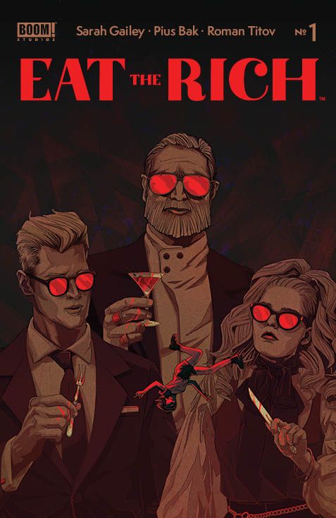
From writer Sarah Gailey and artist Pius Bak comes a brilliant and incisive comic book that mixes ominous horror with sharp commentary. Colored by Roman Titov with letters from Cardinal Rae, Eat The Rich #1 is a phenomenal book that excels at every objective a comic can try to accomplish. With a wickedly smart script and outstanding visual work, this could very well be the best comic of its kind.
“Welcome to Crestfall Bluffs! With law school and her whole life ahead of her, Joey plans to spend the summer with her boyfriend Astor in his seemingly perfect hometown. It’s a chance to finally meet his family and childhood friends, all while enjoying a vacation where every need is attended to. But beneath the affluent perfection lies a dark, deadly rot… will Joey discover the truth before it’s too late, and even if she does, can she survive to tell the tale?”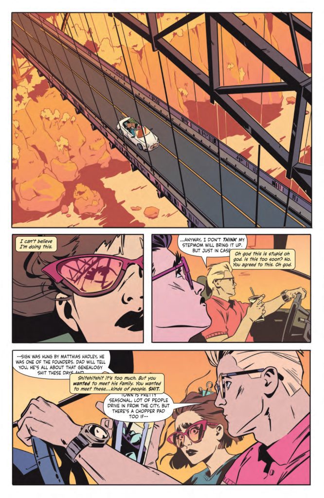
Writing & Plot
Sarah Gailey‘s script for Eat The Rich #1 is a multi-layered work of comics magic. Gailey makes compelling terror through the eyes of a brilliantly characterized protagonist. Joey’s nervousness as the outsider to the wealthy society she is trying to blend in with is written perfectly. Her nervous tics in her speech and constant mental self-assurances all feel real. The way she deals with her boyfriend Astor and his personal issues makes her endearing and personable. Her status as an outsider to this alien social circle she’s stepping into is something the majority of us can surely relate to. Gailey’s dialogue is snappy and naturalistic, and their internal narration is just as great. From a stylistic and character standpoint, this script is an absolute gem.
The real genius and substance in this first issue is how Gailey actually approaches this strange, secretive society of one-percenters. The impenetrable societal norms of people with so much wealth and power they are almost inhuman is both a great plot device for the horror, but also an incredibly timely allegory. Gailey makes it clear that Joey’s quest is going to be harder than she could ever imagine it. This isn’t just because of what the wealthy do behind closed doors, but because they simply don’t partake in reality the way normal people do. Saying anything more would be spoiling the experience, but Gailey takes a very real concern and addresses it in a sharp and entertaining manner.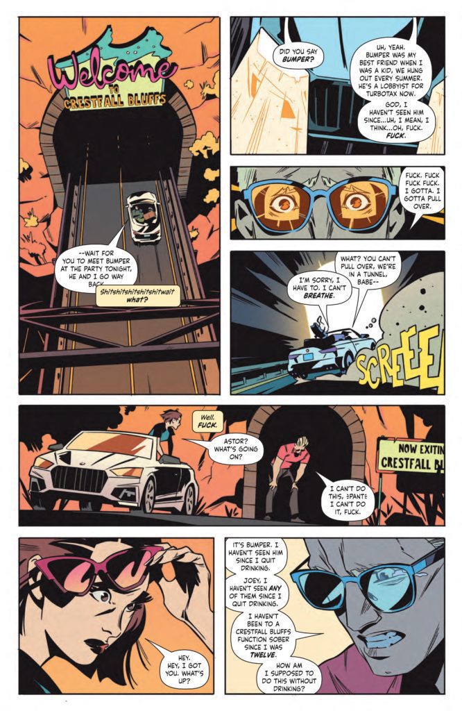
Art Direction
The visual end of Eat The Rich #1 is absolutely stunning, thanks to artists Pius Bak and Roman Titov. Bak’s pencils and inks are expressive and detailed with the intent of crafting atmosphere. His characters are all unique and he creates expressions with a natural ease. From Joey’s flabbergasted face to the facades of wealthy family members, everyone looks unique and easy to read. Bak’s heavy inks create much of the ominous atmosphere throughout the panels. Character’s faces are often obscured in shadow at prescient moments. Set pieces, like the house or certain rooms, are shrouded in black and cast deep shadows. Bak sells the fact that there is something wrong with how unsettling and dark his pencils and inks are here.
Roman Titov’s colors highlight the uneasy atmosphere with an eye-popping contrast-filled palette. Much of the Crestfall Bluffs scenery is bathed in peach and pink hues. Titov crafts a distinct sort of pop-art vapor wave aesthetic in many of the panels. However, there’s an almost Lynchian uneasiness to the whole experience. Much like with Bak’s pencils, Titov creates contrast within the details. He colors specific little details within the panel to sort of throw off the false-prettiness of Joey’s view of Crestfall. They serve to throw the reader off as well, making you wonder what the hell is happening here before the carnage is revealed.
Cardinal Rae’s lettering switches font styles between dialogue and narration, and it works spectacularly well. Her style all-around is very modern, with thin, almost handwriting-esque letters contrasted with a similar italicized font for internal narrating. Her tonal shifts are seamless, and I can hear the characters voices perfectly through how she presents her boxes and bubbles. This first issue is front-to-back perfection in terms of visual direction and stylistic achievement.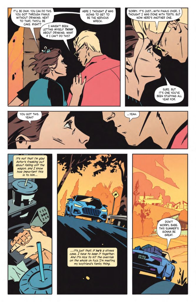
Verdict
Eat The Rich #1 is a perfect mixture of insight, entertainment, and artistry. Sarah Gailey’s script is almost too smart for its own good. They mix brilliant character writing, intelligent commentary, and take an almost cliched premise and make it genuinely frightening. Pius Bak and Roman Titov’s visuals are both gorgeous and eerie, creating a perfectly contrasting atmosphere for this comic book. Be sure to pick up this incredible first issue when it hits shelves on 8/18!

