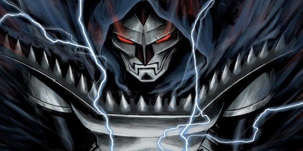
As the new age of 2099 continues, Doom 2099 #1 arrives with the help of Chip Zdarksky, Marco Castiello, and Chris Sotomayer. Will the success of the other series solo series featuring Doctor Doom carry over into this one?
Summary
The future is Doom! In 2099, everything has changed. Technology has changed. Governments have changed. People have changed. But only one thing has remained the same…DOOM.

Writing
This issue suffers from an inability to meld the story with its artwork. The issue buildings to a grand twist but the art doesn’t allow the reader to get comfortable with the storytelling process. You can tell right away this isn’t Doctor Doom or at least this isn’t the usual megalomaniacal individual known and feared throughout time. Also, Doom doesn’t act truly evil or display enough malice to trick the reader into believing otherwise. He’s more like Diet Doctor Doom.
Otherwise, it is a decent issue overall but it doesn’t break out of the shadow of what else is on the market. The new Doom series by Christopher Cantwell has been a fantastic read from the first issue but Doom 2099 #1 feels more like it’s setting up to be a series which will get better moving forward. It sets up some interesting aspects but just doesn’t knock the reader out of the park on this first outing.

Artwork
As mentioned in the previous section the art doesn’t meld well with the story. Marco Castiello isn’t shy about putting Doom’s naked face on display the entire issue but doesn’t go far enough with its presentation. The scarred face of Doctor Doom is supposed to be horrifying and disturbing. Whatever version of Doom this is supposed should look much worse. Here the face could be fixed with the use of a large of amount of concealer.
The colorwork by Chris Sotomayor is probably the best part of the entire issue. The color perfectly captures the post-apocalyptic look. The landscape characters look as if they could be a part of Fury Road.

The lettering work by VC’s Clayton Cowles does a great job of adding to the audio quality of the issue. Much like the writing work, the lettering serves its purpose but doesn’t bring any exceptional aspect to the presentation of the piece.
Conclusion
The new Doom 2099 #1 isn’t bad but it doesn’t achieve the greatness it set out to accomplish. Frankly, it’s a better experience in the future than Ghost Rider 2099 but only by a small margin. Doom should be able to bring greatness with an iron fist and sadly this issue doesn’t.


