

There is a tendency in media to make reboots all gritty and serious with an adult edge, as if trying to justify their existence (see the excellent Battlestar Galactica TV series, for example, or the Scooby Apocalypse comic book series). Arguably, however, Dick Tracy was always dark and serious with spontaneous outbreaks of humor and ridiculousness, especially later in cartoonist Chester Gould’s career. Therefore, the new ongoing series from Mad Cave Studios can fit the modern tones of the comic book into the series without having to reject the principles of its founding narratives.
Dick Tracy issue #2 re-introduces a new set of characters to the readers and places them more specifically within history. Whereas the first issue had a more generic, early 20th century setting, a number of sequences in this second issue distinctly place the action after the Second World War. These references, and disturbing dream sequences, feed into the characterization of the main cast, but also the city setting itself. There is a pronounced air of distrust between characters, and a sense of re-traumatization evident in more than one cast member. The aftereffects of the war hangs heavy over the characters and this is represented by the constant threat of violence.
Credit: Mad Cave Studios
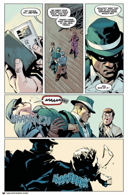
In issue two, the plot begins to thicken as Dick Tracy continues to investigate the murder of Emil Trueheart at The Green Eye with the assistance of the victims daughter, Tess. Their main lead, Mumbles, isn’t saying very much (that they can understand), but he clearly knows something. Meanwhile, Pat Patton is searching for the truth about what happened to his brother on a seedy rebuilding project and comes face to face with someone he knows to be a traitor to the country.
The two story threads begin to come together, and there is the ultimate tragedy for one character as a gang war looms on the horizon with our favorite detective holding court at the center of it all.
Alex Segura and Michael Moreci expertly reintroduce well known characters into the comic in a way that makes them new and interesting but also familiar and comforting, which is no easy task. In the same way that Mumbles appearance in issue one was exciting and intriguing for long time fans of the property, so too are the appearances of familiar faces such as Pat Patton and old wrinkles himself, Pruneface. Elements of their original characters are still there, embedded in their personalities and their actions, but these are new takes with new motivations and goals. For example, Pat Patton is yet to become a member of the police force, but his inherent investigatory skills are still there, and the driving force behind his story.
One of the beauties of this reboot is the way that the characters have been reinvented and brought to life on the page. It’s like revisiting friends you haven’t seen in ten years: their lives are different and exciting, having branched off into new, unexplored territory but, deep down, they have the same personality traits that you’ve always loved. The writers have done an excellent job with these 60 plus year old characters.
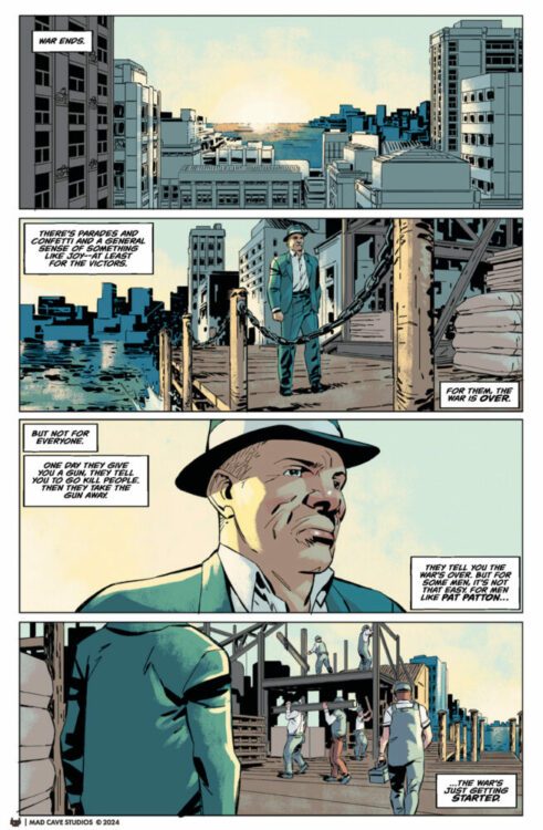
Credit: Mad Cave Studios
Any fans of Dick Tracy will know Pruneface the minute he turns up on the page. He doesn’t look like the Pruneface from Chest Gould’s run on the comic strip, or even like the character played by R.G. Armstrong in the 1990’s movie, but he is still distinctive enough to be recognizable. And non-fans of the franchise, who wouldn’t know him from Adam, will still get the impression that he is an important figure in the story. This is because Geraldo Borges knows how to frame a character’s reveal on the page. With Pruneface, it starts with a wide panel of action: Patton struggling with some goons. The next panel, equal in size and shape, has taken a step back and moved behind Patton to show the view over his shoulder. On the far left of the panel, positioned between the figures of two of the goons, is a man cast in shadow, ominous and clearly significant. Finally, two panels, half the size as the previous ones, each with a close up: one of Pruneface and then of Patton. Pruneface is a man, worn out and despondent, and the facial features that give him his name, adds to the impression of this tired old man. It is, however, Patton’s reaction that tells the reader that Pruneface is a significant player in the narrative, a man with a past that will somehow become relevant. Patton stares in shock, Borges giving the reader a close up on his face so that we can see his reaction clearly.
But it is the words in the panels that are the biggest clue here. “I should have known,” Patton says from off-panel in Pruneface’s close up, and then again but bolder, louder, with more shock in his own closeup. Jim Campbell emphasizes the words and in turn heightens the emotion by changing the size and boldness of the text. The first speech is like a whispered exclamation, a confession Patton is making to himself, but the second speech is an accusation and acknowledgment, screamed at the man Patton clearly knows.
I have focused on this one scene to highlight the craft of the visuals, to demonstrate how much creative design goes into a single page. This level of storytelling happens again and again throughout the pages of the comic. The attention to detail makes this a fascinating comic to read. Each page is a cornucopia of visual treats, often providing clues to elements of the narrative, like the police procedural it is. Tracy’s dream sequence and the burst of violence towards the end of this issue is superbly visualized and is where Mark Englert’s colors really shine. The violence of the sequences are brought out with the stark blood red that dominates the panels. This is contrasted with the muted yellows and oranges in the panels but very little other color remains. The dreams of the central character are soaked in violence and this is reflected in the violent scene later in the book. The matching color scheme makes the reader draw a connection between these two moments, linking Tracy’s memories of fighting in the war with the violence he faces on the streets of the City.
Credit: Mad Cave Studios
I am slightly biased when it comes to this comic because I love Chester Gould’s creation so much. I have read and re-read some of Tracy’s adventures over and over again. Just the announcement of this comic was exciting for me because there is nowhere near enough Dick Tracy comics out there, and a few of the previous outings that do exist haven’t been to my liking. Whether it was the style of the artwork or the narrative decisions made, there was something lacking from them. This new comic from Mad Cave Studios, however, is exactly the kind of Dick Tracy comic I have been wanting. It takes the characters and the themes of Gould’s original stories and gives them a modern twist, visually and narratively. This has more in common with the comic prequels for the 1990’s movie, drawn by Kyle Baker, and is less like the Mark Allred written reboot brawn by Rich Tommaso. It is also set in a very specific time frame allowing the creators to tie in with real world events and the history of the comic strip. The 1940s were the high watermark for Gould’s run on the newspaper strip, so setting the comic in that period is an acknowledgment to the greatness that came before.
In conclusion, I would say that the following two things are true: existing Dick Tracy fans will love this and people who have never read a Dick Tracy comic will also love this. It is an intriguing, exciting, superbly visualized crime/adventure comic. What more do you need to know?
When is it out?
It’s out now!