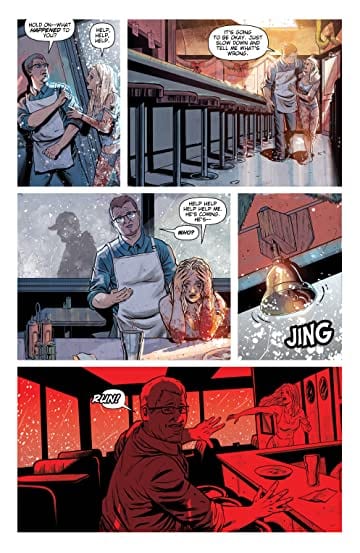
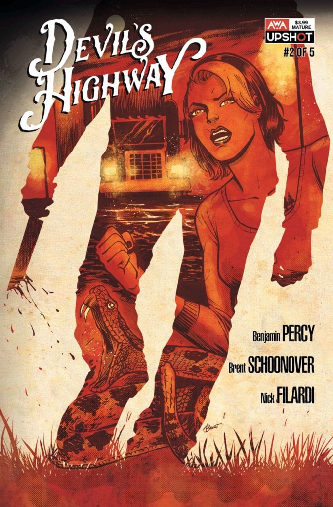
There is a killer on the road in AWA Studio’s latest crime thriller Devil’s Highway; a violent hunter who is about to become the hunted. When he is forced by circumstance to kill the owner of a small town diner he unleashes a determined, vengeful daughter onto his trail.
In this bittersweet homecoming story writer Benjamin Percy and artist Brent Schoonover mix police procedural with a Death Wish movie to create a murder mystery with a sharp bite.

Creating Mood
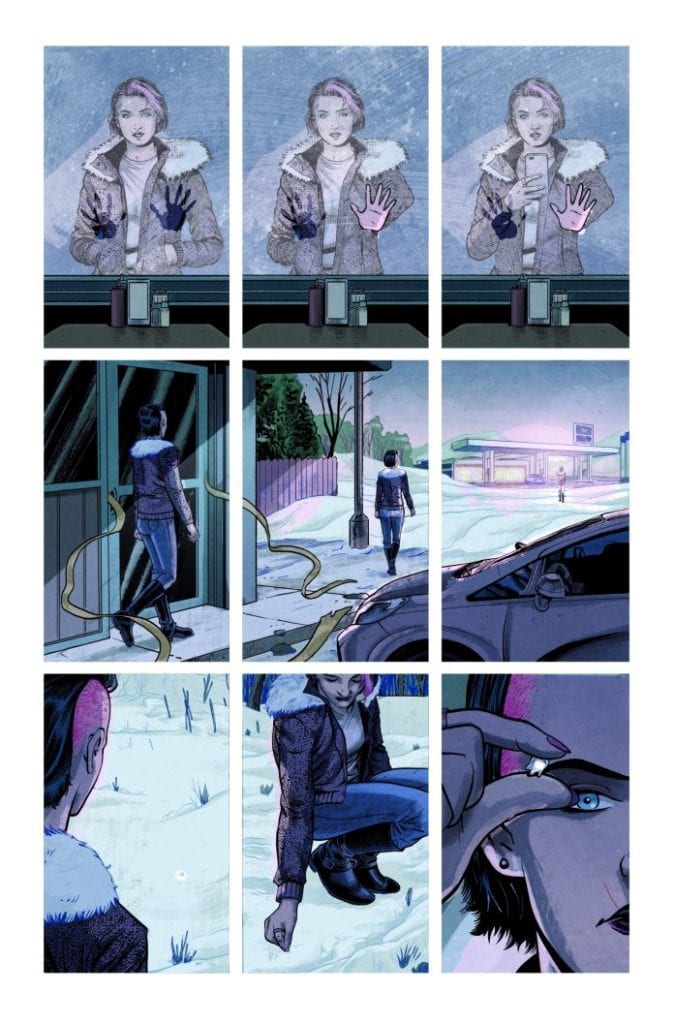
There is a distinctive feel to Devil’s Highway that is created in large part by the setting. The decision to unfurl events during the Christmas Season allows Percy and Schoonover to juxtapose ideas and emotions beautifully. The coldness of winter, with the constant snowfall, mirrors the bleak story line and the heartbreak that a number of the characters encounter. This is contrasted with the trimmings of the season, the baubles and bells, enhancing the sense of loss. From the opening diner scene onward, the violence of the story contradicts the inferred emotional highs of the season.
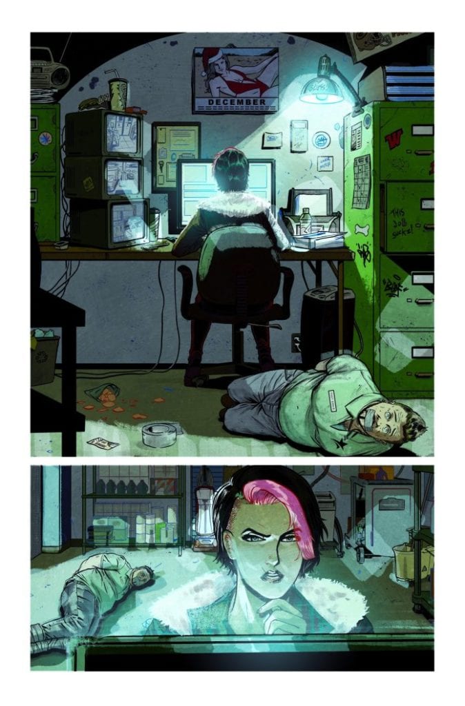
As the story progresses the cold winter scenes allow the creators to produce a brooding atmosphere. Tension is built around the bleakness and the murky white of the landscape. There is diminished lighting for most of the scenes with the colorist, Nick Filardi, picking out details from Schoonover’s inks using gradients of grey. The truck stop scenes especially have a run down, off the beaten track feel to them.
The atmosphere is accentuated by the noir-esq voice-over, spoken by the central character, Sharon. Her meticulous investigation of her own father’s murder gives the comic that classic P.I. vibe. Sharon has all the hallmarks of a Raymond Chandler protagonist and she is instantly likeable. There are layers, buried beneath the hard exterior, that are sure to be excavated over the course of the series, but in the first two issues her personality has enough sides to keep readers interested.

Visualising Character
The focus of Devil’s Highway is on the search for a mysterious serial killer, who leaves a specialist mart on his victims, and as such touches a number of the cliches from the crime genre. The inept police department; the vengeful family member, the sinful victims; they all have a part to play in the narrative. This does make an element of the plot seem unoriginal and the comic occasionally struggles to make itself significantly different or new.
However, the majesty of the artwork helps to pave over the occasional crack in the narrative. Schoonover draws some visually impressive characters and brings their personalities, or lack thereof, to the page. Each panel allows the reader an insight into the cast member or get a step closer to the locations. He captures the knowing and subtle looks that the characters give each other, adding depth to the story. The casts interactions scream of fear, desperation, or any number of other emotions. There is a scene in issue one where Sharon confronts the police officers and through minimal, but specific, gestures, Schoonover is able to bring out the animosity and fear that the characters have for each other. Sharon makes her presence known in the police station and on the page.

Marks on Bodies
One of the most fascinating aspects of the comic is the running motif of marked bodies. The most obvious is the mark left by the serial killer on each of his victims. This represents the mystery inherent in the comic and the dominance that the killer has over the local town. Marks on bodies extend as a motif beyond this however, to take in various tattoos and even injuries. Sharon has a prominent tattoo on her chest, one that is shown too often not to be specific in some way. Part of the growing mystery inherent in the comic, perhaps?
Sal Cipriano’s letters fit the theme of the comic. The majority of the speech is straightforward with balloons placed in an orderly manner, befitting of the straight talking, down to Earth characters. Where his work really shines in this series is in the background lettering or the design work for the computers. The style of font that he uses to pick out the different levels of technology gives the scenes a realistic feel while reinforcing the mundane lives of the townspeople. Very little depicted in Devil’s Highway is high tech, and this comes across in design work.
The visuals are highly detailed in every respect, from the pencils and backgrounds to the color choices and the lettering design. All of the Art works together to provide a full picture of Drift County where this is set. The reader gets a feel for the people and the place from the images in the panels. This sense of location is then used to intensify the action within the narrative, drawing the reader deeper into Sharon’s life.

Conclusion
The opening gambit in Devil’s Highway is gripping, if not too original. From the beginning the creators pull you into the narrative and make you care for the central character. When the plot begins to dip, the visuals lead you through by creating a tense atmosphere that it is difficult to escape. Ultimately, the mystery is intriguing and the central character is empathetic enough to keep you hooked. There is a warming humanity underneath Sharon’s hard exterior which is illustrated through a number of her actions. This is a refreshing aspect to the comic because too often ‘tough’ characters don’t have any real redeeming features.
Devil’s Highway has a solid concept and a visually engaging world. If you are a fan of crime thrillers and enjoyed titles such as Killer Groove from AfterShock Comics or Criminal from Image then this is worth investing in. It has a bit more heart than AWAs Archangel 8 but just as much gripping action.
Issues 1 and 2 of Devil’s Highway are available now with the third issue in the series due for release on 16th September.

