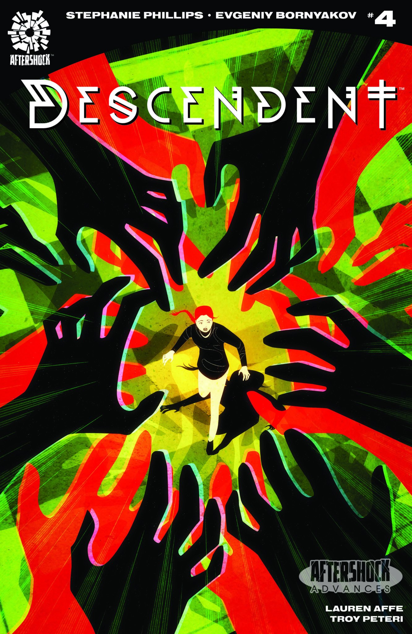
This week Stephanie Phillips breaks open the conspiracy at the heart of her comic from AfterShock Comics, Descendent, and introduces the horror behind the scenes.
This chapter of the story may be called ‘Worst. Stakeout.Ever’ but that does not ring true for the reader. Descendent issue 4 is packed with action and suspense, and as the narrative unravels the true horror shows it’s face.

Descendent Story
Stephanie Phillips proves in this issue how clever she is at building stories. Not only does she start to tie together the various plot threads from previous issues into a coherent whole but the narrative structure in this single issue is captivating. She flicks between scenes and time periods in order to produce the greatest impact, building the tension on every page.
The opening leaves a cliff-hanger which gets resolved later on but that sense of dread prevails over everything else, even the comedic moments. And this is Phillips strength; she is able to keep the prevailing atmosphere alive while indulging in some character development. The growing relationship between David, Amanda, and Jo is a delight to read. Phillips has created three very different characters who have been forced to work together and the way they interact gives the comic it’s entertainment value.
Each of the central cast have very distinctive voices which can be heard through their speech. David provides the much needed comedy that holds the rest of the story together. By making the reader identify and become attached to David, and through him Amanda and Jo, Phillips is making it easier to introduce the more outlandish aspects of the plot. As a reader you are sold on the story through these great characters.

Descendent Art
The plot moves at quite a pace in this issue. The conspiracy is opening up, David and Co have an idea of what is happening, and the villain behind it all has finally shown her face. To illustrate the fact that the plot is now moving at breakneck speed, Evgeniy Bornyakov has injected a healthy dose of energy into the artwork.
The opening scene is a wonderful establishing page. The fear and desperation of the running girl is clear and the panels build up on top of each other to highlight the growing urgency of the situation. Bornyakov zooms in on each panel, distorting the elapsed time and putting the reader into the centre of the action. He then continues to do this throughout this issue.
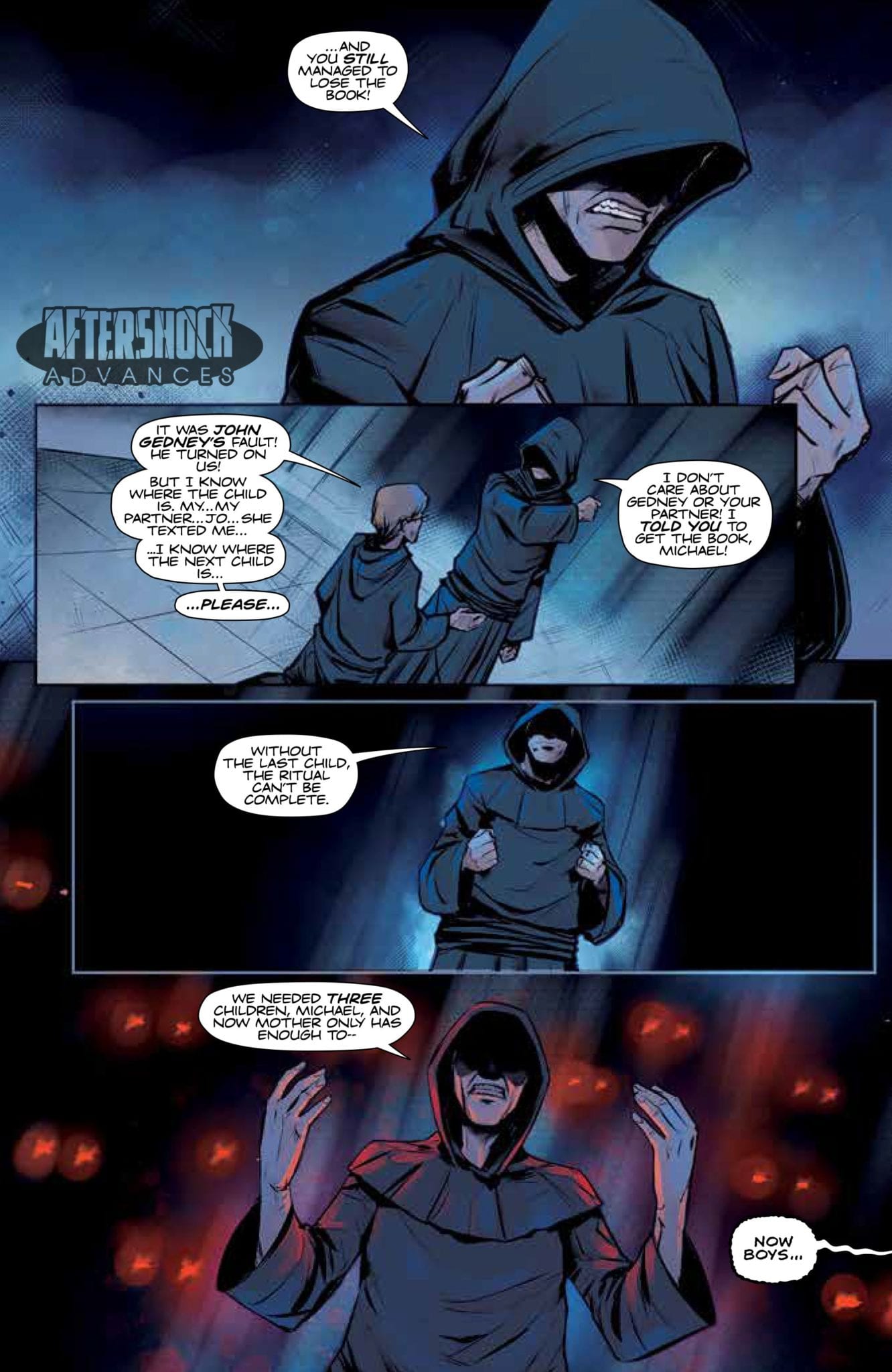
His composition and framing brings out the very best of the character’s interactions and the bound that is growing between them. In contrast the villains of the piece have a distance between them that is only crossed with acts of violence.
The contrast between the two sets of characters becomes more vivid thanks to Lauren Affe’s coloring. David and Co have a warm, light color pallet for their opening scene which makes it stand out from the surrounding action. There are cold blues and imposing shadows for Sarah Gedney’s introduction and striking reds and oranges added for the Cult’s meeting. This juxtaposition of coloring tells the reader everything they need to know about these people and their situations.
The lettering provided by Troy Peteri helps to pace the story across the pages and acts as a focal point to lead the reader across the page. The small sound effects stand out from the action creating a definitive impression of sound. They add weight to the actions because of the stark contrast to the images behind them.

Conclusion
There are some inconsistencies with the balloon placements, especially where they butt or break the boarders of the panels. There are also some questionable panels where the energy of the image isn’t quite captured by Bornyakov’s art. However, the strong narrative and superb character work rides over these small flaws to produce a more than satisfying chapter in the series.
Descendent #4 is an intelligent comic that stands as a single issue but also reflects on what has come before. The art work for the most part is captivating and draws the reader into the story. The cliff-hanger ending for this issue is a real show stealer and, no matter what faults you may have found earlier in the issue, the final splash page is a guarantee that you will be back next month.

