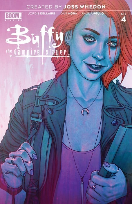
Issue 4 of Buffy The Vampire Slayer marks the end of the first story arc in BOOM! Studios new Buffy-verse. With the announcement of the surprise Angel comic, also out this week, certain elements of the plot may have been given away. Or have they?
The element of surprise has been an integral part of this series so far with the creators mixing up what the fans know about the characters and their relationships with each other. Nudging a character slightly to create a different dynamic has given this version of Buffy an edge over other tie-in comics in the franchise and this issue is no different.

Writing/Story
In this issue Jordie Bellaire has slowed the plot down, producing a character driven issue. The emphasis of the narrative is on how the lives of the central characters have been affected by the appearance of the Slayer in Sunnydale.
It open’s with Buffy and the Scooby gang training. Giles warns of the dangers of ahead, referencing Drusilla’s appearance in previous issues, and then gives Buffy the night off to relax before the coming battle.
This element of the plot allows Bellaire to focus the story on Buffy and her friends. She is able to show them as the teenagers that they were before the craziness began and how they interacted with each other. It also allows for the narrative to compare who they were before with who they are now. Bellaire does this by highlighting the small changes in their interactions; for example, the moment when Xander is late and Willow expresses concern because he is never late.
The slow pace of the comic relaxes the readers and allows Bellaire to build up the momentum leading into the final pages. She lulls the reader into a false sense of security and then slowly takes that security aware. It is something that the TV show did really well and Bellaire does it beautifully here. Although the changes made earlier in the run to one of the characters may lead the reader to guess what is going to happen, or at least who it will happen to.

Art
As ever the art work is brilliant. Dan Mora lays out each page with a simple goal in mind; relaying the story, and then fills each panel with dynamic images.
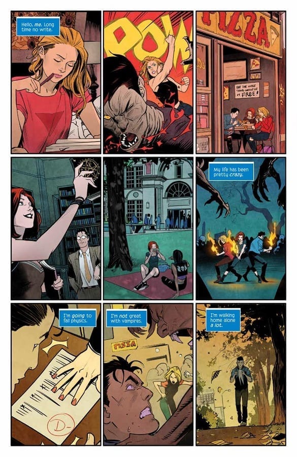
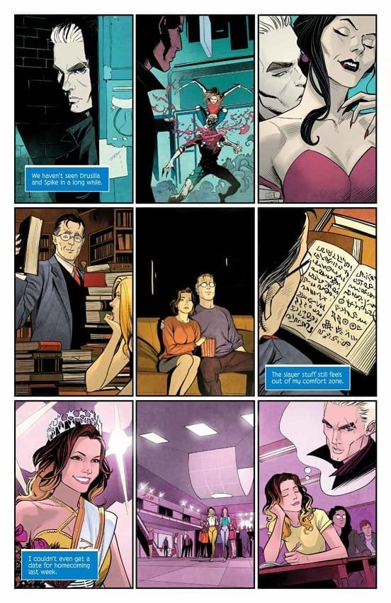
The opening pages are an example of how good Mora is at expressing character. He employs the 9 panel grid and dedicates one row of three panels to each central character. Then each panel represents a different aspect of the character; sometimes by portraying an act which has already happened in the comic or by glimpsing something that hasn’t been explained. Each three panel row adds depth to each character so that the opening two pages contain a plethora of information.
Raul Angulo gives each scene a different color theme to distinguish each one and set the tone for the scene. The school and home scenes are fairly muted with Buffy standing out in vibrant clothing because she is the focus of those scenes.
A more unnerving color palette is then used as the story progresses and a contrast between panels on the same page picks up the mood of the characters, forcing the reader to subconsciously compare them. There is one moment later in the comic when Angulo shifts the shading tone to a deep red just on one character and instantly the reader knows the danger this character is in. It is simple but extremely effective.
The lettering, by Ed Dukeshire, manages to capture the Buffy-speak that Bellaire employs throughout. The inflections and emphasis by the characters on words and phrases is perfectly captured by Dukeshire’s work. He also creates an ambiguity with the main caption boxes making the reader double guess who is speaking. Usually this would be a bad thing but in this instance it helps to keep the narrative moving while retaining an element of mystery.
One of the area’s where Dukeshire excels is in the texting conversations. He creates believable mobile screens with the text laid out in a realistic manner. As the character tilts the mobile phone, the text is also tilted to match. Just like the straightforwardness of some of the coloring, this obvious lettering technique makes the world of difference to the readability of the comic.

Conclusion
This issue of Buffy The Vampire Slayer is both a wind down from the opening excitement and set up for the nightmare to come. The entire creative team painstakingly make so much of the action mundane and normal so that the reader can get to know the characters better. It also helps to set the right tone for the end of the issue. From the opening there is no indication of how the narrative will progress which is perfect for this type of story.
This first arc of Buffy The Vampire Slayer has been near perfect from start to finish. Bellaire has captured the essence of the characters and given them her own spin. In turn the entire art team have all pulled out their best work to make sure that this comic would be a hit.


