There has been a Blade movie in the works for a while, which means that it’s time for Marvel to capitalize on the character. This installment of Blade is written by Bryan Hill, who has worked his way around Marvel before with books like Fallen Angels and Killmonger. Joining him on this visual journey is Elena Casagrande on art, Jordie Bellaire on colors, and Joe Sabino with the letters.
WRITING
Blade #1 starts off fast. We see a girl in a club with music and dancing. People are generally enjoying themselves, and then BOOM, monsters everywhere. This is what Hill is bringing to this book. It’s hard to find a good action and horror combo in the Marvel universe, but this issue shapes up what the series will look like moving forward. Hill delivers chills and curve balls throughout the first issue that will keep you engaged. Blade is tasked with saving a girl named Dana Smith. If he fails at doing this, the world will end. To get information on Dana, Blade must talk to Tanaka, and they’re not exactly besties.
Hill writes Blade like an old time veteran who has seen it all. Nothing is surprising to him, and he’s tough to kill. This tone and vibe of the series works well, especially for readers who are not familiar with the character. Hill and Casagrande choreograph new and interesting fight scenes for the issue. No lie, Blade throws a futon to get Dana out of the way of a killing blow. This team gives us the Blade that we’ve always needed in a book that is scary fun!

ART
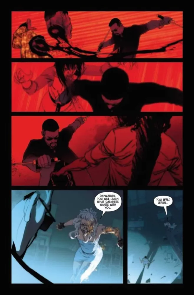
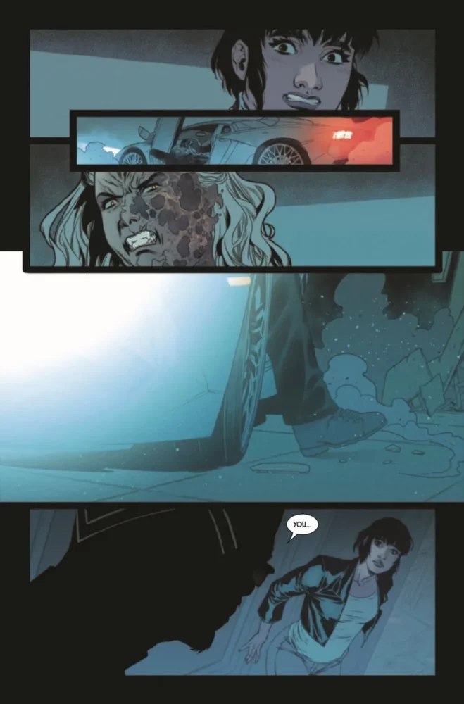
The pencils by Elena Casagrande are excellent. Casagrande beautifully draws creepy pages that will capture the readers attention. Seeing a human pinned to the wall with several samurai swords sticking out of him like a pin cushion is certainly attention grabbing. The panel layout by Casagrande is also exciting. She doesn’t always use a traditional formula for a page, sometimes she’ll have panels where it looks like a sword is cutting the page. Sometimes she’ll have panels with little inserts within another panel. This layout is visually interesting and works well with an artsy book like Blade. Casagrande also capitalizes on Hill’s script when it comes to the fight panels. She’s creative with how she draws what the script demands. Casagrande will give us images from above or action panels from different angles. These little touches make the pencils in this issue stand out.
The colors by Jordie Bellaire are flawless. This looks like it’s going to be an interesting visual journey, and Bellaire is the perfect colorist to tap for it. She isn’t afraid to use dark reds that mask entire panels or have backgrounds with dark blues. When something needs to stick out, like the mask of an armed assailant trying to kill Dana, Bellaire makes sure to make the gold pop on the face. Bellaire doesn’t have many colors that leap off the page in this issue, but when a villain is using a powerful sword that is on fire, Bellaire uses a bright yellow for the torch. We can also trace the fire as the sword is swung. Bellaire offers a masterclass in how to color in Blade #1. She once again solidifies herself as one of the best colorists in the industry.
The letters by Joe Sabino work well with this issue. Sound effects are important in comics, and Sabino uses a decent amount for this issue. Someone crashing through the window warrants a “SKISSKKK.” Sabino places the words above the villain with low opacity so the reader can see through them. As Blade decapitates someone, Sabino lays out a “KRRRSSSHHHH” which wraps in a little at the bottom of the page. Word balloon placement is great. No character or action is covered by any dialogue. Sabino did a fine job with this issue, but that’s nothing new.

CONCLUSION
Blade #1 is an enjoyable and creepy book. The twists and turns will surprise you and question what will happen next. Bryan Hill turns in a wonderful script that is exactly what the character needs. Hill, Casagrande, and company are breathing new life into Blade and making him more fun than ever. Blade #1 is available at a comic shop near you!

