A new creative team takes on BOOM! Studio’s Angel + Spike comic starting with this week’s issue. Picking up from issue 12, with Fred in the clutches of the evil law firm Wolfram and Hart, experienced horror writer Zac Thompson and award winning artist Hayden Sherman instantly put their stamp on the characters and the series. Where Bryan Edward Hill’s run was about bringing the characters together, this new arc starts by tearing them apart.
Often a change in creators midway through a story can have a fundamental effect on a comic: sometimes good and sometimes not so much. Changes in tone and focus can derail a fast moving narrative, bringing it to a screeching halt and staling further development. This happened to a certain degree with Angel’s sister comic Buffy the Vampire Slayer but how well do Thompson and Sherman adapt to Angel’s world?

Hit The Ground Running
The previous 13 issues of Angel + Spike have built up an engaging and abundant world, populated with strong, fascinating characters. There has been a story growing underneath but Byan Edward Hill’s focus on character has made the series unmissable month after month. This new issue gives Angel and his crew a new evil to track but ‘character’ is still at the heart of the story and Thompson knows the cast very well.
A violent creature is tearing the homeless of LA apart and it’s up to Angel Investigations to stop the threat. With the help of Kate Lockley it isn’t long before Angel has picked up the creature’s trail. Thompson uses a ‘creature of the week’ formula to ease the reader back into the story after last month’s one shot. The premise of the narrative is not the violent attacks but how each member of the cast reacts to them. This approach allows Thompson to illustrate his understanding of the central characters and the driving forces behind their personalities.
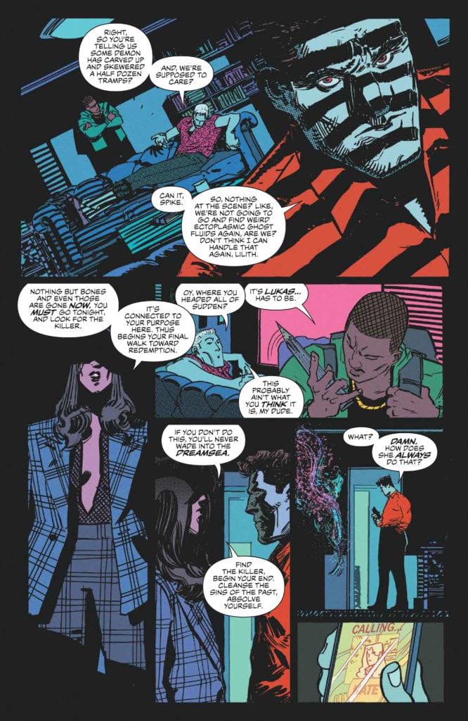
Gunn’s obsession with Lukas: Kate’s devotion to justice: Lilith’s penchant for obscure premonitions: And Angel’s over-protectiveness. All the character beats are here, reiterated and reinforced. None of it feels forced, however, because the framing narrative is so enticing and gripping. The simple slasher-on-the-street story is elevated by the dynamic artwork and Thompson’s commitment to the horror narrative embedded into the Angel mythos.

Fangs and Claws
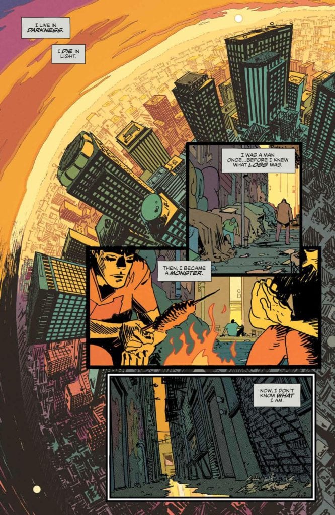
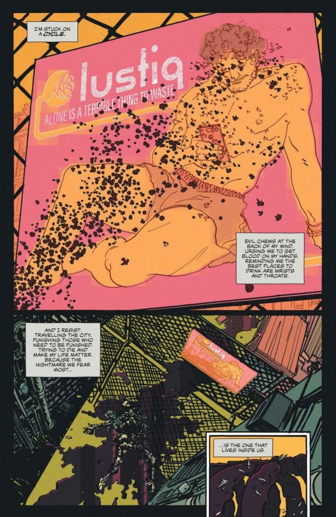
The opening page of this issue instantly informs the reader that there is a new look to Angel + Spike. The style is unapologetically different from Gleb Melnikov’s with warped perspectives and brighter coloring. Hayden Sherman uses exaggerated shapes to create the images within the panels, while maintaining a figurative distinction between the characters. The pages are almost impressionistic in style giving the reader a sense of the cold, unforgiving streets and Angel’s equally unwelcoming home.
Roman Titov uses contrasting colors to highlight the action and the characters across the panels. For example, the brightness of the clothing sits starkly against the blues of Angel’s office. When Lilith enters the scene, her jacket and trousers almost blend into the background, as if she is emerging from the scenery and not quite present in the room. Sherman uses a lot of heavy black shadows to create an overpowering atmosphere and Titov enhances this by keeping the majority of the coloring dark, carefully picking out one or two elements per panel.
The overall effect is oppressive. The art truly sets the scene for the cast of characters who are not in a great place. Tensions are running high and rifts are forming. Neither the plot nor the artwork allows the reader to feel comfortable throughout this issue. Not even Ed Dukeshire’s lettering offers any respite. There is a strong emphasis on the negative aspect of the speech, especially near the beginning, through the captions. Dukeshire leads the reader across the page leaving a specific impression in your mind. The words Darkness, Die, Loss and Monster stand out and linger as the images become disturbing and full of fear.

Conclusion
Angel + Spike has been an impressive comic staking out its horror credentials and building a cast of damaged characters. Hill and Melnikov are a hard act to follow but Thompson and Sherman have filled the roles perfectly. The tone and themes that have kept readers coming back month after month are still front and centre in this new arc but there is the sense of new blood behind the scenes.
Some of the panels are outstanding. A low angle shot of Gunn dipping his fingers into a pool of blood and a field of dead haunting Kate’s vision are dynamic examples that steal the page. These panels capture the reader’s eye on the page turn and draw you through the layouts with a sense of anticipation.
Mixed in with the action and the shocking character moments, and there are a few in this issue, are some wonderful comedic elements. The inclusion of lightness amongst the prevailing darkness is a welcome element. The TV show always relished moments of comedy and it’s pleasing to see that Thompson and Sherman aren’t afraid to add elements of laughter and ridiculousness into the mix. It makes the narrative more rounded, more realistic, and above all more enjoyable.
A change in creative team can usually signal a good dropping off point for regular readers but to do so here would be a massive mistake. Thompson and Sherman, along with Titov and Dukeshire, have taken the reins of Angel + Spike and are driving the comic in the right direction.

