From the creator of The Spire and current Hellblazer scribe, Simon Spurrier, comes a new science fiction, adventure comic called Alienated. Published by BOOM! Studios on 12 February, the comic is co-created by Chris Wildgoose, artist on Batgirl and the wonderful Porcelain series.
Populated with teenage outcasts and focusing on the everyday struggles of being in high-school, this opening issue has more in common with a demon free Buffy the Vampire Slayer than it does with any of Spurrier’s previous titles, that is until the cliff-hanger ending.

Scripting Teens
The opening pages introduce the readers to the three Sam’s of the story. Samuel, Samantha, and Samir are all outcasts at their local school, linked by a bully called Leon. Spurrier uses Leon as a narrative tool to lead the reader from one character to the next. The three are then forced into a meeting which changes their lives forever.
The focus of Alienated #1 is the characters: almost the entire issue is given over to building up their personalities. The tool Spurrier uses to reveal their characteristics is linked to the greater, Science fiction element of the story but for the most part, you’re not entirely sure what this comic is. Despite being an unsure mix of genre’s, this approach serves the comic well and makes it much more engaging.
If you ever read any ComixTribe comics you may have come across a comic called Find, written by Sam Read and drawn by Alex Cormack. It too was a science fiction drama and has a similar tone to the one captured in Alienated. It is sedated, with the action provided by a mostly ineffective bully. There isn’t a sense of threat in the plot but there is a slow layering of character and narrative. This builds up at a comfortable pace until the outstanding ending.
Spurrier’s decision to use telepathy between the characters, thanks to an incident early on in the comic, not only gives the plot the science fiction rooting required for what’s to come but it also allows the reader to get to know the main cast. Usually the dialogue box is used to give the reader access to a single character’s thoughts, here Spurrier evolves that making these disconnected words a larger part of the narrative and integral to the plot.
A major comic book element, something unique to comics, is used not only to tell the story but to be a part of it. Spurrier elevates a mechanism of the medium in a similar way to Jim Jarmusch in The Dead Don’t Die where some of the cast become aware they are in a movie.

Outlining Thoughts
Chris Wildgoose has a detailed art style which is accentuated by his fine inked lines. He is able to create complex scenes in single panels without making them seem crowded. All of the location shots overload the reader with information. This helps to set the scene and build character but it also controls the readers pace. It becomes difficult to rush through the pages because there is so much to see and take in.
You find yourself spending time soaking up the contents of a bedroom or the architecture within a street scene. The desired side-effect of this is that you subconsciously spend more time with the characters than you realise. As you digest the setting you are also experiencing their day to day lives. This is a wonderful storytelling technique. It’s subtle, informative, and also a little bit manipulative.
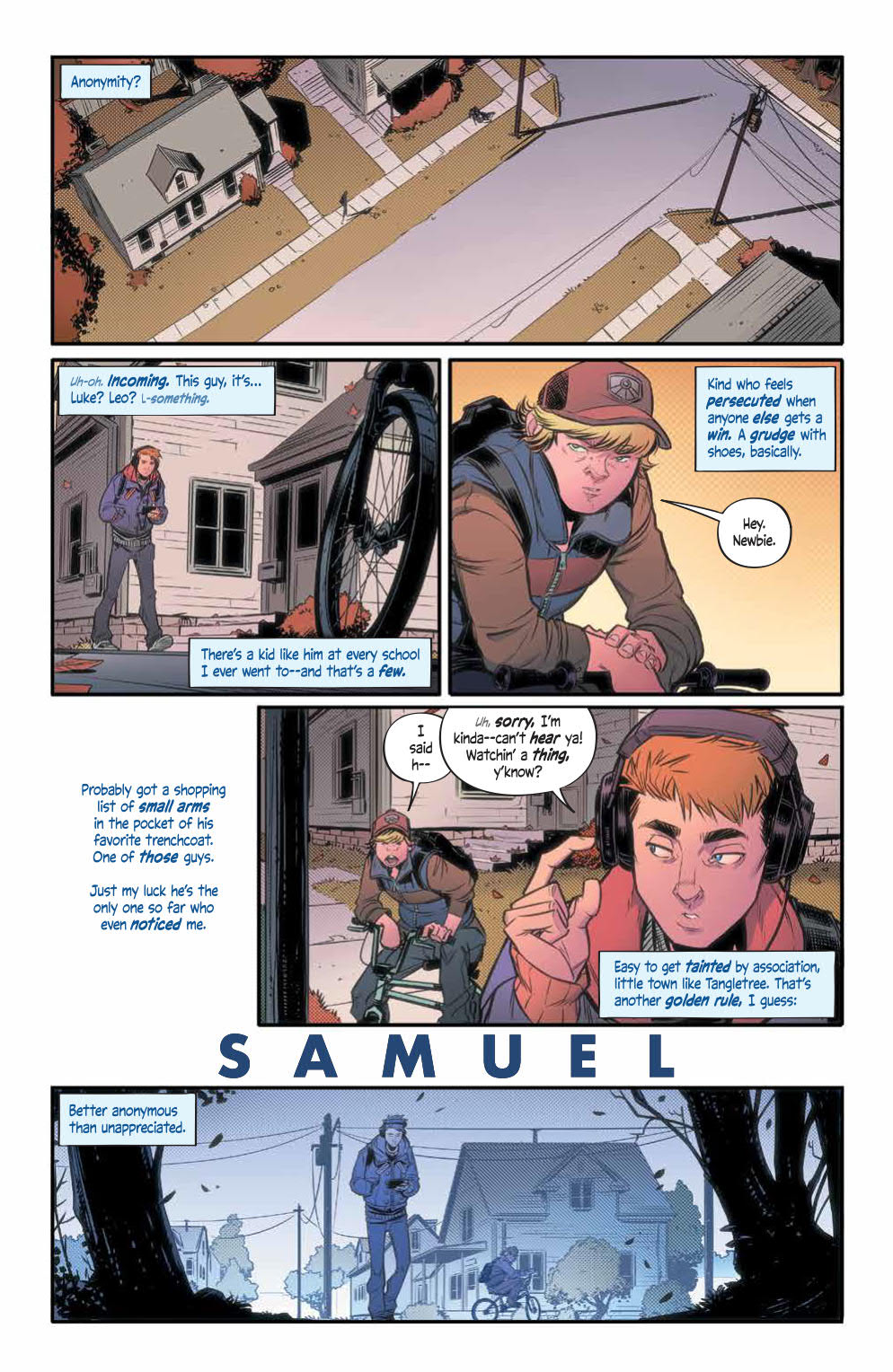
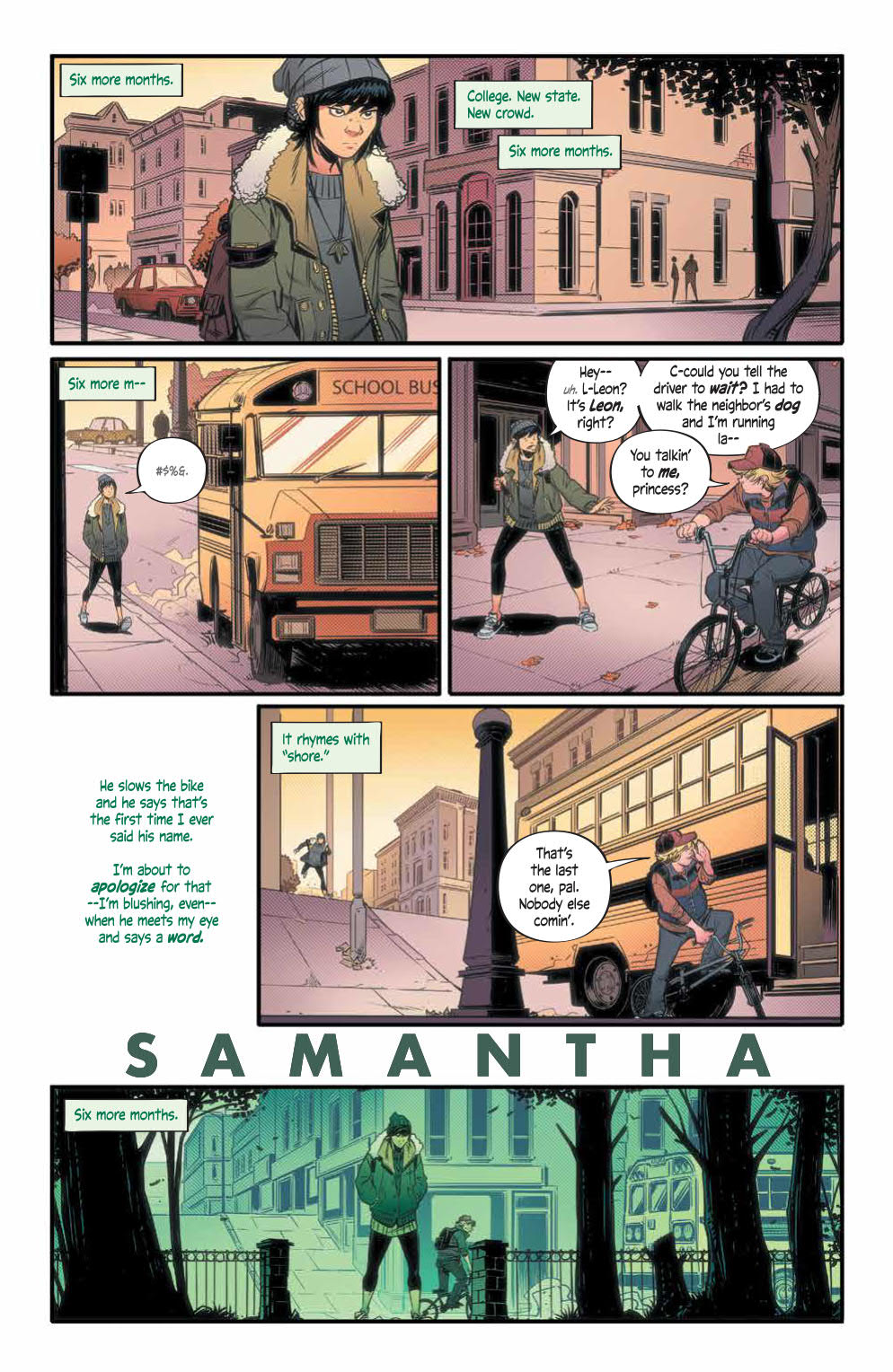
The panel layouts are also impressive. They produce a noticeable structure to the comic, especially in the introduction to the characters. Each member of the main cast has an introductory page which is laid out in exactly the same way. Four rows are split with a widescreen panel top and bottom. There are then two panels on the second row. Finally, the third row has one panel with dialogue hovering in the large space to the left of the panel.
This identical structure links the characters even before they have met and helps to highlight the differences in their personalities. As a reader you are forced to compare and contrast because the structure demands it. It is a wonderfully satisfying part of the comic and makes you want to read on.
Andre May also uses this part of the comic to layout his color language for the comic. Each of the three Sams has a different color assigned to them as illustrated in their introduction pages. The color of their speech is reflected in the coloring of the panels so that the final panel on each page is distinctively different with a hue that matches the character. As this is so noticeable, it makes it easier for the reader to know who is thinking what later down the line.
This color language continues throughout, with shadows succumbing to the different shades and the clothes matching their speech color. Jim Campbell makes the distinction between the characters’ speech very obvious which is important in a comic like this. He also adds extra tweaks to some of the speech balloons to give the words and phrases different emphasis. He has a cool technique of altering the size of the font within a speech to create a whisper effect or an emotional uncertainty.

Conclusion
Alienated is a comic about comparing and contrasting. The creators use the tools at their disposal to build a world of characters that is believable and complex. By the end of the first issue you will feel as though you have been with the three Sam’s for a lot longer.
The artwork is beautifully designed and laid out with great coloring and lettering that lead you through the narrative effortlessly. Everything is dense, in a good way, making this single issue seem so much more. It is so satisfying and exciting.
You may not know what Alienated is, going into it, or even throughout the majority of the comic, but that’s okay because the journey here is so well presented. Spurrier captivates with his lyrical finesse allowing him time to build up to the more outlandish elements of the story.
Alienated #1 is a must buy.

