After two of Marvel’s premier teams were given the Grand Design treatment, the Hulk — the publisher’s jolly green ball of rage — is finally stepping up to the plate. But the other two Grand Design projects tried to weave decades of continuity into a single narrative, an approach that puts the Hulk at a serious disadvantage. Early on, The X-Men and Fantastic Four both had long, sustained runs by stable creative teams that formed the backbone of their respective histories. The Hulk… doesn’t. His early history is defined by being kicked from title to title, trying to find an angle that worked. Thankfully, cartoonist Jim Rugg isn’t trying to convince anyone that the Hulk was a product of careful planning. He’s here to show all the wild, weird places the Hulk has been. If there’s one constant, it’s that Bruce Banner will never, ever catch a break.

WRITING
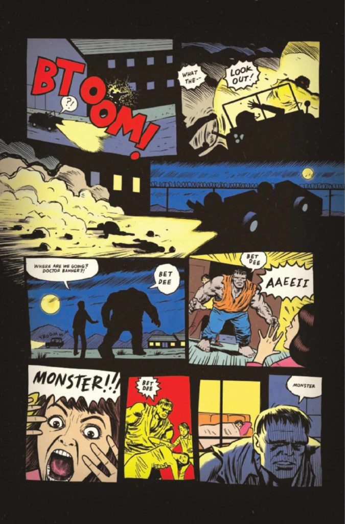
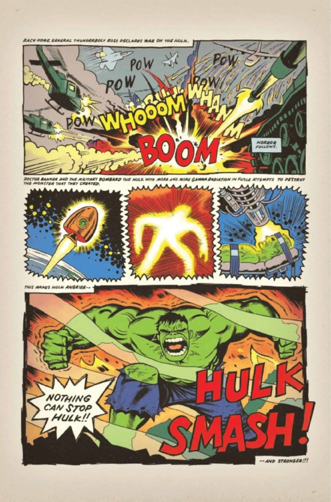
Starting from the fateful nuclear accident that ruined Bruce Banner’s life, Hulk: Grand Design #1 covers the first twenty years of Hulk comics. Instead of a more traditional plot structure, the comic engages in a sort of narrative scrapbooking. The Hulk bounces between different phases in his life, each declared with small recreations of classic comic covers and splashy headers. A character dies only to reappear pages later, a caption box offhandedly mentioning that yes, they returned from the dead again. It all starts out a bit disorienting. Thankfully, it doesn’t take too long to settle into the comic’s unique rhythm and let it guide you from moment to moment.

ART
Rugg’s art is the main star of the issue, as is his ability to copy the styles of other artists. From Jack Kirby to Micky Demo to Herb Trimpe, Rugg changes the Hulk’s appearance to fit the different artists of each era. But more than just comics are referenced in this issue. An entire splash page is dedicated to the Hulk jumping out of a TV, against a collage of different advertisements for the Incredible Hulk TV show. A small aside notes a Trimpe Hulk drawing appearing on the cover of Rolling Stone. And Hulk’s first fight against Wolverine is drawn with colored pencils on notebook paper. Because what schoolkid wasn’t obsessed with that matchup? This Grand Design doesn’t feel like a tribute to the Hulk’s comics, as much as it does to the Hulk as a pop culture icon.

Special attention must be given to Rugg’s skill with expressions. For a comic focused on a green monster whose overriding emotion is rage, there’s a good amount of variety to the Hulk’s angered expressions. Sometimes he’s drawn with a squat face, clenched teeth, and small eyes turned condescendingly downward. Other times, his eyes take up the entire panel in vein-popping detail. It’s a Hulk that broods, simmers, rages, and screams. It’s those faces that keep the comic’s narrative from spiraling out of control — the Hulk’s cycle of loneliness and rage grounding tales of space aliens and nuclear mutants.
VERDICT
Hulk: Grand Design #1 is a history lesson as frantic as the character himself. Pieces of the character’s past are violently thrown together in a haze of fists and clenched teeth. But every so often the smoke clears, and in a moment of reflection, he realizes that he’s truly, hopelessly alone. Then the fighting kicks back in. And so the cycle continues. It always will.
Pick up Hulk: Grand Design #1 this Wednesday at your local comic book store, and check out our interview with Jim Rugg right here on Monkeys Fighting Robots!

