The premise is simple: read one comic every day for the entire year. It seems like a simple task but there is no way that I read 365 comics last year, even if you count the individual issues in collections. So, this year, I am committing myself to this reading challenge, in the hope that I can broaden my reading habits and fully engage with my favorite hobby again.
I started the week off in 1994. At that point in my comics reading life, I was very much entrenched in the world of Vertigo Comics, an imprint that had been founded a year earlier. It was also the year that I moved to somewhere that had an actual, specialized, comic shop. Previously, most of my comics had come from mail order or the occasional visit to a city. For the first time, in 1994, I had an LCS (local comic shop).
I was also a student. So, it was lucky for me that the average comic cost around a pound (£). The speculation boom in this period was just starting to build and it would only be a few years until the entire industry crashed. But, until then, there were many great comics to be found.
Credit: DC Comics
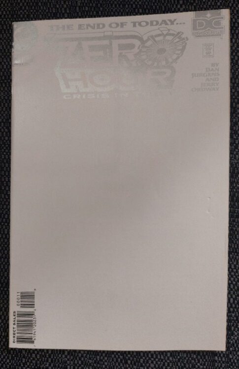
Comic Number 141: Zero Hour #4 -0
Small confession time: I have never read any of DC Comics big event stories, except for the weekly 52 comic and the five issue Zero Hour. I missed out on Crisis on Infinite Earths, Final Crisis, and Flashpoint. I guess by reading 52 I experienced some of Infinite Crisis but I didn’t have a grounding for a lot of the narrative. And that’s my problem with DC events: I don’t really read DC (superhero) comics. I have some Batman, a few Superman, more Supergirl. The only Green Lantern I own ties in with the Supergirl comics and I think I only have a single issue of the Flash.
Therefore, the complex event stories that DC produces are completely lost on me.
I couldn’t tell you why I own Zero Hour. Perhaps it was the cheap cover price (70p per issue). Or maybe the gimmicky reverse numbering of the series, starting at number 4 and going back to 0. Somewhere, I have some Batman and Superman issue 0’s that tie in with this event but I didn’t feel the need to dig them out.
Some people might say that the creators, Dan Jurgens and Jerry Ordway, are a big sell but I find the script a bit cliched and the artwork very DC standard. It looks like a 1990’s superhero comic. There is nothing outstanding or inventive inside the covers. The occasional use of white space, an element of the story itself, makes for a striking page but generally, this series looks exactly as you might expect for a comic from this period.
The narrative is continuity heavy, as you might expect, and even now, after years of reading more DC comics, I still don’t know who a lot of the characters are. Even the main hero and villains of the story are a bit of a mystery to me. I have no biographical knowledge for them and haven’t read a comic that included them outside of this series (that I’m aware of). If you look at it from that point of view, Zero Hour must work on some level because, nearly 30 years later, I still own and occasionally read this series. Many comics have come and, literally, gone from my collection in that time but Zero Hour hangs in there. I couldn’t tell you why.
Credit: DC Vertigo
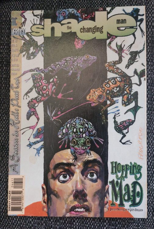
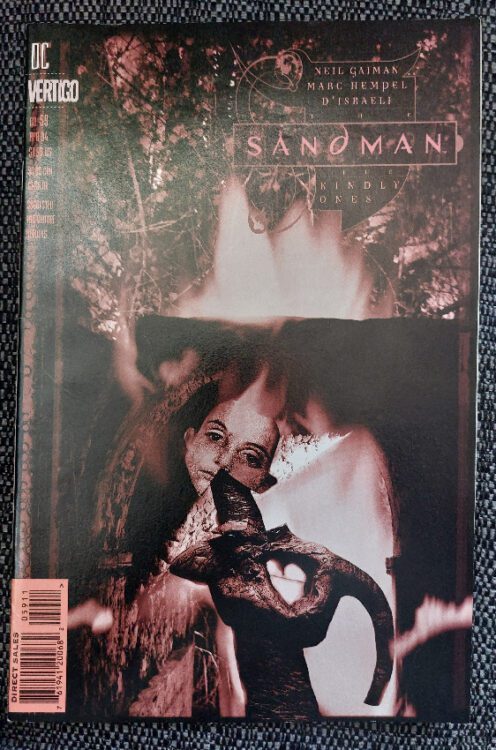
Comic Number 142 and 143: Shade the Changing Man #46 and The Sandman #59
I have lumped these two together because they have a lot in common. Not only are they published under the Vertigo banner but they are both early parts of a bigger story, poetically written by superb writers, and illustrated with expressive art that even today seems bold and fresh.
Peter Milligan (Shade) and Neil Gaiman (Sandman) both concentrate on the characters in their narratives but manage to do this by incorporating the environment around them and threading the plot through them. The characters are the story, not just facilitators of it. And one aspect that these two comics share is the large cast. Despite their titles referring to a specific character, both comics have a wide lens, taking in all of the supporting cast and treating them as central characters. Milligan and Gaiman write very different stories but both of them create worlds for the readers to explore.
However, it is the artwork in these two comics that is the real star. You have Marc Hemple and D’israeli providing strong, bold artwork for The Sandman. Shapes and color form the world the narrative sits in, holding it firmly in place like a ridgid framework. The structure of the comic page is mirrored within the panels where the images have very defined forms. But this is then subverted by the expressionistic coloring and poetic script that seems contrary to the art style. Together, it creates a fantastical world where anything, and everything, is possible.
Credit: DC Vertigo
This is exactly the same impression you get from Glyn Dillon’s work in Shade. He takes the script from Milligan and transforms it into a disconcerting visual world where everything is slightly off kilter. The reader’s point of view is barely direct, with so many panels viewed from unconventional angles. The scenery, especially the backgrounds in the hotel scenes, is often skewiff creating an uncomfortable setting for the story. This is not a place where you want to be, and it represents the breakdown in the characters’ relationships.
Both of these comics are visually impressive and have narratives that are engaging. Yes, they are both chapters in larger stories but you can still enjoy them as individual issues. Over the years I bought The Sandman on a regular basis, only missing a few issues now and then but Shade was a lot more hit and miss. However, I can still read Shade, even with the jumps between issues and gaps in the story. The artwork is reason enough to open the cover.
Credit: DC Vertigo
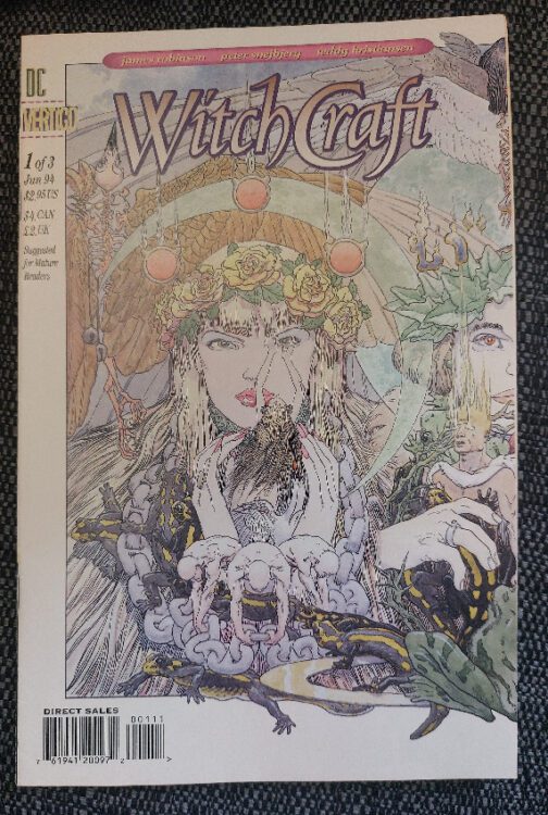
Comic Number 144: Witch Craft #1
The Sandman was a massive hit and in 1994 it was heading towards a spectacular finale. Therefore it’s not surprising that there were spin off comics around. Witch Craft took the Kindly Ones, the three witches that caused so much grief in The Sandman, and gave them another story of revenge.
Witch Craft includes some disturbing elements and the abuse of a central female character is the foundation of the narrative. The rape and murder of a priestess catches the attention of the three witches and, spurred by an urge for vengeance, they start to conceive a plan that stretches across decades and involves future generations of the original characters.
James Robinson writes an involved script, heavy on the description and conversation. Some pages contain a lot of text and there are some pages that are almost swallowed up in the speech. At these moments, it reads more like a stage play than a comic but there are other pages that counter this, pages that visually capture the reader. The more upsetting elements of the narrative are dealt with via text, with visuals that are not explicit or exploitative. The two artists, Peter Snejbjerg and Teddy Kristiansen, handle the script perfectly and combine the 1990’s Vertigo style with a dark, horror-esq imagery.
This comic looks like a Shakespearean tragedy. And I’m sure that’s not by accident.
Credit: Rebellion
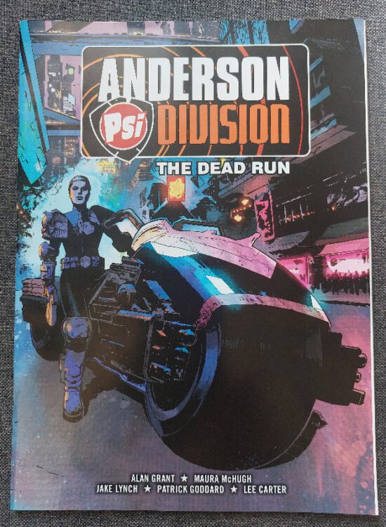
Comic Number 145: Anderson PSI Division: The Dead Run
My 1994 adventure was derailed halfway through this week. Long story short: I happened upon a stack of 2000AD comics that a neighbor was selling. While my son got a few of them to read (he has not read any Judge Dredd but was interested so I couldn’t say no) I have ended up with a number of Judge Anderson and Rogue Trooper comics. These comics are collections of stories originally printed in various issues of 2000AD and the collections were given away free with the Judge Dredd Megazine.
In The Dead Run, there are three stories, with The Dead Run being the main feature. However, it is the opening story, Death’s Dark Angels, that’s the most interesting. It features a cult who worship Judge Death and try to trap and sacrifice Judge Anderson in an attempt to resurrect the Dark Judges. It is a short, black and white reprint but includes every aspect you would expect from a Judge Dredd story: violence, crime, sarcasm, and brutality. The cult is portrayed as losers: lost souls who have nothing else in their life except to idolize something that is detrimental to their own health. And the Judges stand above them, bewildered by the depths that some people sink to.
Judge Anderson is lured into the cultists’ den and is then rescued by Judge Dredd in a seemingly sexist trope but there is something about the way Alan Grant has written the characters that dull that cliche. You don’t get the feeling that Anderson is a damsel in distress, instead she is calm and cool under pressure. Her attitude is one of disappointment in the criminals rather than a fear for her life. When Dredd turns up, she quips about his tardiness highlighting the relationship the two Judges have; there are very few characters who would speak to Dredd with such sarcasm, friend or foe.
The other two stories in this collection are entertaining but it is Death’s Dark Angels that has the classic 2000AD feel to it. You can see from this short story why the characters have endured as long as they have.
Credit: Rebellion
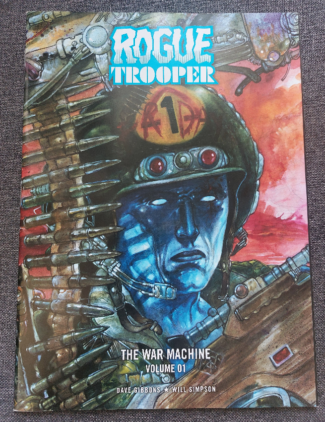
Comic Number 146: Rogue Trooper: The War Machine volume 1
Another comic from my find this week and another story new to me. Out of all of 2000AD‘s on ongoing characters, Rogue Trooper is the one I probably have read the most, however, this is the first time I have read Dave Gibbons’ reboot of the character from 1989. The War Machine introduces a genetically enhanced soldier who discovers an unsettling truth behind the war he has been sent to fight. The comic is violent and pessimistic. The Trooper, in this series called Friday, internalizes his own mission and purpose which creates an element of hope. Hope for the character at least, but not the reader. At each step the audience knows that the answers Friday seeks are not ones he wants to hear.
The artwork by Will Simpson epitomizes late 1980’s British comics. The painted images arranged in often misshapen panels demonstrate the experimentation and excitement for the medium. There is an expressionist approach to the visuals that lends itself to the narrative and the disconnection that the central character has to the world around him. The violence of the war and the helplessness of the soldiers is expressed through the often abstract images and odd shaped panels. Even the lettering by Bambos captures how small the Trooper is in the grand scheme of things. Small, rounded text is fit snugly into caption boxes barely big enough for all of the monologuing.
This first part of The War Machine is a tour de force of storytelling. Superb artwork by all involved and an engaging script that makes it difficult to imagine reading it in small segments in the original 2000AD issues. If only I had the second volume..
Credit: Rebellion
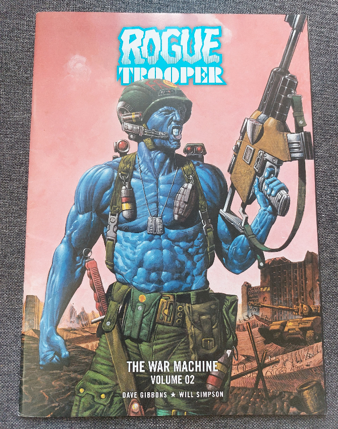
Comic Number 147: Rogue Trooper: The War Machine Volume 2.
This continuation of the Rogue Trooper story as re-invented by Dave Gibbons is as good as the first part. There’s not a lot that I can add although there are some other extras in this volume. The additional stories in the volume are also great reads (even the Mark Millar one) but do suffer in comparison to the title piece.
That seems like a bit of a cop out for the end of the week. But it’s been a busy one. Again my plan to focus on a particular year has gone astray. Hopefully I can manage to stick to my guns next week when I pick a third, specific year of publications.

