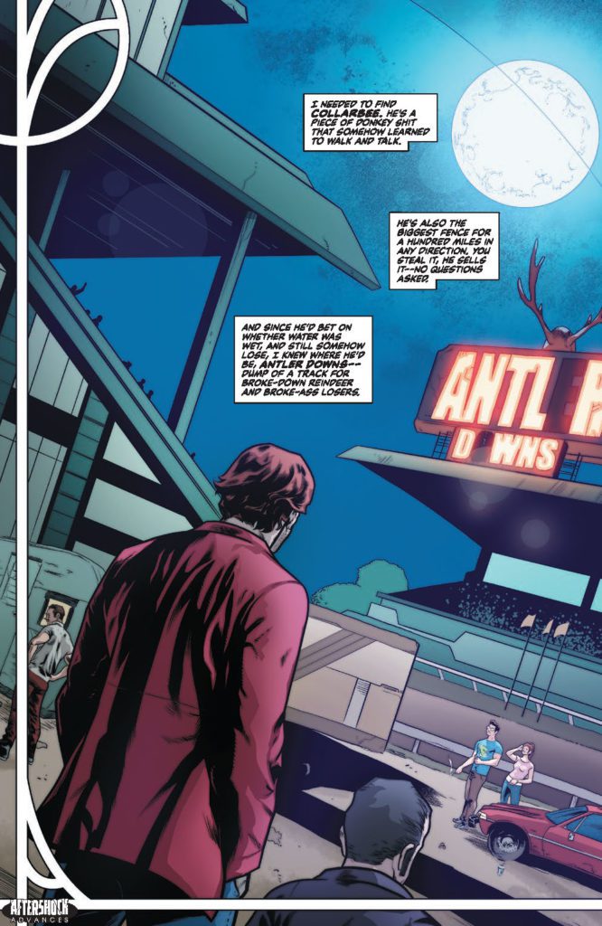
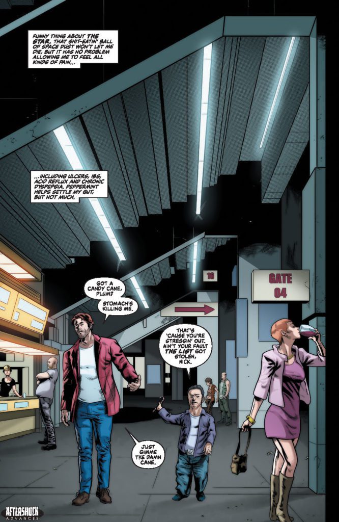
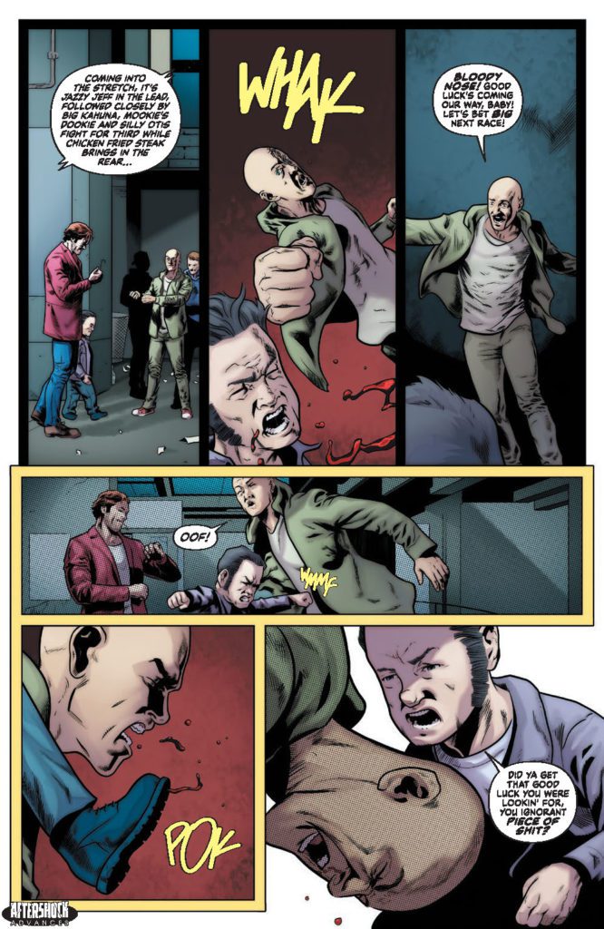
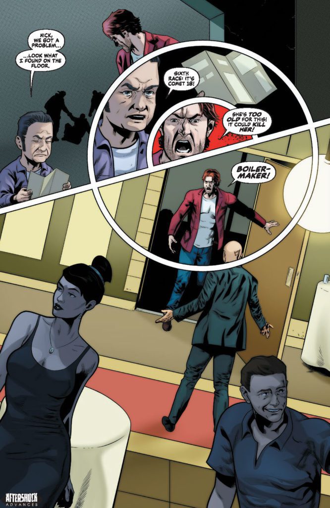
THE NAUGHTY LIST #2 hits your local comic book store May 25th, but thanks to AfterShock Comics, Monkeys Fighting Robots has an exclusive four-page preview for you.
About the issue: Nicholas, an immortal, depressed and pissed-off Santa, and his right-hand elf, Plum, head to Antler Downs, a rundown racetrack, in the hopes they learn who is using the Naughty List to brutally murder people…ya know, a Christmas story…but the patrons who frequent this shady establishment have other plans. Unfortunately for them, Nicholas and Plum didn’t come here to play any reindeer games.
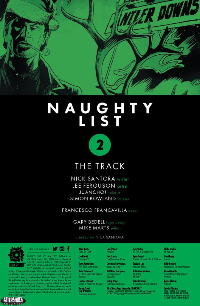
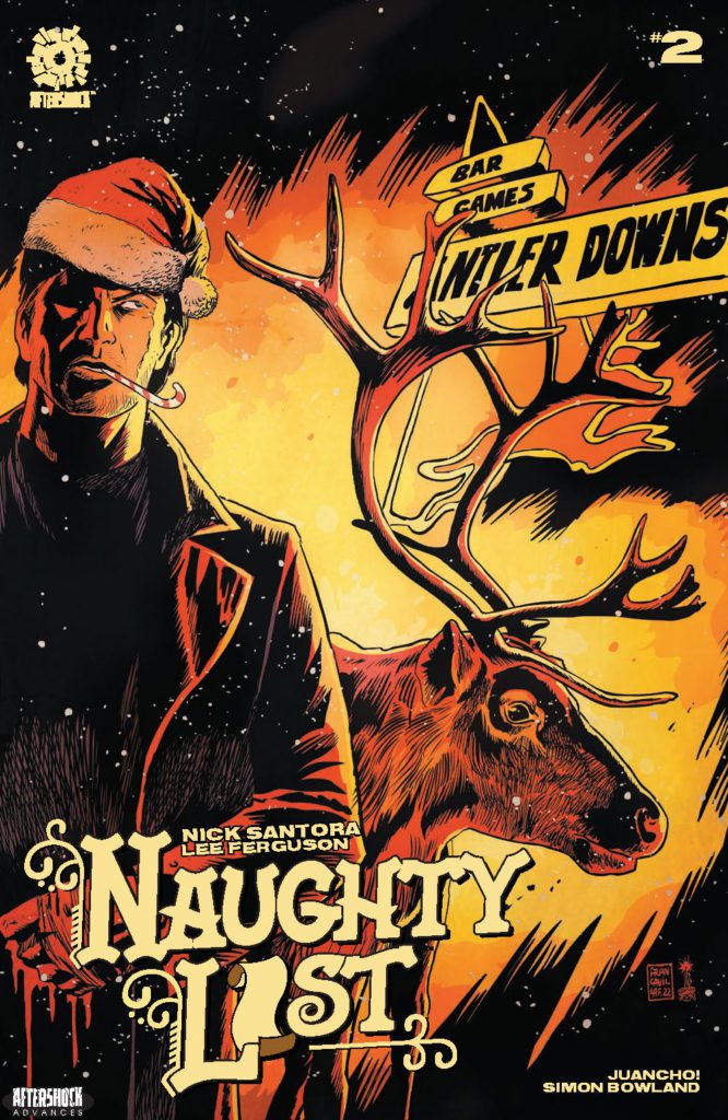
AfterShock’s NAUGHTY LIST is by writer Nick Santora and artist Lee Ferguson, with colors by Juancho!, and letters by Simon Bowland. The cover is by Francesco Francavilla.
Check out our THE NAUGHTY LIST #2 preview below:
Did you pick up the first issue of AfterShock Comics’ NAUGHTY LIST? Sound off in the comments!
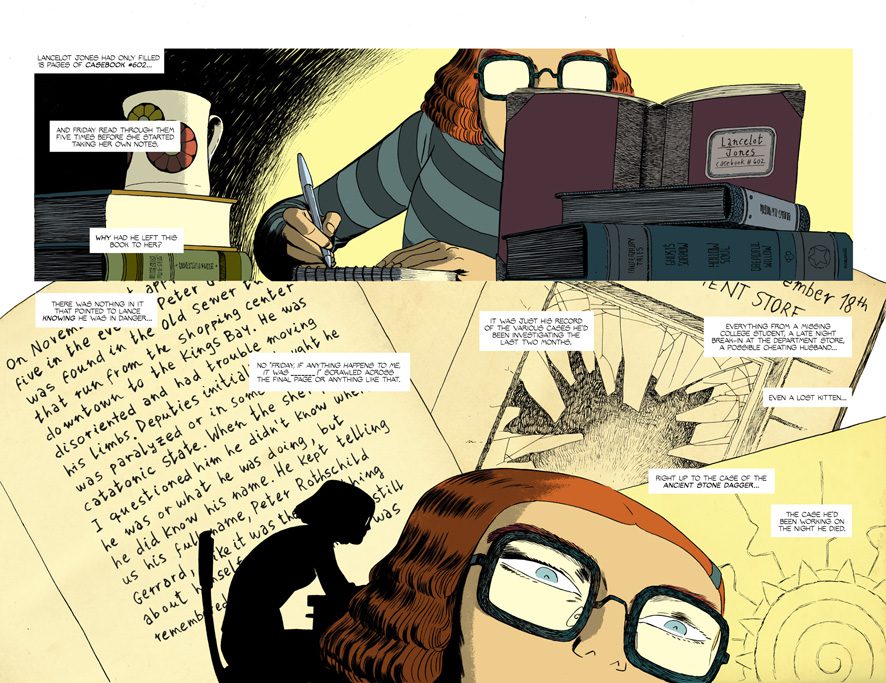
Most stories don’t do tragedy quite right. At least, not in a way that you really feel the gravity of the loss a character is experiencing. Friday, written by Ed Brubaker, with art and letters by Marcos Martin, and colors by Muntsa Vicente, is not most stories. Rather than dwelling on the death of her childhood friend and detective partner, Friday Fitzhugh trudges on. But the ghost of Lancelot Jones is never far behind, and this creative team makes sure we remember that.
Writing
Some tragedies really sink their teeth into the emotions of a character. You see page after page of weeping and wailing. There’s not much left for the reader to feel once the characters have filled their boots. Other stories with death and loss kind of speed right past those themes, treating those things merely as inciting incidents. You forget anything sad happened at all in a page or two. Brubaker, brilliantly, stakes his claim on the middle ground of these approaches. Friday Fitzhugh is on the case of her partner’s death. She knows this is the best way to honor his memory – it’s what he would want. But while she has a job to get done, Brubaker shows us little moments where she lets Lancelot’s memory get to her. These “invasive thoughts” are quickly done away with, but those two seconds of pain speak volumes.
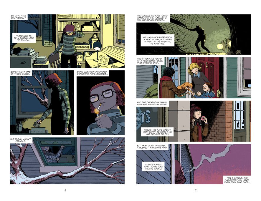
Part of how Brubaker achieves this approach is by getting the plot going. We begin to piece together some of the mysteries that Lancelot left in his wake. They pull us in with all of their weird little details. You find yourself wondering how some of these things could possibly fit into what happened to Lancelot. And with a magical element to the story slowly seeping into the narrative, things feel twice as scattered. But all of this is done in such a satisfying way. After all, it’s Brubaker. So you know it’s all going to make sense in the end. You see all the wildly different pieces to the puzzle as a promise that this story is going to cover lots of ground and take us to all kinds of curious places.
Art
Martin’s art slowly pulls us into the compelling mystery, all while subtly weaving in moments of quiet heartbreak. We see how alone Friday feels without Lancelot. When she’s pouring over books in a big library, looking for clues, Martin pulls back to show Friday as a small speck in a vast, empty place. But Martin also makes us feel as though there is some strange beauty in feeling such deep emotions. The same scene has light streaming in from the windows, catching the dust in the air. It makes you feel as though you’re sitting in the room with Friday, experiencing some of the intensity of what she’s going through just by being close by. Later, we see Friday think about Lancelot again. Martin focuses us in on her eyes for two panels. Her eyebrows tense in the first panel. She’s angry he’s gone, maybe she’s even angry with him. But the next panel we see her brow relax again and her eyes fill with sadness as the grief comes flooding back.
Apart from the stunning emotionality of this chapter, Friday #5 also sees the introduction of several new characters. Martin’s character designs are simply iconic. From the shape of their heads to their wardrobes, from their facial hair to their moles, everything about these characters makes them unforgettable and unique. Even their expressions and body language feel specifically tailored to each individual. Martin fills this cast out with all the kinds of characters you would want in a spooky murder mystery.
Coloring
Vicente makes it so that the atmosphere of each scene radiates off the page. You’re not turning a page, you’re entering a room. Whether it’s the pale yellow light that’s cast over Friday’s room, or the dark blues that surround a clandestine meeting, every setting has a character of its own. As Friday sneaks around in the dark, we briefly see her face when she finds a clue. Her glasses’ lenses are shown in a startling red. With this, Vicente has us feel all of Friday’s shock and determination.
At the start of this issue, we see Friday thinking about Lancelot’s old cases. She pictures him investigating each of them as she hangs out her window, smoking a cigarette. As we go back and forth between these scenes, it’s actually Lancelot’s scenes that are bright and colorful. Friday blows smoke out into the purplish blue skies of early nighttime. It’s such an interesting choice on Vicente’s part. Most flashbacks in modern comics appear faded or grey. But Friday pictures Lancelot as full of life, colorful. She’s the one who looks grey and faded. In some ways, she’s the one who really feels dead.
Lettering
Early on, we see Friday looking through Lancelot’s notes. As she tries to put the pieces together of Lancelot’s various cases, we see her thoughts described in caption boxes. Martin makes it so that the trajectory of these caption boxes is easy to follow, but the ride is still bumpy and scattered. It’s like it’s taking time and effort for Friday to try and put this all together. Later, when Friday asks someone a few questions, the person responds in a couple weak lies. His answers come out in word balloons that barely move past his face. You can see the lack of conviction in what he’s saying.
Verdict
Friday continues to be the most delightful comic that’s coming out. It’s emotional, mysterious, and ever-so-slightly supernatural. And with this chapter, this creative team promises they’re taking us to weird, new places. Get your copy of Friday #5 from Panel Syndicate where you can pay what you want to for it and all proceeds go straight to the creative team.
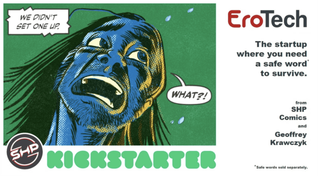
EROTECH #1 is a dark, NSFW comedy launching on Kickstarter this May. Darin X. Cape writes the book with art, letters, and design by Geoffrey Krawczyk. At first glance, the premise sounds like the next great HBO Max series, an R-rated dark office comedy.
About the issue:
The startup where you need a safe word to survive. Join Samantha as she rallies her team of misfit engineers and out-of-touch managers to release a new sex robot in this edgy comedy.
Cape sets the first issue up nicely on the first page with an email to the entire staff of EroTech from “the Owner.” The stakes are established, and the comic jumps right into the action. And boy, does it jump into the action! This book is definitely not safe for work, but it’s not gratuitous either. After the opening sex-robot scene, the book becomes an office drama with all the awkward social dynamics you would expect.
The best aspect of the writing is how the characters are introduced throughout the issue. You come away with feelings about each person after reading the first issue. The last page hooks you on the main character, Samatha, and I still want to know what type of wine she drinks after work, sitting on the couch. It’s a sign of good writing that I want to know more about these characters. Even the creep in the basement, Erik, is part of an insanely good subplot, and I can’t wait to see how it unfolds. Cape has intrigued me, and now I’m along for the ride.
Krawczyk has a tremendous indie 80s vibe with his art style. You can see EROTECH #1 fitting nicely in the pages of Heavy Metal or in the first film. Also, he adds real drama when he puts several pages on a black background, as opposed to the white pages that highlight the office drama. In an office, there are a ton of back and forth conversations. Krawczyk’s panel layout keeps the story flowing correctly and guides the eye toward the essential plot points.
The star of the show is Krawczyk’s colorwork. He pushes the envelope with color technique and textures The book is very layered with color, which adds depth to the panels and sucks you into the story. The texture he uses also puts the story in its appropriate genre (edgy, indie). The edginess adds drama and makes you feel like no one is safe in the story. The colors in EROTECH #1 are like the score in a film; they build upon the drama and move you closer to the edge of your seat.
The last page of the book is all drama, because of Krawczyk’s panel structure and color technique. The inverted pyramid of panels leads you to the punchline, and the colors guide you to flip the page, BUT IT’S THE LAST PAGE! This is how you hook a reader with art and story.
EROTECH #1 is a solid first issue and a great example of how there is a comic book out there for everyone. Don’t forget to check out the Kickstarter Campaign.
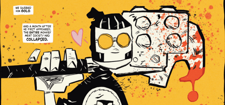
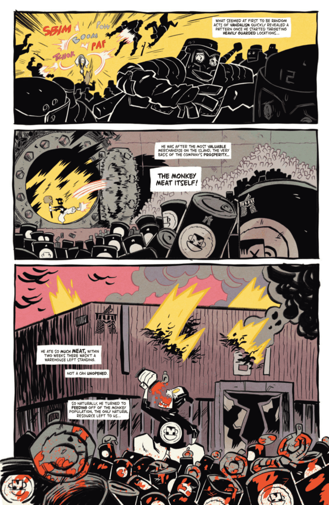
The Monkey Meat Corporation has fallen. After 4 issues setting up its far-reaching menace and power, the fifth and final installment in Juni Ba’s Monkey Meat mini-series opens by revealing that the company has met with an ironic fate. All it took was a consumer who’s a bit more enthusiastic than most. Someone so in love in with canned monkey meat that he’d eat the company out of their signature stock. Now the only option left to them is pouring whatever resources they have left into killing the little glutton. There’s comfort in knowing that there are things even the world’s most powerful company couldn’t see coming.
WRITING
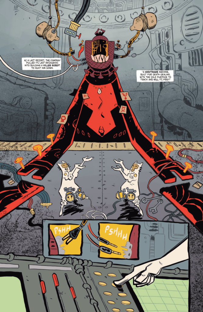
Juni Ba wastes no time in establishing the stakes of Monkey Meat #5, opening on a page of the mysterious “Golo,” equipped only with a massive, bloody can opener and a bottomless appetite. By page 2, he’s already cutting a swath through the company, smashing his way past employees in a bid to swallow can after can of processed meat. Page 4 has the company build a giant robot to stop him. This is an issue that moves fast, reveling in the chaos of collapse, while the Monkey Meat Corporation’s desperate bid to save what they can only compounds the violence and destruction. Because that giant robot won’t stay tame for long.
Up until this issue, the Monkey Meat stories tended to focus on individuals either trying to do their best in a corrupt system or being corrupted by it themselves. So there’s dark humor in the ultimate agent of change being an empty-eyed maniac. Characters throughout the issue can’t help but pin all their hopes on Golo, even while Ba makes it clear how selfish and thoughtless the character is. He’s positioned as an unsatisfying answer to a far-reaching problem. Up until now, there’s been nothing the company couldn’t monetize. But they’re undone by a grotesque parody of the ultimate consumer. Golo is a bit of a problem himself, though at least one that can finally rid the world of the Monkey Meat Corporation. And maybe there’s a small flame of righteousness within him, waiting to take over and inspire the people around him towards societal change. Maybe.
ART
Juni Ba jumps between chaotic all-out battles and quiet scenes of destruction as the island the series has taken place on slowly crumbles. Golo provides the energy and momentum for the issue, constantly wearing his emotions on his sleeve as he sways between extremes. He’s a silent, simple, cartoon character, coming from the tradition of Tom and Jerry or Wile E. Coyote, just with the sinister undercurrent of unchecked consumption. It gives all the heavier ideas the comic is tackling a lively touch. This is both a comic that dwells on the consequences of rampant consumerism and one where a man fights a robot with a giant can opener. The neon reds, yellows, and oranges, aid the comic by feeling simultaneously foreboding and energetic. His lettering keeps up the pace with the rest of his art, showing serious variety in expressing sounds. Shouts are rendered in scratchy, frantic lines, quieter footsteps in thick, simple brushstrokes. Not to mention Ba’s ability to throw out fun, memorable designs at a manic pace. Monkey Meat may have many modern anxieties at heart, but it’s a joy to look at.
VERDICT
Monkey Meat has been one of the best books on the stands since it debuted, and the concluding issue is no different. It’s out from Image Comics today, so make sure to pick one up, as this may be your last chance to grab the series off the stands. Though perhaps not. Companies as large as the Monkey Meat Corporation rarely stay down for long.
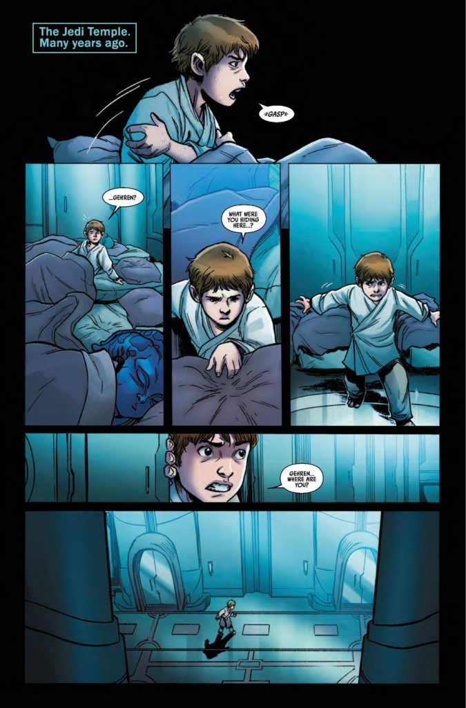
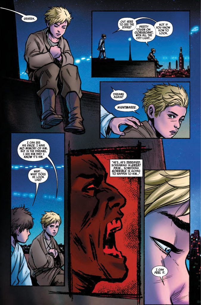
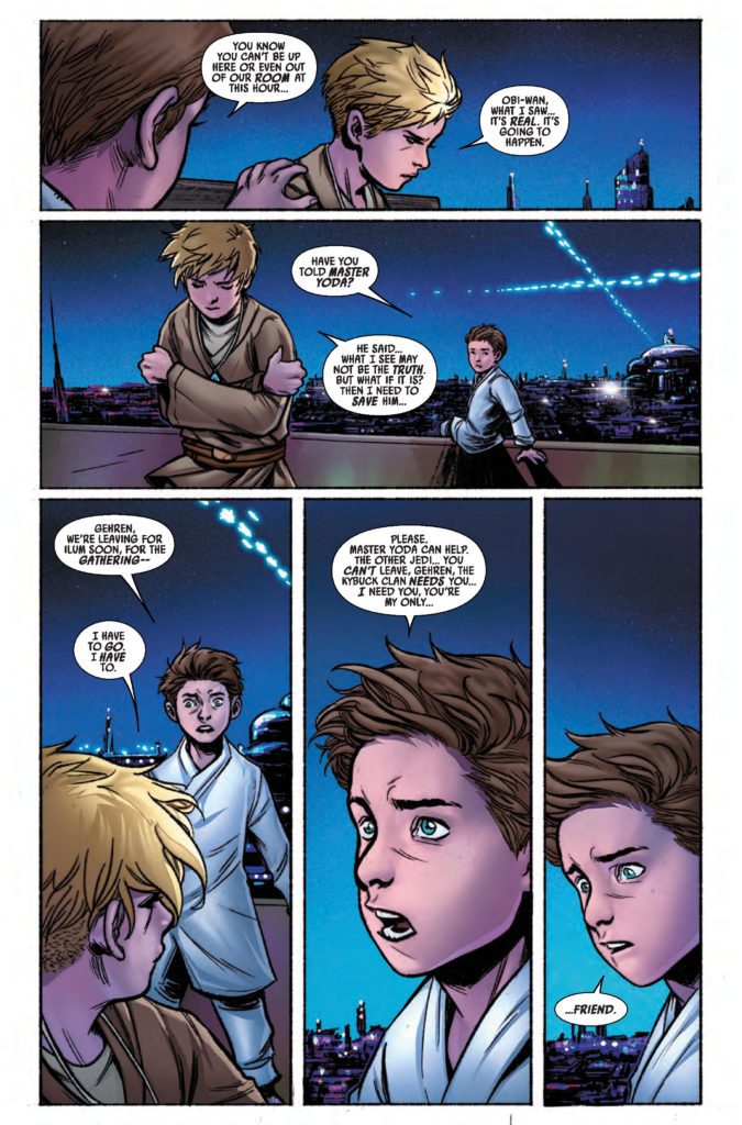
From writer Christopher Cantwell (Halt And Catch Fire, Regarding The Matter Of Oswald’s Body) and artist Ario Anindito (Star Wars: The High Republic) comes the recollections of one of modern fiction’s most beloved characters in Star Wars: Obi-Wan #1. With colors from Carlos Lopez and lettering from Joe Caramagna, this opening chapter offers a compelling look into one of Obi-Wan’s early memories. With a safe yet solid script and stellar visuals, this comic will be a must-have for fans of the iconic “Negotiator.”
“Fast approaches the ultimate destiny of one of the Jedi’s most renowned masters! As he spends his final days in the remote deserts of Tatooine, Obi-Wan Kenobi takes time to reflect on — and record — key moments of a heroic life long-lived. Writing in old leather-bound journals from his hermit’s hut, Obi-Wan remembers his days as a young Jedi Initiate, his trials as a Padawan, the crucible of Jedi Knighthood and the Clone Wars, and some of the earliest challenges he faced as a true Master of the Force! In this tale, Obi-Wan considers a watershed Youngling adventure he narrowly survived on Coruscant when he was but eight years of age…This is just the beginning of his Jedi journey!”
Writing & Plot
Christopher Cantwell is sure to entertain most fans with his script for Star Wars: Obi-Wan #1. This chapter sees Obi-Wan residing on Tatooine shortly before the events of the original film. Here, he’s reflecting on moments from his past that have never been seen before. This comic, as well as the whole mini-series, are set up as a frame narrative. Old Ben is sheltering in his hut riding out a sandstorm and remembering moments from his past, with each memory making up a new issue. This is a clever and fun way to give readers a collection of new tales starring one of the franchise’s most popular heroes. This issue itself offers something not yet seen in the canon: Obi-Wan when he was still a child. Watching Kenobi as a boy endure the hardship of learning the tough lessons that will go on to make him the Master he turned out to be is a compelling treat. Admittedly, the story and its structure are pretty safe and not terribly surprising. Nothing about this comic, from its serviceable dialogue to its well-written but a bit overbearing narration, will do much to really awe dedicated Star Wars comic readers. However, this is still a completely engaging chapter that is worth a read for those who want to see Obi-Wan at a point in his life we’ve never seen.
Art Direction
Easily the most impressive aspect of Star Wars: Obi-Wan #1 is Ario Anindito’s art. Just like his work in The High Republic, Anindito brings the Star Wars universe to life with an attention to detail that perfectly matches the visual style of the franchise while keeping his own art style intact. From the sand swept plains of Tatooine to the elegance of the Jedi temple on Coruscant, every setting looks the part yet feels especially unique in this comic. Classic characters, including Alec Guiness-era “Ben” Kenobi and others who show up look fantastic, and the work Anindito has put into the numerous aliens we cross paths with really shows. Where Anindito really flexes his skill, and this comic’s biggest visual surprise, is how he texturally changes his style from “past” to “present.” There’s a visible roughness to his pencils when we’re with Kenobi on Tatooine. The flashback sequence to child Kenobi has the more expected, modern digital style with very clean lines. Both styles are great, but Anindito’s Tatooine sequence has this stunning, almost classic aesthetic. He pulls off a style that sits somewhere between Sean Phillips and Steve Epting in those scenes, and it looks brilliant.
Carlos Lopez’s colors in this comic nail the rest of this issue’s visual experience. The arid landscape of Tatooine has scarcely been more stunning than when seen here in Lopez’s range of desert tones. At the same time, the cool metallic hues of the Jedi temple and the busy lights of Coruscant are respectively elegant and full of life as they should be. The lettering from Joe Caramagna is on par with that of all other Marvel Star Wars outings. Caramagna utilizes a suitable, easily legible font that works great for the reading experience but just sort of stays out of the way. Overall, this is a visually great looking and professionally composed comic book.
Verdict
Star Wars: Obi-Wan #1 is a safe yet wholly entertaining chapter that no doubt gives diehard Kenobi fans what they want. Christopher Cantwell’s script is sharp and does a great job revealing new parts of Kenobi’s past, even if it doesn’t really do anything all that surprising. The visuals from Ario Anindito and Carlos Lopez are stunning and surprisingly varied, offering one of the best looking single Star Wars comics in recent years. Be sure to grab this little piece of Obi-Wan history when it hits shelves on May Fourth!
Tyler Perry’s A Madea Homecoming is the 11th film in the long-running series about a loud and proud Black woman played by writer-director Tyler Perry. Composer Philip White blends family drama and comedy for the film’s score.
The new film in the Madea franchise centers around the return of Madea’s great-grandson, Tim (Brandon Black), who is coming home from college. Tim brings Davi (Isha Blaaker), his biracial roommate home with him. Unfortunately, Tim also has a secret to share with his family. The film descends into hilarious chaos with fights between romantic rivals and a botched marriage proposal. A Madea Homecoming delivers when it comes to everything the franchise promises.
PopAxiom and composer Philip White discussed instruments, becoming a composer, and scoring Tyler Perry’s A Madea Homecoming.
Supernatural
Philip grew up in Madrid, Spain, where he picked up guitar at thirteen. But he moved across the pond for college. Philip went to Tufts and New England Conservatory for a five-year, double-degree program. Philip says “It was great. I don’t think I would’ve enjoyed going to just one or the other. I felt I needed a liberal arts education, but I wanted a strong musical education.”
“I moved out to USC to do a one-year program for composing,” he says. Soon after, he met Christopher Lennertz and started assisting him in 2005. “I could not have asked for a better mentor. In 2008, he gave me a shot at the “James Bond: Quantum of Solace” video game.”
A lifelong Bond fan, Philip’s time on Quantum of Solace was “heaven getting to use those themes. From then on, Chris brought me into more projects on which to collaborate.”
One of those collaborations included a show with a legendary run on television — Supernatural. Philip started programming when the show began. By the third season, he began writing additional music, and by season 13 was a credited co-composer.
About Madea’s Homecoming
Philip’s collaborations with Chris brought the young composer into the world of Madea. Tyler Perry asked Chris to score Boo 2: A Madea Halloween. Chris was stretched thin by other projects at the time, so he suggested that he collaborate with Philip on it. “Tyler Perry and his team were very gracious to bring me on board. A Madea Homecoming is my fourth collaboration with the studio,” Philip explains.
“He’s a performer in the true sense of the word. He can inhabit anybody,” Philip says about Tyler Perry. After Boo 2, Philip scored Nobody’s Fool, A Madea Family Funeral, and A Madea Homecoming. He spoke to the filmmaker’s impact: “Besides his incredible creative output, he’s created this incredible studio outside Atlanta that employs a world of people. I have tremendous respect for him.”
Philip came on board when the cut was almost locked. So, the process for this project began with viewings with key collaborators. “I sat down with Joel C. High, the music supervisor for Tyler Perry Studios, who is Perry’s musical right hand, along with Sami Posner and Johnny Caruso, the music editor.”
“We figured out where the music should start and where it should end,” he says about the results of those meetings. “We figured out what styles we were looking for in different areas.”
Philip explains that the music “needed to serve the comedy and the more intense family moments.” So how did he accomplish that balance? “For the comedy, I relied on a band sound with drums, upright or electric bass, electric guitar, Hammond B3 and Rhodes, and hand percussion. That provided a feeling for whenever Madea and her entourage were on screen.”
“For the more family moments,” he continues, “we had a 22-piece string ensemble with piano and a couple of woodwinds. We had a month-and-a-half before it had to be delivered. So, a month of writing and a couple of weeks of recording and mixing.”
Adjustments
The filmmaking process is an ebb and flow of creativity and compromise. “There was a little bit of flexibility,” Philip says about the process for A Madea Homecoming. “Our music editor created a temp track for about two-thirds of the movie.”
“So, when we spot it, we can play with it and come in or out of a cue sooner or later,” he continues. “Even at the mix stage, we’re still making adjustments. A spot might feel empty, so we’ll need something there, or another spot might feel like the music’s competing with dialogue or sound effects, so it will have to be dialed down or taken out entirely.”
The rhythm of creating for film and television requires multiple viewings to understand the whole picture. “Sometimes when you’re spotting, you’re stopping and starting a lot, so it’s hard to get a flow. So, there’s always little adjustments.”
Wrapping Up
Philip explains what instruments he uses to get started on a project. “It depends on what I’m hearing the score should be. I find that if it’s going to be guitar-centric, I’ll start on the guitar. If I write for guitar, it tends to be for the guitar,” he continues. “The advantage of the piano is that it can be for anything, at least for me. I can imagine it for any number of instruments. I might also hum or sing if I feel it should be more lyrical.”
Philip’s brief list of influences begins with John Williams. “Not to be cliche, but it’s true. I remember watching Raiders of the Lost Ark in theaters when I was seven. I was blown away by the movie. I feel like he scored my childhood. Raiders, Star Wars, Jaws, and ET formed the soundtrack of my youth.”
“I love Thomas Newman. I think he’s so unique,” he continues his list. “Gabriel Yared, who is most famous for The English Patient. I love his writing. Tōru Takemitsu, who scored Ran, is just phenomenal.”
He also admires Bernard Herrmann and his collaborations with Hitchcock. “There’s a flashback scene in Madea Homecoming that we scored in a noir style, as a nod to Herrmann.”
“If I could collaborate with any of my previous collaborators, I would be in heaven. It was such a joy working with everyone at Tyler Perry Studios,” Philip declares.
Finally, what’s a dream project Philip would like to work on someday soon? “I love animation. I’d love to do more animated projects or a musical. I have a real soft spot for musicals.”
Is Tyler Perry’s A Madea Homecoming on your watch list?
Thanks to Philip White and Impact24 PR
for making this interview possible.
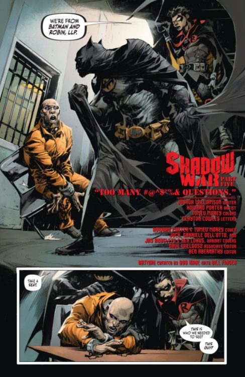
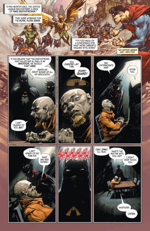
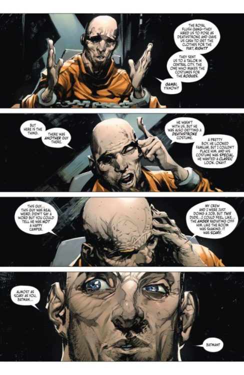
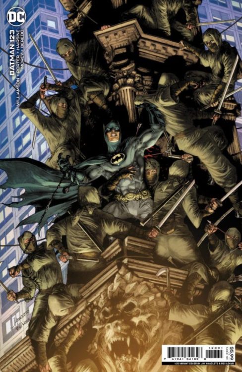
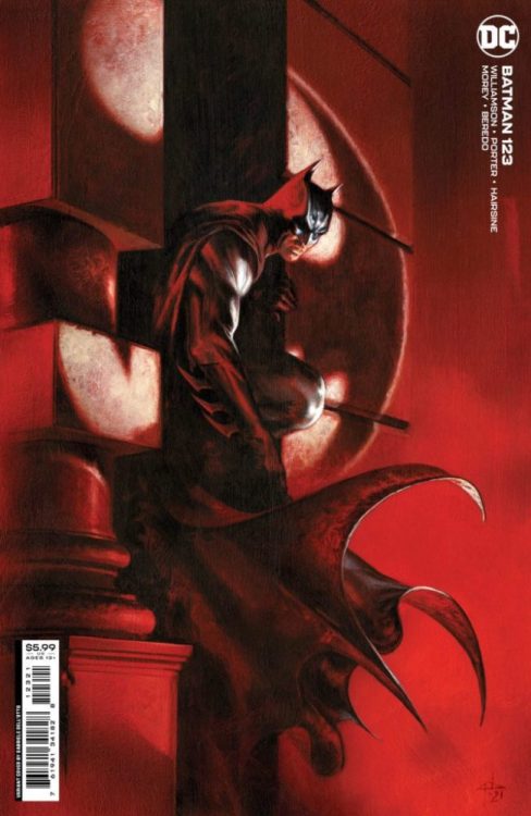
BATMAN #123 hits your local comic book shop on May 3 from DC Comics. The book is written by Joshua Williamson, with art by Howard Porter, Tomeu Morey drops the color, and you will read Clayton Clowes’ letter work.
About BATMAN #123: SHADOW WAR, PART 5 – Batman and Robin are finally reunited! Together they will hunt for the truth behind the death of Ra’s al Ghul! But then who is left to defend the Secret Society against the League of Shadows? Deathstroke’s fight against the Demon’s Shadow ends with a shocking cliffhanger! Plus, what happens when you get Deathstroke infected with Joker toxin? Find out in the epic backup story!
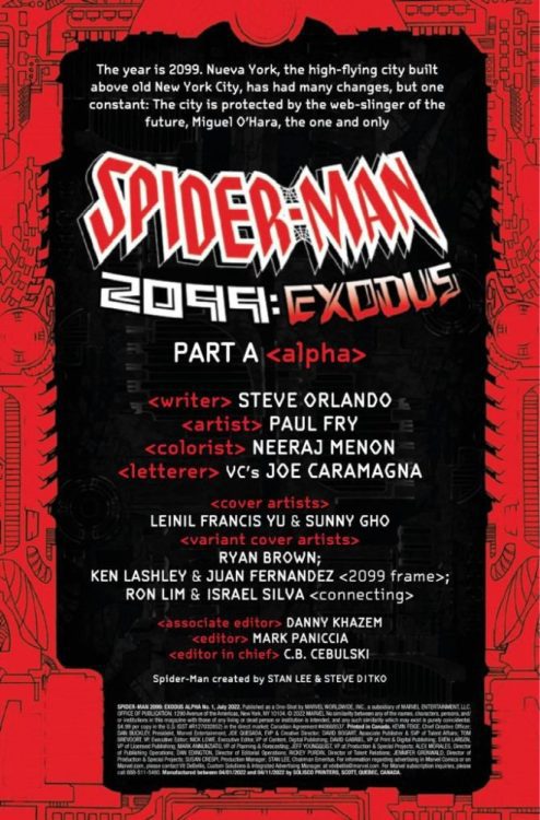
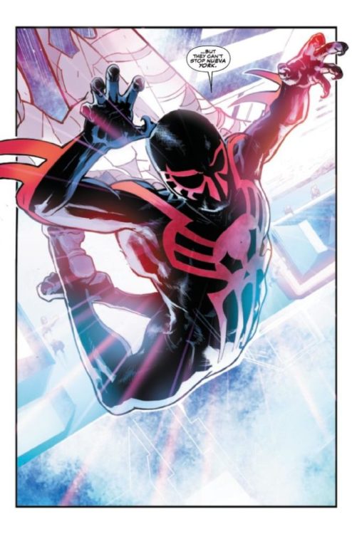
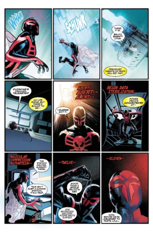
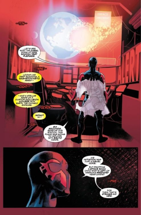
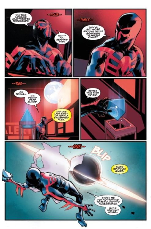
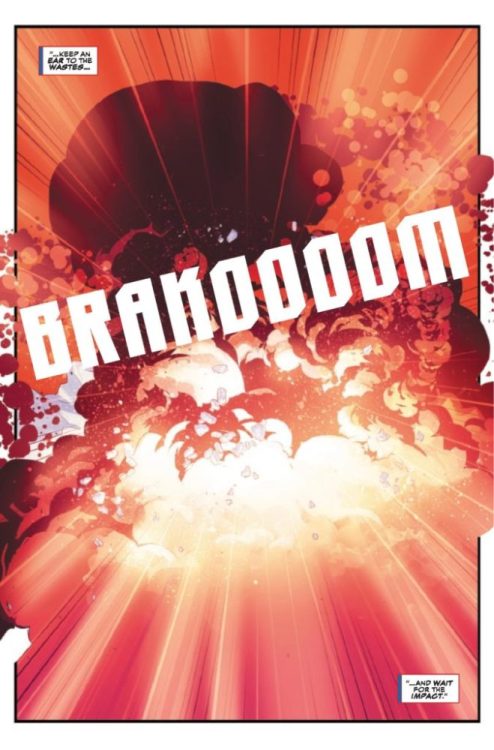
SPIDER-MAN 2099: EXODUS ALPHA #1 hits your local comic book shop this week from Marvel Comics. The book is written by Steve Orlando, with art by Paul Fry, colors work from Neeraj Menon, and you will read Joe Caramagna’s letter work. Leinil Francis Yu and Sunny Gho created the cover.
About the issue: Miguel O’Hara is back! After fighting battles across the timestream, MIGUEL O’HARA is at last back defending his present and our future! For SPIDER-MAN 2099, the only thing constant about life in Nueva York is change. So when a cataclysmic crash creates a new Garden of Eden in what was once the American Wastelands, Spider-Man knows exactly what the next atrocity will be. Watch as THE CABAL plans to set society ablaze — and you’ll never guess who is leading them!
Read the five page preview of SPIDER-MAN 2099: EXODUS ALPHA #1 below:
Neal Adams and Bill Sienkiewicz Batman: Odyssey Unused Page Original Art (DC, 2011)
Legendary comic book artist Neal Adams passed away on April 28, at the age of 80. Since his passing comic book creators and fans have reflected on Adams’ influence and inspiration. Bill Sienkiewicz took the time to talk about his conversations with Adams with respect to what it was like to ink Adams’ pencil work. Sienkiewicz posted the below message on Facebook.
On inking Neal.
Neal and I would have countless discussions about his pencils and what he felt inkers did or did not do with his pencils. He was quite candid about who he felt did or did not capture what he was going for. ( and no I’m not naming names.)
He was the first to admit his pencils were deceptive; they looked very tight but were remarkably open to interpretation due to his use of the side of the pencil and of gradations of pressure. His pencils were actually quite painterly, often to the consternation of inkers who were not being hired to do grayscale or washes in their finishes…. Not that printing would accommodate them anyway.
As a result, he felt a some inkers (and in some cases ones that fans absolutely loved) missed the point of his pencils, actually often didn’t quite capture what he was going for. He felt many inkers ( both of his work and of other pencilers whose work had a full value range of blacks, whites and grays) inked the pencil lines themselves and NOT the values of said lines, with the resulting art having areas that Neal felt “punched holes” in areas of transitions, ruining the turning of the forms.
Because we ALSO discussed painting and the importance of tones, values, grays etc. I actually felt I understood what he meant.
I saw Neal’s pencils not strictly in black and white or binary terms, but very much value-dependent in context/ value-driven, and that’s what I personally tried to capture in my inks over him.
I didn’t try to ink the pencil line as a one-to-one ratio, (- i.e., one part graphite = one part India ink) I tried to ink the relative value of it, something admittedly challenging when not using grayed or watered down ink. This often meant inking some lines thinner or thicker to approximate the ‘grayness’ of said line in context. And context is key.
It wasn’t something he asked me to do; it was something I found exciting and challenging and was my own peculiar way of addressing my inking of him.
Turns out he actually liked what I did .which thrilled me. I mean thrilled me no end.
But damn, when I was “off”, he’d would not hesitate to call me and proceed to discuss what I’d done, or failed to do.
“Hey kiddo…. About page 4 panel 3…“
To be honest, I loved these conversations, which almost had the opposite effect of making me want to capture what he was looking for.
They made me give occasional thoughts to “how can I mess this up in just the right way so Neal and I will able to talk for a few hours?”
In fairness, turns out he”d also call if he really liked something I did, so I didn’t have to resort of any nefarious inking screw-ups.
I’d honestly just like to think he actually enjoyed shooting the shit and talking art with a friend.
Gonna miss those talks.
-Bill Sienkiewicz
Below is a great example of Sienkiewicz’s inks over Adams’ pencils.
Neal Adams and Bill Sienkiewicz Batman: Odyssey Unused Page Original Art (DC, 2011)
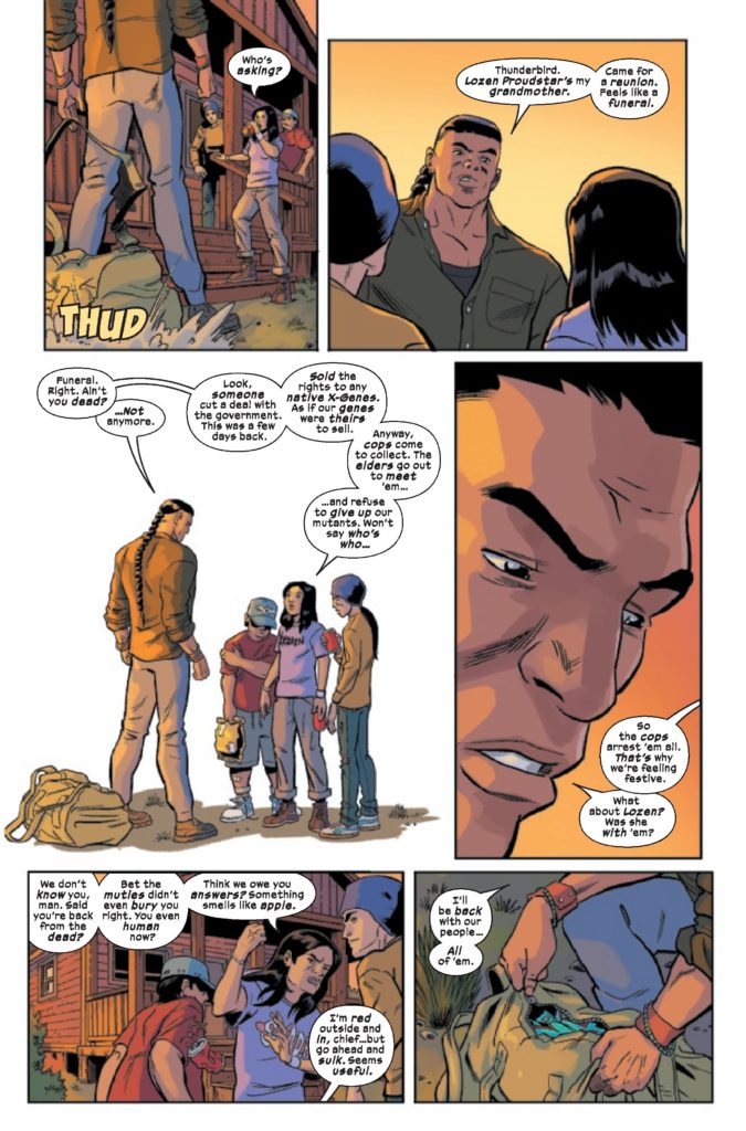
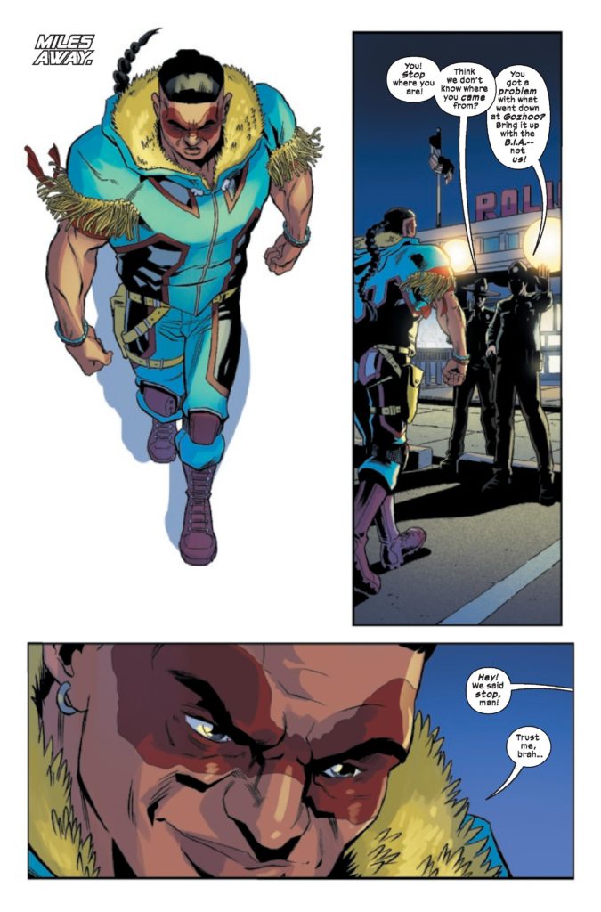
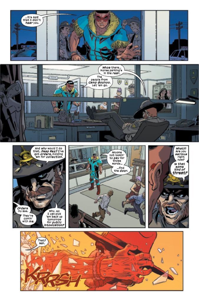
From writers Steve Orlando and Nyla Rose and artist David Cutler comes the return of a character more famous in death than in life with Giant-Size X-Men: Thunderbird #1. Featuring inks from Jose Marzan Jr. and Roberto Poggi, colors by Irma Kniivila, and lettering by Travis Lanham, this one-shot revives and reintroduces us to the first X-Man to die under Xavier’s watch. With a thoughtful, complex, and poignant script and equally thoughtful visual design, this return will undoubtedly stand as one of the most important X-Men comics in recent memory – for more reason than one.
“The world John Proudstar has returned to is completely different from the one he once knew. Looking to find refuge in the familiar, Thunderbird seeks out someone from his past at an Apache reservation…and uncovers a horrifying threat to the Indigenous mutant community. Will Thunderbird be able to save his people? Or will his justified rage lead him astray?”
Writing & Plot
Thunderbird really wasn’t around long enough to be firmly established as a character, so it’s great to see Steve Orlando and Nyla Rose do some thoughtful character building in Giant-Size X-Men: Thunderbird #1. Having the long-dead Native American mutant given the Krakoan resurrection treatment requires a careful hand. Fortunately, Native American pro-wrestler Nyla Rose teamed up with Steve Orlando to be just that. Here, Rose and Orlando establish that John Proudstar never quite felt at home with the X-Men back when he was alive. He’s grateful for what Xavier and the X-Men did for him, but for Proudstar being in a superhero team wasn’t that much different from his time in the Marines. The choice to send Thunderbird on a journey back home immediately after his resurrection on Krakoa is a bold and wise choice. I can’t get into spoilers here, but the writing in this one-shot plays around with ideas of identity, legacy, and loyalty in ways that are both direct and buried under clever subtext. This is a very exciting comic not just for the whole “bringing back a dead character” aspect, but because it handles said resurrection with such intelligence. The socio-political ramifications both in the Marvel universe and here in reality of bringing back a Native character in the year 2021, in the wrong hands, could have ended up with some elements that were rather…problematic. Orlando and Rose really impress with their efforts here.
Major thematic and metanarrative concepts aside, this comic also succeeds in just being a good Marvel comic book. The sequence of events that set up the action have the same kind of stakes and tension that old-school X-Men comics do. Orlando and Rose’s dialogue has that classic comic book-y one-liner snark. Even with the more serious tone of some of the book’s subjects, it still knows how to be a hell of a lot of fun.
Art Direction
Relative newcomer to mainstream comics and member of the Qalipu Mi’kmaq First Nation David Cutler lends his craft to the pages of Giant-Size X-Men: Thunderbird #1. He, along with inkers Jose Marzan Jr. and Roberto Poggi, craft a visual experience that is unique to itself while still sharing the house style of the other Krakoa-era X-books. Cutler’s compositions are super-tight, and his actions sequences that make up the entire middle section of the comic are full of energy and a blast to witness. His facial animations and detail work, again with the assistance of Marzan and Poggi, makes even the conversational sequences engaging and endears the reader to each individually designed character. This one-shot’s pacing feels so effortless and natural because of Cutler’s careful composition. Quite a lot happens in this comic, and Cutler cuts it all together with simple yet impressive layouts. Now, the big elephant in the room regarding this comic’s art is Thunderbird’s new costume design. Liking or disliking the new suit is entirely subjective. A superhero costume can only be seen as “bad” if it somehow betrays what that character is supposed to stand for. Thunderbird wasn’t originally around long enough to be able to stand for anything. Here, under the creative thumb of two native creators, that has changed. Cutler has made John Proudstar’s new turquoise costume with the symbolism that is important to his nation and origin. Regardless if you like this costume or not, it’s certainly more meaningful than the original.
Speaking of colors, Irma Kniivila provides the rich tones of Proudstar’s new suit and every other surface in this one-shot. Her work here is vibrant and helps craft the setting of each scene with that fantastic final detail. Sunlight settling over the rocky cliff of the American Southwest has scarcely looked better in a comic. The lettering from Travis Lanham adheres to the same style that the other current X-books have been using, but with some especially great SFX features. The dialogue and narration letters are smooth and unobtrusive, hiding them in the reading experience. His FX work serves as the perfect punctuation to the action sequences, with their presence highlighting all the big impacts in those panels perfectly. Overall, this is a very solid looking comic book that offers a smooth and often gorgeous read.
Verdict
Giant-Size X-Men: Thunderbird #1 is a bold and thoughtful return for a long-dead character. With insight and intelligence, Steve Orlando and Nyla Rose’s script engages with John Proudstar’s legacy as both the first mutant to die for Xavier, and as a Native American superhero. The visuals from David Cutler, Jose Marzan Jr., Roberto Poggi, and Irma Kniivila are well composed and rich, and perfectly pace every plot point this comic covers. Be sure to grab this major moment in mutant history when it hits shelves on May 4th!


")