Sonic The Hedgehog #27 keeps the action high thanks to writing by Ian Flynn, pencils and inks by Evan Stanley and Adam Bryce Thomas, colors by Matt Herms and Bracardi Curry, and lettering by Shawn Lee. The quest to claim the Chaos Emeralds is on and if the good guys don’t get them, all is lost. Does the issue deliver enough action for the audience or does it run out of steam halfway through?
“All or Nothing,” Part 2. Will Tails, Amy, Gemerl, and Cream be able to get the Emeralds, or will the Restoration’s last desperate plan fall to ruin?
Writing
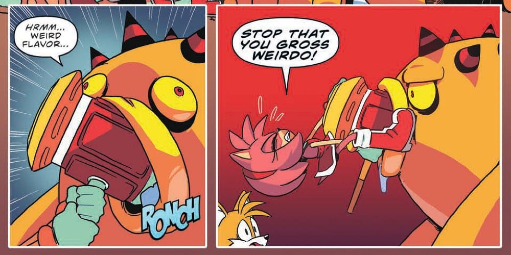
The battles against each of the Deadly Six to obtain the Chaos Emeralds continues and manages to deliver some great battle scenes. Amy and Tails have to fight against Zomom, who has more of a stomach than brains. Though there is a joke about how easy Zomom is to fool, the giant monster doesn’t simply hand over the Chaos Emerald to the good guys. Instead, the battle results in some property damage and some careful planning to have any hopes of achieving success.
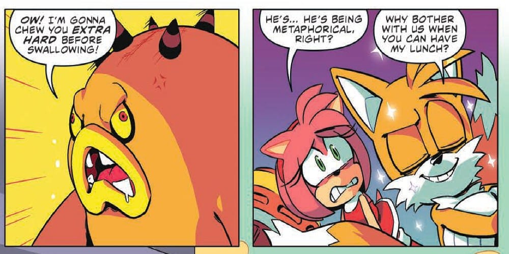
The real draw of this issue is Cream the bunny and Germerl trying to defeat Zeena. The relationship between Cream and Germerl is tested and their struggle tugs on the heartstrings. Ian Flynn makes it clear never mess with Cream or you will face the wrath of Germerl.
Artwork
The pencils and inks by Evan Stanley and Adam Bryce Thomas achieve a smooth flow which is perfect for fight scenes. The attacks on the Deadly Six come off with impact and damage. The looks of fear and anger on Cream’s face are very expressive and help to show how fighting is a new experience for her.
With the colors by Matt Herms and Bracardi Curry the magic Zeena uses is very eyecatching. Between her attempts to control Germerl and the energy tethers she uses in battle, the color adds to the weights behind the attacks. Also, two different sunset scenes achieve contrasting emotions, one of sadness and the other of impending danger with the execution of different colors.
The lettering by Shawn Lee adds a phenomenal audio quality to the issue. The effect of “Piko” as Amy uses her hammer comes off as a perfect representation of the character’s ability. The lettering also adds to the rage Gemerl experiences when Zeena puts Cream in danger.
Conclusion
The battles in Sonic The Hedgehog #27 are intense but the struggle the characters face in the process will be what really wins readers over. Seeing a character which has limited facial features like Germerl able to express emotions is a success thanks to the art and story working in harmony. With any luck, the series will continue to deliver at this level of quality.
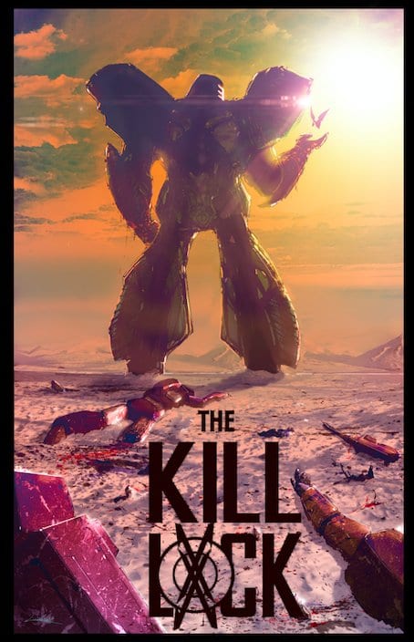
The fourth issue of Livio Ramondelli’s “The Kill Lock” brings this motley crew of machines together like a dysfunctional family, just before an unpredictable climax. The stellar characterization combines with Ramondelli’s gorgeous art and Tom Long’s letters to create what may be the most easily enjoyable issue thus far.
“If their sources are right, they’re on the World of the Cure—the one and only place to have the Kill Lock removed and for four robotic criminals to save their lives. But will this barren world provide their salvation… or their destruction?”
Writing & Plot
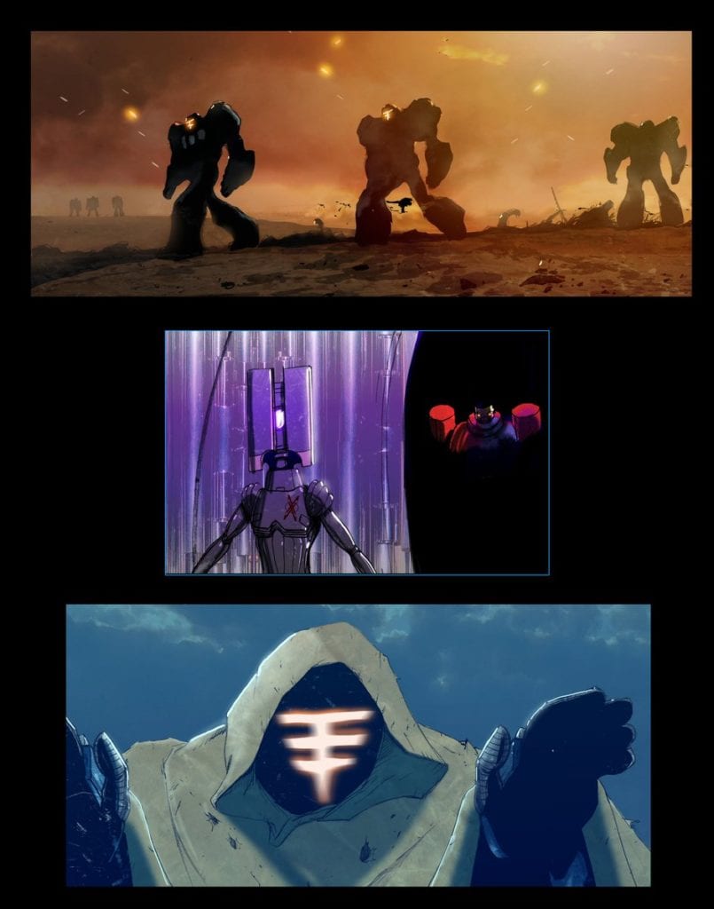
Livio Ramondelli‘s winning formula with “The Kill Lock” has always been his focus on characterization, and using that to bolster the plot and worldbuilding. Issue #4 spends some time on the backstory for “The Wraith,” and it once again feels earned. The story learned about the character is utilized in the rest of the issue. The quartet’s shifting attitudes towards one another (which comes out of necessity) isn’t forced into the plot. Ramondelli was clever to deliver this sort of writing after the ominous foreshadowing in the prior issue. Making “The Kid” the lynchpin for the whole group is a choice backed up by the necessity for survival, but watching them bond over both him and their circumstances is truly a joy to read. This issue’s tumultuous events in the latter half following the lighter scenes increase the stakes exponentially going forward, and it will be nervewracking to see what happens as the story heads into the climax.
Art Direction
Livio Ramondelli’s artistic mastery of desolate environments and unique robots extends into “Kill Lock” #4. His ability to make wholly unique designs for the four central characters (as well as extras) that also display considerable personality through only body language is wildly impressive. As an artist first and foremost, Ramondelli knows how to let the visuals speak for themselves, which is why his characters exhibit so much through the posture or the framing of images. The used future aesthetic of this universe, replete with burned-out deserts and uninhabitable tundras, reinforces the desperate tone of the series. The Lettering from Tom B. Long fluctuates in font and style depending on who’s speaking just as it should, but it’s the Wraith’s font that gets the most special treatment. His lettering is reminiscent of some sort of medieval-esque text, and it genuinely plants that character’s manner and speech in a way that the art and dialogue couldn’t possibly do alone. The visual work here is once again a gorgeous tandem of character focus and world design.
“The Kill Lock” #4 is another meticulously crafted chapter in this surprise Sci-Fi hit. Livio Ramondelli’s handling of character development feels natural and is timed perfectly to max out tension before the major climax. His visual work further allows for focus on the four characters as they face hostile environments. This, along with Tom Long’s thoughtful lettering, makes for a consistently stellar series that never fails to impress and engage. Be sure to keep picking this series up from your local comic shop when this issue hits shelves on 3/25.
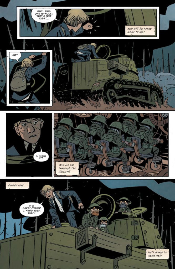
Ansel’s quest comes to a surprising conclusion in FOLKLORDS #5, available in comic book stores on Wednesday, March 25th. After embarking on a journey to find answers to questions about his origins, the out of sorts hero has faced many fantastical challenges across the land. However, it appears our modern, “real” world has invaded not only Ansel’s dreams but his plane of existence as well. Will he and his band of friends prevent the two realities from destroying each other? And where are the Folklords?
Story
The story opens up with a bang (literally) as Ansel, Archer, and Ugly hide behind a barrier as a World War 2 tank barrels down their path. It seems that the modern world is meshing with their reality in highly destructive ways. Yet Ansel notices something peculiar about the tank: it’s made of wood.
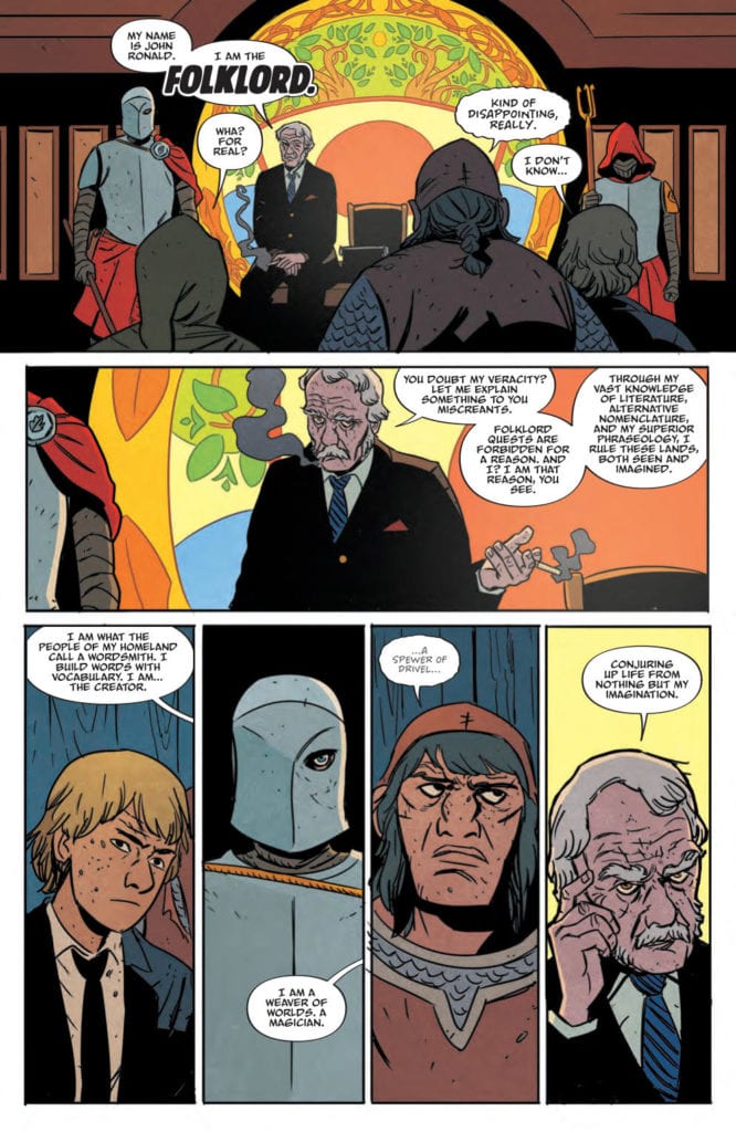
As it turns out, a group of drugged gnomes were forced to pilot the tank as a ruse. The real danger lies in the group of Librarians, who soon apprehend our heroes. And in a short few panels, readers are introduced to John Ronald, a.k.a. The Folklord. And he claims he’s invented the entire world they’re living in with nothing but his mind.
Matt Kindt’s narrative contains all of the thrill and flair one would expect out of any best-selling fantasy novel. The build up to the Folklord’s reveal is played out well, slowing down afterward as the reality of his position takes time to set in. But even though things take a turn for a worse, Kindt finds ways to balance the tone so readers don’t dwell in despair for long.
Artwork
The illustrations within FOLKLORDS #5 are a perfect blend of modernity and fantasy. Matt Smith’s penciling and ink work incorporates suits, ties, and war attire in the middle of a fantastical labyrinth. Colorist Chris O’Halloran fills these “modern images” in with a combination of the bland colors to create a stark difference between them and Ansel’s colorful world. In addition, Jim Campbell’s lettering looks as if it was torn from a fairytale book, adding to the authenticity of this tale.
Comic Covers
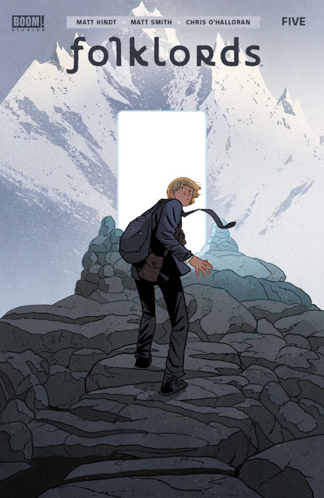
Main Cover
Smith put together the main cover of this issue, and it captures the essence of this issue. We see Ansel ascending a mountain and coming upon a shining pinnacle, representing the conclusion of this journey.
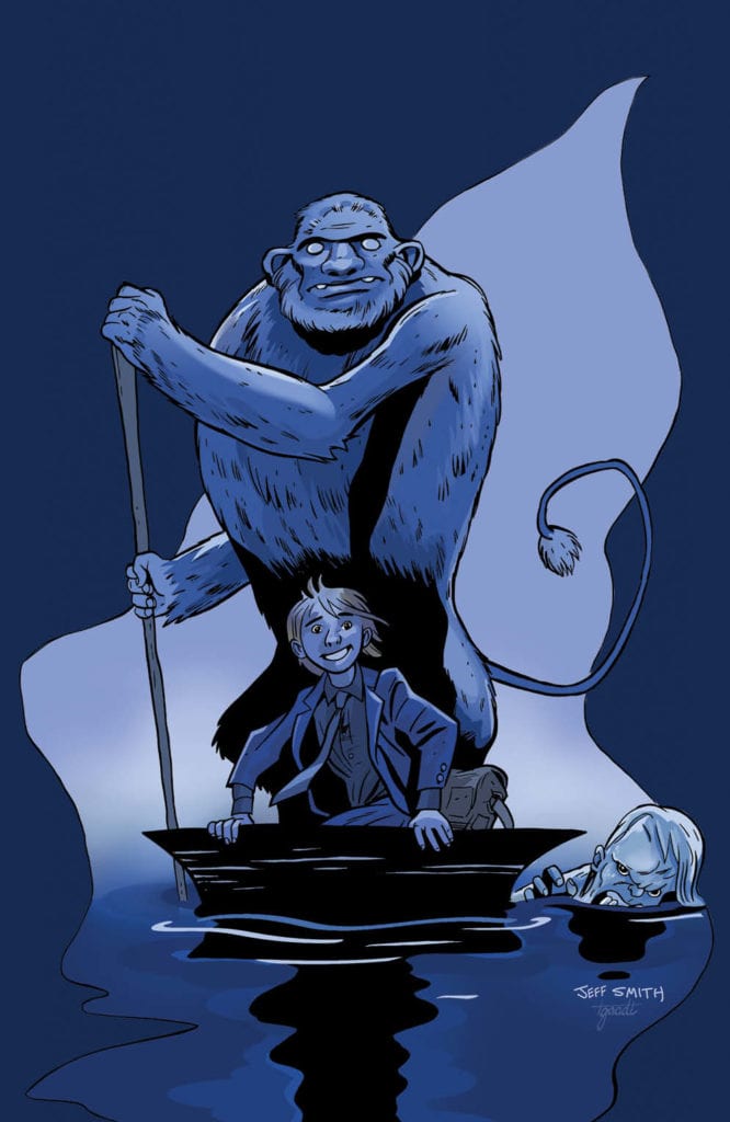
Unlocked Retailer Variant Cover
Jeff Smith’s variant cover depicts Ansel smiling gleefully as he’s ferried across a river into unknown territory. It looks much like the River Styx, drawing analogies to the fabled passage in Greek mythology.
Conclusion
FOLKLORDS #5 is a satisfying conclusion to this exciting narrative, but it also opens up the door to something totally new. We hope to see more from Kindt, Smith, and team in the future!
What do you think about the Folklord’s identity? Let us know in the comments below!
Of all the rapidly unfolding COVID-19 news and its effect on the comic industry in particular — such as the canceling/postponement of the entire spring convention season — we may have just gotten the biggest blow yet. Diamond Comics, which handles the majority of distribution to U.S. comic stores, today announced a freeze on all new product.
What that means for customers in the short term is that physical comics (like this week’s Action Comics #1021) will no longer be available in stores for the foreseeable future.
Here’s the official statement to retailers from Diamond CEO Steve Geppi:
CORONAVIRUS EFFECTS ON DISTRIBUTION
As everyone knows, the world faces ever-increasing challenges related to the COVID-19 pandemic. Its effects on the comics & collectibles and tabletop gaming industries have been felt far and wide. We are hearing from thousands of retailers that they can no longer service their customers as they have in the past, many of them forced to close by government action or resort to in-person or curbside delivery. Even those still open are seeing reduced foot traffic in most cases, a situation that seems likely to worsen with time.
Our publishing partners are also faced with numerous issues in their supply chain, working with creators, printers, and increasing uncertainty when it comes to the production and delivery of products for us to distribute. Our freight networks are feeling the strain and are already experiencing delays, while our distribution centers in New York, California, and Pennsylvania were all closed late last week. Our own home office in Maryland instituted a work from home policy, and experts say that we can expect further closures. Therefore, my only logical conclusion is to cease the distribution of new weekly product until there is greater clarity on the progress made toward stemming the spread of this disease.
EFFECTS ON DIAMOND COMIC DISTRIBUTORS
Product distributed by Diamond and slated for an on-sale date of April 1st or later will not be shipped to retailers until further notice. For the time being, however, we have been able to develop procedures with our teams at the distribution center in Olive Branch, MS to safely continue fulfillment of direct ship reorders for the retailers who are able to receive new product and need it to service their customers. It’s unlikely that orders will be filled on the same day they are placed, and these plans are subject to change if at any point we no longer feel that we can safeguard our teams while fulfilling orders.
Product distributed by Diamond UK and slated for an on-sale date of March 25th or later will not be shipped to retailers until further notice. Further updates with regard to reorders and other Diamond UK-specific information will be communicated directly to their customers as information becomes available.
EFFECTS ON ALLIANCE GAME DISTRIBUTORS
Product distributed by Alliance has been shipping from our Fort Wayne, IN and Austin, TX warehouses. Both are closing at the end of the day on Tuesday, March 24th, in the interest of employee safety and to comply with direction from local governments. Any orders not shipped by that time will not be processed until further notice. Your dedicated sales team will still be working remotely and will help you with any orders you’d like to place today or questions you may have.
OUR SHARED PATH FORWARD
With these changes in our distribution strategy, we will work with our publishing partners to develop programs that will address product already in the pipeline and what will happen when we resume distribution. We know that during this time you will face many challenges, and we will direct our energies toward addressing them, rather than fighting on increasingly numerous fronts to get product out.
For those retailers who remain open in various forms, I encourage you let loose your own creativity. For the time being, you will be able to replenish your perennials from Diamond and/or Alliance, but you should also remember the stock you already have in your stores. If your doors remain open, it’s likely you will have customers who will continue to seek diversion from events of the world. Special sales, promotions, and even eBay can help you bring in cash during this trying time. Product for which you’ve already paid may well hold some of your answers. There have been many solid suggestions offered about how to help our retailers, and we will bring many of them together in future communications.
Besides the industry’s most immediate needs, we have been and will continue looking toward the future, when we see stores reopening, bringing staff back onboard, and getting customers in the door. We are looking at issues like debt accrued due to this crisis, what reduced ordering means for your discount tiers, and the availability of credit to help stores through and after this difficult time. We don’t have all those answers today, but we understand the many issues you are facing and look forward to addressing them as partners who all have an interest in the long-term health of the industry we love so much.
As I mentioned in my last update, this industry has been one of the greatest joys of my life, from my days as a collector to a retailer to today. I and my Leadership Team have made these decisions knowing full-well the effect they will have on all of you, as well as our publishing partners and our own team members around the world. At the end of the day, the safety and security of our teams and yours, along with the many customers we all serve, is paramount. I again thank you for your ongoing patience and support.
Thank You,
Steve Geppi
Chairman & CEO, Geppi Family Enterprises
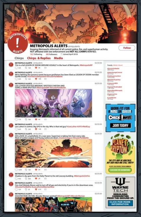
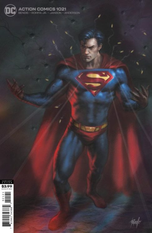
Action Comics #1021 hits your local comic book shop next week (if it’s open, ugh), but thanks to DC Comics, Monkeys Fighting Robots has a six-page preview for you to check out.
Two splash-pages in one preview must be our lucky day. The Twitter feeds continue to be a great Easter egg hunt of details. It also slows the reader down, which sets you up to enjoy the comic book.
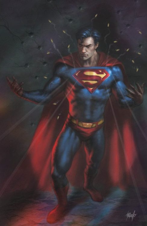
Brian Michael Bendis wrote the issue, with pencils by John Romita Jr., Klaus Johnson inked the book, Brad Anderson dropped some color, and you will read Dave Sharpe’s letters. Lucio Parillo created the variant cover.
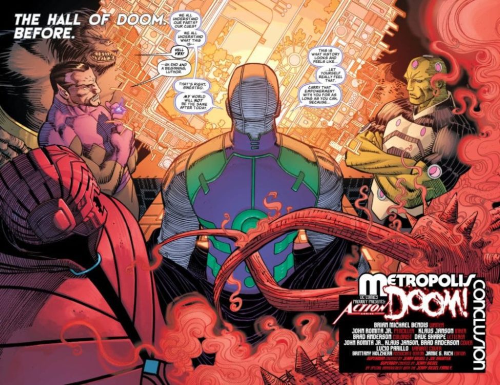
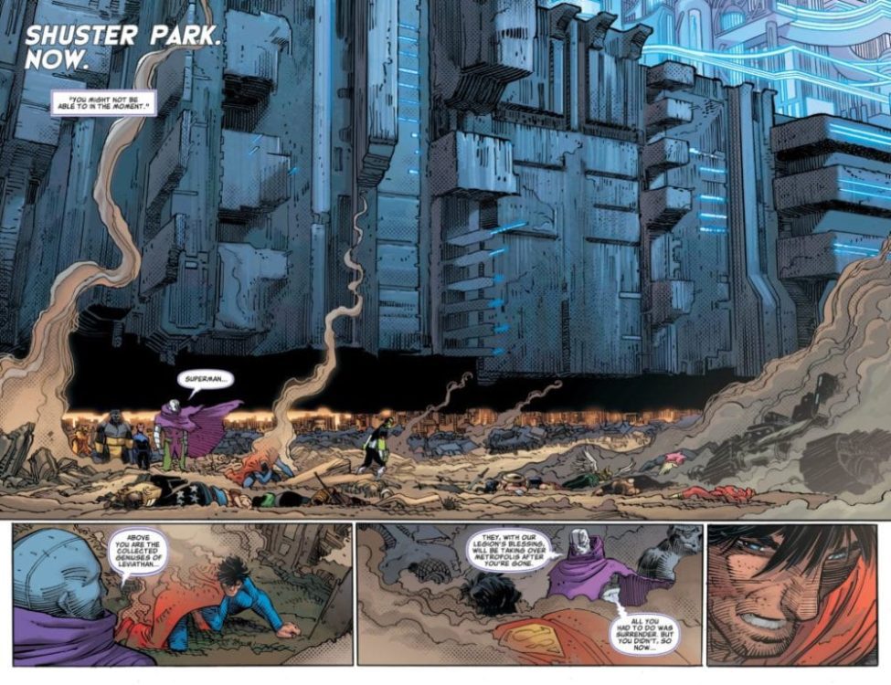
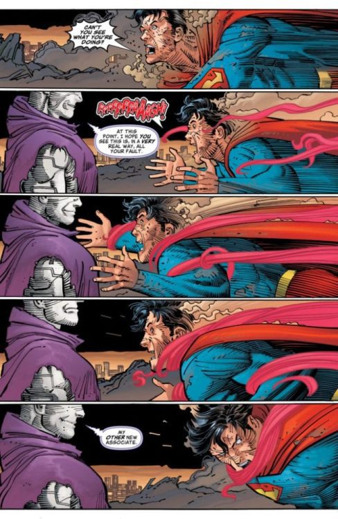
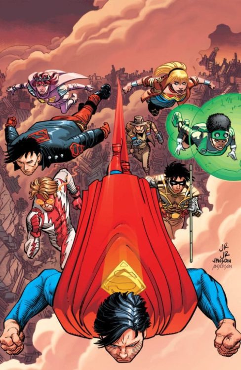
About Action Comics #1021: Metropolis down! The blockbuster supervillain team-up of the century continues. Leviathan! The invisible mafia! The Legion of Doom! All have descended on the city of Metropolis to challenge Superman at his most vulnerable moment. With the truth about the Man of Steel’s secret identity out in the open, all the rules of engagement have changed-and no one is safe! Guest-starring the Justice League and Young Justice.
Are you reading Bendis’ run on Action Comics? Comment below with your thoughts.
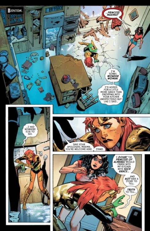
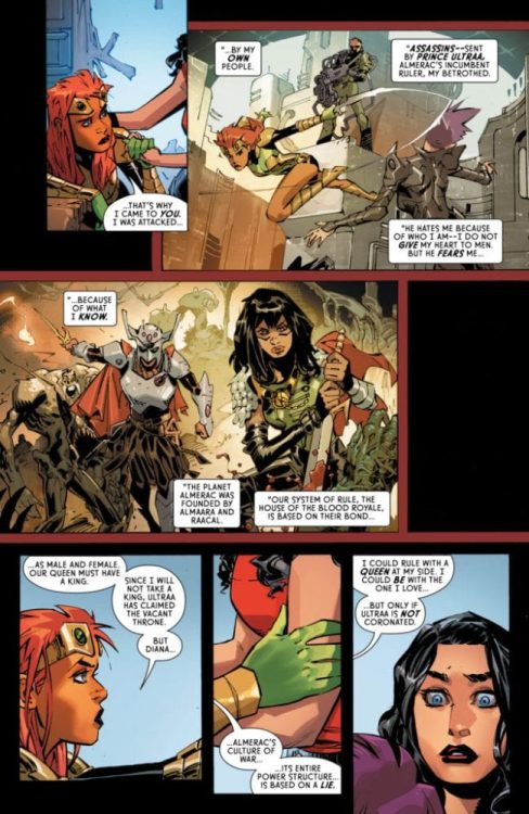
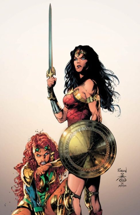
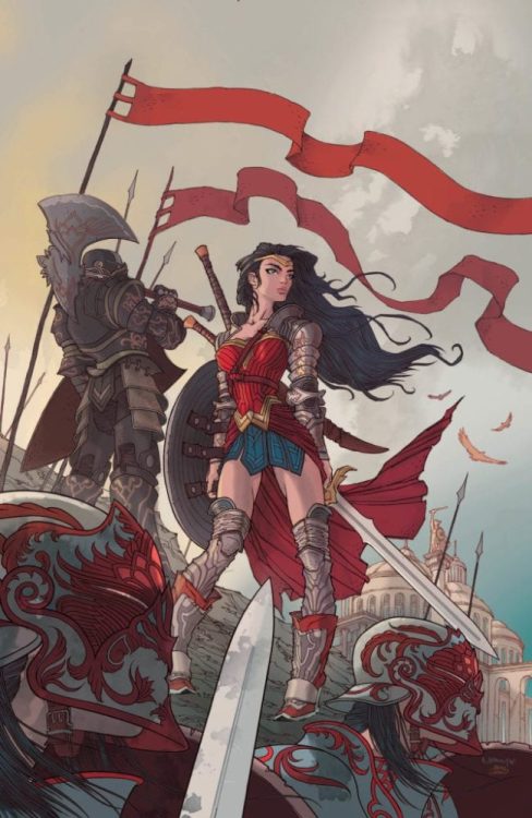
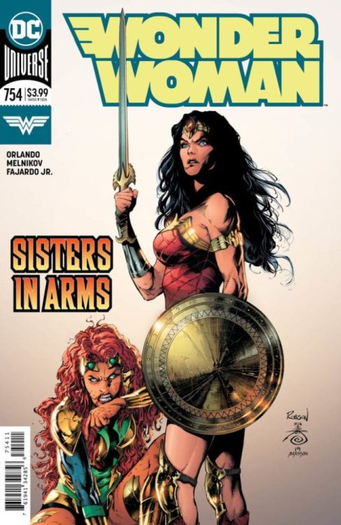
Wonder Woman #754 hits your local comic book shop next week (if it’s open, ugh), but thanks to DC Comics, Monkeys Fighting Robots has a five-page preview for you to check out.
First of all, both covers are filthy good. Robson Rocha, Danny Miki, and Brad Anderson knock it out of the park with the main cover. Clean and badass are the first two words that come to mind.
The variant cover by Rafael Grampá and Pedro Combiaco is pure epic. Wonder Woman leading an army into battle is always so powerful. Their Wonder Woman is feminine and unmoveable.
Steve Orlando wrote the issue, with art by Gleb Melnikov, Romulo Fajardo Jr. dropped some color, and you will read Pat Brosseau’s letters.
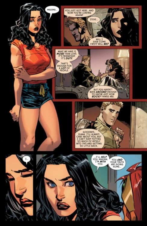
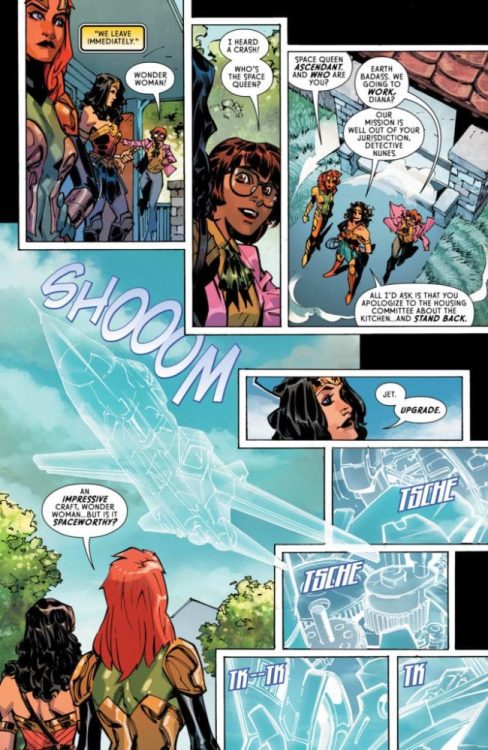
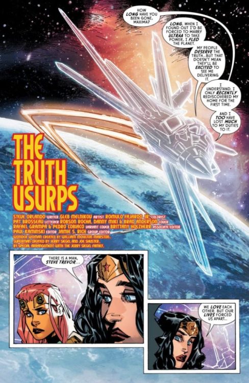
About Wonder Woman #754: Just when she thought her troubles were over, Wonder Woman is thrust into a new adventure that takes her out of this world! Princess Maxima, the former ruler of the planet Almerac, has crash-landed on our hero’s doorstep and is desperate for her help. Maxima’s people are victims of a vicious lie, and only the truth she’s discovered will set them free. With Wonder Woman by her side, can she retake her throne and bring back the planet’s peaceful matriarchal society? Back on Earth, there is no peace…only Warmaster! The vengeful villainess has obtained a weapon of mass destruction that can wipe out the Amazons for good!
Are you reading Orlando’s run on Wonder Woman? Comment below with your thoughts.
JUDGE DREDD FALSE WITNESS #1, available from IDW on March 25th, tells the tale of our future law enforcer pursuing a courier holding dangerous cargo. To say this story draws parallels to current year immigration concerns would be the understatement of the 22nd-Century. But does it still hold up as an entertaining read? Let’s find out.
Writing
Brian Eastman’s story is a thinly veiled essay on current year immigration woes. Paper-thin. That’s not a bad thing if the writer can spell out those issues in an engaging story and without being too on-the-nose with the characterizations. Eastman pulls it off successfully.
The main character (Mathias) has a clear backstory and a relatable motivation for his actions. Dredd is, well, being Dredd. And the main villain’s true master plan makes sense, albeit a bit too convenient.
There is an odd bit in the middle of the book explaining the genealogy of “mutants” that was a little hard to follow. The opening narration talking about the nature of fascism seemed out of place with the rest of the story. You get the impression Eastman just wanted to pontificate on fascism and used this story as a platform without blending into the context.
Pencils/Inks
Kei Zama’s artwork carries through consistently from the cover to the internal pages. The dark, dirty sewers look especially grimy. The lower streets look worn and tattered. The pristine penthouses look shiny and new. Zama captures the nature of the aesthetic difference between the multiple levels of society.
The artwork could be a little more potent if the inks weren’t so heavy. Every shadow and outline is a series of thick, almost blotchy, lines. Using thinner lines, especially on character faces, would have helped take the artwork up a notch.
Coloring
Eva De La Cruz’s coloring works for this issue when juxtaposed with the inks. Zama continues the thick lines and deep shadows from the cover throughout the rest of the book, making every line very heavy. De La Cruz really had to push to get the colors to pop through the heavy lines, and she does so expertly.
Lettering
Shawn Lee handles the lettering duties, and he does a great job keeping the different voices straight in an easy-to-follow way. Also, Lee organically blends the sound effects into all panels with action. For example, Dredd’s gun contains an array of different munitions types, so it’s not as simple as lettering “BANG! BANG!” every time Dredd fires a shot. Lee needed to incorporate everything from stuns to incendiaries to straight munitions, and every panel matches seamlessly.
Cover
Zama is pulling double duty for both cover and internal art on this first issue. Zama’s composition on the cover conveys heavy intimidation from Dredd and his fellow judges. The shadows are VERY heavy, making the Judges faceless (or more faceless than usual with their helmets on). Whether intended or not, keeping the shadows deep and obscuring the characters’ faces makes you feel like the Judges’ authority is a deep, dark force. The shadows de-humanize them as individuals on one particular side of the law, possibly with evil intent.
It’s a very good cover in that it captures the spirit of unceasing intimidation a lawbreaker would feel when confronted by the Judges.
Conclusion
JUDGE DREDD FALSE WITNESS #1 takes a current issue and brings it into the 22nd century without being too heavy-handed. Judge Dredd, in typical Dredd fashion, doesn’t play favorites…in the best way. I’m looking forward to the next issue.
Writer’s Note: Local Comic Shops (LCS) are going through a tough time right now with the pandemic outbreak of COVID-19. Comics fans of every flavor that care about his or her LCS should try to do what they can. So, here’s my part:
If you’re in Northern Delaware, South East Pennsylvania, or Southern New Jersey area, please take a moment to visit Captain Blue Hen Comics in Newark, DE. Say ‘hi,’ pick up a book, order a book (they’re on Comichub.com), and let them know you support them.
Nicnevin and the Bloody Queen is a folk horror story of adolescence from H1’s second batch of titles. After the Ignited universe, newer series like Meyer and Big Country bring in more genres. Each of which detail a humanizing experience for readers to follow. Going through puberty at its peak is a very good concept. But does the execution match the concept’s quality?
Nicnevin is Bloody Drama
Nicnevin and the Bloody Queen follows Helen Mullane’s titular protagonist who is going through a very compelling drama scenario. At the tender age of 15, she is among the one-in-five teens conflicting with family. After being expelled from school and with her parents apparently going through a divorce, Nissy with her mother and brother stay in the countryside for the summer. While there Nissy goes through some believable albeit risky things like sneaking cigarettes and lusting for her much older neighbor Reggie. Which in turn awakens her secret magical heritage that causes animals to go into an orgy.
Unfortunately, Nissy is not that great a character to get behind. Her rotten personality makes her rather cringing to read. Especially since the audience never really sees why Nissy is so angry with her mother. Or even why she values her father so much. The reader does not have a reason to vouch for Nissy’s behavior since they don’t know what’s going on.
A Fair Folk
As for the magical world that serves as the main plot, it brings in some great interest. Surrounding Nissy and her encounters with Reggie are folktales surrounding the setting. This makes the setting feel as much of a character as the cast. Complete with how it interacts with the cast and how it calls them to action. Nissy gets glimpses of the magic underneath everything and Reggie wants to find the fairyland.
There are some elements of the book that take away the tension and horror. As much as the magic shows itself to Nissy, she’s rather passive about all of it. Most of the time she just notices animals acting strange and goes back to what she was doing. While there is death befitting the folk horror, those deaths don’t really have a lot weight until near the end. Before the climax, Nissy just reacts to it as much as the animals. If Nissy gave more of a reaction, the tension would be immensely higher.
Nicnevin Demands Great Art For The Bloody Queen
Dom Reardon and Matthew Dow Smith’s art evokes similar supernatural horror stories like Hellboy. Some pieces of the story even share the pitch-black shading against bright surfaces of Hellboy. The contrast between known safety and mysterious evil feels apparent. Even in the brightest of days, there is still a shadow of danger lurking in the corner. Thanks to both artists experience in the horror genre, this is a given.
The fantasy sequences throughout the story feel enriching. Nissy finds herself welcomed to the folkloric stories of old Britain through her dream-like fantasies. They feel so important that when Nissy decides to partake in the flowers’ potion language to get Reggie’s love, the lettering captions match the text from folk texts she finds. When the fantasies come alive near the end however, they feel absolutely alien to the reader and some characters; emphasized by the difficult to read fonts of some texts. Even with the way the fae speak, green word balloons show how alien they are. What once seems fascinating becomes genuinely terrifying. Because no matter how familiar an outsider can be to this world, the fae reminds them that they are not a part of it.
Blood Queen Nicnevin Demands Familiarity
In all circumstances, Nicnevin and the Bloody Queen is best for people familiar with folk horror. The characters can be pretty forgettable, especially when they make adolescence feel cheap. None of them feel like they need care unless the plot demands it. Which is a shame because the artwork evokes feelings of both beauty and terror.
THE 6 MILLION DOLLAR MAN IN JAPAN collection, available from Dynamite on March 18th, is a fresh take on the 70’s cyborg. Written by Christopher Hastings, this is the complete collection of Steve Austin’s very first mission, but a less faithful adaptation of the original TV series. Does it stir all the right nostalgia feels? Let’s find out.
Writing
Hastings chose to take Steve in a slightly different direction for the character’s first outing. In the original TV show, Steve is more serious and determined. Here, Hastings has written Steve as a cavalier and joking character. Hastings stops just short of slapstick, but you get a distinct Deadpool vibe with the constant stream of jokes. It’s different, and it’s a lot of fun.
Pencils/Inks
David Hahn opted for a comic strip style with the artwork, and it fits the tone to a tee. But make no mistake, the lines are sharp when necessary and flowing when called for. For example, Steve’s exposed bionics are sufficiently mechanical looking to suit what robotics should look like for that time period. Hahn’s art works really well.
Favorite Panel/Page: By far, my favorite is the last page of issue #4 in the collection. Steve recklessly jumps out of a plane in an attempt to use his metallic body as a projectile and ram another plane. His plan fails in spectacular (and hilarious) fashion.
Coloring
Roshan Kurichiyanil’s coloring work is bright and cheery, which compliments both the tone of the story and Steve Austin’s personality. Excellent work.
Lettering
Hats off to Ariana Maher for the lettering in this collection. It’s difficult enough to letter for English in assorted modes of conversation – shouts, whispers, normal speech – but more impressive to also correctly letter in Japanese AND Russian as well. Hats off, indeed.
Cover
Michael Walsh’s cover art matches the bright and fun style of the internal pages. The costume design and background imagery fit the 60’s/70’s aesthetic of TV shows with fantastical elements ala Man From UNCLE, Get Smart, and I Dream Of Jeannie. Oddly, Walsh creates a style more reminiscent of the 60’s than the mid-70’s (which is when the story takes place) but it works.
Conclusion
THE 6 MILLION DOLLAR MAN IN JAPAN collection is a departure from the Steve Austin you know and love, but the series is thoroughly entertaining. Pick this book up if you like your sci-fi light, with a lot of action and plenty of humor.
Writer Declan Shalvey and artist Gavin Fullerton unite their talents to create “Bog Bodies,” a crime story like nothing you’ve read before. They, along with the talents of Rebecca Nalty on colors and lettering from Clayton Cowles, create a wholly original story about small-scale crime and the haunting effects it has on those involved in it – willing or not.
“A cold, poignant story of crime, survival, and regret, “Bog Bodies” follows an Irish gangster on the run after a job gone wrong who encounters a young woman lost in the Dublin mountains. Injured and unarmed, the unlikely pair must try to evade their pursuers and survive the desolate bog that has served as burial grounds for unspeakable murder throughout history.”
Writing & Plot
The winning technique behind “Bog Bodies'” enrapturing plot is writer Declan Shalvey‘s ability to give the reader just enough – but never too much. Shalvey focuses on the characters first and foremost and the immediate conflict they find themselves in. He progresses the plot by throwing wrenches into its workings: a gangster is on the run, he meets a girl, they run together, things happen, etc. On top of the characterization via placing characters in a set of situations, Shalvey then reveals just enough backstory into the events that led to this story to point the reader towards the truth. This is the true genius at work in this graphic novel. The writer trusts his audience enough to hand them the clues and directions, but he never holds their hand to the truth. The plot-twist revelations in this novel’s final act are fantastic not only in their execution but also in how open to interpretation they become. I spent a large portion of my morning musing upon the hows and whys of this story’s ending.
The characters themselves are fleshed out brilliantly. Each of the four main characters has their own distinct personalities, motivations, and manners of speaking to one another. The dialogue is full of Irish colloquialisms and naturalistic speech that are a complete joy to read. The nuance in this graphic novel is an example of knowing how to utilize the comic medium to its fullest potential.
Art Direction
Gavin Fullerton‘s artwork in “Bog Bodies” is an entrancing mix of detailed character art and environmental scale. The latter of these being how Fullerton uses landscapes to set a tone, then refocuses on the small-scale events our characters inhabit. He often draws panels of one or two people from a distance in the backdrop of the Irish countryside. These moonlit scenes instill a sense of quiet as well, adding to the hushed and unnerving tone of the novel. Fullerton’s panel direction guides the plot and its individual moments along in a pristine manner, highlighting stellar character moments in tune with the book’s prevalent mood. Much of this mood is created by colorist Rebecca Nalty. The brilliance of the coloring in “Bog Bodies” is that it’s all created as a reflection of the light sources within the comic. As this graphic novel takes place entirely at night, everything from the moon to a car’s taillights provide the hues that paint environments and characters. This also creates a ghostly pallor in key scenes that set a very specific and necessary mood. Clayton Cowles lettering offers spot-on inflection for the variety of tones the characters inhabit in their dialogue. This spot-on artistry is all in part to a visual team that utilizes setting and practical ideas that are rarely seen in comics – if any medium at all.
“Bog Bodies” is a creation of contemplative beauty. Declan Shalvey has written a crime story rife with emotion that trusts its audience to interpret events. Gavin Fullerton and Rebecca Nalty bestow the work with visual artistry that creates detailed, believable characters in an environment that speaks whole pages, often with no words needed. This is a graphic novel that will leave you thinking about it for hours – if not days – after finishing its final page. Make sure to grab this masterful piece of storytelling from your local comic shop when it hits shelves on 4/22.