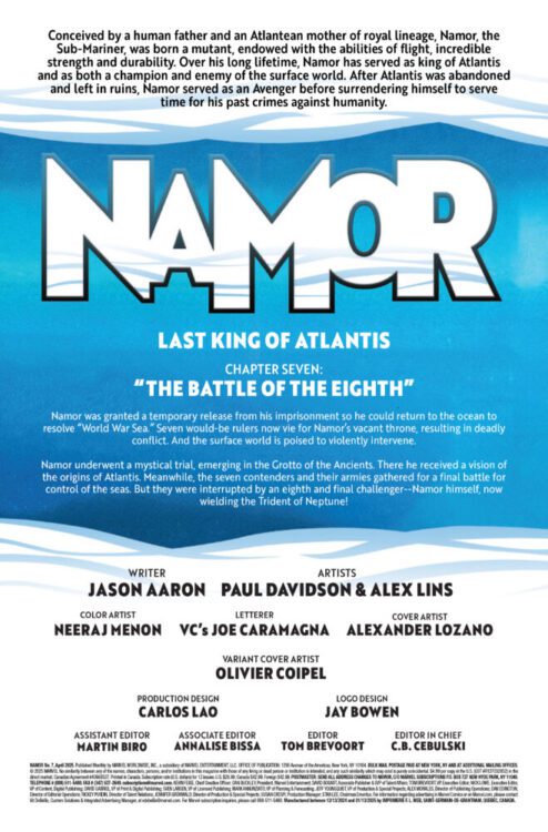
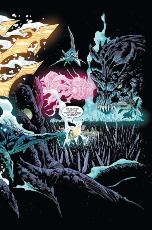
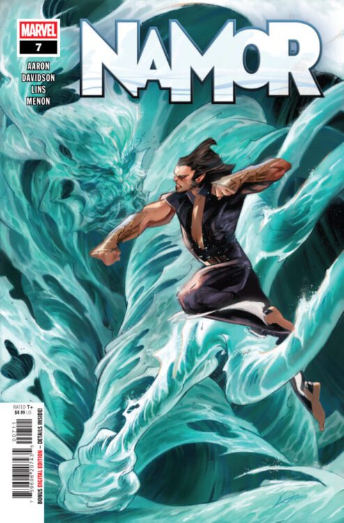
NAMOR #7 hits your local comic book store on February 5th, but thanks to Marvel Comics, Monkeys Fighting Robots has an exclusive four-page preview for you!
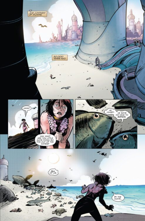
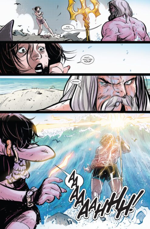
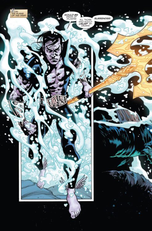
About the issue: The dark secrets of Atlantis laid bare! While World War Sea rages in the deep, Namor learns the dark truth behind the original sinking of Atlantis, a revelation that will forever change the course of the undersea realms!
The issue is by writer Jason Aaron and artists Paul Davidson & Alex Lins, with colors by Neeraj Menon, and letters by Joe Caramagna. The main cover is by Alexander Lozano.
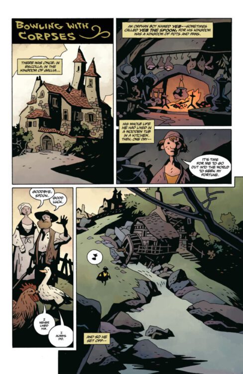
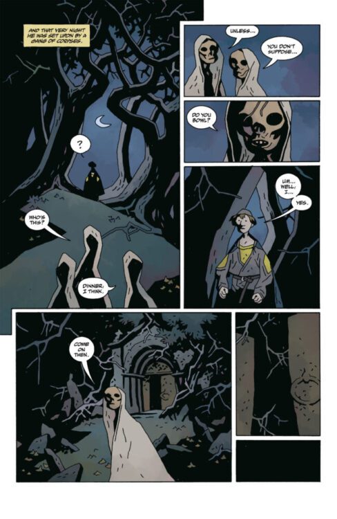
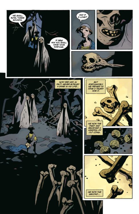
From comics legend Mike Mignola comes a new graphic novel full of folklore and myth in Bowling With Corpses & Other Strange Tales from Lands Unknown. Featuring long-time collaborators Dave Stewart on color art and Clem Robins on lettering, Bowling With Corpses is exactly the kind of mysterious and clever romp fans of Mignola’s work would expect. With sharp, humorous writing and Mignola’s signature visual style, this is a must-read for fans of Hellboy or comics in general.
“New folklore-inspired tales abound in this new anthology of fantasy stories written and drawn Hellboy creator Mike Mignola. From a search for the beating heart of a long-dead sorcerer, to a pirate girl who makes a deal with the devil, to the titular boy who wins a grim prize in a game with some undead interlopers, and more.”
Writing & Plot
Mike Mignola’s signature blend of folklore, myth, and witty humor all collide once more for Bowling With Corpses & Other Strange Tales from Lands Unknown. For this new world of magic and monsters, Mignola takes readers on a tour of different tales with different lessons, but all with his now iconic sense of mystery. The first story, Bowling With Corpses, takes us to do just that – while also setting up the tone and worldbuilding for Mignola’s new creation. Every story offers a unique sort of tale while bolstering this new mythology and promising more in the future. Several of the tales in this volume, like any great piece of folklore, end in a way that basically says “we haven’t seen the last of them.” Mignola is still a master at pacing and direction, which is why his more wordy panels and pages still flow so well. There are pages of characters talking about the many gods, lands, and legends this world has to offer. While it can feel like rambling, the way these sequences are constructed and paced makes them feel like a rabbit hole to fall down rather than just exposition. Of course, Mignola still knows when *not* to write as well, and his ingenious sequential direction frequently steps in to bolster the storytelling. Mignola’s sense of humor is on display in Bowling With Corpses as well, with plenty of delightfully funny pieces of dialogue interspersed to break up the mystery and add whimsy to the story. All in all, this is exactly the kind of graphic novel fans of Mignola’s work would be delighted by in terms of its story crafting.
Art Direction
Mike Mignola’s unmistakable visual work is on full display here in Bowling With Corpses & Other Strange Tales from Lands Unknown. From his iconic approach to character design, to his atmospherically rich inking, and his expert sequential direction, the master is still firing on all cylinders. Mignola is able to swing from moments of macabre delight and whimsy wo those of genuine dread and immense mystery. This is all due to how dynamic his visual approach really is. The strange joy in watching a boy bowl with some corpses for a promise of treasure, or farm animals comment on their place in a tale of mythic heroes, is just pure comics greatness in the simplest ways. Mignola’s manner of playing with timing for both structural and comedic effect is a constant treat, as he utilizes the comics medium to demonstrate the kinds of effects that can only be captured in said medium. Joining him are his two most faithful collaborators, Dave Stewart and Clem Robins. Stewart’s color art has always filled out Mignola’s worlds with his dark, flat palette completing the atmospheric tones of this new universe. Clem Robins’s lettering is the perfect finishing touch for the reading experience. His dialogue fonts are great of course, but it’s his iconic SFX work and the detailed touches on specific panel moments – like exclamation points above a character – that really set his work apart. As phenomenal as Mignola is, his work just wouldn’t feel complete at this point without the efforts of his collaborators. Overall, Bowling With Corpses is yet another astonishingly stellar piece of visual storytelling from some of the greatest to ever do it.
Verdict
Bowling With Corpses & Other Strange Tales from Lands Unknown is yet another stellar entry in the Mignola library. The Hellboy creator’s iconic style of mystical yet simplistic writing takes readers on a journey into a new land of gods, monsters, and adventurers with all the wonder and humor we expect from a modern legend. Mignola’s art, completed by Dave Stewart’s colors, is still a joy to experience and shows off just what the medium is capable of in the hands of a practiced master. Be sure to grab Bowling With Corpses from your local comic shop today!
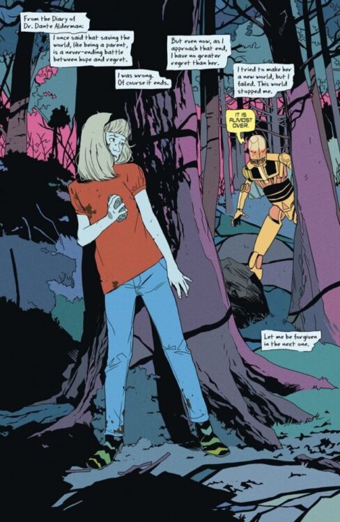
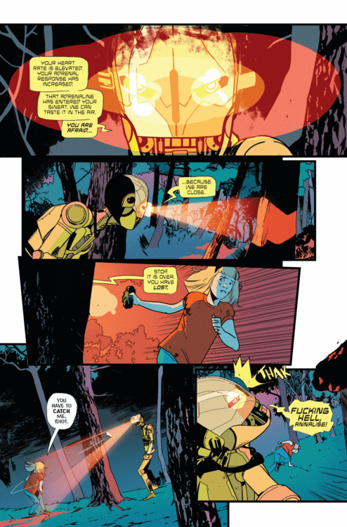
Fan-favorite creative duo Matthew Rosenberg and Stefano Landini (The Punisher War Machine vol.2) are bringing a brand-new creator-owned series, We’re Taking Everyone Down With Us, to Image Comics. I had the chance to talk to Matt about the book and I am beyond excited. Like all his books, it’s an amazing concept filtered through relatable characters. Read our chat below and make sure you pick up We’re Taking Everyone Down With Us when it debuts in March.
Monkeys Fighting Robots: Matt, for those folks who haven’t heard about or had the pleasure to read the first issue of We’re Taking Everyone Down With Us, what’s your elevator pitch for it?
Matthew Rosenberg: We’re Taking Everyone Down With Us is both a spy-fi love letter and a tongue-in-cheek satire of the over-the-top romanticism of the 60’s and 70’s spy thrillers like James Bond. But we’re approaching the story from a different angle, instead of being about the super macho spy and the devious villains he fights, it is about the teenage daughter of one those villains whose life becomes collateral damage in their games of global domination. And then I throw in a lot of the stuff I like to talk about like family, revenge, growing up, and some robots for good measure. When all is said and done the recipe is probably equal parts Tinker Tailor Soldier Spy, Leon: The Professional, Diabolik, and Paper Moon. But that’s really pretentious so I’d just say it’s about a foul-mouthed kid and her robot bodyguard on their quest to kill a very powerful man.
MFR: You’re no stranger to revenge stories, having written The Punisher for many issues. What about revenge stories makes them so appealing to read, and in your case, to write?
MR: The best motivators in all of fiction, and maybe all of life too, are love and revenge. So when you can do a revenge story that is also about love? How can you pass that up. For me, writing revenge is really cathartic. It’s something we all fantasize about doing in both little ways and grandiose ones. So when I get to dig in and explore both the gratification aspect of it, but also the moral consequences, it really is the kind of story that I feel like I’m learning about myself as I go. And hopefully, that leads to me saying something worth hearing.
MFR: Did anything other story or genre in particular inspire this series?
MR: Yeah, with all of my stuff I try to really wear my heart on my sleeve. I get why people obscure their influences and inspiration. It’s romantic to think ideas sprung forth from nothing. But I am a big story nerd so it feels really disingenuous to me to try and play the instructable wizard. Obviously, a lot of spy movies were a big influence, Connery and Moore era Bond, but also the more modern stuff- Bourne, Mission: Impossible. But also things like John le Carré and Graham Greene for their more grounded approach. Rucka’s Queen & Country, Brubaker and Epting’s Velvet, and Millar and Gibbons’ Secret Service. But we’re also pulling a lot from other places, coming-of-age stories like La Haine and Heathers, buddy road trip stories like Midnight Run, Nice Guys, and Butch Cassidy and the Sundance Kid. And then at its heart, the book is about family too. So stuff like Paper Moon, The Royal Tenenbaums, and To Kill A Mockingbird were all sort of guiding lights.
MFR: Is this a story you’ve been cooking up for a long time? When did this idea first hit you? And how did the project come together?
MR: In 2020 Stefano and I were supposed to do a series at Marvel, but the pandemic hit and everyone was told pencils down and the book was paused. When things were unpaused we were no longer on the book that we had been so excited about. So Stefano actually approached me about us doing a creator-owned book together and I was really into the idea. He sent me some drawings of this robot character that he’d been playing around with and I just fell in love with the design. From there I built a whole world for the robot to live in. Some of it was born at that moment, some of it is stuff that’s been in my head for years. I tend to really focus on a few themes and dig deep into them, and sometimes that spills over into the next book. So in some ways this book is in conversation with my other titles We Can Never Go Home, 4 Kids Walk Into A Bank, and What’s The Furthest Place From Here?. They aren’t literally connected but I think there is a thematic throughline as I reassess things I’ve said, if that makes sense.
MFR: I love how you can come up with these evocative, long titles that fit the books perfectly. What’s your secret to this?
MR: I start with a title that is way too long and make everyone mad and then I cut and cut until they just kind of ignore me.
MFR: Like so much of your work, you have this amazing ability to come up with insane high concepts, yet ground them in ways that connect the characters with readers. How the hell do you pull off that magic trick?
MR: I don’t think I’m exactly weird in this, but I also have talked to enough of my peers about process to know it’s not how everyone works. I start with characters and relationships and build the world and the story up from there, and not vice versa. I think a lot of what we forget in comics, especially in the days of IP farming publishers and people chasing the Hollywood bag, is that what makes people come back every month and spend $4 or $5 on a story is caring about the characters. That goes back before Homer and Aesop. Although I don’t know how much they charged per issue. Character is at the heart of what we’ve always done. It’s cool if you have an awesome idea for a time travel story about Hamlet or figured out how to do John Wick in space, but if I don’t give a fuck about Cyborg Hamlet or Martian John Wick as people then none of that matters.
MFR: You’re teaming up again with artist Stefano Landini, who you worked with on The Punisher. What made you choose Stefano as the artist for this book?
MR: I mean, he chose me as the writer. But yeah, I love Stefano. We worked on
The Punisher and those are some of my favorite issues in the run. And then we did a Grifter story at DC that was great. I think he is one of the best storytellers I’ve ever worked with. He knows how to handle action and acting equally, and he can go small or go big. There is just an ease to his storytelling that makes it a joy because you know you can try anything. I hope more people fall in love with him from this book.WTEDWU 01 01 (1)
MFR: Another aspect of the art that stood out for me was the coloring. Roman Titov just kills it. What made you choose them for the book?
(NOTE: Roman and Jason Wordie split coloring duty on the book. It’s all a bit confusing.)
MR: Roman was coloring my other book What’s The Furthest Place From Here? for a long time and I just love the imaginative simplicity of it. Big, gorgeous colors that work in service to the lines but never overpower them. Unfortunately Roman had to take a big gig outside comics. We talked about it and I’m happy for him and was sad that we’d probably lose his colors. But the great Jason Wordie stepped in to take over. When I told Jason he can redo everything so it’s only his work, he looked over what Roman did and appreciated it as much as I do. So he suggested maybe taking Roman’s work and building off of it, and that’s sort of how the final colors came together. It really is everyone sort of building on top of each other in a cool way and I can see clearly this influence of Roman’s in Jason’s work, and I can see where Jason is making it his own completely and it’s very fun to watch.
MFR: And of course you once again have Hassan Otsmane-Elhaou doing the lettering. What made him the right choice for the project?
MR: He’s the best letterer in comics.
MFR: What do you hope is the final takeaway readers will have about We’re Taking Everyone Down With Us?
MR: I hope it makes them laugh, and yell in joy and anger, and I hope it makes them cry. All of us are looking for ways to feel numb these days, and art can be great for that. But that’s not what we’re trying to do. Be vulnerable. Feel things here. Let a foul-mouthed little girl who kills people and her robot friend into your heart. We promise not to break too much stuff.
MFR: Any final words for our readers?
MR: I don’t know, man. I write comic books. Practice caring about all the people you’ll never meet. Don’t fuck up
We’re Taking Everyone Down With Us is out from Image Comics on Wednesday, March 26.
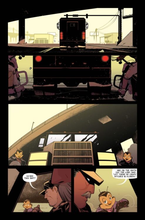
From Image Comics, with a story by writer AJ Lieberman (Martian Manhunter,Batman: Gotham Knights, Harley Quinn), artist Mike Henderson (Dead Man Logan, Daredevil, Cable: Love & Chrome), and colorist/letterer Iñaki Azpiazu (Eki, Cruel Kingdom, Proof) comes a highly anticipated neo-noir series, The Hive.
Set in the homeland of strange, confusing, and bizarre (a.k.a. my home state of Florida), The Hive follows ex-members of a criminal organization known as, you guessed it, The Hive. Although our protagonists possess a strange power that allows them to command others through direct commands, they quickly discover that no one leaves the Queen Bee without getting stung.
Writing/Story
The first issue of The Hive starts with a bang, as the readers are thrown headfirst into a world of violence, crime, sex, and bees. Lots and lots of bees. Although quite a lot happens in the opening chapter of this tale, Lieberman does a great job of dividing the many characters and their portions into digestible bite-sized pieces, providing enough exposition to allow for a glimpse into their characters and relationships, without revealing much of their story. The most gripping of these characters is the Queen Bee herself, Shae, who is the source of all the fear and plotlines in this first issue. A calm but cruel monarch, no one in the story is unaffected by her presence and control. As a character, she seems to exist outside of the chaos of the first issue, yet paradoxically seems to control all outcomes just the same.
The highlight in the writing was likely the small preambles before the action begins or resumes at various points in the comic. The conversations in those moments feel real and natural, sometimes uninvolved with their violent world. There is a world of characterization that comes from the characters’ actions and lines, unrelated to their main goals and objectives, which gives these people a real personality within moments of introducing them.
Art Direction
Henderson’s art in this first issue perfectly complements the story choices and the chaos within the narrative. No member of The Hive seems to be a stranger to multitasking, so every conversation is usually accompanied by many ongoing visual actions, whether that be crime, sex, or intense showdowns. It doesn’t matter—there is no lack of happenings in their world. Henderson also uses framing and two-page spreads very well, with some scenes giving an intended suffocating feeling, only to be immediately contrasted by a similar environment, yet with a complete change in dynamics through panel density alone.
While sex and crime are used copiously throughout the comic, each character is represented differently in those moments through a layered use of shadows and colors—courtesy of Azpiazu—giving a profound sense of characterization and personality without overstating. This is exemplified directly in sex scenes, with certain characters being cloaked in shadows, face covered, with small panels showcasing hidden views of the act, as if in shame of it. Yet, the following scenes display a similar situation like a badge of honor, with bright bold colors showing the characters involved, displaying them proudly as their entire bodies face the reader. The lettering is also important to note here, as it can be very understated as the comic begins, with traditional textboxes being used for most of the first half. However, as the characters’ powers begin to be showcased and the action amps up, Azpiazu shows his hand and delivers some extremely impactful impact frames and diverse speech bubbles.
Verdict
The Hive #1 stellarly sticks to its bee motif, presenting a variety of “workers,” each with their own story, none of whom are as important as their Queen. While the first issue only leaves the reader with questions, there is no lack of action or exposition, allowing an enthralling mystery to unfold.
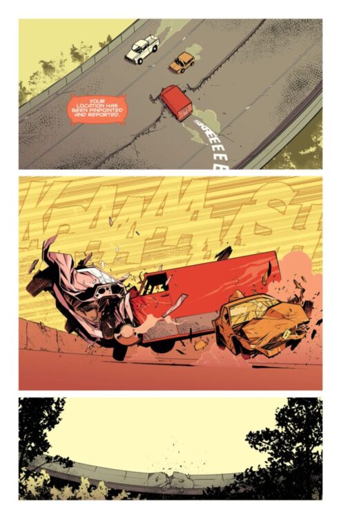
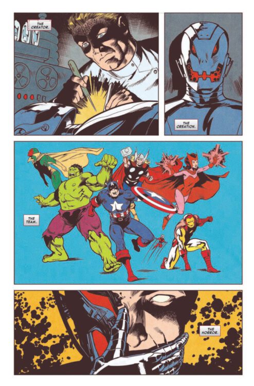
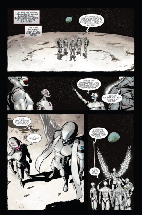
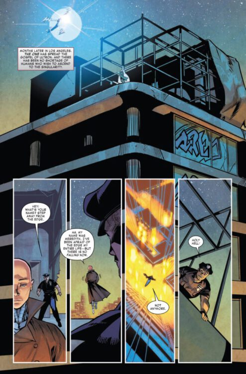
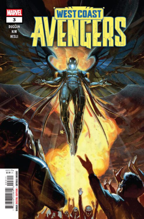
WEST COAST AVENGERS #3 hits your local comic book store on January 29th, but thanks to Marvel Comics, Monkeys Fighting Robots has an exclusive four-page preview for you!
About the issue: As a second Ultron appears and declares himself leader of a terrifying new religion, Iron Man and War Machine reveal at last how their Ultron became a hero!
The issue is by writer Gerry Duggan and artist Danny Kim, with colors by Arthur Hesli, and letters by Joe Caramagna. The main cover is by Ben Harvey.
Check out our WEST COAST AVENGERS #3 preview below:
Are you reading WEST COAST AVENGERS? Sound off in the comments!
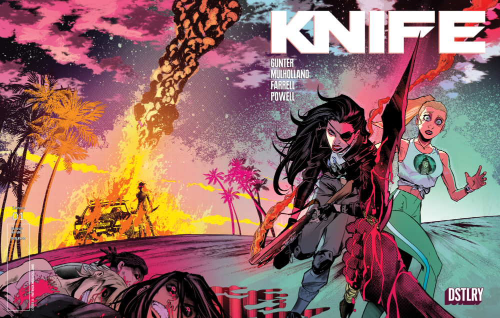
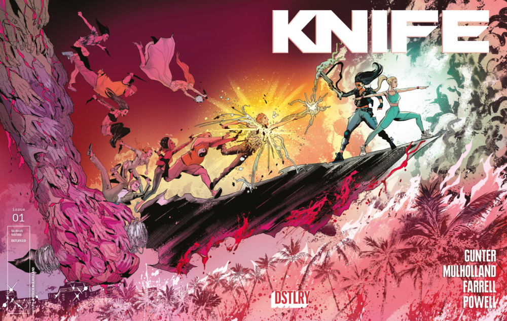
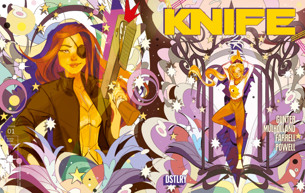
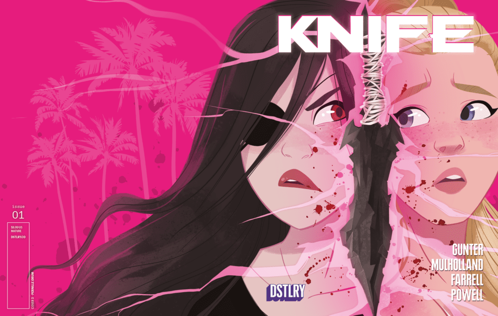
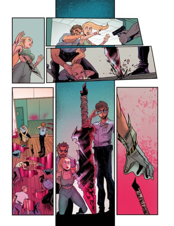
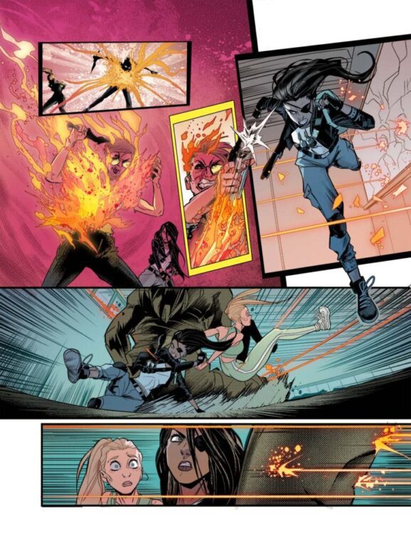
DSTLRY PRESENTS KNIFE, A MIND-BENDING SLASHER COMIC FROM MILES GUNTER & PATRICK MULHOLLAND
DSTLRY, the next-generation publisher redefining creator-owned comic books and collectibles, is thrilled to announce KNIFE, a horror action series from writer Miles Gunter (B.P.R.D.) and artist Patrick Mulholland (Power Rangers) debuting this April.
Cover A by Patrick Mulholland
The visceral thriller follows Paige Russell, a yoga instructor navigating the anxieties of her first class. She soon faces more challenges than teaching the downward-dog pose as an ancient blade containing sinister primordial power invades her studio. This KNIFE possesses anyone who touches it, instantly turning them into an unstoppable killing machine—but somehow Paige is immune to its hold.
Cover B by Patrick Mulholland
Paige joins forces with Riva—a survivor of the KNIFE’s destruction who sports a molotov-cocktail firing shotgun—to decipher the weapon’s nature and survive its brutal wrath.
Cover C by Nicoletta Baldari
“KNIFE takes the slasher premise into new territory,” explains co-creator and writer Miles Gunter. “Cutting deeper, I’m analyzing what it means to maintain calm no matter the chaos engulfing your world. KNIFE is a meditation on maintaining your sense of self in the face of relentless adversity.”
Cover D by Pernille Ørum
“This is horror at its most widescreen. Chaotic, unhinged, and wild,” continues co-creator and artist Patrick Mulholland. “It’s a concept that could only work in comics—specifically DSTLRY’s oversized format. We’re constructing a visceral thrill ride for your eyeballs, as well as a story that’s good for your heart. And that’s something we need more of in comics right now.”
“Miles has the ability to straddle massive action set pieces with intimate characterization,” says DSTLRY CCO & Co-Founder Chip Mosher. “Knife is an incredibly exciting entry into the DSTLRY library, creating one of the most memorable horror experiences of the year,” continues CEO & Co-Founder David Steinberger.
Each issue of KNIFE is presented in DSTLRY’s perfect-bound Prestige format, featuring wraparound covers with spot gloss on robust cover stock, complemented by 48 pages of exquisite interior stock. “It’s the DSTLRY difference,” says DSTLRY CCO & Co-Founder Chip Mosher.
For more information on KNIFE and to keep up with DSTLRY’s upcoming releases, visit www.dstlry.co and follow DSTLRY on social media at @DSTLRY_Media.
After being long out of print, Marvel’s Doctor Doom: Books of Doom returns to stores this week in a new collection, and it’s essential reading for fans looking to learn about the character before his introduction into the Marvel Cinematic Universe.
The 2005 series is by writer Ed Brubaker and artist Pablo Raimondi, with inks by Mark Farmer, Andrew Hennessy, and Robin Riggs, colors by Brian Reber, and letters by Rus Wooton.
In a nutshell, Books of Doom is Victor Von Doom’s origin story, told in a series of flashbacks and intercut with interviews, documentary style. It covers his childhood growing up in a band of Latverian nomads, up through his eventual takeover of his home nation, with a whole lot of trauma in between.
Cover art by Paolo Rivera
This 2025 edition comes with a new forward by Brubaker, in which he discusses his background with Doctor Doom, going back to a specific comic he read during his own childhood. This forward shows how personal writing this story was for Brubaker, and in reading the story itself, you can feel it. There’s a palpable passion in the storytelling and the development of Victor as a character. Brubaker is a master of writing sympathetic bad guys (hello, Criminal), and it’s clear that interest started with Doom.
Despite featuring one of Marvel’s biggest villains, Books of Doom is not a superhero comic. There is some action throughout, but this wouldn’t be described as an action comic at all. It’s a character study, and—as the back cover describes it— an “epic Russian tragedy.” You’re watching Doom take hit after hit during his youth, seeing him slowly turn into the villain we know he becomes, and understanding how he ends up where he does. The man is a dictator and a murderer, but somehow you begin to feel for him, hoping (in true tragedy fashion) that the story somehow won’t end the way you know it has to.
And the reason you feel for Victor is because Brubaker breaks down the armor the character wears (the metaphorical armor, not the physical armor he wears, which is really just a representation of the metaphorical armor). Books of Doom covers a lot of familiar ground: Victor’s mother being trapped in Hell, his time at school and the explosion that scars his face, and his eventual takeover of Latveria. These concepts had been covered in comics prior to this series, and they’ve been revisited since 2005, but there’s a sense of humanity to Doom here that isn’t always present in other stories. Even through his bravado, there are moments where you can feel Victor’s fear and insecurity, even if he would never admit it. In humanizing Doom, Brubaker makes it easier to sympathize with him.
Cover art by Paolo Rivera
Raimondi and the whole art team do a brilliant job cementing the documentary vibe of the book. From the linework, to the coloring, to the lettering, Books of Doom leans away from the cartoony and into realism. The lines are detailed and the colors are naturally muted, making this story from the Marvel universe look and feel like it could be happening in our own world (minus a couple of the more fantastic scenes). This style, coupled with the character acting done by Raimondi and his inkers, helps foster the aforementioned sympathy in readers by allowing them to sink deeper into the story. And extra props to Wooton, because this is something of a dense read, and his lettering helps carry readers through the pages with ease.
Books of Doom is not the only Doctor Doom book you should read to prime yourself before Robert Downey Jr. puts on the mask, but it is on the list of essentials (along with the original Stan Lee/Jack Kirby work on Fantastic Four and Jonathan Hickman’s work from Fantastic Four to Secret Wars, among others). It’s a look at the man behind the mask, so don’t go into it looking for big superpowered battles. Instead, settle in and enjoy a study on what could drive a man to become on of the most infamous villains in comics history.
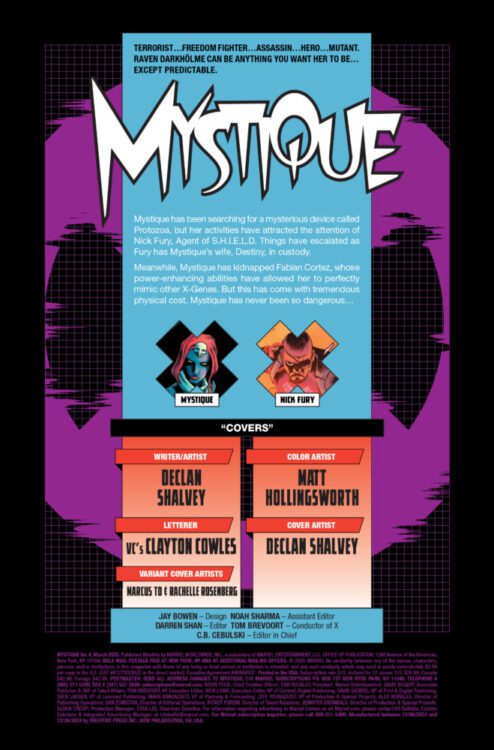
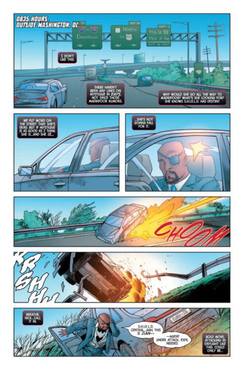
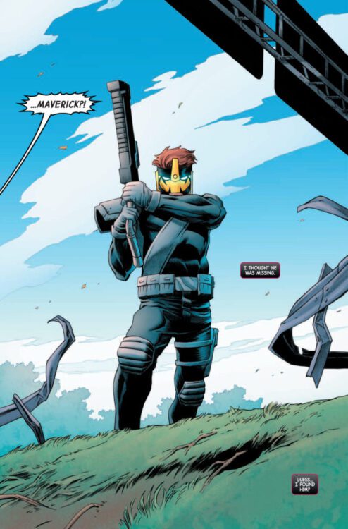
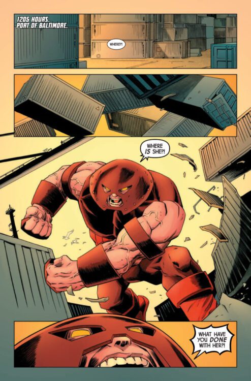
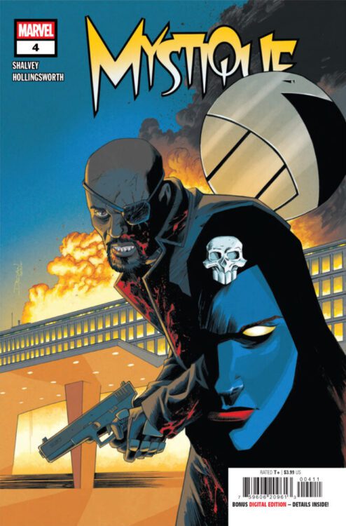
MYSTIQUE #4 hits your local comic book store on January 22nd, but thanks to Marvel Comics, Monkeys Fighting Robots has an exclusive four-page preview for you!
About the issue: Mystique has never been this powerful, but with a loved one in custody, she’s never been this dangerous either. Can Nick Fury convince S.H.I.E.L.D. of the danger? Or is he already too late?
The issue is by writer/artist Declan Shalvey, with colors by Matt Hollingsworth, and letters by Clayton Cowles. The main cover is by Shalvey.
Check out our MYSTIQUE #4 preview below:
Are you reading Marvel’s MYSTIQUE? Sound off in the comments!
Spider-Gwen: The Ghost-Spider, “Haunted”, is out January 22nd, collecting the first five issues of the Marvel Comics series.
“Haunted” sees Gwen Stacy, the Spider-Woman of Earth-65, relocated to the mainline Marvel Universe by the TVA under mysterious circumstances. No one is supposed to know she’s there—including her friends Peter Parker, Miles Morales, and Cindy Moon—and she isn’t supposed to suit up and play hero. But Gwen is a Spider, and with great power comes great responsibility, so how long will she be able to hide on the sidelines? (Spoiler: not long at all.)
The series is by writer Stephanie Phillips and artists Federica Mancin (issues #1-3) & Paolo Villanelli (issues #4-5), with colors by Matt Milla, and letters by Ariana Maher.
It may sound trite or clichéd for a publisher to fold a popular character from an alternate universe into their mainline one, but the creative team here makes the story feel exciting and interesting. Phillips’ story is entrenched in mystery: Why is Gwen on Earth-616? Why can’t the other Spiders know? These questions hook the reader in and keep them turning the pages looking for answers.
Art: Mancin; Colors: Milla; Letters: Maher
There’s also a personal tragedy piece to the story. Gwen is expected to keep a low profile and stop heroing, which she simply can’t do. She’s a hero at her core—a Spider being told to sit on the sidelines even though she could be helping people. At the same time, she has to isolate herself from her friends for their safety; she can’t rely on them during this trying time in her life. Great Spider-People stories usually deal with navigating personal struggles and interpersonal relationships like these; Phillips clearly understands that.
“Haunted” is an exciting superhero comic on top of these other elements, and Mancin & Villanelli don’t let you forget it. Ghost-Spider goes up against Chameleon in this story, who’s had an upgrade that allows him to better mimic other villains. In a way, Gwen gets to battle a number of classic Spider-Man villains in this story, and they’re all new to her. It was surely a ball for the artists to get to draw all these iconic baddies, and you can feel their excitement radiate off the page. Their art styles are different—Mancin’s is more cartoony with a manga-inspired flair, while Villanelli’s has a bit more of a gritty edge to it—but both artists infuse their issues with a visceral energy. Fights are big and electric, with a fluidity that carries you from one panel to the next.
Easing the transition between the two artists are Milla and Maher, whose respective colors and letters create a consistent tone throughout the arc. From her first comic to the Spider-Verse films, Spider-Gwen has become associated with bright neon colors, particularly pinks and purples. Milla ensures these are all still present here, even among the backdrop of Earth-616, which typically has a more natural color scheme. It’s a detail that ties Gwen back to her roots on Earth-65, while also adding some vibrancy to an already fun and inviting comic. This carries over to Maher’s letters, which also utilize Gwen’s signature palette in narrative captions and special effects. Maher’s work also enhances the aforementioned fluidity of the art, guiding readers through a sea of action.
Spider-Gwen: The Ghost-Spider is an exciting new chapter for fans of Earth-65’s Gwen Stacy. Who knows if the heroine is in the 616 for good, but we’ll certainly enjoy her story while she’s here.
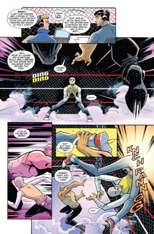
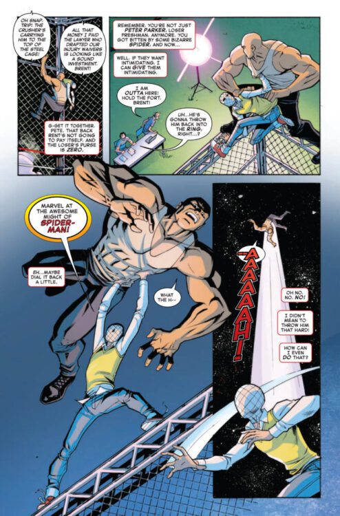
YOUR FRIENDLY NEIGHBORHOOD SPIDER-MAN #2 hits your local comic book store on January 15th, but thanks to Marvel Comics, Monkeys Fighting Robots has an exclusive three-page preview for you!
About the issue: GREAT POWER WITH NO (WEB) STRINGS ATTACHED!
Peter Parker hasn’t been the same since he was bitten by that radioactive spider-but he’s just starting to learn the lessons that make him the Spider-Man we all know and love! Before he swings onto our screens for the new YOUR FRIENDLY NEIGHBORHOOD SPIDER-MAN series on Disney+, he’s got some hard lessons to learn…
The issue is by writer Christos Gage and artist Eric Gapstur, with colors by Jim Campbell, and letters by Joe Caramagna. The main cover is by Leonardo Romero.
The comic is a prequel to the upcoming animated television series of the same name, which will begin streaming on Disney+ on January 29th, 2025.
Check out our YOUR FRIENDLY NEIGHBORHOOD SPIDER-MAN #2 preview below:
Are you excited for YOUR FRIENDLY NEIGHBORHOOD SPIDER-MAN on Disney+? Sound off in the comments!