If we learned anything from Ghostbusters, it’s that you should always look out for demonic dogs. That demon dog might actually be your best friend. Available now from Boom! Studios,Buffy the Vampire Slayer #26 deals with the immediate aftermath of last issue’s ’90s multiverse weirdness. Returning writer Jeremy Lambert teams up with new illustrator Marianna Ignazzi of An Unkindness of Ravens fame. Also returning are colorist Raul Angulo and letterer Ed Dukeshire.
The previous issue gave us only a sampler for what messing with the multiverse can do. Now Willow’s got a ghost demon dog stalker, Anya’s true motives are up in the air again, and the art style has reverted us to the ’60s. It’s a whirlwind for sure, but the basic plot keeps us trucking along with the Scooby Gang.
Lambert’s pace speeds up and slows down, seemingly as dictated by page count. Twenty-four pages may sound like a lot in comic book terms, but it hardly gives readers time to breathe, let alone the characters. Is this entirely a bad thing? No, the fast pace keeps things exciting. However, for the long-time reader, it’s like speeding down a scenic route. How are we supposed to immerse ourselves in the world and characters when we spend the movie equivalent of half a second on getting real?
Artistic Differences
Despite my frustrations over the fast pace and plot focus, I believe Lambert does his best in striking the right balance within the constraints. We still care about these characters, and the plot is strong enough to sustain readers long-term.
On the illustration side, Pinti’s ’90s style character design is out and replaced by an older, late-1960s look by Ignazzi. What this means is everybody looks vaguely like a Hanna-Barbera cartoon character. This is a fun change, but the style falls short in recognizing Ethan and Wesley. I had to do a double-take because the face shape or hair wasn’t quite what I was used to. Nonetheless, the new style adds to the sense of warped time and space in the multiverse.
WILLOW’S GOT A NEW DOG (AND STALKER)
Colors and lettering follow Ignazzi’s ’60s style in their own way. Angulo uses less purple, red, and blue than usual in favor of dull brown, gray, and black, which signal the issue’s sinister tone. The darker colors are also practical as this issue involves less action and more sit-downs in offices and the like. Moreover, these less saturated colors contribute to the dusty, ’60s color TV look.
Looking Sharp
Letter Dukeshire uses small tweaks to great effect. He uses SFX sparingly but with sharp edges while the dialogue bubbles are mostly centralized to let the eye flow down and naturally leave ample room for action to speak louder than words. Overall, Dukeshire’s lettering is smooth and symmetrical. If I can say one thing on behalf of long-term Buffy readers, I’ll say Dukeshire’s been a reliable constant that makes up for any writing or aesthetic-related inconsistencies.
We may not have seen much of the multiverse, yet we know its effects are here to stay. But multiverse hiccups are only one of many obstacles on the way to facing the “big bad” that Anya’s been teasing. Is it the mayor, perhaps? Or someone else that the council is puppeting? Whatever it is, the Scooby Gang has to overcome their squabbles to fight it. Buffy the Vampire Slayer #26 keeps us on our toes as we look forward to the next reveal.
Delicacy comes to comic stores on June 9 from IDW’s Top Shelf imprint. The creator, James Albon, thanks to some food industry insights, crafts a unique tragedy.
Delicacy With A Passion
Albon pulls a lot of influence from some friends in the restaurant and gardening markets to make a believable falling out story. Delicacy is ultimately about peoples’ struggles with hustle culture and how it can ruin relationships. From just the first pages, readers feel a struggle that brothers Rowan and Tulip inherent from their mother and aunt. The reader can’t help but empathize with the brothers as they seem to find a way to live their dreams. Tulip feels torn about his passions as a cook with his dishes’ detail and a restaurant owner’s financial worries. In juxtaposition is how Rowan’s rural lifestyle isolates him. The need for stability genuinely feels out of reach between them.
Innocence Turns Dreadful
Albon illustrates Delicacy like a children’s book that brings about a sense of innocence. The bright colors of some decor match the dishes that Tulip prepares as if trying to match qualities. In this way, Tulip presents to his patrons a sense of joy that he hopes to convey through more than one sense. As the bright colors become more frequent, it begins to evoke a sense of intoxicating euphoria. As if all of the efforts to keep such a feeling going leads to mental degradation. Meanwhile, Rowan’s rural surroundings have tranquil aesthetics that feel comforting. Only to show bitterness with how the brothers’ mother hides anything man-made. Despite both settings trying to push each other away, they hide a mutual ugliness.
Taste The Delicacy And You Won’t Get Enough
Delicacy is one of the best releases to come out this year. The efforts to evoke the main tragedy come off as genuinely authentic. From the attention to detail to character dynamics, this story is one to remember.
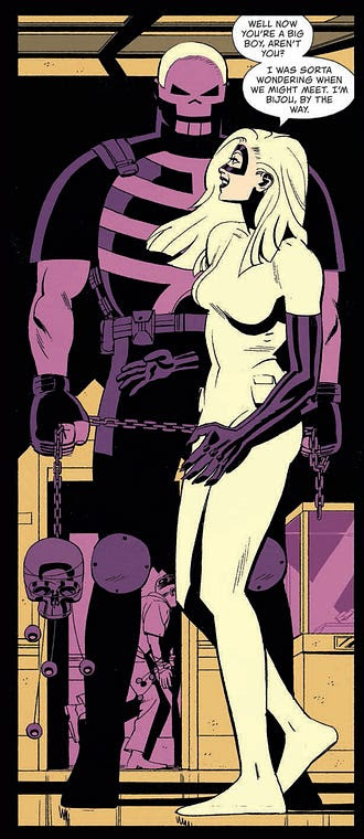
Dark Horse Comics’ Black Hammer Universe has given its take on classic characters like Captain America and Martian Manhunter. Skulldigger and Skeleton Boy showed us the Black Hammer version of Batman and Robin. And with Dark Horse’s Black Hammer: Visions #5, we revisit that little corner of this universe to see what a Batman and Catwoman dynamic would look like in Spiral City. Writer Kelly Thompson, artist Leonardo Romero, colorist Jordie Bellaire, and letterer Nate Piekos tell a tale of fun and death.
Writing
Thompson gleefully shakes up the status quo. In fact, “glee” might be the perfect word for it. We see Skulldigger, living his life as he always has. He’s silent, violent, and filled with rage. But then Bijou comes on the scene. She’s the Catwoman of Spiral City, forever breaking the law and having fun doing it. And so much changes in Skulldigger’s life when he meets her. The writing goes from feeling demure to vibrant. This violent vigilante is having fun, despite himself. But, of course, this is Spiral City. Thompson reminds us that doom is around every corner here. She brings us to joyful heights, just so that the fall back down hurts all the more. It’s beautiful, tragic, and fantastically written.
Art
Romero immediately shows us the life that Bijou brings into Skulldigger’s world. Our first glimpse of Skulldigger is a 9 panel grid where he’s washing his face. While the page is subtle and beautiful, it also feels ordered and lifeless. The very next page, we see a spread of Bijou jumping over rooftops. And from then on, the pages are playful and versatile. Some images work as a backdrop to other panels, some panels are dedicated to a single sound effect. All of it is fun. But as we end the issue, Romero brings us back to the original image. We see Skulldigger looking into the mirror, but it has new meaning to it now. As he opens the door to walk down the stairs, the light behind him casts a crooked silhouette on the wall next to him. It makes it feel as though his life was once ordered, now it’s all out of whack.
Coloring
Bellaire uses an extremely minimalistic palette for each scene. When we first see Skulldigger, the whole page is blue. And when he chases Bijou into a museum, the page is colored in different shades of purple and yellow, and that’s it. It’s an interesting approach, because it both sets a mood for each scene and also makes the issue feel very colorful. Sure, individual moments are monochromatic: Bellaire shows entire scenes in green or pink or red. But together, like ribbons on the page, the issue feels vibrant and beautiful. It’s only when Bijou and Skulldigger briefly meet each other out of costume that the page feels colorless. Bellaire shows us that their late night escapades are like a drug to them. It brings color to their life, a color that changes how they see everything.
Lettering
Piekos uses a uniform style in the lettering of this issue. The smash of a window is shown just like the boom of an explosion. The font looks tidy and retro. It makes us feel like these characters are living in some other world. Even the sounds of violence are neat and easy to digest. It’s only right at the end that Piekos adds the slightest variation. With one devastating sound, he adds an exclamation point and capitalizes the first letter. It stands apart from the other sounds of the scene, yet nearly blends together with the other noises of this world. Piekos seems to be showing how those innocuous sounds lead to big, devastating ones like this. And even when devastation happens, it’s hard to tell the difference from the status quo of their lives.
The Black Hammer Universe has always had plenty of fun. But, as a whole, it leans towards dark, philosophical storytelling. This creative team took the grittiest of Black Hammer‘s characters, Skulldigger, and filled his life with fun. It not only works well, this issue really is a lot of fun, but it sets us up for some devastating heartbreaks. Pick up Black Hammer: Visions #5, out from Dark Horse Comics June 9th, at a comic shop near you!
Ant #12 comes to comic stores on June 9 from Image Comics co-founder Erik Larsen. Joining Larsen in this long-awaited finale is flats artist Mike Toris and letterer Ferran Delgado.
Background
The Ant is a character with a surreal background of publishing rights and backstory. Created by Mario Gully for Arcana Studios, the character is a power fantasy for coping with harsh realities and turning life around. Following Hannah Washington’s alter-ego, she constantly struggles with how her reality shifts. This state all but reflects the behind-the-scenes drama, including premature cancellations. Gully ultimately sells his character’s rights to Larsen after seeing the Savage Dragon creator’s passion.
Ant #12: Ending As A Prologue
Larsen’s plans for Ant #12 is ultimately a slate cleaning prologue for a new series. It’s actually set up kind of nicely for readers not too familiar with the title character. The reader can seem just as confused and frustrated as Hannah is. There’s something big going on, and instead of something big and dramatic, Larsen cleans the continuity slate. Keeping what works like Ant’s enemies and rejecting what doesn’t is vital to starting anew. Without much of the backstory baggage, Ant now shares space with the likes of the classic Savage Dragon.
Part of Something Bigger
To help ease Ant into Larsen’s storytelling, Larsen employs several clever techniques. Ant #12 is a display of anticipative movement where actions have an impact. The way Larsen draws Ant climbing walls and fighting enemies evokes a sense of wonder, and her red costume and visual flair against muted backgrounds adds to the excitement. Which does come with the implication that Larsen put more effort into the coloring details of Ant than anything else. He happens to have help from Toris with basic flats. It also comes with enemy designs and machinery that evoke a campiness reminiscent of Jack Kirby.
That’s all to say nothing of the lettering by Ferran Delgado. Not only do the word balloons, captions, and sound effects match Larsen’s art style, they add to the narrative weight. In a two-page spread with actions going on, the change of speech becomes apparent as one-word balloon changes to another. After the attacks of these characters move with these characters’ speech, the captions going down slows it down. This adds to how heavy Hannah feels in the moment while demonstrating the scale she’s facing.
Keep An Eye Out For Ant #12
Ant #12 will be a satisfying read for people following this character and be a good introduction for new readers. With Larsen taking creative duties, this prologue will give readers something to look forward to.
From writers Dan Fogler and Laurence Blum and artist Ben Templesmith comes a bleak, brutal, and madness-filled look at a NYC militarized disaster zone through the lens of a slightly insane, somewhat addled detective in Fishkill Vol. 1 from Heavy Metal publishing. This over-the-top neo-noir is an assault on the senses, grabbing the reader by the shirt collar and dragging them along in a manner that evokes Miller’s Sin City and the best 2000 A.D. Dredd stories. Although this comic comments on some pretty questionable subjects and can’t quite hold all of its narrative quips together, it’s got enough style and atmosphere to make this volume a rough-edged winner that demonstrates the kinds of stories that can only be told in the comics medium.
“A love story wrapped in a modern noir that takes our hero down the conspiracy rabbit hole where he starts to question his own sanity. FishKill is a love story wrapped in modern noir that takes our hero, Detective Bart Fishkill, so far down the conspiracy rabbit hole that he starts to question his own sanity, even to the point of wondering whether if he isn’t the villain in the first place.“
Writing & Plot
Dan Fogler and Laurence Blum’s scripts for Fishkill Volume 1 are a motley mix of clichés, unhinged dialogue, and even bits of rhyme and verse that make these issues a familiar but still grotesquely enthralling read. The plot unravels through the murky perspective of our protagonist Bart Fishkill, flavoring the story with a sort of nonsensical madness that rumbles along on its violent trajectory through the comic’s dystopian events. The way the narrative builds is reminiscent of Marv’s story in Sin City, and the state of New York City in the story fuels that further. Fishkill himself is a unique protagonist for a neo-noir in how he finds himself being propelled through the story. He doesn’t have Marv’s sinister drive, nor the surprising intelligence of Eric Powell’s The Goon (another obvious influence on the comic), but is instead carted along by his mental imaginings(?), unable to fully grasp what is going on in his life or to his city as it falls into an authoritarian regime. Fogler and Blum’s writing comes across as noise, with a dozen sounds and clues going off at once and leaving the audience — along with Fishkill himself — to figure out just what the hell is happening here. The scale of the events going on beyond Fishkill’s grasp makes for a head-spinning but enticing read and the dark fall of a city is entertaining in a disturbing way.
Not everything here is a complete win, though, as there are enough awkward and questionable bits to throw off the pacing. Some parts seem to leap out of the story as paranoid preaching rather than just pieces to a puzzle. There’s also a young girl who tags along with Fishkill a couple of issues in, and how she’s handled is a bit questionable — and more than a little off-putting. This is not a book of subtlety, and there’s no requirement that it has to be. However, such a tool can work in a story’s favor, especially when you’re trying to handle hard moral no-go topics. This all being said, this comic has such a unique flavor to its narration and dialogue that it warrants giving it a go on its script alone.
Art Direction
Fishkill volume 1 is blessed with the unmistakable style of Ben Templesmith’s artwork. His unique visuals swing between caricature and immaculate detail, all while maintaining a consistent tone and quality within the book. The grimy and fog-covered New York descends into dark chaos in dementedly beautiful fashion, with art that is somehow both over-the-top and subdued. Fishkill himself is a hulking mass of a man with insane proportions and an equally ugly mug; in other words, a perfect protagonist for a dark neo-noir tale. The various villains and side characters look like your bog-standard heads of conspiracy types but are menacing enough to be memorable. Templesmith takes his dark and beautiful style to the architecture, with its landmarks displayed in a dour and ironically oppressive manner to match the regime that has come of the story’s conspiratorial acts, and they show in the background of the small streets and apartment building where faceless and heavily armed police carry out their work. Templesmith’s hazy style here makes the uncertain reality of Fishkill’s perspective all the more believable and effective as well, with specters of memory popping in and out of the story in a way the comes off as surprising (as it should) but also fitting. It adds more uncertainty to the comic’s already shaky reality.
Templesmith also handles the lettering, which comes out as varied and stylized as the rest of his work. Fonts swing wildly from character to character, from scratchy scribblings cursive prose to other fonts I’ve never even seen in a comic before. There’s nothing familiar or formulaic about the letters here, which may bother some but honestly is a welcome sight. He uses the sing-song and rhyming recitations as an excuse to use a lot of lettering styles, and it works pretty damn well. This is a fantastic-looking comic, with a visual style that stands amongst its peers and stands out from the rest of the crop.
Fishkill Vol. 1 is a knockdown, drag-out, grimy, and gritty neo-noir comic book that wears its influences on its sleeve while still staying original and interesting in its own ways. Fogler and Blum’s writing questions the reliability of the story’s own narrative and tosses you down a conspiratorial rabbit hole. There are certainly some bumps and questionable turns in the road, some of which detract from the book’s enjoyability, but this stays a solidly written experience through these first 4 issues. Templesmith’s art is a brilliantly macabre revelation, with a sort of uncanny beauty in its unorthodox character designs and intelligent direction. This is a delight of a neo-noir story, and if you’re a fan of the genre, you owe it to yourself to pick up this first volume, available now!
DC Comics’ Rorschach is turning out to be one of its most experimental titles. Writer Tom King, artist Jorge Fornes, colorist Dave Stewart, and letterer Clayton Cowles are always finding new ways to push the plot and medium in new directions. DC Comics’ Rorschach #9 takes some of the ongoing concepts of the series and uses them in their simplest forms.
Writing
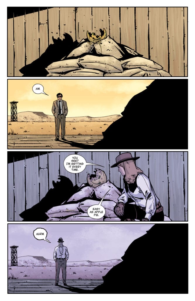
King brings us back to the house that was discussed in the last issue. He shows The Kid and Rorschach as they train and talk there in the past. But he also shows us the detective that’s piecing this all together in the present. He walks through the property, looking for clues of what might have gone on. King shows us what Rorschach and The Kid said to one another, but the detective mostly stays silent. In a way, we begin to see the detective’s own similarities to Rorschach. And just as we begin to connect the two in our minds, King adds another element to the detective’s life. An element he accepts calmly and without pause. In fact, it leads him to talking through what he’s seeing out loud. It’s an unsettling thing that happens, yet it makes him feel at home. It speaks volumes about his character.
Art
Fornes makes a point of slowing down the pace in this issue. Fornes shows us multiple versions of what feel like the same moment. We watch Rorschach walk through the house, and on the other half of the page we see the detective do the same thing. They’re different characters, at different times, but their actions and movement are the same. But Fornes also shows us small changes from one panel to the next on some pages. When Rorschach tells the Kid he thinks she’s a good shooter, Fornes gives us 6 panels to show her reaction. She seamlessly goes from laughing, joyfully, to crying at her own ineptitude. This issue feels incredibly slow, but it mirrors the gradual descent into madness that the characters are feeling. Fornes pulls the pacing back, so we can feel just as the characters do.
Coloring
Stewart’s approach to this issue is refreshingly simple. He uses a straightforward color palette for the detective’s scenes, with an emphasis on yellow. These scenes show the detective walking through the house in the light of the day. He sees everything as it is, with no filter and no distortion. But the scenes with Rorschach and the Kid are shown through a purplish-blue haze. It has the look of watching a surveillance tape off of an old TV screen. It adds to the feeling that the detective can almost see into the past, that he is somehow privy to the same information we are. And so, Stewart’s coloring brings the walls down between these scenes. It acts as a marker for which scenes are present day and which are in the past, while simultaneously making it feel like a character can look from one time into another. How Stewart is able to do these seemingly contradictory things, and so simply, is anyone’s guess.
Lettering
Cowles lures us into thinking of Rorschach and the detective as one and the same. The “Hm” of the detective is placed in the exact same part of the panel as Rorschach’s “Hurm,” two panels later. The same is true when they each use the phone. We see it from the same angle and their dialogue is placed in the same spots. And as the issue comes to a close, Rorschach sits down with the Kid at a table, grabs her hands and says “It will be good.” We see the detective sitting at that same table just a panel later. He looks down at the same spot where the lettering was a second ago, but nothing’s there. Just like Stewart, Cowles blends these times together and visually shows us how one time informs another.
Rorschach continues to be a fantastic series. The fact that it has the power to do jaw-dropping issues like issue 7 and simple, quiet, slow issues like this one, shows its incredible range. Pick up DC Comics’ Rorschach #9, out from DC Comics June 8th, at a comic shop near you!
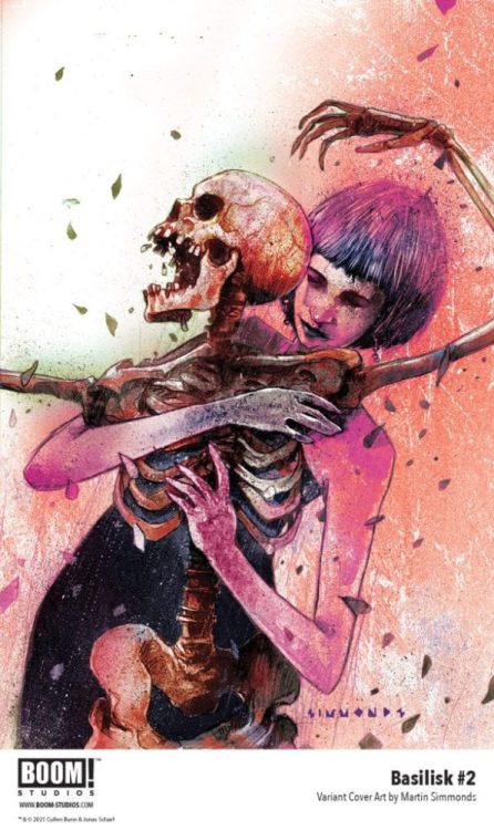
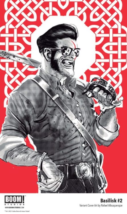
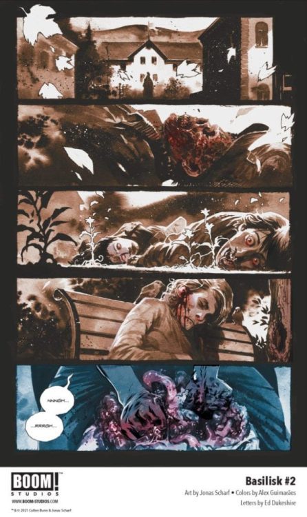
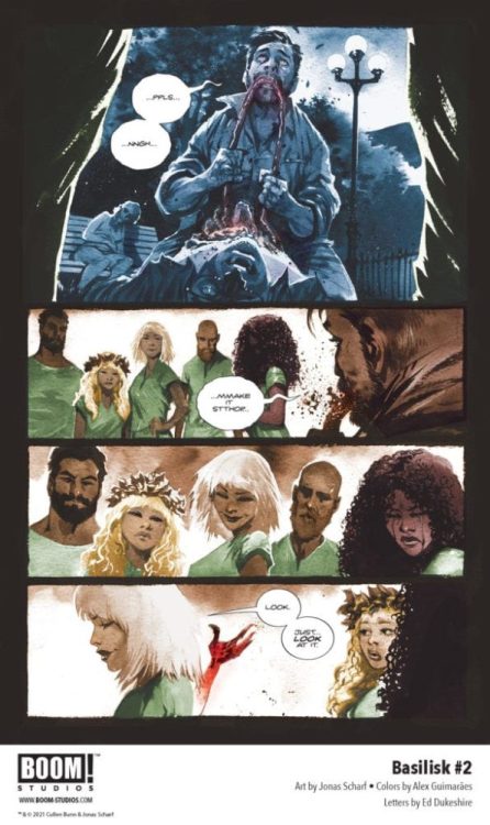
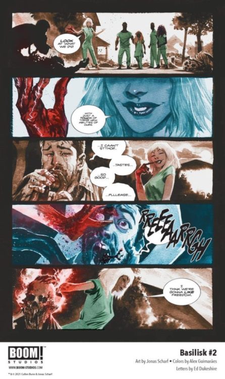
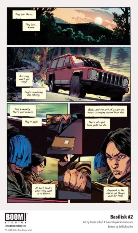
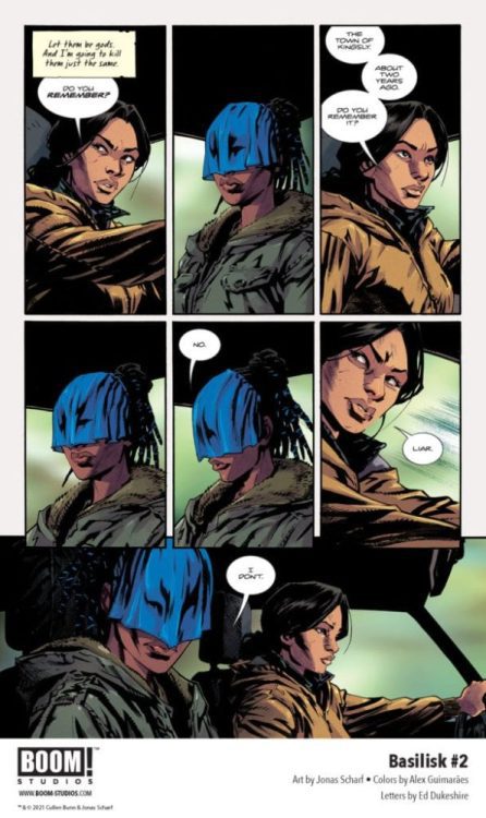
BASILISK #2 hits your local comic shop on July 7, but thanks to BOOM! Studios, Monkeys Fighting Robots has a five-page preview for our readers.
The supernatural horror series is written by Cullen Bunn, with art by Jonas Scharf, Alex Guimarães drops the colors, and you will read Ed Dukeshire’s letter work. The main cover art is by Scharf, and the variant covers are by Martin Simmonds and Rafael Albuquerque.
About BASILISK #2: Is redemption possible if it is coerced? Forced to confront the horrors of her past, Regan hits the road with Hannah – a victim from her past – who has her own set of secrets. Meanwhile, the other four remaining members of the Chimera find themselves tired of hiding from the world and move to reignite their reign of terror and death.
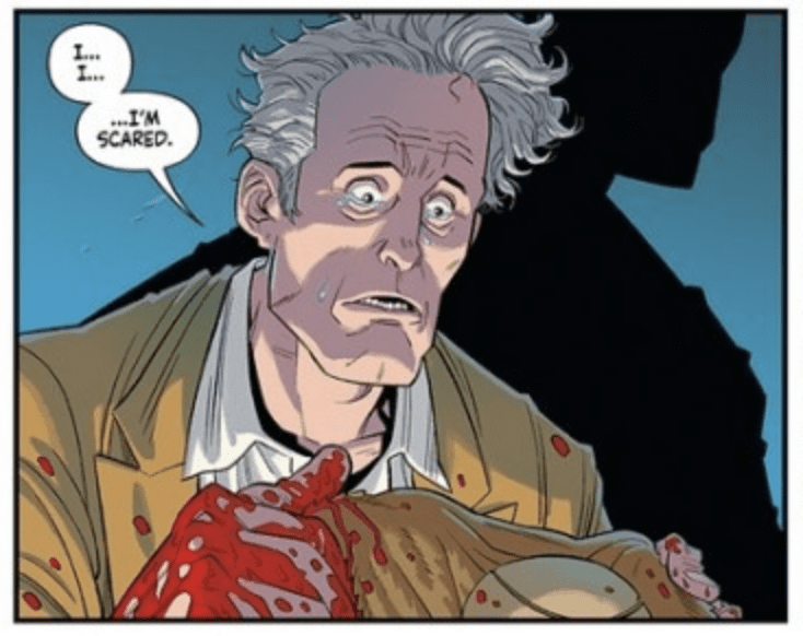
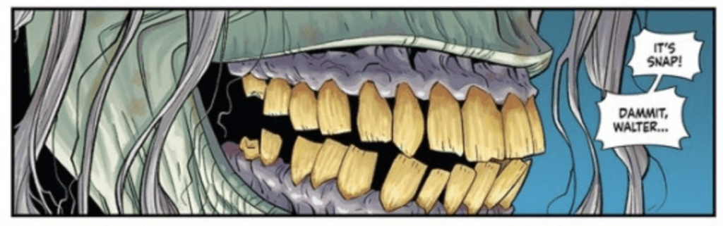
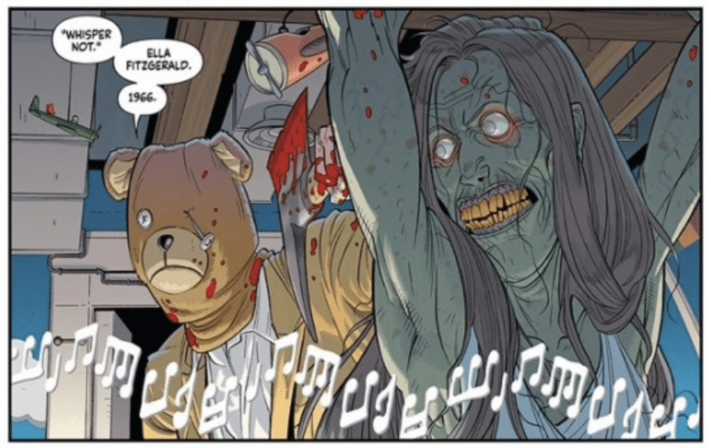
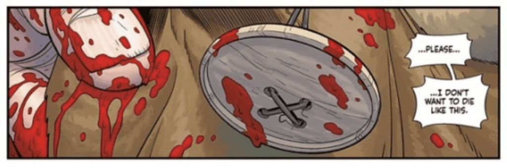
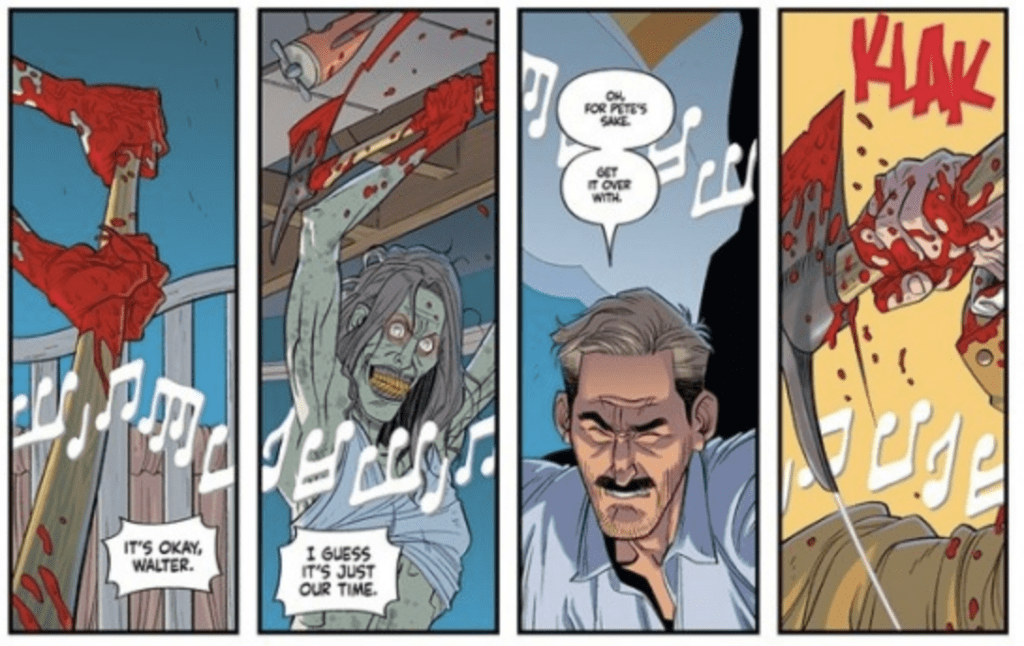
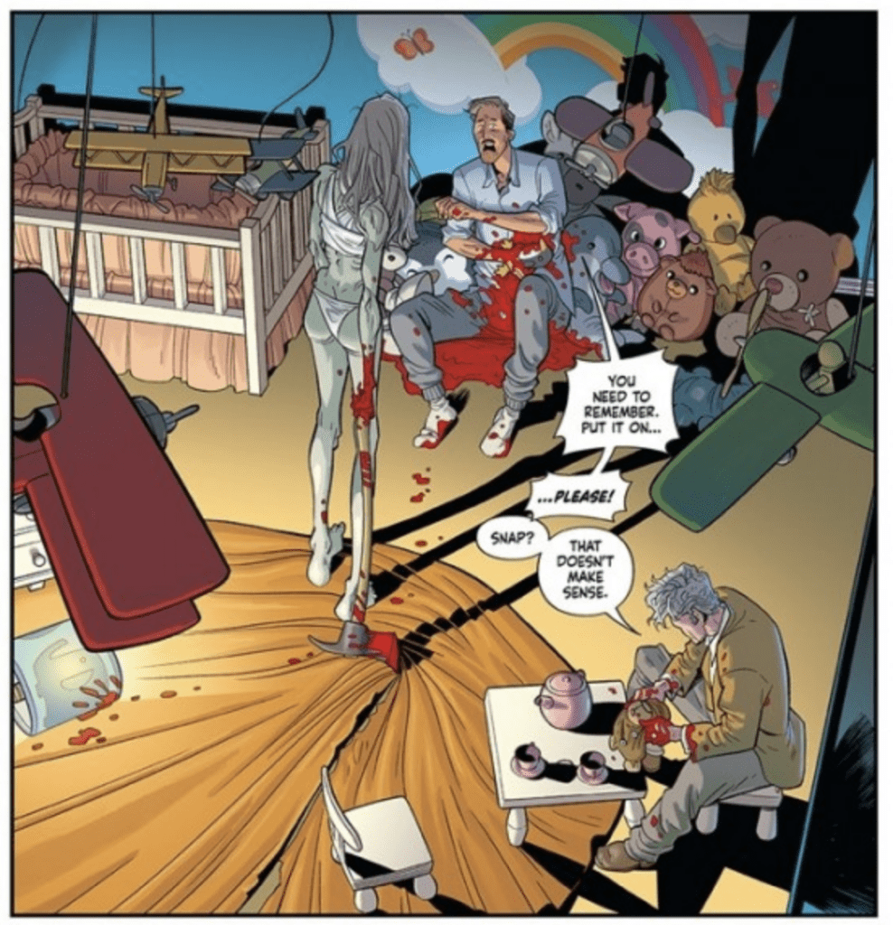
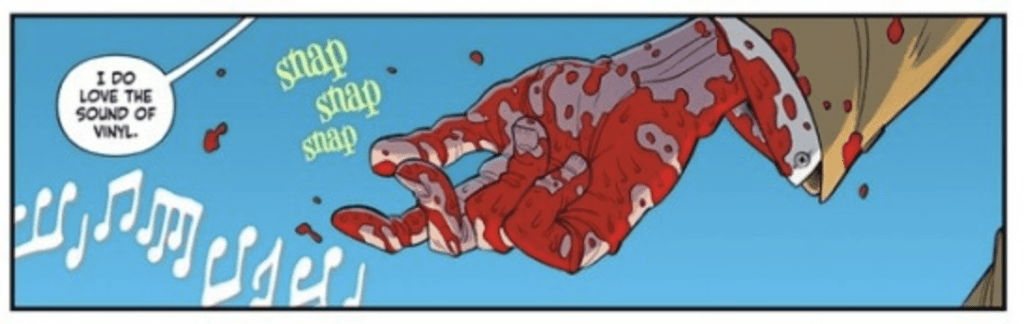
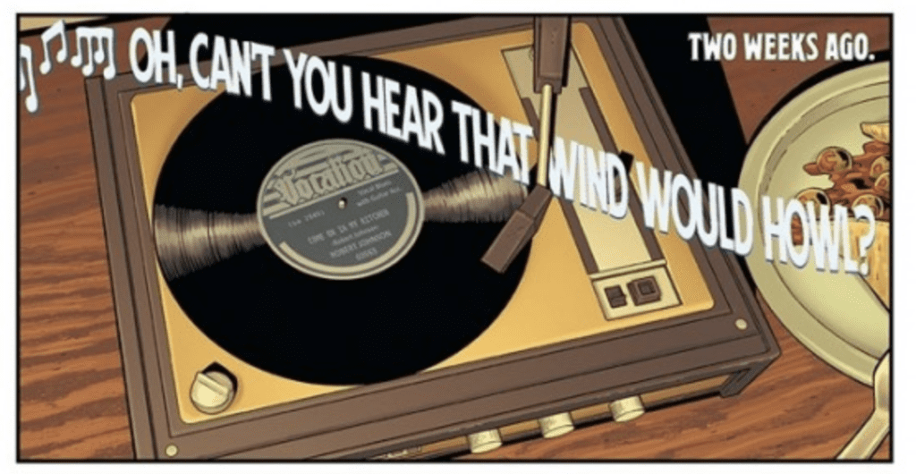
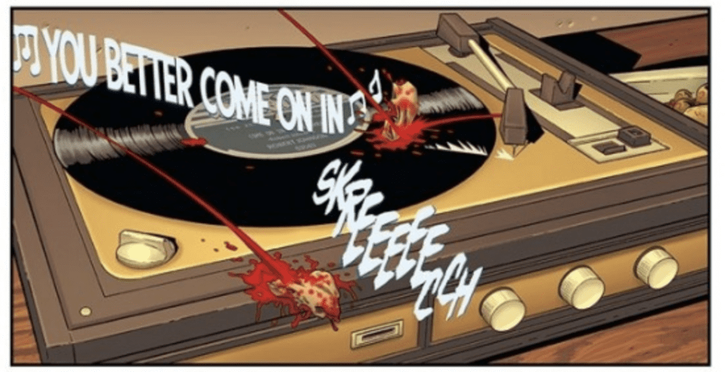
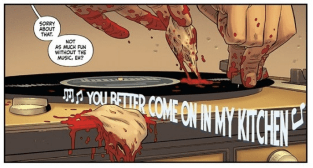
Artist Daniel Hillyard and writer Doug Wagner have an insane comic book coming out from Image Comics on June 23. VINYL #1 (OF 6) is an unsettling tale of psychopaths, sweet love, and a serial killer named Walter. Hillyard and Wagner took the time to chat with Monkeys Fighting Robots about the new series.
MONKEYS FIGHTING ROBOTS: Doug and Daniel, thank you for taking the time to chat with me.
HILLYARD:Thank you very much. It’s nice to meet you.
WAGNER:It’s our pleasure, Matthew.
MFR: Doug, Daniel Hillyard’s art is excellent in the first issue. Talk about how he pairs well with your script.
WAGNER:Daniel’s work is absolutely stunning, and his storytelling is always on point, which makes my job of delivering a visually captivating story so much easier. What makes his art so perfect for something like the dark comedy, horror of VINYL is his ability to draw realistically and in great detail but with a layer of Disney-esque animation to it. It helps take what could be an overly horrific scene and make it feel comical at the same time. We both agreed we wanted to lean into that aspect of this project heavily. I wholeheartedly admit we went way too far with some of the more disturbing bits, but then we purposefully added a touch of comedy to it all. Daniel and I seem to personally enjoy the mix of those two feelings, and we desperately want the reader to experience that same sensation as well. Yeah. We ain’t right.
HILLYARD:Thanks, dude. I will pay you later. [wink]
MFR: Daniel, how does Doug Wagner play his scripts? Is everything spelled out, or does he give artistic room to explore?
HILLYARD:The way that Doug writes amazes me. All the crucial information is there in the script, but with loads of room to play. When I read a scene or a panel description, it’s like a bolt from the blue, and I know exactly what to draw. Sometimes we go into a scene with a particular motif in mind, like starting and ending each book with a certain panel layout, but we try not to get too precious about things and let the story grow naturally. Sometimes Doug might say something in a conversation that sparks an idea, or sometimes I might draw something into a scene without realizing it, and before we know it, there is this whole other dimension to a character or scene that we hadn’t expected. And that all comes from that freedom to play a little.
MFR: Can you talk about the creation of Walter and how you constructed the character? Are there artistic elements that make Walter standout out as well?
WAGNER:We started with this idea that Walter shouldn’t “feel” like a threat. Actually, we were aiming for quite the opposite. We wanted him to be one of those people that blends in… until he doesn’t. It was important that he felt like that favorite, cool uncle that you know you can hang out with that won’t judge you. The relative you go to for real advice, not the kind you wouldn’t dare ask for from your parents. That was Walter’s basic foundation. From there, we had to figure out how to sell that aspect of him. Typically with me, once I can find that foundation for a character, the character takes it from there. I stop telling them what to do, and they start telling me what to do.
HILLYARD:From there, we worked closely to define Walter visually. Sometimes it’s easy, and characters appear on the page in the first sketch, and for others, it takes a little longer. With Walter, I remember it being a long process. We bounced a lot of images back and forth until we finally hit on one, and both thought, that’s him. I think it’s like trying to match a face to a voice. You’ve heard this person talk over the phone but never seen their face, then suddenly you have to spot them in a crowd [laughs.]
MFR: Doug, is it tough to make a serial killer the hero of the story? (Should I seek help since I already like Walter?)
WAGNER:Well, maybe we both should seek help then. To be honest, I take way too much pleasure in taking a character that should be perceived as a horrible creature and making them likable. Walter starting out as a serial killer kind of made that easier. In this case, I got to start with the character’s primary flaw and build from there. Okay, he kills people, but what’s the good side of his soul, and how will we show that to everyone. In VINYL, we find Walter has a big heart for those he deems worthy of it. He doesn’t deem very many people worthy of it, and God have mercy on your soul if he deems you not. I think just about everyone has a little bit of that in them. I mean, I’d burn down the world to protect my cats. I’d do far worse to avenge them. Doesn’t everyone have something they feel that way about?
HILLYARD: Is it wrong that I’m now envisioning Doug burning down the world, hugging his cats, and laughing maniacally? What, just me? Okay.
MFR: Was there a conversation about Walter wearing a different mask, and if so, why is the Teddy Bear mask perfect for Walter.
WAGNER:There was never another mask per se, but we did spend a few days trying to conceptualize the right one for Walter. We both agreed it shouldn’t be your typical horror movie-style mask. Been done. Not for us. Since we were playing with trying to create this beautiful horror mixed with dark comedy, we knew it had to be something that walked that line. I believe I threw out the idea of a teddy bear head being used as a mask, and Daniel ran with it, far past my expectations. We tinkered with it until it was something we would both be terrified by in real life but made us giggle at the same time. I have to admit my favorite part is that dangly eye. I silly laugh every time I see it.
HILLYARD:It sort of started off as a random idea. We’d never done a killer with a mask before, but right from the start, Doug threw out the idea of a bear mask. I tried a big mascot-style mask with reflective eyes, but what I hadn’t realized is that Walter would need to carry it around with him, so that idea quickly fell away [laughs.]
MFR: The last page of the first issue is epic as we witness a transformation of Walter. How dark is Walter going to go? Do you have a line of darkness you won’t cross?
WAGNER:Oh, Walter’s going to go pretty dark. But we’re hoping his kind of darkness comes across a little different than you’ve seen before. It’s this cold, unfeeling, unrelenting kind of thing. He’s just so matter-of-fact about it. In my head, it’s all based on his personal philosophy. His philosophy is a little more in line with Sun Tzu in that he believes you must love your enemy in order to absolutely ruin them in every way.
As far as a line, I won’t cross. I really don’t know. I haven’t bumped into one yet.
HILLYARD:Oh yeah, it gets pretty crazy. I mean, later in the story, there’s some stuff there that’ll give people that faraway glazed look in their eyes.
MFR: Creating horror in comics is challenging; what elements do you plan to use to scare the reader?
WAGNER:This is all my opinion, but I think to be successful in a horror comic, you have to focus on psychological horror and building tension. I mean, you can’t exactly do a jump scare or creep somebody out with how a character moves and talks. But you can have the reader worried about what’s around the corner, what’s on the next page. You can tease them with what a character might do in the next panel or scene. If you can make the reader hesitate before turning the page, scared of what they might see, that’s a win in my book. That’s the tension part you hope you can attain. On the psychological side, I think that’s where concept is everything. Imagine you’re locked in an underground bunker and have to choose whether to side with a Manson family-style death cult or a group of serial killers. That’s the basis of VINYL, and I think everyone would be terrified to be caught in that fight. AND you know us, we also tossed in a ton of over-the-top, ridiculously ridiculous gore, but I don’t think that scares people as much as makes them uncomfortable.
MFR: The first couple of pages come out swinging with a crazy-looking monster lady. How did her design come together?
WAGNER: Mum, as we affectionately refer to her, was a blast for me. This was one of those characters where Daniel and I cut loose and just let our 5-year-old selves have at it. We sounded like kids hopped up on caffeine and moon pies.
“Mum should be all emaciated and bony with nasty teeth.” “I want people to cringe when they see her.” “She should drag an axe around.” “An axe covered in BLOOD!!”
Yes, I’m fairly certain that’s exactly how that conversation went.
HILLYARD:[Laughs] that’s exactly how I remember it.
MFR: Daniel, your art style is realistic but not hyper-realistic; how do you think that influences how people connect with the story?
HILLYARD:Thanks so much. I read somewhere that people only see a small percentage of a character’s emotion when it’s shown in a still image, and so in comics in particular, you have to dial it up a little. I still want our characters to feel solid and real but have a cartooniness (is that a word?) to them. Characters that you can really play around with but still be uncomfortable with seeing cut apart. I think that hyper-emotive expression is one of the reasons that so many people relate to their favorite cartoon and comic book characters. My hope is that we can tap into a little of that here and in the many other books that we plan on making together and create characters the people can fall in love with. Characters that you’ll miss.
MFR: What’s your reaction going to be like when a person walks up to your table at a convention dressed like Walter?
WAGNER:I have yet to see anyone dressed up as one of my characters, so I have a feeling I will probably be overwhelmed by pure joy and a sense of validation. Heck, I might even cry.
HILLYARD: That would be my whole world! And maybe that was the real secret reason for having a character wearing a mask. You never know.
MFR: Doug and Daniel, thank you again, and best of luck with the series.
WAGNER:Thank you, Matthew. I can’t tell you how much we appreciate you giving our little book the time. It means the world to us.
HILLYARD:Thank you so much, Matthew.
VINYL #1 (OF 6) hits your local comic book shop on June 23.
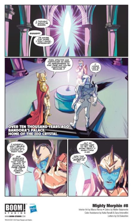
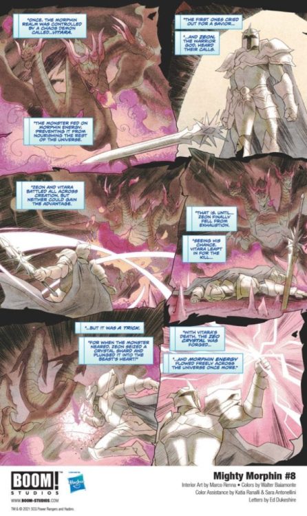
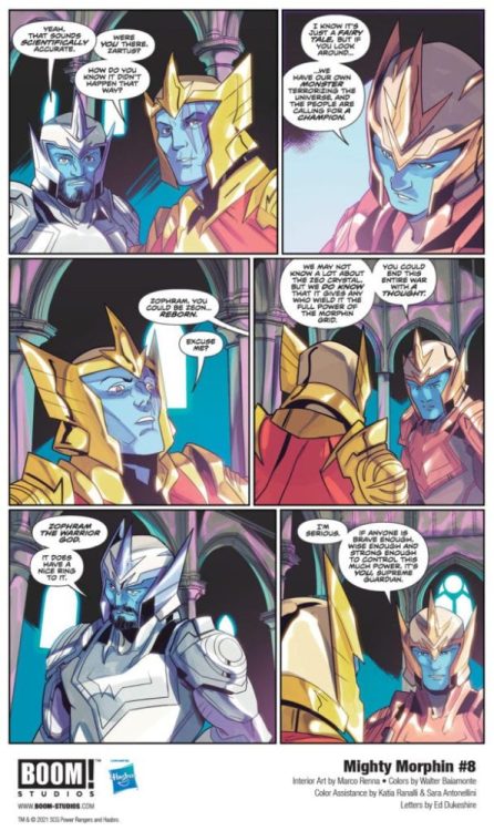
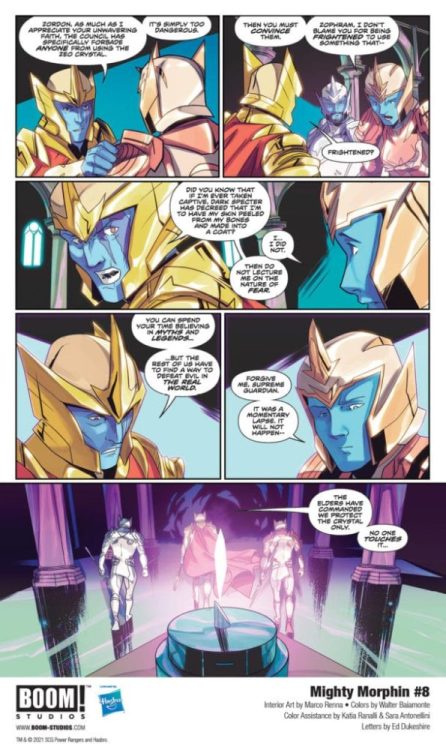
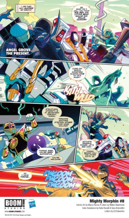
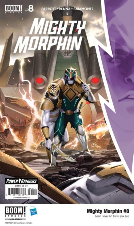
Past & Present Collide in Your First Look at MIGHTY MORPHIN #8, and thanks to BOOM! Studios, Monkeys Fighting Robots has an exclusive preview for our readers.
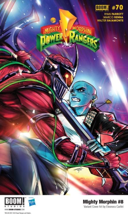
The book is written by Ryan Parrott, with art from Marco Renna, Walter Baiamonte drops the color with color assistance by Katia Ranalli and Sara Antonellini, and you will read Ed Dukeshire’s letter work. MIGHTY MORPHIN #8 features main cover art by acclaimed illustrator InHyuk Lee, and variant covers by Eleonora Carlini, and Peach Momoko.
About MIGHTY MORPHIN #8: Will the Power Rangers be able to save Angel Grove from Lord Zedd and his Putty Primes? With Tommy’s life on the line, the rest of the team will have to rely on new allies with their own agenda. Meanwhile, past and present collide as the truth reveals itself and all the players make their moves…
It is May 31, 2021, and if you are reading this, it means you have survived the apocalypse! I’m your host Matt Sardo, and boy did we have a week. Let’s talk about it.


")