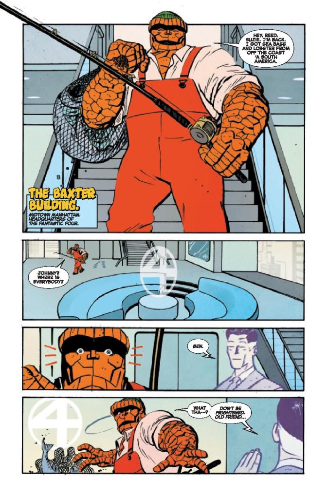
“Brooklyn, New York. Years Ago.” So starts writer Walter Mosley’s script for The Thing #1. Letterer Joe Sabino shows the dateline in a large, yellow, almost goofy font. With these small things, Mosley and Sabino create a time capsule to campy 60’s comics. Yet, the image that artist Tom Reilly and colorist Jordie Bellaire present, on the first page, is anything but campy. A hooded figure stalks a dilapidated neighborhood. The background characters are quiet, silenced by a hushed terror. The hooded figure does a mysterious yet horrifying act, and then we’re met with a smiling Ben Grimm in a fisherman’s outfit.
The Thing #1, from Marvel Comics, is a wild blend of 60’s stories with a modern temperament. Writer Walter Mosley, artist Tom Reilly, colorist Jordie Bellaire, and letterer Joe Sabino manage to have the best of both worlds.
Writing
Mosley’s range is shocking and brilliant. One might thing that Mosley, a celebrated novelist, would tend towards having a more text-heavy script. But The Thing #1 is wonderfully paced. Mosley, on multiple occasions, will blast us through an action sequence that has little dialogue at all. And his wordier scenes have a joyful silliness to them. By setting this issue “Years Ago,” Mosley gives himself the perfect opportunity to celebrate old comics, by matching their tone and style. Yet he’s always bouncing back to scenes of a deeper and darker nature. Mosley really has found a fantastic balance of fun and depth.
Art
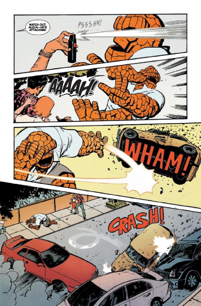
Reilly brings in so much of the wonderful silliness of The Thing #1 with his art style. Every emotion the characters feel is amped up to 11. When Ben Grimm and Alicia Masters get into a fight, it escalates immediately. In one panel, Ben looks angry with his arms crossed, in the next they’re both yelling at each other with their whole bodies contorted in fury, in the full throws of an all-out shouting match. And when Ben is talking to someone about his strengths and weaknesses, he’s a whole tableau of emotions. He’s depressed then deep in thought, satisfied then totally discouraged. All of it is plain as day on his face.
Reilly gives these pages a really melodramatic tone, matching the time period these scenes are celebrating. But the truly emotional moments, Reilly slips under the radar. When Ben is trying to be strong, or when he’s facing away – almost like he’s too hurt to face the reader at all – that’s when your heart breaks. Reilly hides it among the flashy fun that he provides so well, but it’s the beating heart of the story.
Coloring
Bellaire shows what each scene is about in the color palettes that she chooses for them. When we open on the hooded figure, the scene is grey and lifeless. Soon, it evolves into something red and violent. Later, when Ben has a nightmare, his dream is colored in that same tint of red. But when we first see Ben, he looks like himself. He’s wearing orange coveralls and looking happy. The color palette is warm and welcoming. As Ben begins to feel more and more isolated, the color palette turns to a cold blue. Ben is always a character who wears his heart on his sleeve. Thanks to Bellaire, The Thing #1 follows Ben’s example!
Lettering
Just like everything else in The Thing #1, the lettering has a great way of bouncing between styles. Even at the beginning, the dateline is in big, yellow bubble letters. Sabino makes it feel and look like an old comic. The big sound effects that follow, like the “KRASH” of a door bursting into pieces, adds to what could almost be called the “60’s Batman” effect. But just a few pages later, it’s the thin white lettering of “KNOCK KNOCK” that stands out. It’s eerily quiet compared to everything else we’ve seen. And soon we see why. The lettering for the “BTHMP BTHMP” noise of a beating heart is just as subtle. Sabino makes the most horrifying moments the most understated and it has a brilliant and terrifying effect.
Marvel’s The Thing #1 is a ton of fun. But hidden between the laughs and the action is a really emotional story too. This creative team is somehow having their cake and eating it too. They’re celebrating old comics, in all their campy glory, and creating a timely narrative of heartbreak and disillusion. Pick up The Thing #1, out from Marvel Comics November 10th, at a comic shop near you!
Whenever Edgar Wright makes a film, there is always interest from film aficionados. His latest film sees the filmmaker make a dark and intense horror film.
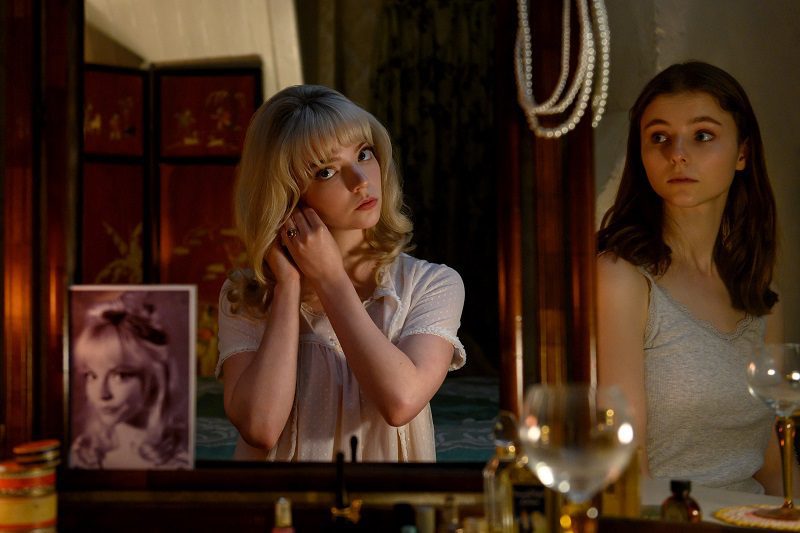
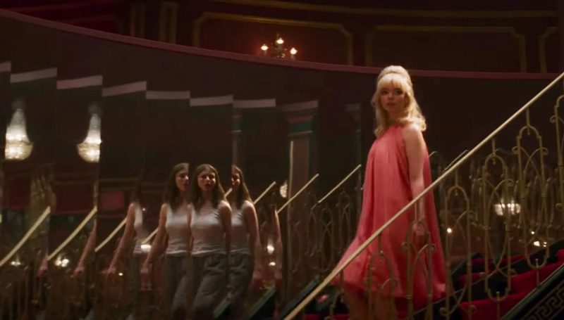
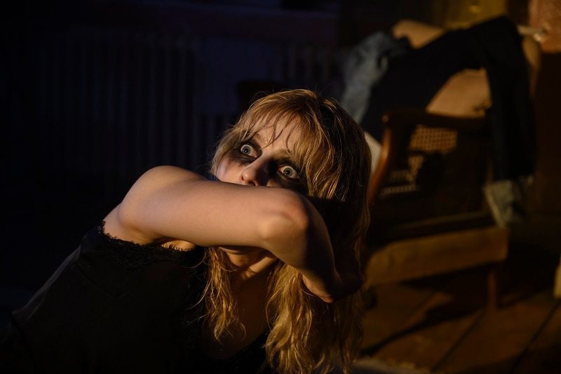
Eloise ‘Ellie’ Taylor (Thomas McKenzie) moves to London after being accepted by the London College of Fashion. Despite Ellie dreaming of becoming a fashion designer, she struggles to adapt to life in Halls and moves to a Bedsit in Soho. At night she develops a psychic connection to Sandy (Anya Taylor-Joy), a confident singer in the 1960s. But the journeys to the ’60s end up taking a dark turn.
Wright is no stranger to the horror genre. Shaun of the Dead was a horror comedy and Hot Fuzz and The World’s End had horror elements. Nor is he a stranger to have some pathos in his films – like the reveal in The World’s End that the main character had tried to commit suicide. Last Night in Soho marked Wright’s first seriously toned horror, and he showed he had no problem stepping out of his comfort zone.
Last Night in Soho was a perfect cocktail of acting, writing, and direction and was a mainstream horror with a lot of substance. It was a horror film about sexualization, sexual abuse, and mental health. There has been a rise of #MeToo influenced films, and Last Night in Soho is one of them.
The #MeToo elements mainly come from Sandy’s half of the story. She’s an aspiring singer who was confident to go into one of the biggest clubs and states she wants to perform. However, Sandy was being harassed by older men in the club, and it gets worse for her as the film progressed. She was made to perform as a backup dancer in a highly sexualized show, and she was made to impress men to help advance her career. A horrific sequence was when Ellie was backstage and saw the backup dancers perform sex acts or take heroin to dull their pain. It pulled back the glamorous curtain.
Even in the present day, Ellie suffered at the hands of sexism. She was on the receiving end of inappropriate comments when she arrived in London and saw leaflets for prostitutes in a phone box. Ellie saw one of the venues Sandy performed in had turned into a massage parlor.
Ellie and Sandy’s experiences in London play into another theme of the film: there was a lot of sleaze underneath London’s flashy facade. Both go to London with high hopes and discover that the city’s bright lights are not what they seem. Ellie’s story does play like an inversion of the old British horror trope that the countryside is scary. Ellie moves from a lovely little house in Cornwall to the horrors of the British capital.
Mental health was also a significant theme of the film. Early in the movie, it was stated that Ellie and her mother had issues with mental health. Ellie’s mum committed suicide, and Ellie sometimes sees her in the mirror. Ellie struggled and was trapped in a waking nightmare. Many characters ask if she’s okay and tell her it’s okay to ask for help. It was easy to feel for Ellie and her struggles because she’s a nice girl who can’t escape the haunting.
Ellie’s struggles to adapt to uni life felt believable. She’s a quiet girl from the countryside who’s made to live with a load of overprivileged people who want to party. It was hard for her to acclimate, and she had few interactions with her fellow students. Her only friend at university was John (Michael Ajao). Synnøve Karlsen deserves a lot of praise for her role as Ellie’s roommate, Jocasta, because she was so repulsive. She was a vain and callous posh girl who deserved an unpleasant death.
Wright made a tremendous and thoughtful genre film. and shows he can adapt by making a serious female-centric film.
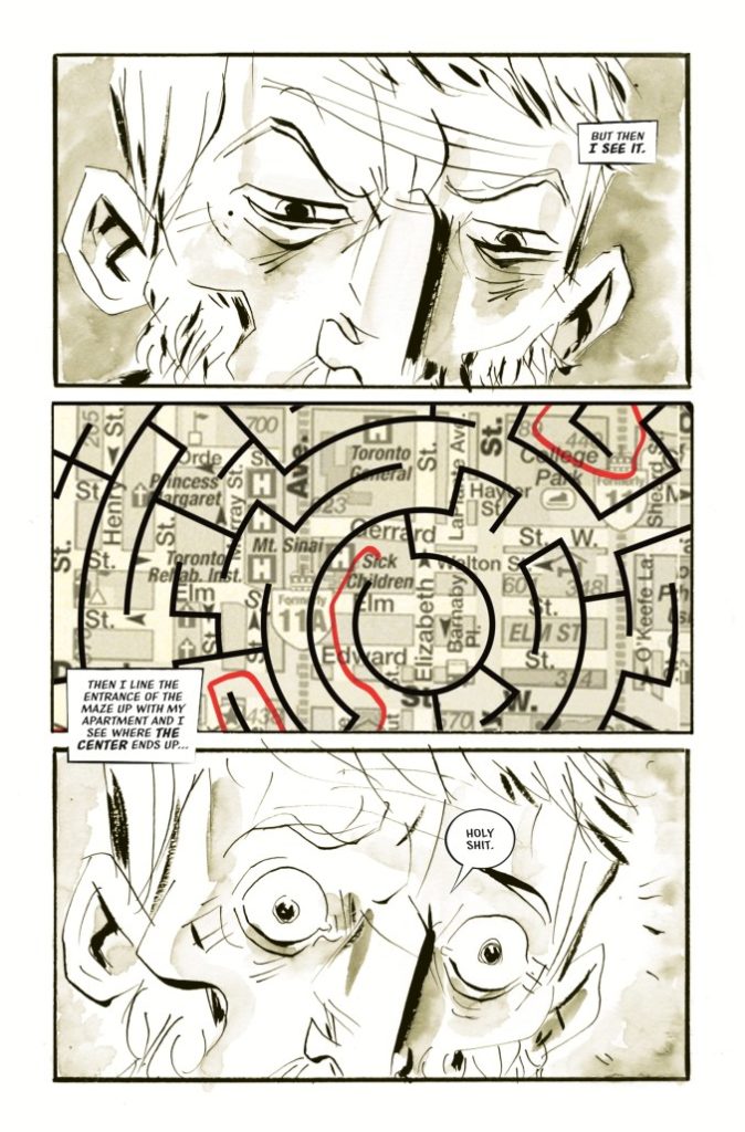
Modern comics heavyweight Jeff Lemire (Sweet Tooth, Black Hammer) continues his fascinating meditation on grief and dreams with Mazebook #3. With lettering from Steve Wands, this series continues to get more and more compelling. With outstanding character writing, increasingly mysterious plot developments, and pitch-perfect visuals, Jeff Lemire may be in the process of crafting his best work yet.
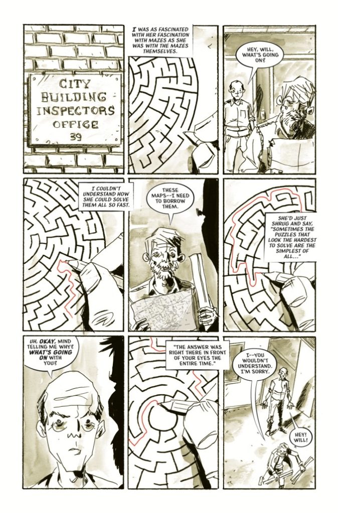
“Will’s a melancholy building inspector who’s been grieving the loss of his puzzle-loving daughter for years. After getting a mysterious phone call from a girl claiming it’s her and that she’s trapped in a labyrinth Will sets off on a journey fighting through the corridors, tunnels, and monsters of his city on a mission to bring her back home.”
Writing & Plot
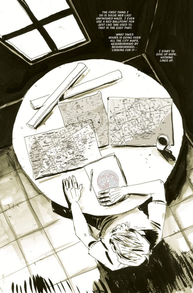
No one should be surprised at Lemire’s ability to write and construct a plot when they open up Mazebook #3. He’s one of, if not arguably the, most accomplished comics creator of the last 15 years. So the fact that I was still taken aback at how great elements of the writing are just goes to show how delightfully surprising this comic has been. Will’s oppressive sadness that turned into desperation in the past 2 issues has finally morphed into a sense of resignation. We see him give up on reality to give himself over the the strange, almost supernatural world that his daughter has been seemingly contacting him from. Witnessing Will do this is strangely cathartic. The notion of him leaving the melancholic half-life he had had to give himself over to mystery is honestly the healthiest decision he could make.
Lemire makes these developments feel so natural. Every plot event has come across with a sense of perfect pacing.
The real surprise and treat here is Lemire’s wonderful dialogue writing. There’s a scene between Will and his neighbor that goes on for a few pages that is perfectly constructed. His dialogue is both realistic and charming, like we’re witnessing an actual conversation between two people. The word choices are perfectly manicured and structured for normal speech and it makes for some of the most convincing dialogue I’ve read in a comic. Jeff Lemire is running at his absolute best in this series, and his work in this issue propels Mazebook to near the upper class of his work overall.
Art Direction
Jeff Lemire’s art continues to be the perfect visual touch in Mazebook #3. His rough, unconventional style adds a heart and character to the book that comes through despite it’s comparatively odd aesthetic. What really sticks out about his work are his character expression details. Lemire has always managed to craft intimate character moments through his facial expressions. His wiry linework makes for convincing emotional moments, and in this case work wonders during that quiet conversation scene I mentioned earlier. His work also manages to maintain a gloomy, mysterious atmosphere through a lack of detail in the environment. This touch makes even more sense the further away from reality Will becomes.
Lemire’s use of color in this series is unique and beautifully melancholic as well. Instead of filling the lines with color, the pages are semi-saturated in a single tone. Most of the book has a sheen of light patina. This will change over to light blues and greens, with splashes of color on an important detail. Lemire’s visuals will no doubt rub some people wrong, but they’re the perfect touch for his own work.
Verdict
Mazebook #3 makes an already intensely fascinating comic series considerably more so. Jeff Lemire writes a compelling, expertly paced issue with great, naturalistic dialogue. His unmistakable visuals are the perfect vehicle with which to tell this story. This is fast becoming one of Lemire’s best works yet, so be sure to grab this issue when it hits shelves on 11/10!
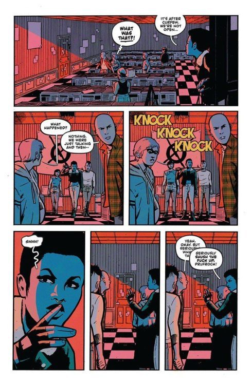
Tyler Boss and Matthew Rosenburg, the creative team behindFour Kids Walk Into A Bank, come back together for a story of angst, music, and gang violence in the apocalypse in What’s The Furthest Place From Here #1. With lettering from Hassan Otsmaine-Elhaou, this opening chapter is a unique and brilliant fusion of youthful rebelliousness and apocalyptic desperation. With mysterious storytelling, standout characterization and kickass visual direction, Boss and Rosenburg likely have another absolute wonder on their hands.
“The world has ended. All that remains are gangs of children living among the ruins. But Sid believes there must be something more out there. When she disappears into the wastelands, her gang will risk everything to bring her home. A story about the things that matter most—your survival, your loved ones, and your record collection.”
Writing & Plot
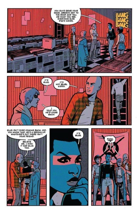
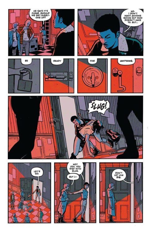
The joint storytelling effort of Tyler Boss and Matthew Rosenburg makes for a singular comic read with What’s The Furthest Place From Here #1. Post-apocalyptic stories are so popular and prevalent in every medium that it’s hard to imagine how new and unique ones can be created. Boss and Rosenburg answer this problem with a perspective, style, and tone unlike any other story of its kind. Our protagonists are a group of punks known as “The Academy.” Their main enemies are the other rival gangs in the neighborhood, and the idea of growing up. This opening issue sets up a fair amount of mystery going forward. We don’t find out how the apocalypse began, or why these “kids” (who appear to be in their late teens/early 20’s) fear growing up so much. These are secondary concerns, though. What matters most is what these characters do with the lot they’re given.
Boss and Rosenburg have made a point of advertising just how important music is to this comic series. Hell, the “Deluxe” edition of each issue comes with a 7″ vinyl with tracks selected by the creators. The branding of each individual’s personality by a record they select from the record store they shelter in is such a punk teen and comic book move. The record choices work as a backdrop to the character’s actual personalities. Each member of The Academy has their own quirks and concerns that are naturally worked out through interaction amongst each other, and with their enemies. Boss and Rosenburg craft these characters with such a distinctive voice that it’s impossible not to feel the tone of every moment. There’s an inescapable attitude that this book has that is just so damn rad.
Art Direction
Surprising no one, Matt Rosenburg’s art direction in What’s The Furthest Place From Here #1 is just as cool as the plot construction. There’s so much to unpack in character design, settings, color choice, and panel direction here. First off, the very nature of this comic’s concept demands a roster of easily recognizable hooligan survivalists. Rosenburg & Co. deliver. Characters are inked and drawn with immaculate detail to bring them to life. The Academy as a whole looks like the same folks who you see at your local underground punk/hardcore/ metal venue. Considering the music Boss and Rosenburg admit to listening to while making this comic, this visual choice makes to much sense. Every alt hairstyle meshes with shredded jeans, fishnets, torn tank tops and olive-colored cargo jackets. Ah, I can smell the PBR and American Spirits.
Panel Direction
The real treat in this comic’s visuals is its direction. There isn’t an adherence to a specific panel structure. Really, in that regards it’s relatively bog-standard. However, it’s clear that the intention was just to use however many panels it took to do the job. Close-ups on important detail pieces that we will need to remember are balanced out by sometimes lengthy conversation pages. The shifting perspectives from different people in a conversation, or even panels focusing on a group as a whole, really set a sense of place and noise within the setting.
There’s a party scene in the record store where everyone in the party is being shown even though the dialogue focus is only on two or three characters. Rosenburg and Boss give the whole group attention, even if only a couple are moving the narrative forward. This actually gave me the impression of a Robert Altman film, where so much is happening and the setting is full of noise, making the comic feel more alive.
Colors & Lettering
The coloring (with assistance from Claire DeZutti) is tonally rich and varied from scene to scene. There’s a sort of flat tone carried over each page, but it changes drastically in each setting. The record store has a constant red tinge to it that is reminiscent of a film developing room – or even more fitting, the backlighting of an underground venue. Every surface pops in its own right, and every panel looks like it could be an alt album cover. The lettering from Hassan Otsmaine-Elhaou is distinct and perfect for this comic. There’s a definite hand-drawn feeling to the font and how dynamic it is. The text in the word bubbles flows with its size and bold changes in a way that is difficult to describe without actually experiencing it. Every aspect of this comic’s art is absolutely top-tier, and is a massively cool piece of creativity altogether.
Verdict
What’s The Furthest Place From Here #1 is, in my professional opinion, an absolute ripping ass-kicker of a comic. Boss and Rosenburg are two creators at the height of their storytelling creativity and this issue shows. A mix of The Warriors, Mad Max, and the sensibilities of My Chemical Romance’s Danger Days, this is an impossibly cool mix of styles and mediums into comics. Please be sure to grab this comic when it hits shelves on 11/10!
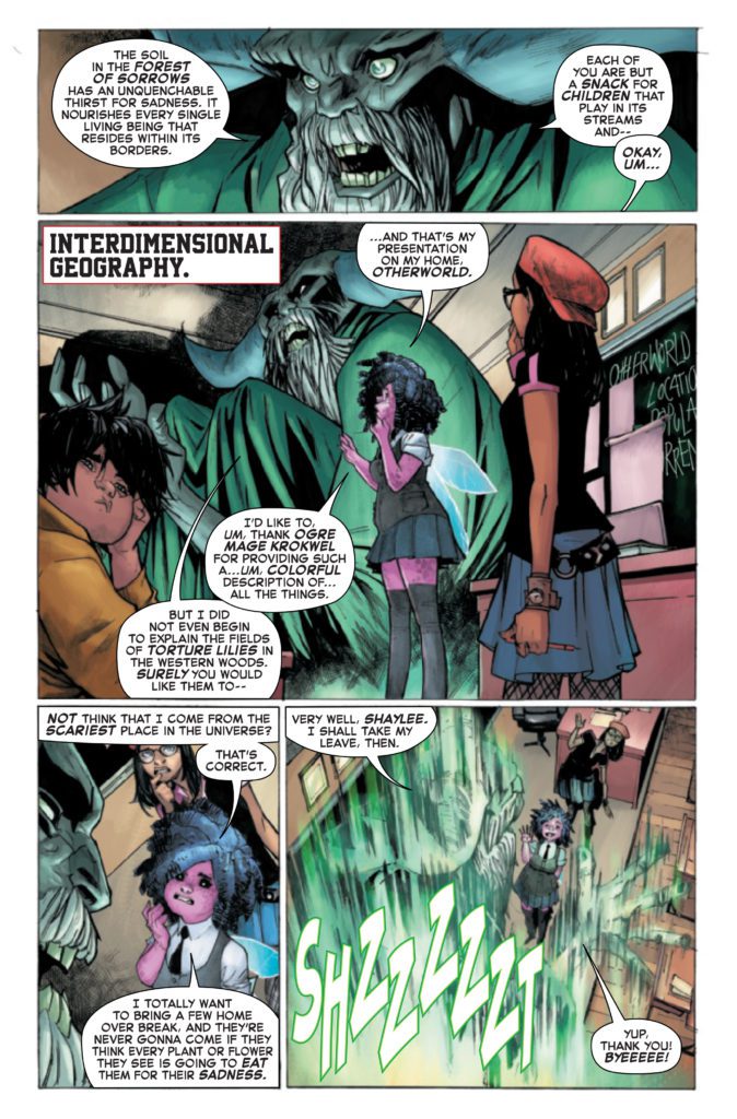
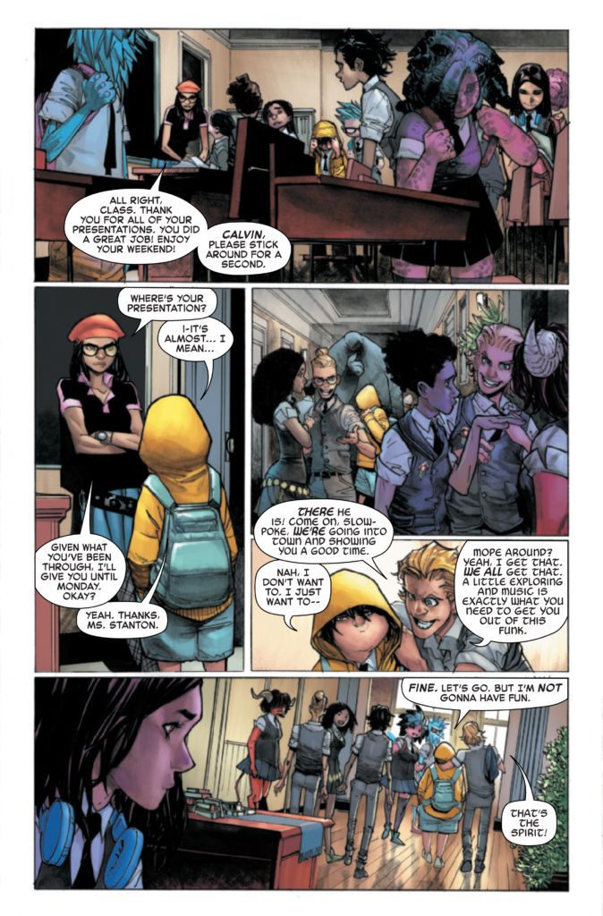
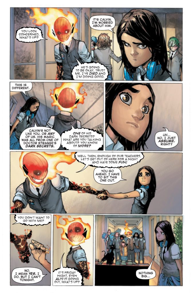
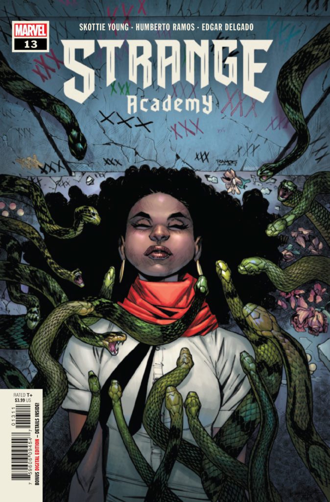
STRANGE ACADEMY #13 hits your local comic book store November 10th, but thanks to Marvel Comics, Monkeys Fighting Robots has an exclusive four-page preview for you.
About the issue: The Strange Academy kids have a night on the town in New Orleans! Some kids go for a tour of a famous NOLA graveyard, and I’m sure you know how teens in graveyards usually go. Emily takes a field trip of her own, and we also learn the SECRET ORIGIN OF ZOE LAVEAU!
The issue is by writer Skottie Young and artist Humberto Ramos, with colors by Edgar Delgado, and letters by Clayton Cowles. The main cover is by Ramos and Delgado.
Check out the STRANGE ACADEMY #13 preview below:
Are you reading STRANGE ACADEMY? Sound off in the comments!
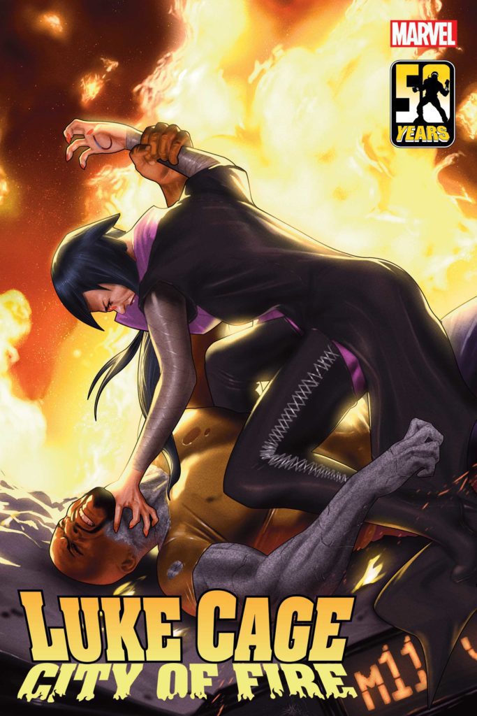
LUKE CAGE: CITY OF FIRE #3 (OF 3) hits comic shops in February, but thanks to Marvel Comics, Monkeys Fighting Robots has an exclusive first-look at the book and its two covers!
About the issue: A TURNING POINT FOR CAGE!
As the city burns, the Regulators set their sights on an innocent child who’s unwittingly holding critical information. Luke Cage races to get to the girl first, which brings him face to face with Jo Rockhead, the lethal leader of the Regulators who has the power to turn people to stone.
It’s a fight for the very soul of the city – but when Luke finds out he and Rockhead have something in common, will his resolve waver?
The issue is by writer Ho Che Anderson and artist Sean Damien Hill. CITY OF FIRE is a tie-in to DEVIL’S REIGN, the new Marvel event spinning out of Chip Zdarsky and Marco Checchetto’s DAREDEVIL.
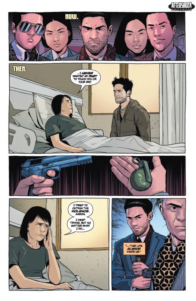
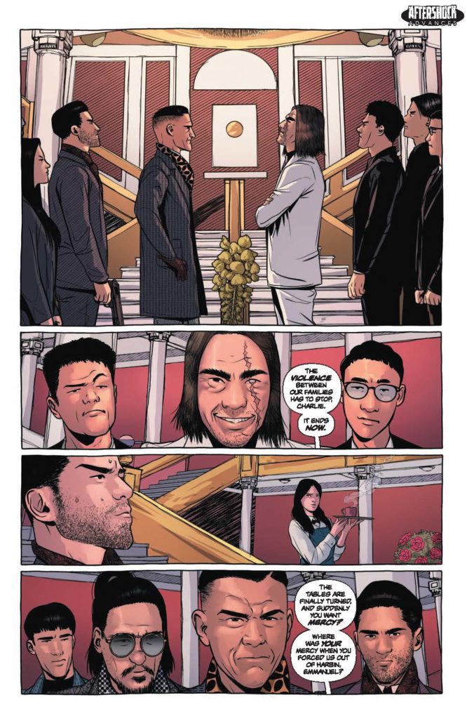
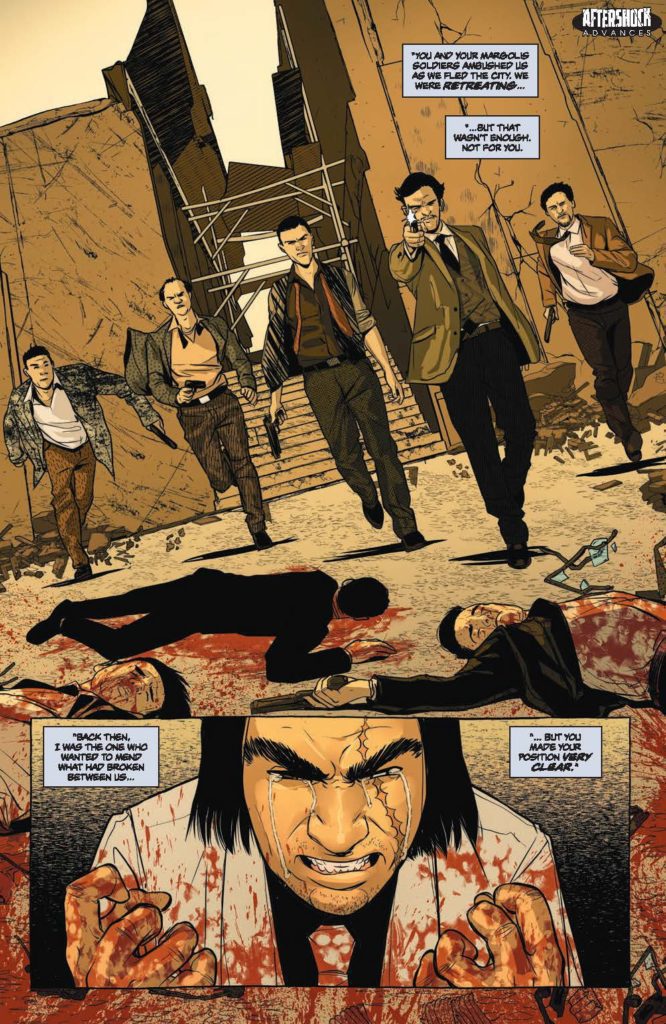
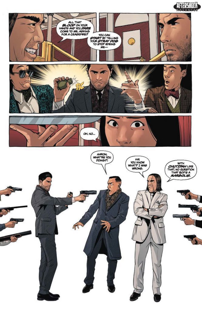
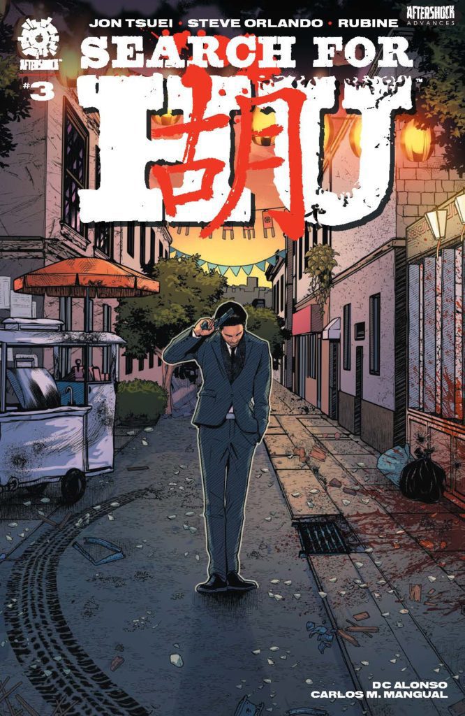
SEARCH FOR HU #3 hits your local comic book store December 1st, but thanks to AfterShock Comics, Monkeys Fighting Robots has an exclusive four-page preview for you.
About the issue: Aaron Tse’s path of revenge has already taken him from America to China to avenge an attack on his parents perpetrated by his own family. After a disastrous shootout between the Hu and Margolis sides of said family, Aaron questions everything. Is this a war he can’t win? Just when Aaron thinks the stakes can’t get any higher, tragedy strikes again, and this time, it might finally push him past the point of no return.
The series is by writers Steve Orlando & Jon Tsuei and artist Rubine, with colors by DC Alonso, and letters by Carlos M. Mangual. The cover is by Rubine and Alonso.
Check out the SEARCH FOR HU #3 preview below:
What’s your favorite current AfterShock series? Sound off in the comments!
Glen Carabin is a new writer and artist in the comics industry. His debut work, Dartmouth, is a fun, pulpy, experimental blast of comics, right to the face! Monkeys Fighting Robots got the chance to chat with Carabin about his creative process and inspirations behind Dartmouth.
Monkeys Fighting Robots: So, Glen, you mentioned to me before that part of the reason you have such a unique style in Dartmouth is because you just didn’t think you could draw. And so, you photoshopped actual photos of scenes and added lettering over it. It really does create a unique and interesting style though, kind of born out of a “shortcut” so to speak. Do you plan to keep this style going in more works that you produce or are you looking for a more conventional artist for your future projects?
Glen Carabin: If I had to illustrate this book, it would never get done, and I’d have nothing to prove my interest in making comics. That said, I am not an illustrator, but, after creating the Dartmouth character through photo-manipulation on an iPhone app, and writing the story for this book, I would mention it in conversations at comic shops and show the images to people in hope of finding someone interested in illustrating it for me.
I eventually realized though, that’s probably not going to happen. So, with some encouragement, I decided to do my own art for the project. I enjoy working in photoshop. I consider it a hobby or pastime to develop scenes and sequences each night with a game on in the background. I also now realize it would be a ton of work for an artist to illustrate these next couple of books, so I’m not even going to think about it.
But, to answer your question, the reason I wrote this book in the first place, and did the artwork, is to show artists that I am willing to do the work, that I am serious about making comics. And the last thing I want to do is insult artists by passing off what I’m doing as a replacement for the work they do. It’s not. Like I said, if I didn’t do the artwork on this book, it would never get done. I had to do it, and incidentally, while I was making Dartmouth, I read Brian Michael Bendis’ book Words for Pictures. In it, he writes, “Comic art does not have to be inked line art. It can be painting, etching, photography, multimedia, or any combination thereof.”
That passage gave me the confidence to continue working through this project. Like what I was doing was ok. Furthermore, I absolutely do hope to collaborate with illustrators, real artists on other projects someday. In the meantime, I am certainly open to giving the covers of the next two or three issues of Dartmouth (front, back, inner and outer) to artists interested in developing any cover art for the project. Just let me know.
And one final note, there’s a website called Blambot. These guys offer fonts for indie creators to use to develop professional quality lettering for their comics. I need to give them a mention here. Their fonts really improved the overall quality of Dartmouth.
MFR: This question is a two-parter. There are some clear references in Dartmouth to real life events, places, and things. Even the name, Dartmouth, is like Dartmouth, Nova Scotia, which I know is your stomping grounds. What were some of the real-life inspirations for this work?
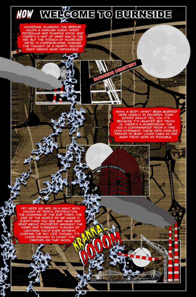
Carabin: First off, in Dartmouth there’s an important body of water called Boonamoogwaddy Harbour. It’s actually spelt Ponamogoatitjg. It’s what the Mi’kmaw First Nation called the area we now know as Dartmouth, Nova Scotia. The initial inspiration for the lead character and for this book obviously comes from the city’s name, Dartmouth, but also, if you live here and take a closer look at the lay of the land, it eerily resembles the geography of Gotham. For example, if you cross from Halifax into Dartmouth via the MacKay Bridge, you arrive near a district called Burnside.
Likewise, in Gotham City, if you cross Brown Bridge, I believe it’s called, you arrive in Burnside and, as you know, Batgirl keeps watch over Burnside. So there’s a nod to that character and her alter-ego in Dartmouth through a bookstore called Gordon’s Gently Loved Books. Then there’s Tufts Cove Generating Station (Burnside Power Plant in the book). It’s situated near Burnside, Nova Scotia, in a location similar to where Interstate Light and Power is located in Gotham, on the Burnside side of the bridge. And next to Tufts Cove Generating station you will find Tufts Cove Cemetery (Burnside Cemetery in the book). Tufts Cove Cemetery is neither haunted nor contaminated, however, it’s been restored by a volunteer community group and is now a beautiful, historic landmark in the city. The similarities Halifax Regional Municipality has with Gotham City, especially the Burnside locale, along with this idea for Dartmouth that was rattling around in my head, made it near impossible to ignore. It felt almost like the city was screaming at me every day to write this book.
MFR: Second part of the question: There are just as many references to fictional or literary inspirations. Bernie Wright feels like a nod to the brilliant artist Bernie Wrightson, the Dark Side Lounge kind of nods at both Darkseid and the Dark Side Club from DC comics. What were some of the literary and fictional inspirations to your work?
Carabin:Dartmouth is absolutely a tribute to Bernie Wrightson. In fact, along with Spawn and Batman, Dartmouth certainly takes inspiration from Swamp Thing and, the last page of the final climactic sequence in Dartmouth is modelled after Bernie Wrightson’s contribution to Batman #400. Then, you’re right, there’s the Dark Side Lounge. Locally, Dartmouth is nicknamed the dark side. I’m not from this city, I moved here a number of years ago, so I’m not sure where this nickname comes from but I am a huge fan of DC Comics. I couldn’t resist making some kind of a reference and found the Dark Side Lounge satisfied that compulsion.
There’s also a reference to the Court of Owls in a little coffee shop in Burnside called Night Owl’s Coffee. You may also see/feel/hear inspiration in my writing coming from the great Jack Kerouac. On a side note, if you ever have a chance to read the Kerouac/Burroughs collaboration, And the Hippos Were Boiled in Their Tanks, take some extra time to enjoy chapter 6, where Kerouac writes about the time he spent in Sydney, Nova Scotia. And finally, to comment on some inspiration for the artwork in this book, Grant Morrison and Liam Sharp’s Green Lantern run provided me with a sense of artistic freedom that was essential in the creation of Dartmouth.
MFR: Lastly, this definitely feels like it’s the start of something bigger. Do you plan to come back to the world of DARTMOUTH, continuing the story further?
Carabin: Absolutely, Dartmouth is a 3 or 4 book story. Don’t get me wrong, Issue 1 is a complete story with a satisfying payoff for the final sequence. But, reading it may leave you with a few questions that will be answered in the first few pages of issue number two, which I am currently working on.
Check out Carabin’s brilliant debut, Dartmouth, available digitally on Gumroad. Hopefully it’s not long before we get the next chapter of this wild series!
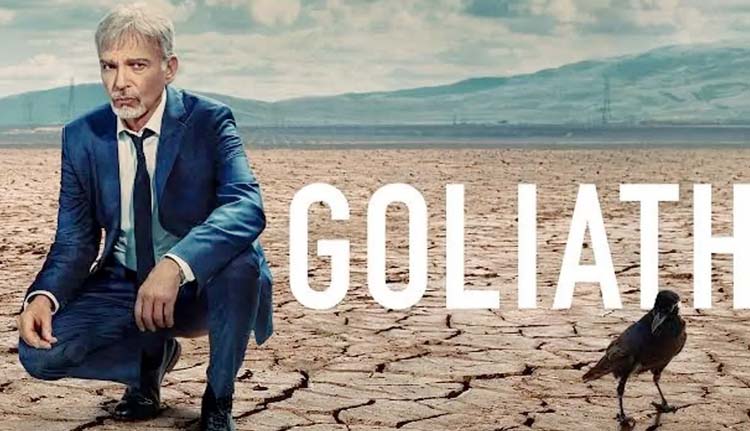
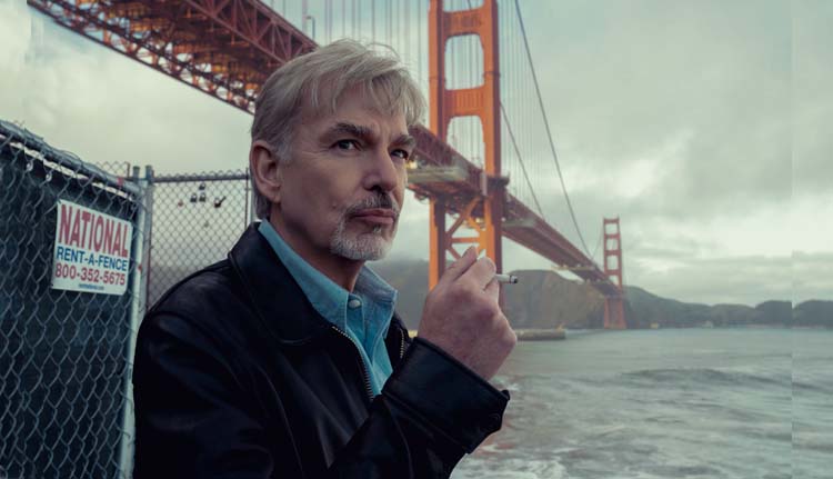
GOLIATH is an Amazon series starring Billy Bob Thornton (Sling Blade) as a formerly brilliant lawyer turned alcoholic after he blames himself for a case that ended in tragedy. Jon Ehrlich and Jason Derlatka added the sonic layers that elevate the show’s drama.
Billy Bob Thornton stars as Billy McBride, a former lawyer living in an extended stay hotel. McBride founded a successful law firm and was one of the best lawyers in town. However, McBride helped a murderer walk free. Unfortunately, that murderer went on to kill more people, and the tragedy sent McBride into a downward spiral that included a lot of alcohol. Soon to start its fourth season (and final), Goliath’s an evolving dark drama that’s sure to stun viewers as it comes to an end.
PopAxiom spoke with Jon and Jason about their journey to create music for film and television and arriving at Goliath season four.
When did music come into their lives?
Jon: Music has always been a part of my life. It’s hard to find my way back to the origin. I was the kid who played the piano. I went along with it because people applauded. Scoring to picture was not where I originally thought I was headed. I was in high school and bands thinking I would go on tour and be an artist. But I fell in love with theatre and, in college, wrote a bunch of musicals. I was working in the theatre for a bit, and I think I had that lightning bolt moment that I should probably do this with moving pictures.
Jason: I grew up pretty remotely in Montana. There was always music in my house growing up. My family would sing and perform in church. We had a piano, an organ, a drum set, some keyboards, and a multi-track recorder. So I always knew I wanted to create music and tracks. When I got to college, we had a music technology program. I had a little exposure scoring to picture.
How did they become composers for film and television?
Jon: Initially, that was working on commercials, but then a friend who was in graduate school at NYU and making his student film asked me to help him out. I thought, ‘this is great, so I went to LA to do a year at USC in film scoring. By the time I finished that year, I was already immersed in the world out there.
A friend of mine from the theatre, Shaun Cassidy, was out here producing, and the minute he could, he got me a gig on the show Roar with Heath Ledger.
Jason was a part of my early commercial music house years.
Jason: I was able to do a concert that was part of the university fund-raising efforts involving producer David Foster. That inspired me. He said, ‘You need to move down to LA and immerse yourself in the business.’ So after college, I moved to LA, started networking, and hanging out at the record plant. I did a little bit of everything. Through that period, I met Jon. Through the Jingle House that he set up, I got opportunities scoring to picture with a few commercials. That started our working relationship.
I loved the idea of telling a story through music. So my trajectory changed from the record side of things to scoring to picture. It started with these projects with Jon.
How did their working relationship evolve?
Jon: Initially, with the commercial stuff and spillover work, but then we got into a groove. We were in the same space in Santa Monica, and it just worked. We’ve worked together longer than some marriages. We’ve got good chemistry and different strengths as well.
Jason: We compliment each other. We have similar sensibilities.
Jon: I think we also inspire each other. On Goliath, one of the first things I think of when I come up with something that I like is how Jason will use the theme.
Jason: We also don’t have egos when it comes to the work together. It’s very collaborative. When you’re working under deadlines, it’s nice to have someone to bounce things off of that does sort of know what you do. You have that in the back of your head. I know what his sensibilities are; if I get stuck, there’s a sort of a safety net.
Jon: After COVID, though, it got a little strange. We were in the same space for a long, long time. Our studios were down the hall from each other.
How did they connect with Goliath?
Jon: Larry Trilling, who became the showrunner, was an executive producer and a director of many episodes. By the third season, he was directing every episode. We worked on Invasion with him, and he was an EP on Parenthood. He brought us in to score the pilot, which they were re-doing after scrapping the original version.
What was the problem with the original pilot?
Jon: I think the problem was that the world of Billy and the world of Cooperman in the first season were starkly different. It was very black and white, and it felt like two shows. It wasn’t holding together. That was my take. We came in and worked to connect those worlds.
Jason: We were fortunate to earn a degree of trust fairly quickly. It was nice to get to a point where we could dig in and do what your instincts tell you. With Goliath, that seems to be the sentiment at the beginning of the season. This show, the musical vocabulary, the sounds, the changing locations, and new characters, it’s constantly changing things up. We were excited to get in there and add new elements. The new season, in particular with the Chinatown-noir feel. It helps to do a job when you have that sort of trust.
How did they earn that trust to evolve Goliath’s score?
Jon: In some ways, the key is like a lot of things, it’s that first week where we’re in meetings, or on the phone, your first reaction to the first thing they expose you to tells them if you understand their vision. In this case, they were sort of figuring out the show. We were able to say, ‘here’s how the music can supply connective tissue and provide something that you can’t accomplish visually.’ It’s always the coolest choice for a score to find what it can do that the picture can’t.
Where will season four take viewers?
Jason: In season four, we get into Billy’s psychology, and he goes into the wormhole of his recollections with his father, an emotionally abusive man. Billy’s struggling with pain and that psychic distress. He goes back to that relationship in his head.
Jon: Season four is like watching classic noir like Rear Window, Vertigo, and High Noon. So, the season’s seen through the prism of his fragmented memory of those moments. He transforms them into his storyline for season four.
After season three, he’s struggling with dependency while also going up against Big Pharma.
One of the big things that the score could do for season four was play off the visuals we see that are sometimes shot-for-shot homages of these movies that we know. So, the score is classic noir. We get to kind of put on a costume. It’s sort of Halloween for a composer.
Jason: We don’t always have the luxury of being featured, but this was an opportunity to do that. I know Billy Bob had thoughts and ideas that we considered and were inspired by when we worked on season four.
Jon: He directed the first episode. While he was cutting it, he had some exciting ideas. Billy [the character] lives in an apartment in Chinatown, and the set looks so much like Rear Window. So, there’s this whole community of people, and there’s a woman incessantly practicing trombone with a piece by Tchaikovsky called “None But the Lonely Heart.” It becomes this haunting thing that’s always there. He’s going in and out of these hallucinations that bring us into his recollections. Is this real or a hallucination? We hear snippets of this melody.
So, we take this source music, and it becomes a part of his unconscious. He’s heard it so much that it becomes this sort of romantic theme that supports Billy’s vision of himself as the classic film noir cynical hero.
Jason: It’s a rare opportunity for us to write big in places and let it go dramatically in ways that you wouldn’t be able to get away with in other projects. But you could here with the vernacular and the style of storytelling.
Jon: Also, part of our process in building these sounds and establishing this vocabulary involves messing with things. Taking instruments played unconventionally and turning them on their side, reversing things, pitching, and effecting them to create something completely different. This score is orchestral and noir, but there are elements underneath that are more twisted. That’s been a lot of fun.
What composers live in Jon and Jason’s creative DNA?
Jason: Jon and I admire some of the same people. Some of our writing is undoubtedly inspired by people like Thomas Newman and Carter Burwell.
Jon: Trent Reznor too. If we’re connecting things to season four of Goliath, the show has that dark, twisted, Trent Reznor-y vibe as an element. Whereas season three was probably more Thomas Newman or Carter Burwell. But season four is classic noir; Bernard Hermann and Alex North. I’m a huge Jerry Goldsmith fan. Basic Instinct is a gorgeous film noir kind of score.
Is Goliath on your watch list? Watch it now on Amazon!
Thanks to Jon Ehrlich and Jason Derlatka, and Rhapsody PR
for making this interview possible.
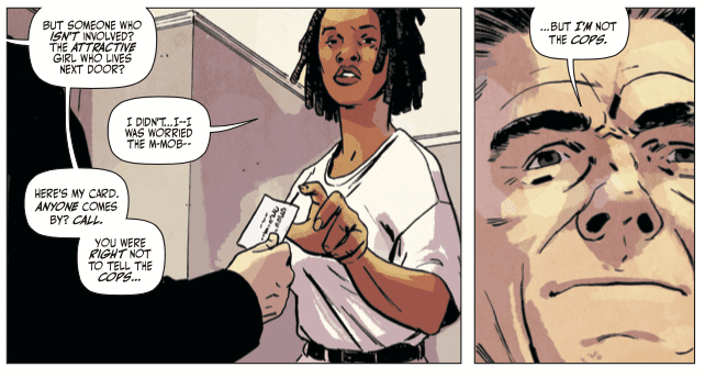
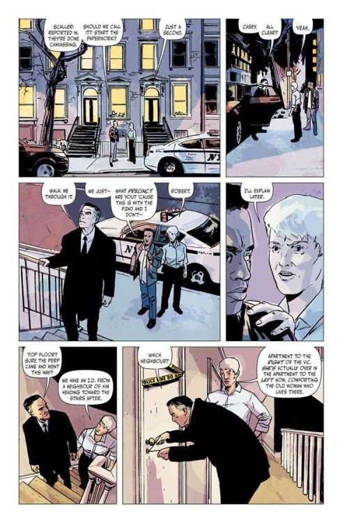
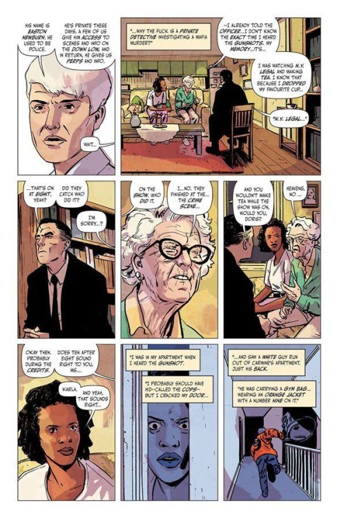
Newburn #1 is going to make you hate writer Chip Zdarsky and artist/colorist/letterer Jacob Phillips. Not because the new series from Image Comics isn’t great — it’s fantastic, fresh, and funny. And that’s exactly the problem. When you read about Easton Newburn, you’re going to be pissed off you hadn’t come up with him first. Zdarsky and Phillips introduce readers to their own version of Columbo. Difference is, this guy might kill you if you cross him.
About Newburn #1 (from Image Comics):
EASTON NEWBURN is a private detective without loyalties, investigating conflicts between rival crime factions while collecting enemies along the way. In this DEBUT ISSUE, a man is murdered after stealing from his own mafia family, but they aren’t the ones who ordered the hit…
Writing
Zdarsky’s script for Newburn #1 has several plates spinning at once. It’s a brilliant crime thriller, an interesting mystery, and it has a dash of comedy. But none of these factors are competing against one another; they were perfectly in sync. In fact, it’s the gritty, no-nonsense tone that makes the jokes land so well. And it’s the laughable disregard these characters have for other people that makes them feel so damn dangerous. When Newburn is stopped at the entrance to a club, he wastes no time in getting his arm around the bouncer’s neck, ready to choke him out. When the club owner comes out, he just tells Newburn to go easy on the new guy. It’s all part of a day’s work for these characters. Their casual responses to violence are both hilarious and disconcerting at the same time.
Art
Maybe it’s Phillips art that puts the Columbo connection in my mind. There’s a dry smugness to Easton Newburn. It’s like he has the whole thing figured out from the first scene, but he’s waiting for his cue to blow the lid off the case. He’s waiting for his “one more thing” moment. You can see it on his face. He’s completely emotionless as other characters get riled up, but then he grins slightly when he knows they’re really pissed off. It’s these little flashes of self-satisfaction, between the lifeless looks of a man on the job, that we learn everything we need to know about Newburn. His is the face of a man who knows far more than he’s letting on.
Coloring
Through Phillips’ coloring, every scene in Newburn has a kind of glow to it. The night air is a dark, rich purple. The inside of a seedy, Russian bar is cast in a deep red hue. Even one of the character’s apartments has a soft pink glow to it. Phillips reinforces a sense of time and place to each scene. He gives buildings a personality and street corners a sense of character. It’s a beautiful issue that completely immerses you in the world it’s portraying.
Lettering
Phillips’ lettering is definitely the issue’s biggest weak point. Word balloons often show up with very long tails that jut into the faces of some of the characters. It’s often a little distracting. And when we see Emily’s journal — Emily is at the center of Newburn’s case and her thoughts show up as pages from her journal — it’s odd that there’s no effort to make those pages actually look like a journal. Instead, we see her entries in white and yellow on a black background. It’s a strange design choice that takes the reader out the world for a second. But all of this is small potatoes in the face of this fantastic issue that Zdarsky and Phillips have put together.
You definitely don’t want to miss this series. Zdarsky and Phillips are doing some of their best work with Newburn. Pick it up and check out the awesome backup story “Brooklyn Zirconia – Part One” by writer Nadia Shammas, artist Ziyed Yusuf Ayoub, and letterer Frank Cvetkovic. Newburn #1 is out from Image Comics November 3rd at a comic shop near you!


")