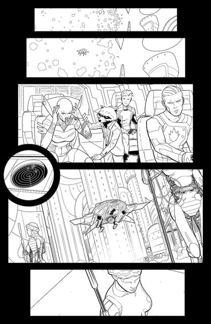
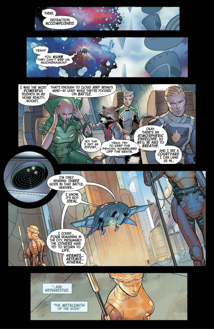
Guardians of the Galaxy #1 dropped last month with Al Ewing and Juann Cabal at the helm. After I talked about the book on the Panel Breakdown, Cabal offered to explain his thought process behind his panel structure, and relationship with Ewing and colorist Federico Blee.
Enjoy the interview below
MFR: With Guardians of the Galaxy, can you talk about your relationship with Al Ewing? Does he keep his scripts tight, or does he give you artistic freedom?
JUANN: This is the first time Al and I work together, so there’s this logical “info given-info needed” imbalance in issue #1. Luckily, we overcame it pretty fast, and now we are more and more “synchronized” (same with Darren (Shan), Lauren (Amaro) and Federico (Blee))
Al is an excellent writer. His scripts are very descriptive and literary, but clear and precise at the same time. It’s quite easy for me to know what crazy beautiful idea he’s thinking of and how to best translate it into images (and how to boost it, given the chance).
Also, he’s very open-minded in terms of layouts, ambients, and the graphic part in general. This, for an artist (and a control freak) like me, is a dream come true.
MFR: Can you talk about your panel layout in the first issue so the average person can get a better understanding of your work? Some pages had horizontal rectangular panels, and then some had vertical rectangular panels. What’s the meaning behind them?
JUANN: My work is based mainly in dualities. In every project, I like to start with a general idea and then experiment, putting it face to face with opposite concepts, depending on what each scene asks for. This approach covers everything, from character design to rhythm. In the case of panel layout, for example, I wanted to make a contrast between expansive cinematic horizontal panels for cosmic sequences and other kinds of compositions for the rest (character development, introspection, etc.)
In order to give a general idea of my working process, I’m going to address some specific pages, if you don’t mind:
MFR: We don’t mind!
JUANN:
PAGE 1 – Vertical paneling and Kirby dots in the kid’s cereals foreshadow de impending doom coming from the sky.

PAGES 2 & 3 – Utopian planet (horizontal) VS dead looming (vertical), again.
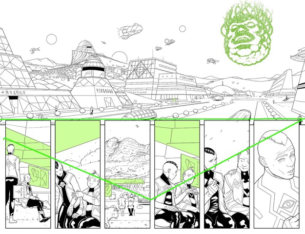
PAGES 4 & 5 – I wanted this sequence to look ominous and apocalyptic in a cinematic way.
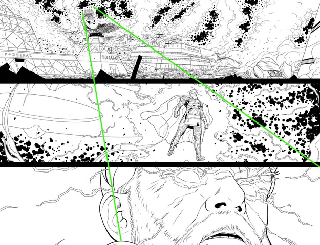
PAGE 7 – Again, the pace is broken by someone coming from the sky.

PAGE 9 – The family splits. OK, this is the kind of experimentation I love. It’s relatively easy to make it work in action scenes, but you have to be subtle in quieter ones.

PAGE 13 – I used a circular composition to introduce Marvel Boy in a classic comic-book fashion. Something cheesy but awesome.

PAGE 14 – Yes, a broken man under pressure.

PAGE 15 – Here, there were two factors to push me towards this composition:
- I needed space to represent Nova’s isolation.
- When Nova falls, Star-Lord rises.

PAGE 16 – This one is a meta-joke. Too subtle, apparently. My fault. You don’t know what’s on Rocket’s hand until he bites it. First, the composition connects it to the citadel, and you may think it has something to do with the plan, but in the end, it’s just some kind of space fruit. This matches the line, “we need a distraction.” That’s the fruit, a distraction for the reader. 😀

PAGES 18 & 19 – Hmm. That face may look familiar to fans. This is one of the few closeups of Zeus in his human form, and I wanted to establish some kind of visual parallelism with his Norse counterpart (wink, wink). A visual representation of all the gods in all mythologies having the same primal essence.
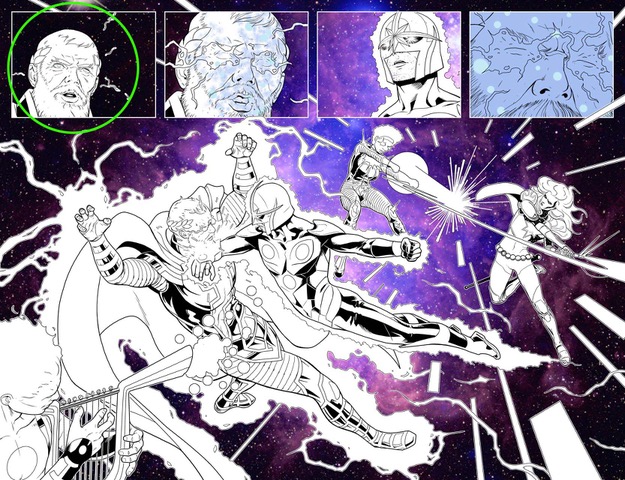
PAGE 20 – Love what Federico did with the citadel.
PAGES 22 & 23 – I wanted Moondragon to be the only character to keep the concentric narrative as she’s the one influencing everyone else’s minds.

PAGE 25 – Contrast again! Speed from the last page VS Hermes striking. I needed something to “break” this sequence as it breaks Moondragon’s manipulation too, so the idea was this panel to look like something static, frozen in time. Think of Quicksilver in X-Men movies.

PAGE 26 – Classic “Z” structure to isolate the action in space from the citadel.

PAGE 27 – My favorite one! I gave lots of thought to Noh’s gauntlets, and I’m very happy with the result. You’ll see.

PAGE 28 – Here I experimented with the technique of having different characters following the same motion.

PANEL 29 – My guideline here was: open panels for space closed ones for the citadel.

JUANN: These are a few examples, but I think it’s easy to get the idea. As you can see, there are no pre-established rules (apart from basic composition ones, but even those are not written in stone) and is very intuitive and adjustable to what the script demands.
MFR: Guardians of the Galaxy has a great cast of characters to draw, which character puts a smile on your face when you get to draw him or her, and why?
JUANN: I love Marvel Boy’s weirdness. I’m always thinking of new cool ways to portray his crazy powers. Also, I tried this David Lynch-inspired haircut, and I think it suits him nicely.
Phylla is ultra-cool too. I always liked the depiction of the Cosmic Awareness in the Peter David era. I wanted her to look a little less “knightly” and heavy, and more Barbarella-like.
MFR: With the evolution of coloring, do you leave your art cleaner to let Federico Blee add depth with his colors? What’s the artist/colorist relationship like?
JUANN: I think the colorist needs complete freedom. With Federico, firstly, he told me to guide him a bit with ambients and that kind of stuff. He caught on very fast, and now I barely have to send him notes. He nails it in every scene, plus his rendering and brushstrokes are simply amazing.
MFR: When you draw Peter Quill and Richard Rider, what are the artistic elements that separate them? Did you give them different postures?
JUANN: Reading the script I thought it’d be interesting to swap a bit their features and body language to match their roles in the first arc. You can see a beaten, dejected Richard while Peter looks sharper and cleaner than usual. Again, we’re playing with contrasts. When Nova falls, Star-Lord rises.
They’re both much-beloved characters, so we took extra care to stay true to their essences; and, most importantly, to make them look cool no matter what.
MFR: Friendly Neighborhood Spider-Man and Guardians of the Galaxy both have a ton of humor. How do you set up humor with art in comics?
JUANN: At the end, all emotions come from the interpretation of the script. I need to read not just the character, but the scene and the context. That tells me when a goofy face or a visual gag is appropriate and/or necessary.
MFR: What are you most excited to draw in upcoming issues of Guardians of the Galaxy?
JUANN: Crazy stuff. Lots of crazy stuff. Even crazier than our usual standards. That’s all I can say. ;D
What did you think of the interview? The visual guide Cabal sent over helps so much in understanding the different concepts of the process that we as a reader sometimes miss.
Guardians of the Galaxy #2 hits your local comic book shop next week, on February 19.


