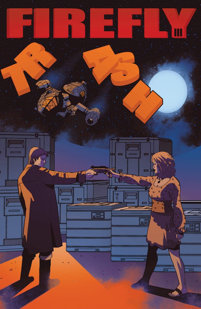
FIREFLY #23, available Wednesday from BOOM! Studios, brings us back to the characters we all know and love – and an adventure that we never imagined to see them in. This world is starting to look more and more futuristic by the day.

We’ve seen it happens dozens of times. A favorite television show (or movie) continued on, but only in comic book form. That is the fate for Firefly, thanks to the early cancellation of the series. From the comics, fans have finally had a chance to learn some of the answers they’ve long been asking.
Now, it feels like the series is moving on. We’re not looking into the past anymore – not learning about what made the characters the people we know them to be. Instead, we see our heroes (and sometimes villains) facing off against a threat like no other.
Admittedly, this sort of change could result in a take it or leave it response from the fans. After all, the series is taking risks, and some of those risks have forced dramatic changes in the world. Changes, that people might just love. Or hate.
Enter Firefly #23, this is an issue that not even the most die-hard fans could have predicted. The Alliance may be gone, but enemies are quick to fill that void. It’s a depressing thought, and the times aren’t looking a whole lot brighter.

The Writing
So, here’s the good thing about Firefly #23: it is taking risks. This entire plot arc has been full of surprises, and I thoroughly believe that Greg Pak should be given credit for that fact. Also, who can fault the series for bringing back some fan favorites? (I know I for one will never quite be over the events of Serenity).
The plot also raises some reasonable questions about ethics, Mal’s character (and method of getting things done), and the concept of following the letter of the law (as opposed to the intent). These are all good debates to bring up, and could arguably result in some interesting conversations among fans.
That being said, the plot does get pretty…weird at times. The whole robot concept isn’t new, and by itself is fine. But it doesn’t feel quite at home in the world of Firefly. If anything, it feels like it totally came out of left field.
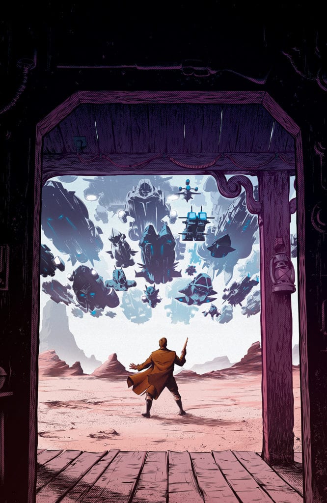
A matter made a bit more uncomfortable by the design of the droids. Not that they’re bad looking – simply because they look like Malcolm Reynolds. More than that, they act like him. As I hinted at above, this isn’t a plot that we could have anticipated.
Is this the strongest Firefly plot out there in the comic continuity? No. But it is taking risks, and having a bit of fun in the process, both of which are facts that I respect. Though I confess that I feel a certain eagerness to see everyone happily ensconced in the safe place that has been discovered (though I have no doubt that bad luck will continue to follow the crew, and ruin those plans).

The Art
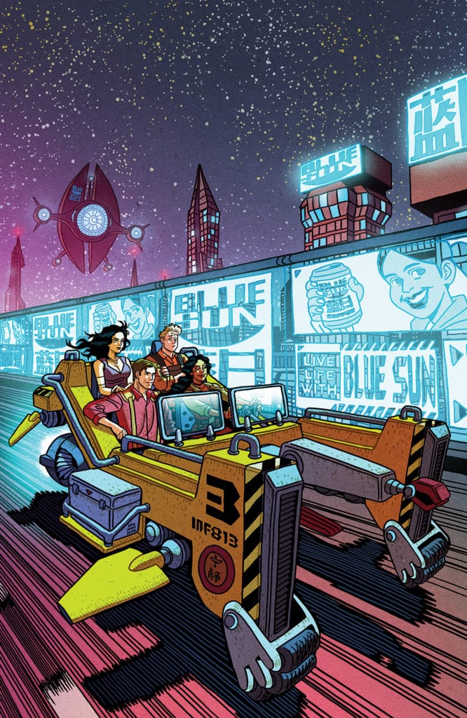
Firefly #23 is full of a unique combination of artwork and styles. The backdrops are bold and vibrant, the droids equally bright against the otherwise Western-style setting. It forces a merger between the whole science fiction and Western concept, but in ways that we haven’t seen before.
Lalit Kumar Sharma and Daniel Bayliss were the lead artists for this issue, and they did a good job of finding the balance between those concepts. The droids look terrifyingly similar to our hero, while everyone else seems to be feeling the fatigue of constant battles and conflict.
Marcelo Costa’s bring life to the issue, thanks to those bold colors already mentioned. They’re eye-catching and memorable, especially when there’s something explosive on the pages (literally). I’m particularly fond of Costa’s sunsets, the reason for which should be fairly obvious.
Jim Campbell’s lettering is the final touch. The sounds and noises of the world feel almost real, and even the distinction in guns is made clear through the lettering. Bullets versus lasers, and everything in between.

Conclusion
Firefly #23 is arguably not the strongest issue in the series, yet it brings with it more changes and risks. That makes it memorable, and I’ve got to respect that, if nothing else. I don’t know how much longer this arc will be stretched out, or how it’s going to end. Another point in the creative team’s favor, as the series has become truly unpredictable.

