If you want to set a tone or produce an identity for a location, one of the most immediate and noticeable ways of doing this is through the coloring. The choice of coloring style can make the difference between a comic leaping out at you from the page turn or sucking you into a specific panel or narrative moment.
Frank Miller used color sparingly to highlight a character or an action in Sin City. The rest of the artwork was solid black and whites, emphasizing the grim world that the characters inhabit. In contrast, the majority of modern Superhero comics are inundated with color. Often bright, primary colors mark out the characters against well lit but more subdued, realistic backgrounds.
Changes in color, sometimes subtle but sometimes not, can affect the reader’s understanding of a situation or scene. The coloring in Supergirl #37, for example, is fairly naturalistic, but Cris Peter enhances tones in the background to reflect the mood of the foreground narrative. It can be subtle, and the effect mostly subconscious on the part of the reader.
Jordie Bellaire’s color work is usually more obvious and emotional. Full panels and, often, entire pages are washed with a single base color with the details picked out in dark or light hues. The color is primarily used to create mood and emotional responses, with very little attention towards realism. A quick flick through Days of Hate gives the reader a sense of the narrative on each page and the relationship to previous scenes/chapters.

The Streets of India
In the latest chapter of the Hit-Girl world tour, where the Millarverse character hits the streets of India, Triona Farrell has been producing some of the most elaborate and effectively colored pages in modern American comics.
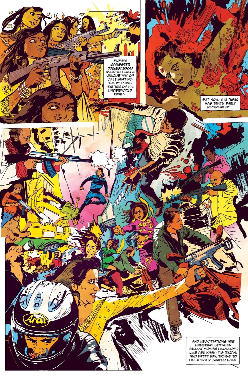
A quick glance at the first page of issue 12 (below) tells you everything you need to know about the coloring in this comic and, more importantly, the setting of the story. The city of Mumbai is full of life, bursting from the streets in amazing technicolor. It is vibrant, intense, but also violent.

The way that Farrell reflects the violence is interesting in itself. The explosions of blood in the second panel resemble flowers in bloom. Later in the comic, the blood flows like waves and scatters like seeds. The consequence of the violence has a natural feel to it, almost as if this is something that is accepted. It’s shocking, at the moment, but then dissipates into the scenery. Just another part of life in the Indian city.
The vibrancy and energy of city life come across on every page. Even when the action shifts to a night scene or takes a character into a physically darker place, the array of color is still there. Lights flash in the background, and the shadows change to deep purples and blues. Even in darkness, there is an abundance of life, represented by the color.
The most notable element of the comic that Farrell highlights is the character costumes. The beautiful designs by Alison Sampson are brought out of the page by depth and varied color. The differences in character’s lives become a part of the color palette with the street kids contrasting against the opulent criminal gang members. The rich tapestry of Mumbai society is featured within the pages as the character extra’s move through the marketplaces.

Hit-Girl
And, one character stands out amongst them all: Hit Girl herself. Her costume, almost entirely violet in color, makes her a focal point on the page. The almost lack of purple coloring within the other costumes means that she is separated from everyone else. Mindy stands alone as a character in a strange land, an interloper into this complex underworld of India.
The central story is about Hit-Girl, so Farrell makes it easy for the reader to follow her through the narrative. However, there is so much more going on. Farrell packs each panel with color and life so that it is almost impossible not to become distracted and admire both the artwork by Sampson and the numerous storylines written by Peter Milligan.

Hit-Girl: India published by Image Comics is a beautiful looking comic, despite the violence that it contains. Farrell brings out the themes of the narrative and the intricate design work, holding nothing back on the color front. She produces an aesthetic that captures the spirit of Mumbai and reflects the complexity of the characters and their interactions. Color can be used for many things; in this comic, Farrell uses it for all of them.
Image Comics releases Hit-Girl: India (Vol. 6) on 19th February.

