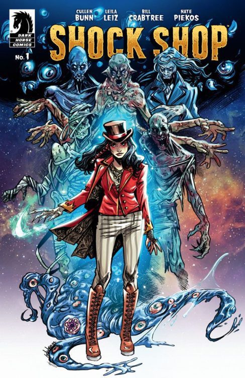
There is always an audience for horror, whether it’s a movie, a TV series, a novel, or comic. The genre is massively popular and attracts committed, passionate fans, who love to indulge in new offerings. Therefore, a new horror anthology title is a welcome addition to the monthly schedule, and is exactly what Dark Horse Comics are offering with their new flip comic Shock Shop, due out on 7th September 2022. The new comic features two stories written by Cullen Bunn and each is illustrated by a different team.
It’s horror; it’s comedy; it’s pantomime. Everything a good horror anthology should be.

Introducing..
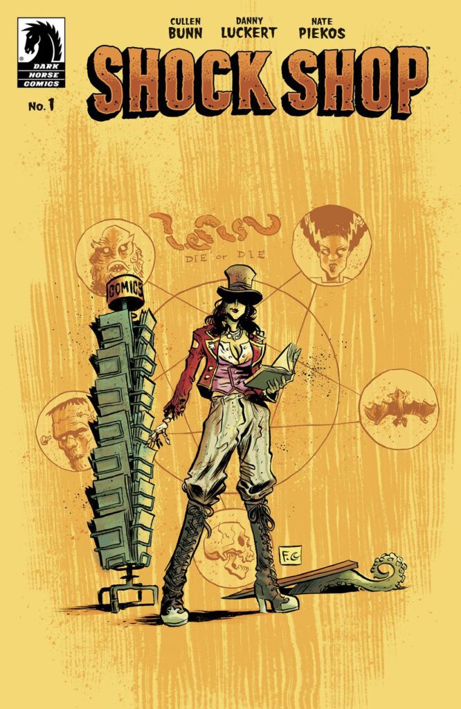
The format of the comic is a clever marketing trick, encompassing two separate covers, one for each story. This allows for the publishers to create a range of appealing covers that can be marketed to different groups within the horror audience. It also leans into the variant cover crazy without having to flood the shelves with too many different versions of the same comic. A variety of superb artists can produce wonderful cover work that can, ultimately, get into more hands. It’s a neat trick.
Another neat trick is introducing a host into the stories. The relationship between hosts and comic horror anthologies dates back to the beginning of comic books and was borrowed from other popular media. From Old Nancy in The Witch’s Tale radio series from 1930 and the ushers and compares of Le Théâtre du Grand-Guignol in Paris which opened in 1897, and whose legacy is referenced within the pages of Shock Shop, the purpose of the host has been to lead the audience into the uncomfortable stories and provide a barrier between the worlds. EC’s Tales from the Crypt and related titles did this superbly with their mix of monstrous and comedic hosts. In those comics each one would go beyond introduction and act as storyteller, interjecting at opportune moments to remind the reader that they are reading a fantasy, a fiction, and often make light of the situation.
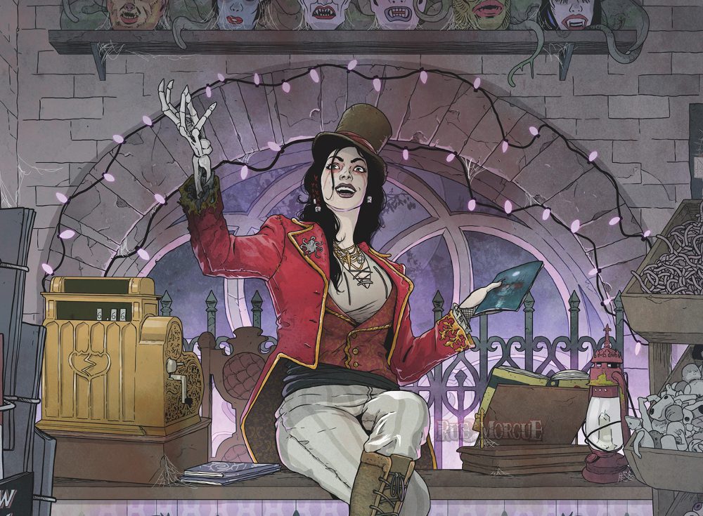
Within Shock Shop, Cullen Bunn gives the audience Desdaemona Nimue Moreau and her comic shop of horrors. She gets a full page spread for each story in which to set the tone and give the readers a visual treat of in-jokes and referencing. It could be argued that this is not enough as she is the most intriguing character in the comic and hints at the exciting world around her. However, unlike Rick from Image Comics’ Ice Cream Man, Desdaemona plays no part in the stories, adopting a more traditional role of host from 1950’s horror anthologies. She introduces the story and then, sadly, disappears from the comic.

Two Tales Told Well
The two stories are: Something in the Woods, In the Dark drawn and coloured by Danny Luckert, and Familiars drawn by Leila Leiz, coloured by Bill Crabtree. Lettering for both is provided by Nate Piekos.
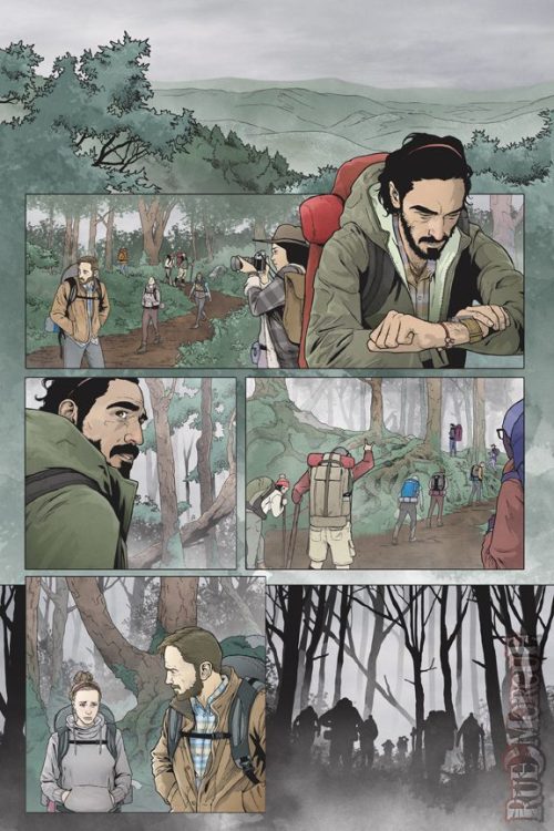
Out of the two, Luckert’s is more visually stimulating with intense storytelling across the page. His colours are expressive and bring out the acting of the characters. This story is full of emotional exchanges, knowing looks, and empathetic glances. Even before the disturbing, mutated body horror shows up, Luckert has conjured up an uncomfortable and tense atmosphere that is only exaggerated by the wilderness setting. More and more, the simple concept of nature is becoming alien and uncontrollable which makes it a perfect setting for a tale of horror, such as this.
Although, that is not to say that Leiz’ work is lesser; it’s just different. The second tale is more comedic in tone and has a flight of whimsy about it that is reminiscent of the late 1980’s Ghostbusters comics. The clever use of red lenses over occasional panels puts the reader into the position of the spirits haunting the house and humanises them potential threat. The red washes are unsettling, but because the reader has been transposed into the role of the ‘ghost’, the artists create a sense of empathy often missing from ghost stories. The panels and pages are cluttered and busy, representing the chaos of the central character who has been uprooted and thrust into a new home. The divorcee is shown to be somewhat irresponsible which in turn explains why he does not take his situation seriously. Leiz’s triumph here is the setting, the way in which she handles the urban environment to tell the reader something about the character. It’s a harder sell, from a horror perspective, especially with the amount of humour on the page, but the character building is still impressive.

Side by side, the two stories work visually well together. Each provides something slightly different in style and tone but there is a similarity brewing within the stories themselves. The simplest way to illustrate the differences is to look at the lettering by Nate Piekos. For the intense, family drama, Piekos carefully choreographs the speech, giving enough weight to each statement. Often he changes the font size or uses bold text to emphasise an argument or backhanded comment. His purpose in the first story is to create tensions between the characters and the location. Within the second story, however, there is a more chaotic approach to the lettering. Piekos plays with the word balloons, changing their shape, sometimes subtly and sometimes drastically. In each instance it tells the reader something about the person speaking. In this story Piekos is focusing on the characters and the way they speak, rather than their actual speech.

Conclusions
When you pick up an anthology comic, not every story will appeal, but you tend to know what to expect from a horror comic. Nothing will come as a surprise, except what is supposed to, narratively speaking. And Shock Shop is no different. It blends modern comic storytelling with classic horror tropes to create enjoyable stories. The contrasting artwork between the two stories gives each one a different tone and if you read them in the right order (Something in the Woods first) the change lulls the reader into a safe space at the start of tale two.
However, despite the lighter tone of Familiars, both stories have the same narrative beats with similar setups. The locations may be different and the dynamics between the characters are more intense in Something in the Woods, but the progression of the stories follow the same pattern. This means that whichever story you encounter second has less of an impact, and may leave you feeling indifferent. Something in the Woods is the stronger horror story, and placed next to Familiars, it becomes obvious, which is then a disservice to the latter.
With Shock Shop, Dark Horse Comics are giving readers two stories spread over four issues. This means that you don’t get a full story, only parts of two, and this ultimately ends up like a taster menu. It wets you appetite but does not satisfy it. One of the greatest appeals for most anthology titles is the one-and-done stories. The Haunt of Fear, Creepy, The House of Mystery, all succeed in telling short stories issue after issue and some of the best creatives working for those titles were able to tell complex and terrifying tales in eight pages or less. With Shock Shop, the artwork is good and fits the tone of each story, there just isn’t enough of each terrifying tale. It’s like watching a horror movie until the first jump scare, turning it off, and then watching a different movie until the same point.
Everything about this comic is great except there just isn’t enough of it. Not enough of the actual stories, not enough of the host, and not enough of a sense of anthology. On this particular occasion, it may be worth waiting for a few issues to come out before sitting down to read them, or buy the trade.

