

The Black Hammer Universe is home to some of the best comics. The main Black Hammer series, Colonel Weird: Cosmagog, and even Black Hammer: Visions #1 are all examples of subtle, nuanced storytelling. So, reading a comic like Black Hammer: Visions #2 hurts. It’s a bump on an otherwise smooth road. Writer Geoff Johns, artist Scott Kollins, colorist Bill Crabtree and letterer Nate Piekos deliver an issue full of empty promises and soulless scares.
Writing
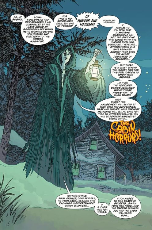
From page one, Johns is off his game. Typically a strong writer, seeing clumsy exposition from him is kind of heartbreaking. We open on Madame Dragonfly. In 1960’s-horror-comics fashion, she addresses the reader. It’s your typical “turn back now, horrors lay ahead” schpeel. By the end of Madame Dragonfly’s lines, we’ve gotten the point and then some. And as she warns that there’s a price to reading the comic: “It is their tale for yours!” it’s hard to feel any chills. It’s a speech that’s laced with self-importance but ultimately lands on an empty promise. No reader will sit there and think that they’ll have to tell their life story to Madame Dragonfly, and the comic itself doesn’t get meta enough in its themes to create any kind of fear of that. It’s simply a modern story, bookended by an anachronistic addressing of the reader.
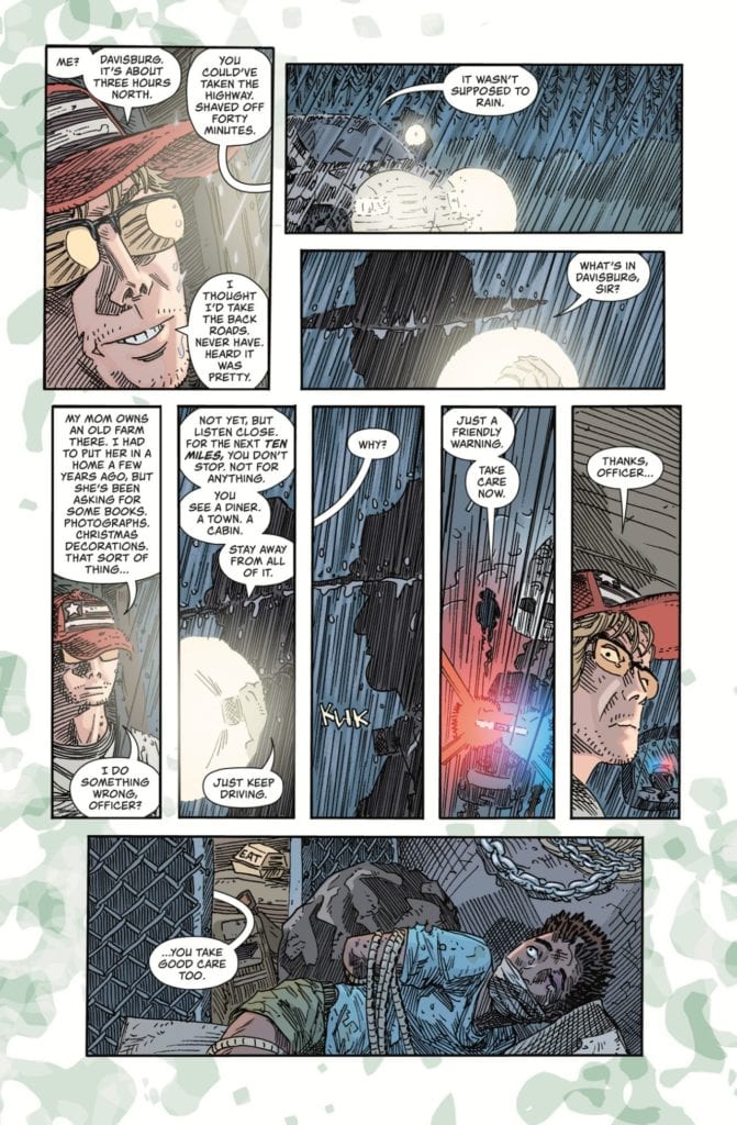
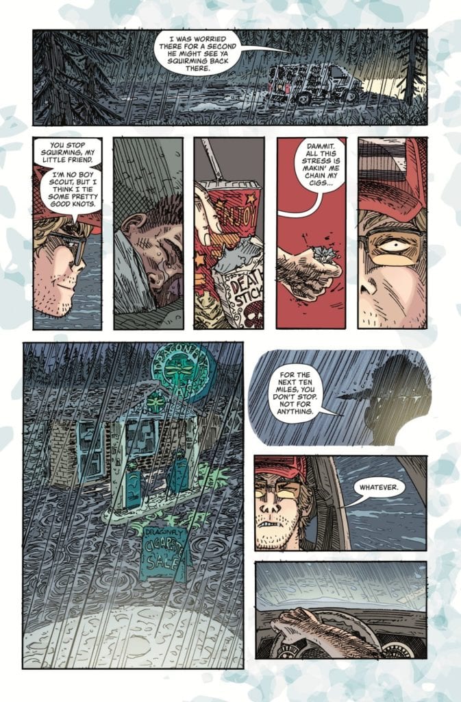
This could work if the modern story were up to snuff. But it’s full of strange exposition-heavy moments. A cop stops a man driving down the road. “For the next ten miles, you don’t stop. Not for anything,” the cop says. And, of course, the man promptly runs out of cigarettes and sees a gas station. It’s your typical horror tale setup. But even though we see the cop’s warning only one page before, Johns feels the need to repeat the panel. He shows us the cop saying that line again, in the man’s mind’s eye, just so we’re clear he’s ignoring the cop’s advice. It’s a little belittling to the reader. It connects obvious dots and does all the work for us. Due to many more moments like this, a cast of characters that feel inorganic and unsympathetic, Johns’ script falls flat.
Art
Something about Kollins’ art doesn’t match the tone of the story either. Moments supposed to show a character’s anger, fear or sadness often come off as just a little funny. Kollins’ style is an odd mix of minimalistic and detailed. All the wrong details get the focus, with a few exceptions. It’s often the surroundings of a character that are detailed. We see the splinters on the door of the cabin, but the look on a young boy’s face is out of focus. It has a cartoony effect. In pulling us away from the characters’ faces, we get pulled away from what they’re feeling. And when we see their eyes only as dots, or their mouths as an angry triangle, it seems more funny than terrifying. Ultimately, Kollins doesn’t help fulfill Johns’ promises either. He shows us a world that just isn’t very scary.
Coloring
Crabtree also creates a strange tone. When we first meet our characters, they’re driving down a street through the rainy night. But the panels that they’re in are brightly colored. The driver is shown in fleshy tones. Crabtree doesn’t set the stage as a spooky late night. These panels could be happening in the middle of the day. And as the story continues, these problems persist. Nearly every scene feels strangely colorful. And Kollins’ art isn’t scary enough for it to feel like Crabtree is playing against each moment. No, the two simply work together to create a scare-free horror comic.
Lettering
Piekos’ lettering is the one thing that occasionally rises above the rest of the story. Moments like a kid falling through a door and his “AAAHHHH!” flying out of his word balloon help create a sense of movement. When the same kid shows up in another room, there’s a word balloon that says, “Who is that?” The lettering is small and sheepish. The follow-up “Who are you?” is bigger and more confident. You can hear the difference just by looking at the page. But Piekos’ sound effects don’t mesh with the story well. The bright yellow, thick block lettered “BAM” of a knock on the door takes the reader out of that moment. We’re all too aware we’re reading a sound effect and not hearing a noise.
Dark Horse’s Black Hammer: Visions #2 is flat and emotionless. We’re presented with characters that feel empty. They don’t have a past, they barely have a present, and we’re left not caring about their future. Every moment of horror is like a jump scare. It’s cheap, brief, and ultimately not scary in its own right. Johns, Kollins, Crabtree, and Piekos don’t go deep into this issue. As a longtime fan of both Johns and Black Hammer, I’m disappointed. Black Hammer: Visions #2, from Dark Horse Comics, is out March 10th.