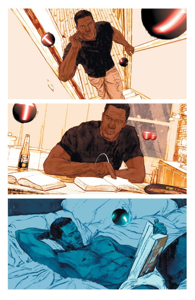
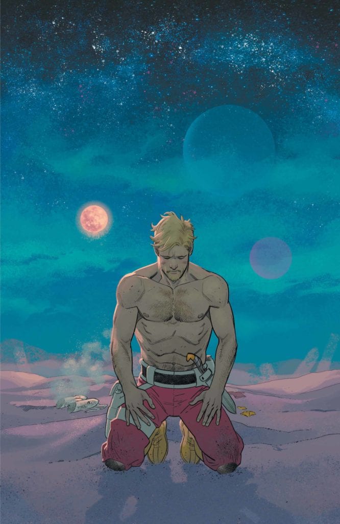
There’s so much to be said for DC Comics’ Strange Adventures. Like so much of writer Tom King’s other works, this story is willing to take its time. With artists Mitch Gerads and Evan “Doc” Shaner on the artwork, and Clayton Cowles on lettering, this creative team seems endlessly interested in the terrifically mundane. As Mr. Terrific joins the story, we get to see a glimpse into a day in his life.
Mr. Terrific: Routines and Ruts

Writing
King knows a thing or two about training. With some time in the CIA under his belt, he surely knows someone can’t just be a “crimefighter” casually. And so, as we follow Mr. Terrific through the rhythms of his daily life, we find it exhausting. Terrific’s T-spheres hover around, spouting trivia questions constantly. Terrific’s answers seem full of foreshadowing and thematic nods. At a few points, Terrific talks on the phone with Batman. The juxtaposition shows how each of them has dedicated themselves to their lifestyle. Batman is punching supervillains, while Terrific carries weights through snowstorms. Terrific’s regimen is so wonderfully boring. And with all of this, King asks us, “Can we really trust someone who makes everything seem like an adventure?” Because in the end, life isn’t as adventurous as Strange’s book would suggest. It’s full of workout regiments and trivia questions.
Art
Gerads’ art for these sections is stunning and messy. It feels as though Gerads refuses to put on airs. Terrific’s life feels real. We see it in the small things, the snow Terrific shakes off his hat, the smudges around the jar that has Terrific’s face mask. But the most noticeable thing about Gerads’ art is how slow it moves. He will spend a whole page on Terrific jogging, lifting weights, diving. And he focuses almost claustrophobically on Terrific. We rarely shift perspective to see someone else; many of the scenes are close up. It gives the whole storyline a sense of constancy. The constancy makes Terrific’s life feel like a rut. A rhythm. But it also gives him a sense of credibility. He’s a man who takes things so seriously; he makes no time for himself. He’s singularly focused on being the best he can be. If Adam Strange is guilty of lying to the populace, Mr. Terrific IS the man you want to look into it.
Coloring
Gerads’ coloring for this storyline is beautiful. It’s almost as if Gerads chose to fight the mundanity of Terrific’s life, with splashes of color. You’d expect a bleak color palette. Greys, whites, browns, but instead, each page feels vibrant. When Terrific is out in the snow, the panels look brilliantly blue. As he enters the bookstore, the palette warms up to a red haze. When he talks with Batman, we get a back and forth of color schemes. Batman is framed in yellows and oranges, fighting in chaos, while Terrific stands out on a frozen lake in a cool blue tone. It gives Terrific’s life a sense of beauty. Sure, he’s tireless. He constantly works to keep himself in shape, mentally, and physically. But life is still beautiful even if Terrific doesn’t have the time to stop and take note.
Lettering
Cowles’ lettering is carefully subdued in the Mr. Terrific scenes. When Terrific punches someone out in the ring, practicing his boxing, no sound accompanies his fist making contact. The silence makes the sudden win feel all the more impressive. And when Terrific visits the shooting range, we get the only sound effects of the storyline. White, crisp, clean. Sounds are just as you’d expect them to be in this world, no added flair. And as Terrific’s T-spheres speak to him throughout the issue, their word balloons, filled with mechanical writing, change color.
When Terrific is on a call with Batman, through his T-spheres, the balloon is grey, and the lettering is softer. Otherwise, the T-spheres speak in red or blue word balloons. The red almost gives them a lifeblood; the questions they ask that are strangely human seem to stand out. The blue feels cold and logical; the questions they ask that are calculated and mathematical stand out. It fits then that the one question Terrific can’t answer is asked in a blue balloon. Cold, distant, the question is asked without a calculation of what feelings it will evoke.
Strange Adventures: Romantic Brutality

Writing
While there’s much to say about Mr. Terrific, his is not the only story King is telling. After all, this is supposedly a comic about Adam Strange. So, King describes Strange’s adventures on Rann through Strange’s autobiography, as it’s read by Terrific. The drama of Strange’s story stands in complete contrast to Terrific’s routines. It’s romantic, full of honor and bravery. Strange is a man of few words. His lines are brief and to the point. He simply does what he believes is right, without all the moral anguish of Mr. Terrific. It doesn’t seem like he really thinks things through. This is a character who smiles in the face of danger. His threats to kill other aliens are couched in terms of his loyalty to the Rannians. Everything he does is right, noble, pure. He is a man who will do anything for the people he loves. But just how brutal is he about to become? And how will he put a brave face on it then?
Art
Shaner’s art style is perfect. Not just in the sense of being beautiful, but how it’s all meticulously put together. Every character, every object, has a crisp outline and just the right amount of detail. It’s clean and careful, yet full of life. There’s a clear emphasis on action in Shaner’s panels. Instead of the claustrophobic life of Mr. Terrific, Strange’s adventures are raucous and full of dramatic flair. Whether he’s plummeting through the air or aiming a gun at an alien “villain,” there’s a real sense of movement. With so much action, it leaves one wondering where the humdrum of it all went. Every moment for Adam Strange is a grand adventure.
Coloring
Just as Shaner’s art style feels meticulously correct, so do his colors. There isn’t the tonal haze we see in Gerads’ art. Everything is colored exactly as it should be. Yet, at the same time, the color scheme is warm and vibrant. Strange never looks discolored by hunger or thirst. Alanna’s face is flushed, and she has blue eyeshadow on, despite her and Adam’s plan to trek through the desert. In some ways, the colors are simple. Bright reds, deep yellows, solid blues, and not much of a gradient in between. It gives Strange’s story a kind of airbrushed simplicity. No shades of grey.
Lettering
In Strange’s book, Cowles gives a sound effect to just about anything that could make a sound. When Strange shoots an alien beast in the belly, we see the noises of his gun and the growling noises of the beams hitting their mark. Cowles deliberately plays up the sound effects to increase flair. As in the last issue, we a massive sound effect scrawled across the page. Cowles is reminding us over and over again; this is a story that’s being told. We don’t get lost in the realism of it as we do in the Terrific chapters. We also see that Adam Strange doesn’t talk much. He has brief lines, small word balloons. It gives us the impression he’s a “shoot first, ask questions later” kind of man. An action hero. It’s a simple story with an archetypical hero if we’re to believe Strange’s own view of his story.
This is not going to be a typical series from DC Comics. The experimentation this creative team is doing is both exciting and beautiful to behold. And the concepts they’re kicking around feel so important for us to consider. It’s a meditation on the boundaries of truth, and the responsibilities of storytellers to their audiences. It might take its time, but it’s already abundantly clear it will be worth the wait. Strange Adventures #2 is out June 16th from DC Comics. Order a copy before they fly off the shelves!

