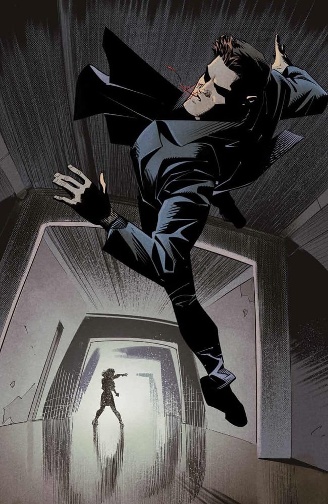
A terrifying rescue mission puts Angel on the path to salvation but what will be the ultimate cost?
In BOOM! Studios re-imaging of the Buffy-verse, Angel’s past is being rewritten and so, it seems, is his future. Writer Bryan Edward Hill doesn’t shy away from prophetic statements and over hints at what is in store for everyone’s favourite vampire with a soul.

Angel Vs Demon
This issue of Angel starts with a demonic smack down. Angel uses his knowledge of the demon world to battle an evil creature without harming the host; at least that is the plan. All of this violence is to rescue a troubled woman trapped in an asylum, a woman haunted by some something demonic. A woman named Winifred Burkle.
Hill opens this issue by showing the reader the consequences of Angel’s past actions. He wants the reader to have the knowledge of the pain and suffering caused by the ‘hero’ in their minds as they move through this issue. The contrast between the opening page and the energetic fight scene that follows tells the reader everything they need to know about where Angel came from and where, emotionally, he is in the present day.
The historic violence is static and controlled. Angel stands above the destruction he has caused and soaks it up. Each moment is a snap shot of suffering. In comparison, the violence in the modern day setting is chaotic and animated. Angel is in the thick of it, taking a beating and fighting hard for himself and those he sees as victims. Hill wants the reader to see how much Angel has changed but also he reminds us that it can take more effort to do the right thing. Being ‘good’ is hard work.
The second half of the comic is about Angel trying to connect with Fred. The plot requires them to work together to defeat the ‘big bad’ in this current story but Hill takes their relationship building much further. With the help/hindrance (you decide) of Lilith, Hill builds an entire world around the two central characters. The hints at what is to come create a heightened level of excitement because of the characters and situations they contain. Hill dives headfirst into the old series and pulls out snippets to tease the readers with.
There is an element of ambiguity regarding some of the flashback/flash-forward sequences because Gleb Melnikov does not rely on creating photo-realistic impressions of the characters. Melnikov’s style does however work in the narratives favour. By hinting at so much in the story Hill could spoil any twists or surprises coming up but by creating a visual ambiguity it fuels speculation. Is that Darla in one of the flashbacks? It is a little unclear, although it alludes to that fact, but nothing is certain.

Visual Storytelling
One of the visual strengths in this issue of Angel is the dynamism Melnikov injects into the compositions. He creates an abstracted 3D world that the characters inhabit producing an uncomfortable feeling in the reader. It draws on the horror aspects at the heart of Angel’s story where nothing is safe and the world contains a wealth of the unknown. The violence is accentuated because Melnikov drops the backgrounds and shows the reader only the interactions between the two characters fighting. Your attention is focused entirely on the back and forth between the two battling demons.
After this opening scene the page layouts are more inviting, allowing the reader to settle into a sense of security as the connection between Angel and Fred is built. Melnikov uses establishing shots to create this safe environment and to illustrate the relationships between the characters in the scenes. The building of this safe environment helps to make a number of scare panels work effectively later in the comic.
The mood in each scene has been created by Roman Titov’s colors. The vibrate reds and oranges during the fight make the moments larger than life while expressing the sense of danger for the characters. Titov then pulls back on the coloring, favouring muted, naturalistic colors for the background in Angels home.
Some elements of the scenery are aptly colored to reflect the characters that the props interact with. Most notably is the chair in which Fred sits. Titov has colored this with a dark green representing the illness Fred is inflicted with. It is a constant reminder that there is something wrong with Fred, even when her speech patterns suggest otherwise.
Ed Dukeshire is responsible for successfully bringing out the speech patterns of the characters. He constantly breaks Lilith’s speech up in to several balloons; some joining while others are linked via connectors. This gives Lilith a majestic, mysterious ambience and adds weight to her words.

Conclusion
Angel often plays second fiddle to Buffy and is often over looked in the larger conversation. This new series, and this issue in particular, is recreating the mythos in intriguing ways. Hill has packed this comic with foreshadows and prophetic speech but keeps it all within the narrative structure. Although he is constantly setting up future events it all seems relevant to the story in hand.
There is a lot of impressive storytelling going on in Angel with each creator picking out the emotional aspects of the characters and the story. The small details add additional layers to the pages, giving the reader more insights into the cast. In short, everything serves a purpose and this makes Angel a gratifying read.

