The climactic end to the first arc of Invisible Kingdom will leave you in awe and desperate for the next chapter.
The Berger Books imprint of Dark Horse Comics has a dedication to great storytelling and Invisible Kingdom is a prime example of this manifesto. The plot, the art, and the design all work together to give the reader a breath taking reading experience.
In this issue the desperate crew of the Sundog face the overwhelming might of a Lux Warship. With little chance of success, the crew throw everything they have into the onslaught and prey for a David verses Goliath type victory.

G. Willow Wilson understands that a person’s true character is revealed when faced with impossible odds. The confrontation in this issue, and it takes up the majority of the comic, is a catalyst for showcasing the cast of characters that have been introduced over the previous four issues. Readers get to witness the cool headed strength of Captain Grix; the loyalty of the crew; and the immense faith embedded in Vess. Even the villainous Warship Captain has a moment to shine, albeit a wash with vile, self-assured arrogance.
Each moment of action is a way for Wilson to engage the reader with the characters on an emotional level. The exhilarating action heavy plot is the top layer of the narrative, with Wilson building character and relationships underneath. As a reader you are swept away by the impossible task the Sundog crew face but within the flood you are exposed to a mix of emotions. This issue takes you on an emotional rollercoaster and there is a moment of relief at the end when it is over and you can breathe again.
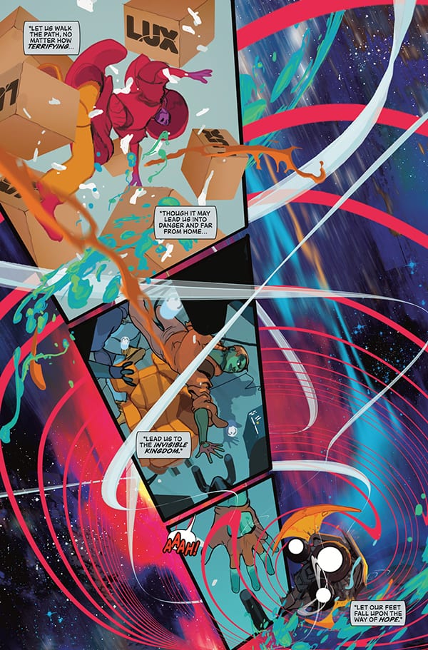
Without doubt Christian Ward’s artwork will blow you away. Five issues in and you would expect to be used to the artist’s beautiful vision but his elaborate, painterly style is a constant pleasure. He captures the chaos of battle as easily as the majesty of space travel. Each page is packed with colourful images barely contained within the confines of the panels.
Ward’s page layouts represent the chaos of battle as much as the artwork itself. He shifts from structured layouts to pages almost devoid of the normal comic book form. Boarders disappear and the images bleed to the edges on all sides. The art reflects the danger of the situation and the traumatic experience that the small crew of outlaws face.
Ward uses shapes and shadows to direct the reader through the page however it is Sal Cipriano’s lettering that does most of the hard work. The placement of the caption boxes and word balloons creates urgency and emotional pauses. He uses subtle, and some not so subtle, changes in the text to emphasise the personalities of the characters. Cipriano’s lettering is the stable framework around which Wards artwork hangs, as well as being the visual punch to Wilson’s script.

Invisible Kingdom has been a successful partnership between creators from the first issue. Each element of the comic works to enhance the reading experience without becoming dominant within the comic. This is especially impressive because of the talent involved, each creator is individually a strong voice within their craft. To come together and produce a comic of this standard without one aspect overshadowing another is a tribute to their talent and commitment to the comic.
Science fiction is extremely popular at the moment, especially with publishers like Marvel and studios like Disney pushing out more and more space based narratives. This makes it difficult for smaller, creator owned material to break through. However, Invisible Kingdom should not have a problem finding a place in the market. The narrative is engaging; the characters are varied and complex; and the art work is outstanding in every aspect. This is a beautiful, exhilarating read and should be on everyone’s reading list.

