

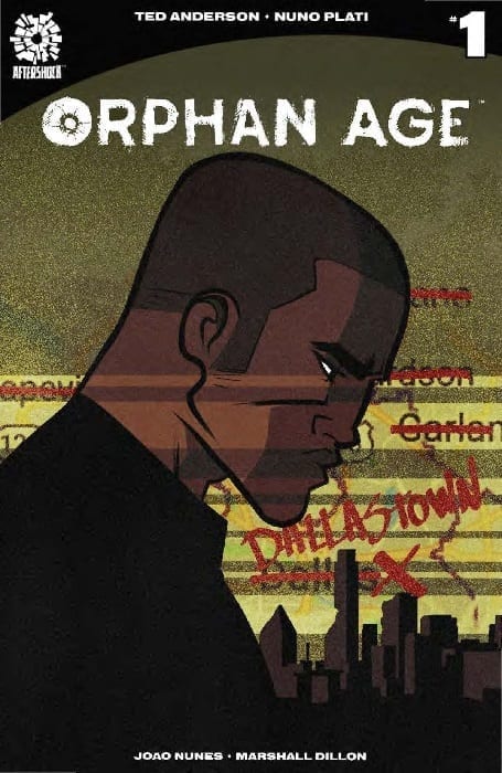
There are many roads to a Dystopian Future; some take months building up the tension waiting for the inevitable end; others get straight to the point and prepare for the aftermath. Orphan Age #1 is one of the later types. It’s also not too dystopian.
AfterShock Comics unleashes a harsh world of religious bigotry and pointless death into comic shops. In the vain of The Walking Dead, minus the Zombies, Orphan Age throws a cast of characters together and challenges them to survive.
Writing/Story
Ted Anderson doesn’t mess about with the end of the world. One page is all it gets at the very opening of Orphan Age. One page. All of the adults die, unexpectedly, leaving the children in charge of the world. Similar in initial premise to The Tribe, a 1999 Australian TV series, Anderson quickly moves the story forward 20 years, when most of these children have grown up.
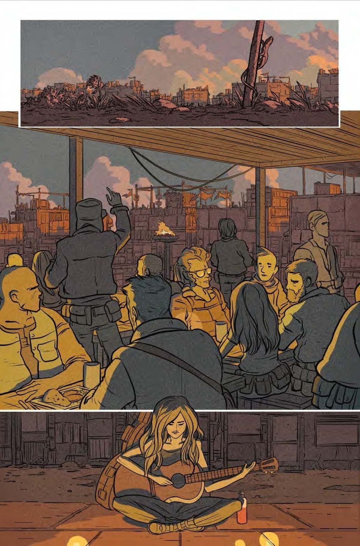
After the opening you wouldn’t be blamed for expecting a narrative that explores the ageing process without guidance from adults however, that is not what the rest of this comic is about. Societies and misguided religion have sprung up with the usual trappings that come with them. Anderson sows mistrust and fear of strangers into every scene almost creating something that could easily slip into a copy of The Walking Dead. Dallastown is a secluded society, at peace with itself, based on simple farming and sharing openly in a group setting. It is obviously set up for a fall.
Anderson creates a diverse cast of characters who will all have to learn to live with each other in order to survive and these are the strongest element of this comic. Each of the main three characters is cleverly written with their own individual voice. The differences between them are presented in a series of staged scenes, setting up future emotional conflicts as the narrative progresses.

Art
Most of the art within Orphan Age has an earthy coloring to it. This produces much of the general atmosphere and keeps the action surprisingly sedate throughout. It is obvious from the natural shades that modern technology has been expunged from this new world. The tone of the colors sets up this element of world building without the need for expositional speeches.
Nuno Plati’s work is carefully considered with thick black lines defining the characters. Plati adds subtle gestures and expressions to the cast to give them a relaxed, contented feel.
This style continues even into the violent sections of the story which distances the reader from a lot of what is happening. The emphasis however falls on the three central characters and their reactions to the situation. This is where Plati places the emotion and gains empathy from the reader, especially in the character of Princess, the youngest protagonist of the comic.
The layouts that Plati uses creates some interesting imagery and focal points. One page in particular focuses on the three central characters and the subtly differences between them. A series of three stacked panels with compositional differences in each makes the reader carefully study each character.
The lettering within Orphan Age is a pleasure to read. Joao Lemos and Marshall Dillon’s work demonstrates how the storytelling can be affected by the speech balloons. Changes in font size can make such a difference, especially when the balloon size remains the same, a technique which is used to great effect in this comic. There is definition between speech volume and overlapping speech balloons that create naturalistic speech patterns.
Conclusion
Where Orphan Age’s narrative fails is in not giving the reader anything new. There is a gluttony of stories dealing with small societies trying to survive that it is difficult to find a new angle. Orphan Age had a potential new angle in the opening pages but then lost it almost immediately. The struggle of the surviving children, alone in an environment slowly decaying, promised a new direction but Anderson skips over it. Instead the reader is left with a Religious Organisation which is, predictably, violent and self-serving, and a small cast of characters on the run in a harsh world.
Orphan Age has some interesting art and tells its story in a sedate, self-conscious way. The highlight of this issue is the integration of the lettering into the art work and narrative. There are moments when the text leaps from the page and tells the reader more about this world than the art or the script does.
There is a lot to enjoy here, just don’t expect anything new from the plot.