While Star Trek: Discovery is storming across T.V. screens, the rest of the franchise has been brought together by IDW Publishing to do battle for the enjoyment of Q and his eternal friends. The second issue of The Q Conflict has a range of covers highlighting the mix of the crews and defines the format that the story is most likely to take for the rest of the series.
Drawing influence from other crossover event type stories, such as the original Secret Wars from Marvel comics and the multi Doctor stories from Doctor Who, The Q Conflict takes on the shape of a competition, pitting the crew of various space vessels against each other. The purpose is yet unstated and the prize a bigger mystery. But when Q is involved, nothing is going to be as it seems.

Writing/Story
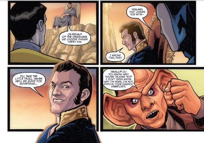
Scott and David Tipton open this issue with the awkwardness of a schoolyard team picking experience. Most of the crew have been separated out between the godlike beings and only Quark and Ensign Kim remain to be picked. Is this a comment on the popularity of these characters? Maybe.
But this moment is quickly passed and the meat of the story begins. Q sets out the rules, with a few choice inputs from Picard, and sets the goal for the first part of the game. What follows is the attainment on this goal by the competing crews and the first stage of The Q Conflict is underway.
As the story plods along, a number of the characters are spotlighted for a moment of emotion or character statement. Ensign Chekov is frustrated; Commander Worf is uncomfortable; and Riker is smug. Most of these character aspects will be known to the readers as it’s hard to believe that anyone reading this isn’t a fan of Star Trek. Therefore, these moments are unnecessary and read as such. It is possible it will lead to important story points later in the series but for now they hang in the narrative like an immobile space craft.
The aim of this issue is to establish to crew rosters and layout the ground work for the ‘game’ they are being forced to play. The Tipton’s have taken a very straightforward approach to this which means that the outcome is a touch bland. There is no real threat to overcome and each crew seem to be on a jolly jaunt rather than fighting for the safety of the universe. Ultimately, the comic follows a group of people racing against each other for a ball. It lacks drama and suspense.
Unlike a crossover event like Marvel’s Secret Wars where heroes and villains are pitted against each other in the game, The Q Conflict has nothing but heroes and therefore at this moment it doesn’t matter who wins. There is scope here for some challenging storytelling, especially as the characters come into real conflict with each other, but this issue is lacking any of that.
There is an exciting narrative hovering on the horizon, the readers just aren’t allowed to go there yet.

Art
The panel layouts from this second issue of The Q Conflict are thoughtfully designed. They lead the reader through the narrative and make it clear exactly which ship and crew each panel relates to. This is important for a comic like this because, in essence, everything is up in the air. The panel layouts ground the reader and focuses each location with its array of characters.
David Messina draws superb likenesses of the star ships crews and clearly has knowledge of each element of the franchise. He produces detailed work for Elisabetta D’Amico to ink and Alessandra Alexakis to color. Between them they create characters full of expression and emotion which is quite a challenge with the script they have been given.
The page layouts establish the location and the characters beautifully. The art team then build on this to make the comic endearing and provide an element of entertainment. The overall aesthetic is that of a Next Generation episode which is much warmer and comforting than the latest film franchise or Discovery.
The script is tedious in places and over written but Neil Uyetake manages to break this down in his lettering and make it flow across the pages. It’s easy to see who is speaking even if it’s not always clear from the dialogue itself. An easy to follow narrative is an important aspect of the comic which is helped by speech balloon placement.
The Q Conflict looks much better than it reads and it is a shame that the art team did not have a more exciting story to work their magic on.

Conclusion
A collection of easy in jokes and a lacklustre story means that The Q Conflict doesn’t live up to the potential of the first issue. The presentation is wonderful with artwork that captures the essence of a Star Trek episode but there is very little to back it up. This means that the flaws are more noticeable and any quirks are over enhanced.
Elements of the story and appearances from some characters will appeal to long term fans of the franchise. There is still potential in this series to tell an outstanding, genre busting story and as the series unfolds, this may yet come to fruition. For now, this chapter simply sets the scene in an adequate if uninspired way.


