Mega Man: Fully Charged #6, out now from BOOM! Studios, brings the miniseries to its conclusion with epic battles, emotional moments, and jaw-dropping art.

A.J Marchisello and Marcus Rinehart close their thrilling series in Mega Man: Fully Charged #6 with an ending that leaves you wanting more. While the issue’s writing has its flaws — the cliffhanger from the previous issue has little payoff and the final plot points seem a little too condensed — Marchisello and Rinehart do a marvelous job of ending the series. It leaves room to tell more stories in the world but provides the reader with enough closure that the ending is still satisfying.
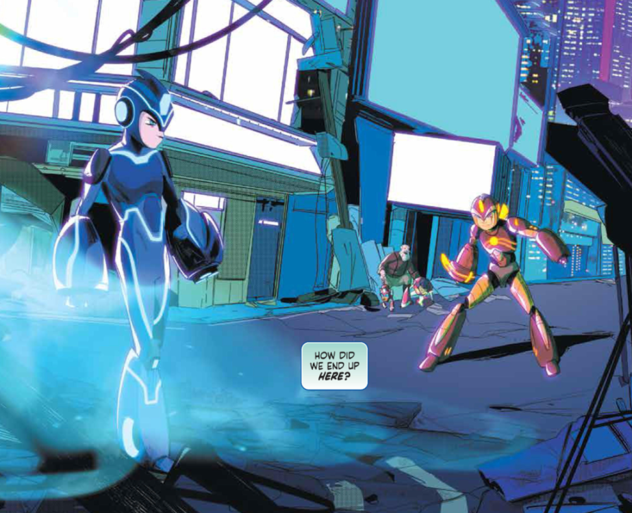
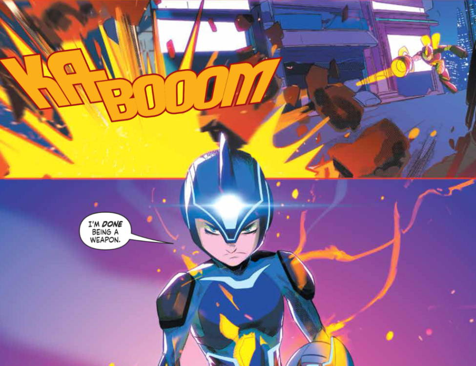
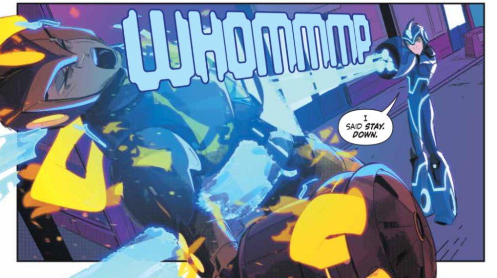
Stefano Simeone’s art in Mega Man: Fully Charged #6 is gorgeous, as always. His forms are unbelievably dynamic, and many of the panels of the issue are framed in a very cinematic way. Simeone also clearly put lots of effort into creating panels where Silicon City is in the background, as his buildings are highly detailed and often features some impressive perspective. I can not praise his work highly enough in this issue or throughout the series.

Igor Monti has quickly become one of my favorite colorists through this series, and his talents don’t slack in Mega Man: Fully Charged #6. Monti, with assistance from Sabrina Del Grosso, turns the art into something genuinely jaw-dropping. The gradient backgrounds are gorgeous. Monti and Grosso’s choice to distinctly change the palette to pinks and grays when showing scenes from the Hard Age gives a unique style to this point in time and makes it distinct, so the reader is never confused. Monti and Grosso also use harsh lighting whenever Mega Man’s busters fire. It illuminates nearby objects and speaks volumes for its firepower.

Ed Dukeshire’s lettering in Mega Man: Fully Charged #6 does a brilliant job of allowing the story and dialogue to flow uninterrupted. Dukeshire also had the task of handling captions from different characters on the panel at once, which he resolved through distinct captions styles that make sure no reader is confused.
This series was a delight, and I’m sure many readers are sad to see it go. It took a show that had a lackluster reception and told an engaging story with gorgeous art to support it. Fans of the show should be pleased to see they get another story in this world, and people unfamiliar with the show can still jump on and experience this dramatic tale.

