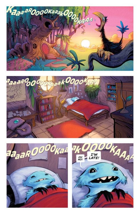
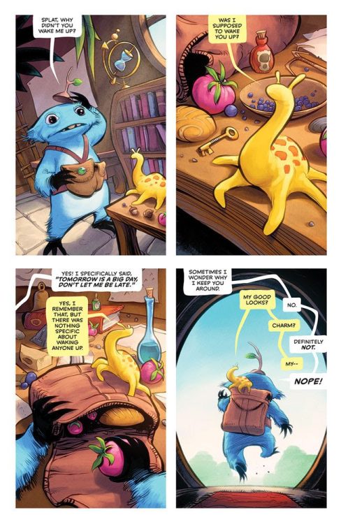
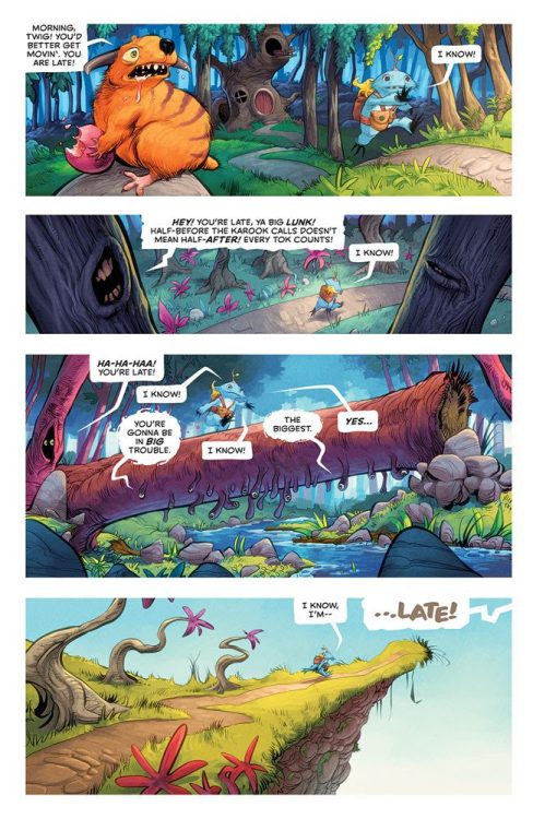
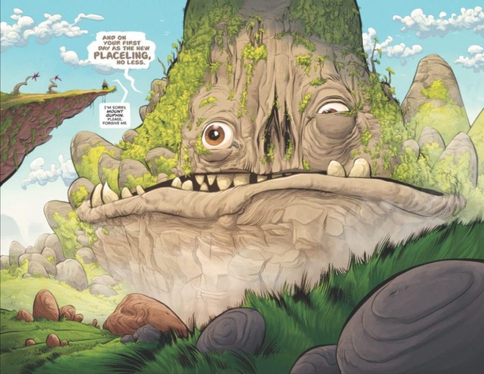
TWIG #1 from Image Comics is an epic fantasy that made me miss Jim Henson and appreciate the creativity of Skottie Young and Kyle Strahm. The book is written by Young, with art by Strahm, colors by Jean-Francois Beaulieu, and letter work by Nate Piekos.
About TWIG #1:
It’s the first day of Twig’s new job as a journeyer on a JEFF SMITH’s Bone-esque quest to save a The Dark Crystal/Labyrinth-style world. Join our hesitant hero for an inspiring and imaginative tale of hope, heartache, and determination to overcome insurmountable odds!
WRITING
The world-building sessions between Young and Strahm must have been spectacular, because the creatures and visuals are awe-inspiring. Young sets up the hero’s journey in the first issue, but also lets Strahm’s artwork breathe as he shows you the universe. There are five silent panels in the book that absolutely suck you into the universe of Twig and his sidekick, Splat. These panels put Twig’s world on display, and your brain can’t help but add the soundtrack to their journey. I could hear the splat of the fish as our heroes ate lunch on the river bank and feel the chill in the night air as they camped out. In addition, Young tastefully develops the character of Twig throughout the issue, dropping little nuggets here and there for you to digest. You can’t help but be drawn to Twig and Splat as the reader.
ARTWORK
Strahm knocks the character designs out of the park. The simplistic features of Twig’s big eyes and crooked teeth emphasize the childlike wonderment of the world we are about to enter. There is such a unique feel to the book. The Belly Mine creatures are brilliant and diverse. There is an homage to Henson, but the style is all Strahm. As mentioned above, Strahm puts the entire world of Twig on display, and the panel layout gives a bounce to Twigs step as your eye travels on the page. The “cinematography” of the book is beautiful. The wide shots display such detail that you search through each panel endlessly. But, when a close-up hits, you feel the moment’s emotion.
COLORS
Beaulieu’s color palette for the issue is warm and friendly. The blue of Twig and the gold of Splat work tremendously well to stand out against the spectacle of their world. Beaulieu goes the extra mile, as all the colors are rich and have a texture to them — you can feel the movement of the story. My favorite panel is of Twig and Splat sleeping out under the stars with “space turtles,” there is such a calmness to the panel because of the colors.
LETTERS
Piekos keeps it simple, and it works. The story is easy to follow, and the word balloons do not overshadow the art. Piekos adds a yellow tint to Splat’s word balloons which works well in conversations with Twig.
OVERALL
TWIG #1 is a fun book that would make Jim Henson proud. So many questions are left to be answered, and I’m excited to read the series. Young, Strahm, Beaulieu, and Piekos created an original universe full of possibilities. TWIG #1 hits your local comic book shop on May 4.


