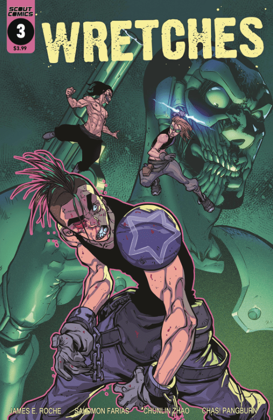
Shea and Sean’s bloody past rears its nasty head into the present as multiple storylines begin to converge on January 29th in Scout Comics’ WRETCHES #3.

It may have only been a week, but if you need to catch up on our previous Wretches review, check them out here. Plus, make sure you grab issue three at your local comic shop or Scout Comics website when it drops.
THE PAST AND PRESENT OF WRETCHES
Writer, James E Roche starts Wretches #3 in the past with a quick introduction to the siblings as kids. Yet, he doesn’t tell the tale linearly. Instead, he switches between the past and present while changing characters in between. During the past, we learn of the sibling’s parents and their hatred of bots. Plus, an introduction to what may be the “big bad” guy/Bot.
However, this usage of multiple stories in different places and times work perfectly in the story’s favor. Roche never lingers too long on a singular story beat; rather he spotlights each equally while teasing more. Luckily, in the present, we are shown Shea engaging in badassery—what we’ve all been clamoring for. During this, Roche sews the seeds of distrust between her and Burr. Nonetheless, they have a common goal. Said goal of making it to a Bot encampment.
The most substantial part of Roche’s multiple storytelling direction is him making them all lead up to one point. That and how each story seems to have a revelation that helps drive the characters and plot forward. Handling one storyline alone is hard, yet three interesting ones at the same time in an issue is a huge task.

ART WITH STYLE
Thus far, Wretches has had fantastic art, with Salo Farias raising the bar with issue three, and his panel design. Farias forgoes the employment of usual white boxed panels and instead relies on the environment. During a simultaneous storytelling element Farias’ uses an interesting layout. In this simultaneous moment, a vertical line dissects the two stories, the further down the line goes, the more left it strays. This makes certain panels larger than others, working out phenomenally.
Although multiple pages are worth noting, they run in spoiler territory, but one more warrants a mention. During an execution line-up, Farias moves the angle around, so you never see the deaths. Nonetheless, you feel each due to Chas! Pangburn’s sound effects. Said “camera” movement is executed magnificently and hits harder than showing the actual killings.
Wretches #3’s action scenes hit harder while appearing more brutal, which can be attributed to Chunlin Zhao’s colors. When the violence kicks in, Farias’ imagery portrays a hyper-violence that sends shivers up your spine. Then Zhao’s colors amplify the pain even more. Not being content with a single color background, Zhao uses a different shade around the impact, showing its intensity. These bone-crushing moments are made more impactful by the technique Zhao employs.
Pangburn continues to bring his A-game. This can be seen in the execution line-up and scattered throughout Wretches #3. Unlike the previous issues, there aren’t any aliens, so Pangburn isn’t given a chance to change the fonts in that way. Yet, he still plays around with styles when characters talk in different demeanors. Especially when a character screams, Pangburn makes sure you hear them.

CONCLUSION
As amazing as the revelations in Wretches #3 story are, the visual team really shined throughout. While reading Wretches in succession, it feels as if the team as come into complete unison in their third issue. This can be seen throughout in the fantastic pages that adorn Wretches #3.
Cover Story: The most amazing thing about Wretches #3’s cover is how comic accurate it is. Everything that is shown on the cover happens in the interior. Usually, comic covers show something flashy that will sell copies. Instead, they do that while showing what happens inside.

DEAR READER
Only two issues of Wretches remain following the third. What have you thought so far of the sibling’s tale?

