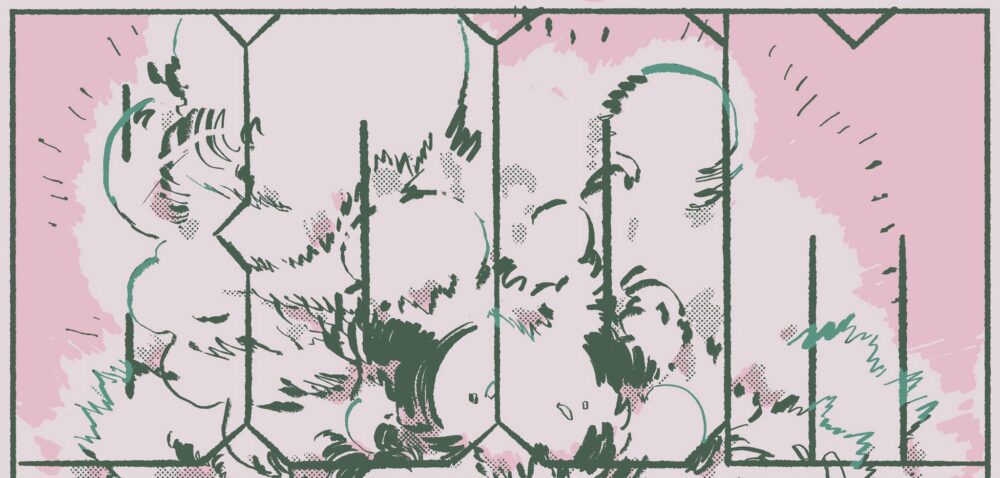
Comics thrive on cool character designs. Sure, there are more grounded, experimental, or contemplative ways to approach comics. But superheroes, shonen, and all sorts of genre comics in between live or die on stylish their leads can be. Just ask Spawn. Fortress #3 by Joel Van Der Knapp demonstrates this principle with its parade of cool, sketchy, sci-fi designs. There are world-ending stakes here, but you still might want to take a few extra seconds to stare at each page.

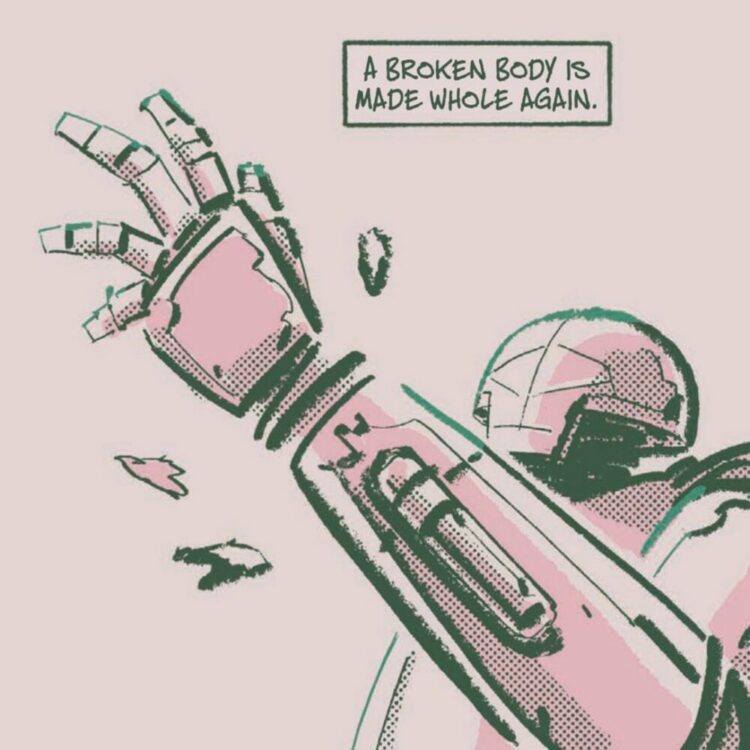
Caleb’s come apart. The man was once a super-soldier in The State Wars, a revolution fought against government-sanctioned death robots. But his powers relied on specialized bionic limbs to harness and keep his abilities under control. Limbs that were stolen. The culprit? A mysteriously independent death robot named Vogon. So Caleb was put into stasis to keep him alive while others searched for his missing limbs. It’s a fellow veteran, Itar, who finally gets a lead and wakes him up. The world he awakes to is a wasteland, still bearing the scars of civil war. But Itar has a plan. Reassemble Caleb’s old super-soldier team, Fortress.
Fortress #3 only checks in briefly with Itar and Caleb, instead focusing on the side characters of a rapidly growing cast. All of them straddle the line between robot and human. Like the bounty hunter, Kyra, searches for her husband’s memory files to try and restore some humanity to his robotic shell. Or an outdated battle droid named “Old Roy” who uses an old war-machine ritual to acknowledge the cost of his victories.
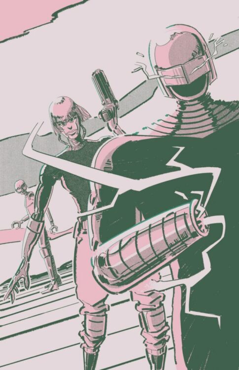
Sure, there might not have been enough time to fully sit with these characters yet. That’s the price of serialized storytelling—26 pages to get in and out. But Van Der Knapp has taken many fun sci-fi high concepts and tied each to a stylish character design. So the issue finds a lot of joy in introducing them one by one. Like Axel, whose “distorted, elongated frame wields supercharged arms, the electricity cutting through the dry air.” Or the aforementioned husband of the bounty hunter, introduced on the first page as “A shell that holds remnants of a man.”

But in contrast to the issue’s love for descriptive narration, the art is often sparse and sketchy. Backgrounds can be as little as a few lines suggesting hills or a gradient. Outlines are drawn in thick brushstrokes. So much of the focus falls on the characters, who get cool, varied designs with introductory splash pages designed to show them off. There’s a detached, alien feeling to many – of all the characters introduced so far, only three have visible, expressive faces, which reflects the book’s blown-out wasteland of a world.
As for the colors, Van Der Knapp manages to get a lot of mileage out of shades of blue and pink. Pink dominates each page, and blue saved for highlighting the outlines of each character. Though it also shows up in finer details like the readout on a scope or outlining details in a dark room. Pink may not be the first color many would choose for a post-apocalypse, but the bright shade overwhelming each page conveys its own bleak tone. Especially in a desert wasteland where the sun’s constantly beating down.

As for the lettering, Fortress continues its dedication to its characters by using fonts to communicate voice. Vogon speaks in a bold, uniform font, befitting a machine. The untrustworthy Hexa talks in a scratchy, jagged font. While characters like Itar and Caleb speak in a font that’s more naturalistic and handwritten.
VERDICT
Fortress #3 manages to make set-up for future issues pretty damn enjoyable. Van Ker Knapp has a severe knack to cool-looking characters with fun hooks. And with the comic finally back on track after a long hiatus, it’s a good time to jump on. You can find buying options for the comic on its official site.

