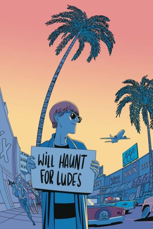
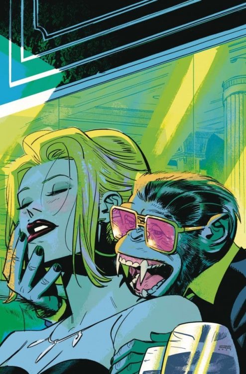
Dark Horse’s You Look Like Death #1 should read like a fever dream. From the pages of Umbrella Academy, we follow Klaus as a teenager. Klaus can talk to ghosts, has a drug problem, refuses to wear shoes, and gets tied up in some nasty business with a vampire chimpanzee crime boss. But writers Gerard Way and Shaun Simon, artist/colorist I.N.J. Culbard, and letterer Nate Piekos of Blambot, make it all seem like just another day.
Writing
Since the first issue of Umbrella Academy, Way has done something brilliant (and Simon seamlessly steps into this world as co-writer, matching the tone Way established). In the face of an incredibly quirky world, Way’s characters have always seemed totally unfazed. In fact, a lot of Klaus’s struggles in this issue come from the fact that he’s used to people just going along with his weirdness. Kicked out of the mansion, Klaus has to use all his guile to survive. Unfortunately he’s one of the most self-sabotaging people to ever walk the earth. Simon and Way depict this tug-of-war in big and small ways.
One moment, Klaus is jumping on a plane and heading to Hollywood, and the next he’s hitching a ride to a funeral parlor. He’s torn between a knack for adventure and a craving for the familiar. Pissing everyone off in the parlor, he’s thrown out on his face. He dusts himself and says “That didn’t go as planned.” But that’s Klaus. There is no clear plan. And Way and Simon have us guessing his motivations constantly, in order to see that Klaus himself is as lost as we are. He’s just lost with a cool smile.

Art
Culbard maintains a feeling of nonchalance, even indifference, in You Look Like Death #1. It’s incredibly obvious, in the opening moments of this issue, where Klaus’s indifference comes from. As he speaks with his father about being tossed out of his home, they’re both trying to prove they don’t care about the conversation. The senior Hargreeves barely even shows his face. He looks out the window, at a newspaper, down at his desk. Klaus responds by smiling through the whole thing. It’s family dysfunction at its finest. Culbard somehow shows us that they’re both coping by deflecting, just in different ways.
This issue, much like Klaus, seems almost allergic to emotion. Klaus is smiling coolly from page one to page thirty-two, but in the brief moments that characters do get emotional, Culbard zooms out. Their faces are drawn minimalistically, the details lost. Culbard puts us into Klaus’s mind. We see the world through his eyes. Klaus is disconnected from humanity, so when people get angry or sad, Culbard yanks us away and makes us looks elsewhere. We gain a brilliant understanding of the character in the process.
Coloring
Culbard’s coloring in You Look Like Death is gorgeous. His greens, blues, and pinks are like neon signs lining the sex-filled streets of Los Angeles. But his coloring isn’t just beautiful, it’s dangerous. It becomes clear pretty quickly that Culbard is associating certain colors with certain things. Klaus’s powers are green. We can see it in Klaus’s eyes when he begins to summon the dead. Danger is pink. We see it on the sign for the funeral parlor, the lights in the drug store, and the glasses of Mister — I mean, The Shivers. It’s beautiful and seductive, but it’s also destructive. Culbard illustrates Klaus’s cycle of self-sabotage. It’s like a habit Klaus just can’t quit, he’s always running into danger and loving every second of it.

Lettering
Piekos’s lettering is versatile, so it’s noticeable when he starts using a default. The datelines in this issue, first telling us we’re at the Umbrella Academy, then the City, use the same font. And when Klaus finds himself in “The Void,” again Piekos uses the same font. This brings us back to the indifference this comic has about strange things. Using one unchanging font for every place, no matter how “out there” the setting may be, gives us a sense of these places being normal. Hollywood is just as normal as the Void.
Or at least that’s what Klaus wants us to think. Piekos gives a few subtle tells that this isn’t the case. After luring us into the page with a big neon sign that says “Drugs” (which is an awesome page by the way), Piekos shows what Klaus is saying as he thinks he might be dying. “Uhn!” he says in large lettering, thinking it might be the last sound he makes. When he wakes up in the Void, we get one textless panel. Then Klaus simply says “Oh…” in small lettering. It’s so subtle, but Piekos gives us a chink in the armor. Klaus gives a crap if he dies, and for a character like him this small moment, quickly followed by another normal word balloon full of regular-sized text, is groundbreaking.
You Look Like Death #1 is a great tie-in to the Umbrella Academy universe. It captures the nonchalant strangeness of its parent series, while focusing in on the reasons everyone wants to insist that everything is normal. It’s a really fun comic, and it’s gorgeous to look at. Pick up You Like Death #1, out from Dark Horse Wednesday September 16th, at a comic book shop near you!

