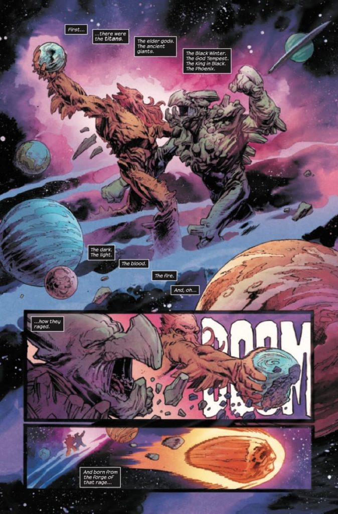
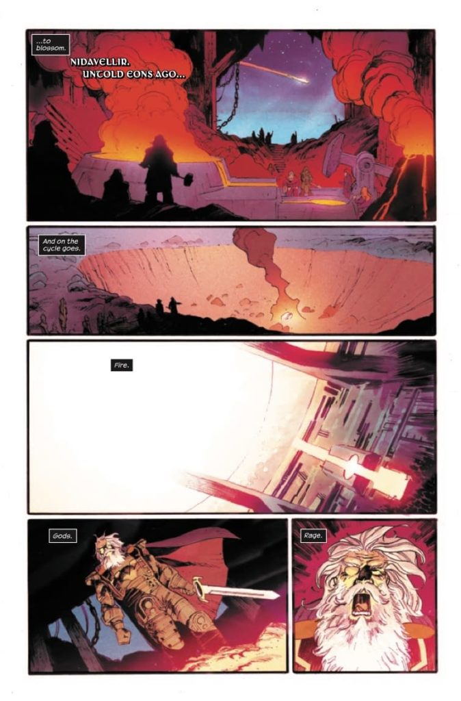
Marvel Comics’ Thor #19 feels like eons of storytelling, boiled down to a sleek 20 pages. Writer Donny Cates, artist Nic Klein, colorist Matt Wilson, and letterer/designer Joe Sabino set the stage for a terrifying new villain to enter the fray. And they do so by going all the way back to the beginning.
About Thor #19 (from Marvel Comics)
“GOD OF HAMMERS” STARTS HERE! Mjolnir has gone missing! And nobody, not even the powerful eyes of Lady Sif, is able to locate it. So Thor must turn to the last person he wants help from…Odin. For until the hammer is found, nobody in the realms is safe! Artist Nic Klein is back for the twists and turns not even the All-Father is ready for!
Writing
Cates shows, in his opening pages, that he can get through huge amounts of exposition smoothly. He gives us a nuanced rundown of the Norse Gods’ entire history. And as he reaches present day, it becomes clear why he took us back in time. To fully understand what’s going to happen next, Cates wants us to know a thing or two about Mjolnir. But as Thor and Lady Sif talk about recent events, Cates briefly gets out of his rhythm. Thor’s dialogue is clunky and expository. It feels more like Cates is telling us what we need to know, not showing us. It’s only really noticeable because Cates’ intro is such a brilliant example of packaging exposition well. And it’s only a small speedbump in a script that feels full of mystery and subtlety.

Art
Klein’s art is stunning. He draws in his own unique style, yet occasionally dabbles in the techniques of Jack Kirby. A monster that Thor, Jane Foster, fights in a flashback gives Klein the opportunity to draw briefly like the King of Comics. Even as he does this, he holds on to his own unique style throughout. But it’s more than just his style that makes Klein’s art work so well. He has a way of luring the reader in, before punching them backwards. He brings the reader’s eyes inward, to the center of the page, then uses the action of the scene to push the art back outwards again. It makes you feel involved in the story, like you’re watching each fight closely from the sidelines, betting on who will come out on top.
Coloring
This is a dark time for Thor. He feels like the whole world is against him. But a lot of the darkness is coming from within him too. Wilson has a brilliant way of showing this. When Thor stands on the Rainbow Bridge, talking to Lady Sif, the contrast couldn’t be any clearer. The vibrant colors of the bridge are under his feet. They ought to shine on the whole scene and make things bright. But no, instead the scene is cast in a cold blue light. We see that Thor isn’t letting brightness into his world. Maybe he’s punishing himself, maybe he’s hunkering down for the next fight. But either way, Wilson shows us that Thor definitely isn’t allowing himself to be happy.

Lettering
In one of the fight scenes, Sabino makes subtle choices that make big changes to how the scene sounds in the reader’s mind. As two figures fight, one of them grunts and yells each time he’s hit. The font tries to burst past the borders of each word balloon, pushing the edges of the balloon out so that they wrap each letter. When another character swoops in to his friend’s aid, he kicks the attacker in the chest. In response to being kicked, the attacker grunts. Instead of letters that are trying to escape their word balloon, Sabino goes in the opposite direction. He shows a “RAGHH!” that’s written smaller than the rest of the font on that page. Instead of grunting loudly, we hear it as the character having the wind knocked right out of them. They’re barely able to make a noise at all. It’s just one example of the many intricacies to Sabino’s work in this issue.
Marvel Comics’ Thor #19 is a comic that exists to herald a coming doom. This creative team sets everything up for the God of Hammers to take the spotlight. When he does arrive, there will be plenty of dread waiting for him. Pick up Thor #19, out from Marvel Comics November 24th, at a comic shop near you!

